QML
← All components

Autocomplete

Suggest matching entries as the user types, so a value can be entered or selected quickly.

import Syidax.Core.Autocomplete

Supported QML types

TypeDefinition / role
Text field with suggestions filtered from a source list.

Learn by example

Previews are images of native Qt runs. Use the buttons below each image to view a result.

01 Basic composition

SyAutocomplete is a text field with suggestions: the strings of source that contain the typed text drop down under the field, and a click or Enter on one of them fills the field.

Qt capture · image
Basic composition · Suggestions
QML code
import QtQuick
import Syidax.Core

Item {
    implicitWidth: Math.max(360, childrenRect.width)
    implicitHeight: childrenRect.height
    id: story

    readonly property var cities: ["Seoul", "Busan", "Incheon", "Daegu", "Daejeon", "Gwangju", "Suwon", "Ulsan", "Sejong"]
    property QtObject settings: QtObject {
        id: storyArgs
        property string placeholder: "City"
        property string trigger: "focus"
        property int min: 0
        property bool caseSensitive: false
        property bool highlightMatches: true
        property int debounceTime: 0
        property string size: "medium"
        property string status: "default"
        property bool disabled: false
        property bool readonly: false
        property bool required: false
        property bool loading: false
    }


    SyAutocomplete { id: exampleControl1; 
        source: story.cities
        placeholder: storyArgs.placeholder
        trigger: storyArgs.trigger
        min: storyArgs.min
        caseSensitive: storyArgs.caseSensitive
        highlightMatches: storyArgs.highlightMatches
        debounceTime: storyArgs.debounceTime
        size: storyArgs.size
        status: storyArgs.status
        disabled: storyArgs.disabled
        readonly: storyArgs.readonly
        required: storyArgs.required
        loading: storyArgs.loading
    }

}

02 trigger · min

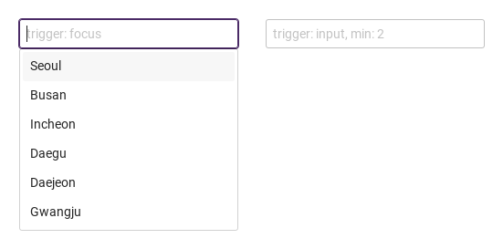
Focus lists suggestions immediately. Input waits for two characters, then lists matching cities.

Qt capture · image
trigger · min · Focus result
QML code
import QtQuick
import Syidax.Core

Item {
    width: 550; height: 300
    readonly property var cities: ["Seoul", "Busan", "Incheon", "Daegu", "Daejeon", "Gwangju"]
    id: sample
    Row {
        x: 20; y: 20; spacing: 30
        SyAutocomplete { id: focusCity; width: 240; source: sample.cities; placeholder: "trigger: focus" }
        SyAutocomplete { id: inputCity; width: 240; source: sample.cities; trigger: "input"; min: 2; placeholder: "trigger: input, min: 2" }
    }
}

03 highlightMatches · caseSensitive

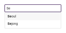
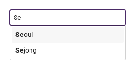
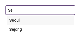
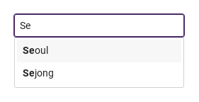
highlightMatches: true draws the first occurrence of the typed text in bold inside every suggestion, so the user sees why a row matched.

Qt capture · image
highlightMatches · caseSensitive · Suggestions
QML code
import QtQuick
import Syidax.Core

Item {
    implicitWidth: Math.max(360, childrenRect.width)
    implicitHeight: childrenRect.height
    // Focused Gallery routes: keep only the selected API and its prerequisites.

    id: story
    readonly property var cities: ["Seoul", "Busan", "Incheon", "Daegu", "Daejeon", "Sejong"]
    property QtObject settings: QtObject {
        id: storyArgs
        property bool highlightMatches: true
        property bool caseSensitive: false
    }


    SyAutocomplete { id: featureTarget0; source: story.cities; value: "Se"; highlightMatches: storyArgs.highlightMatches; caseSensitive: storyArgs.caseSensitive }
}

04 disabled · readonly · status · loading

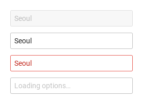
disabled draws the disabled tones; the field takes no focus, no typing, and no list.

Qt capture · image
disabled · readonly · status · loading · Default
Default execution
QML code
import QtQuick
import Syidax.Core

Item {
    implicitWidth: Math.max(360, childrenRect.width)
    implicitHeight: childrenRect.height
    // Focused Gallery routes: keep only the selected API and its prerequisites.

    id: story
    readonly property var cities: ["Seoul", "Busan"]

    Column {
        spacing: 12
        SyAutocomplete { id: featureTarget0; visible: true; source: story.cities; value: "Seoul"; disabled: true }
        SyAutocomplete { id: featureTarget1; visible: true; source: story.cities; value: "Seoul"; readonly: true }
        SyAutocomplete { id: featureTarget2; visible: true; source: story.cities; value: "Seoul"; status: "error" }
        SyAutocomplete { id: featureTarget3; visible: true; source: story.cities; loading: true; placeholder: "Loading options…" }
    }
}

05 changed · selected

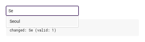
changed(detail) fires whenever value changes after creation: on every keystroke, when a suggestion is picked (the pick writes value first), and when code assigns value; detail = { value, isValid, status }.

Qt capture · image
changed · selected · Suggestions
QML code
import QtQuick
import Syidax.Core

Item {
    component EventLog: Rectangle {
        id: logBox
        property var lines: []
        implicitWidth: 440
        implicitHeight: Math.max(56, logText.implicitHeight + 24)
        radius: 4; color: Theme.semantic.backgroundBold
        function log(value) { lines = lines.slice(-3).concat([String(value)]) }
        Text {
            id: logText; x: 12; y: 12; width: parent.width - 24
            text: logBox.lines.length ? logBox.lines.join("\n") : "Interact with the controls to see event results."
            wrapMode: Text.Wrap; color: Theme.semantic.textDefault
            font.family: Theme.monoFontFamily; font.pixelSize: 12
        }
    }

    implicitWidth: Math.max(360, childrenRect.width)
    implicitHeight: childrenRect.height
    // Focused Gallery routes: keep only the selected API and its prerequisites.

    id: story
    readonly property var cities: ["Seoul", "Busan", "Incheon", "Daegu", "Daejeon"]


    Column {
        spacing: 12
        SyAutocomplete { id: exampleControl1; 
            source: story.cities
            onChanged: (detail) => { if (true) { output.log(("changed: %1 (valid: %2)").arg(detail.value).arg(detail.isValid)) } }
            onSelected: (detail) => { if (true) { output.log(("selected: %1").arg(detail.value)) } }
        }
        EventLog { id: output }
    }
}

06 setFocus · checkValidity · reportValidity · …

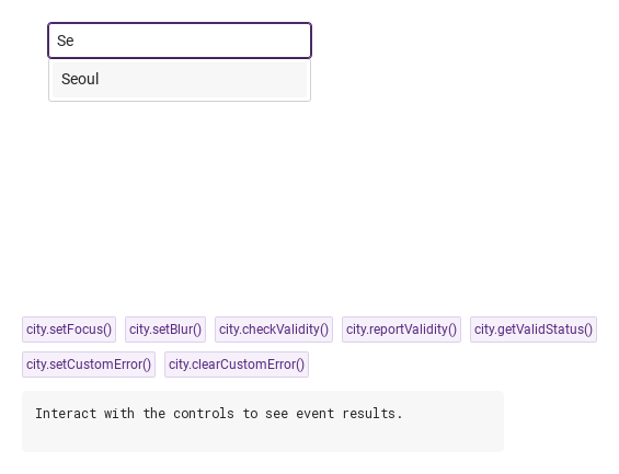
setFocus() focuses the field (with trigger: "focus" that opens the list); setBlur() removes the focus and closes the list.

Qt capture · image
setFocus · checkValidity · reportValidity · … · Suggestions
QML code
import QtQuick
import Syidax.Core

Item {
    component EventLog: Rectangle {
        id: logBox
        property var lines: []
        implicitWidth: 440
        implicitHeight: Math.max(56, logText.implicitHeight + 24)
        radius: 4; color: Theme.semantic.backgroundBold
        function log(value) { lines = lines.slice(-3).concat([String(value)]) }
        Text {
            id: logText; x: 12; y: 12; width: parent.width - 24
            text: logBox.lines.length ? logBox.lines.join("\n") : "Interact with the controls to see event results."
            wrapMode: Text.Wrap; color: Theme.semantic.textDefault
            font.family: Theme.monoFontFamily; font.pixelSize: 12
        }
    }

    implicitWidth: Math.max(360, childrenRect.width)
    implicitHeight: childrenRect.height
    // Focused Gallery routes: keep only the selected API and its prerequisites.

    id: story
    readonly property var cities: ["Seoul", "Busan", "Incheon"]

    Column {
        spacing: 12
        Item {
            width: 560; height: 280
            SyAutocomplete {
                x: 24; y: 24
 id: city; source: story.cities; required: true }
        }
        Flow {
            objectName: "exampleCommands"

            width: 560
            spacing: 8
            SyButton { id: exampleControl1;  visible: true; text: "city.setFocus()"; variant: "secondary"; size: "small"; onClicked: city.setFocus() }
            SyButton { id: exampleControl2;  visible: true; text: "city.setBlur()"; variant: "secondary"; size: "small"; onClicked: city.setBlur() }
            SyButton { id: exampleControl3;  visible: true; text: "city.checkValidity()"; variant: "secondary"; size: "small"; onClicked: output.log("checkValidity() → " + city.checkValidity()) }
            SyButton { id: exampleControl4;  visible: true; text: "city.reportValidity()"; variant: "secondary"; size: "small"; onClicked: output.log("reportValidity() → " + city.reportValidity()) }
            SyButton { id: exampleControl5;  visible: true; text: "city.getValidStatus()"; variant: "secondary"; size: "small"; onClicked: output.log("getValidStatus() → " + JSON.stringify(city.getValidStatus())) }
            SyButton { id: exampleControl6;  visible: true; text: "city.setCustomError()"; variant: "secondary"; size: "small"; onClicked: city.setCustomError() }
            SyButton { id: exampleControl7;  visible: true; text: "city.clearCustomError()"; variant: "secondary"; size: "small"; onClicked: city.clearCustomError() }
        }
        EventLog { id: output }
    }
}

07 Case-sensitive matching

Case-sensitive matching, configured with caseSensitive, trigger, min.

Qt capture · image
Case-sensitive matching · Suggestions
QML code
import QtQuick
import Syidax.Core

Item {
    implicitWidth: Math.max(360, childrenRect.width)
    implicitHeight: childrenRect.height
    id: story

    readonly property var cities: ["Seoul", "Busan", "Incheon", "Daegu", "Daejeon", "Gwangju", "Suwon", "Ulsan", "Sejong"]
    property QtObject settings: QtObject {
        id: storyArgs
        property string placeholder: "City"
        property string trigger: "input"
        property int min: 1
        property bool caseSensitive: true
        property bool highlightMatches: true
        property int debounceTime: 0
        property string size: "medium"
        property string status: "default"
        property bool disabled: false
        property bool readonly: false
        property bool required: false
        property bool loading: false
    }


    SyAutocomplete { id: exampleControl1; 
        source: story.cities
        placeholder: storyArgs.placeholder
        trigger: storyArgs.trigger
        min: storyArgs.min
        caseSensitive: storyArgs.caseSensitive
        highlightMatches: storyArgs.highlightMatches
        debounceTime: storyArgs.debounceTime
        size: storyArgs.size
        status: storyArgs.status
        disabled: storyArgs.disabled
        readonly: storyArgs.readonly
        required: storyArgs.required
        loading: storyArgs.loading
    }

}

08 Delayed search

Delayed search, configured with trigger, min, debounceTime.

Qt capture · image
Delayed search · Suggestions
QML code
import QtQuick
import Syidax.Core

Item {
    implicitWidth: Math.max(360, childrenRect.width)
    implicitHeight: childrenRect.height
    id: story

    readonly property var cities: ["Seoul", "Busan", "Incheon", "Daegu", "Daejeon", "Gwangju", "Suwon", "Ulsan", "Sejong"]
    property QtObject settings: QtObject {
        id: storyArgs
        property string placeholder: "City"
        property string trigger: "input"
        property int min: 2
        property bool caseSensitive: false
        property bool highlightMatches: true
        property int debounceTime: 300
        property string size: "medium"
        property string status: "default"
        property bool disabled: false
        property bool readonly: false
        property bool required: false
        property bool loading: false
    }


    SyAutocomplete { id: exampleControl1; 
        source: story.cities
        placeholder: storyArgs.placeholder
        trigger: storyArgs.trigger
        min: storyArgs.min
        caseSensitive: storyArgs.caseSensitive
        highlightMatches: storyArgs.highlightMatches
        debounceTime: storyArgs.debounceTime
        size: storyArgs.size
        status: storyArgs.status
        disabled: storyArgs.disabled
        readonly: storyArgs.readonly
        required: storyArgs.required
        loading: storyArgs.loading
    }

}

09 Required field and reset

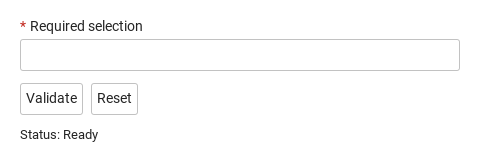
Compare the untouched field, validation error and reset result.

Qt capture · image
Required field and reset · Untouched
QML code
import QtQuick
import Syidax.Core

Column {
    width: 440; spacing: 12
    SyAutocomplete {
        id: field; width: parent.width; name: "selection"; required: true
        label: "Required selection"; source: ["Seoul", "Busan", "Incheon"]
        
        error: "Complete this field before continuing."
    }
    Row {
        spacing: 8
        SyButton { id: check; text: "Validate"; onClicked: field.reportValidity() }
        SyButton { id: reset; text: "Reset"; onClicked: field.reset() }
    }
    Text { text: "Status: " + (field.invalid ? "Invalid" : "Ready"); color: Theme.semantic.textDefault }
}

10 Custom error

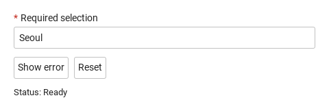
Show an application-specific error, then reset the field.

Qt capture · image
Custom error · Untouched
QML code
import QtQuick
import Syidax.Core

Column {
    width: 440; spacing: 12
    SyAutocomplete {
        id: field; width: parent.width; name: "selection"; required: true
        label: "Required selection"; source: ["Seoul", "Busan", "Incheon"]
        value: "Seoul"
        error: "This selection is currently unavailable. Choose another."
    }
    Row {
        spacing: 8
        SyButton { id: check; text: "Show error"; onClicked: field.setCustomError() }
        SyButton { id: reset; text: "Reset"; onClicked: field.reset() }
    }
    Text { text: "Status: " + (field.invalid ? "Invalid" : "Ready"); color: Theme.semantic.textDefault }
}

API 69

Hover or select an item for its QML example and copy button.

Properties

PropertyTypeDefaultDescription
string""The text. Writable from code (emits changed).
list[]The suggestion strings. Changing it refilters.
string"focus"focus: list on focus · input: list only after typing.
int0Characters needed before the list shows and filters.
boolfalseMatch (and highlight) with exact case.
boolfalseThe matching part of each suggestion in bold.
int0Milliseconds to wait after the last keystroke before filtering (0 = at once).
boolfalseA spinner row instead of the suggestions.
string""Shown while the text is empty.
string"default"default · warning · error · success — a look, not a validity.
boolfalseNot editable, no list, still readable.
int-1The highlighted row in filteredList.
list[]The suggestions currently shown.
boolfalseTrue once the user typed (what trigger: "input" waits for).
bool (read-only)—The list is showing.
string (read-only)—value as a string.
bool (read-only)—The field has focus
bool (read-only)—the pointer is over the box.
string""The frame's title, form key, helper text and custom error copy.
string"medium"small · medium · large — box height 24 / 32 / 40 px.
boolfalseDisabled tones and no interaction
boolfalseempty text is valueMissing.
read-only—Validity: "" · valueMissing · custom; invalid once touched or reported.
real240The width when the app sets none.

Methods

MethodDescription
Focuses the field; with trigger: "focus" the list opens.
Removes the focus and closes the list.
Returns whether the status is "" (silent).
Same, and reveals the error line.
"", "valueMissing" or "custom" (the two are the same).
Forces the custom status (and marks the field touched)
clears it.
Restores the creation value and clears the touched / submitted / custom flags.

Signals

SignalArgumentsWhen
detail: { value, isValid, status }value changed after creation — typing, a pick, or code. Not for the initial value.
detail: { value, isValid, status }A suggestion was picked by click or Enter on the highlighted row (after changed).
detail: { value, isValid, status }The field gained focus.
detail: { value, isValid, status }The field lost focus; the field is now touched and the list is closed.

Behavior

ItemBehavior / conditions
Match (and highlight) with exact case.
The suggestion strings. Changing it refilters.
The matching part of each suggestion in bold.
focus: list on focus · input: list only after typing.
trigger: "focus" (default): whenever the field has focus and the text has at least min characters (min: 0 → on focus). It also closes when the text falls under min, on Escape, when the field loses focus or setBlur() is called.
Characters needed before the list shows and filters.
Milliseconds to wait after the last keystroke before filtering (0 = at once).
Removes the focus and closes the list.
The list is showing.
The suggestions currently shown.
The highlighted row in filteredList.
The text. Writable from code (emits changed).
A suggestion was picked by click or Enter on the highlighted row (after changed).
value changed after creation — typing, a pick, or code. Not for the initial value.
when the list is closed or nothing is highlighted, Enter submits the SyForm the field is declared in (if any). The keypad Enter does the same as Return.
disabled: disabled tones, no focus, no list.
Not editable, no list, still readable.
default · warning · error · success — a look, not a validity.
status adds a look — default, warning, error, success tones on the frame and text — without touching validity. The error line (the built-in text or error) shows once the field was blurred (touched) or after reportValidity().
A spinner row instead of the suggestions.
required and an empty text → valueMissing; setCustomError() → custom; disabled or readonly → always "".
Same, and reveals the error line.
small · medium · large — box height 24 / 32 / 40 px.
The width when the app sets none.
the box is size high (small 24 · medium 32 · large 40 px); the width is preferredWidth 240 unless the app sets width; the list is as wide as the box and at most 300 px tall.

Keyboard

ItemBehavior / conditions
Keyboard: Tab and Shift+Tab enter and leave the field. Hidden and disabled fields are skipped. Escape closes an open picker before continuing. Textarea uses Tab for focus navigation, including inside a modal; it does not insert indentation.