QML
← All components

Empty

Explain why a content area has no items and offer an appropriate next action.

import Syidax.Core.Empty

Supported QML types

TypeDefinition / role
Empty-state message with an illustration or custom content.

Learn by example

Previews are images of native Qt runs. Use the buttons below each image to view a result.

01 Basic composition

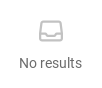
SyEmpty is the "nothing here" state: a glyph, a line of text and, under them, whatever you declare inside — usually the action that fills the empty area ("Create the first project", "Clear filters").

Qt capture · image
Basic composition · Default
Default execution
QML code
import QtQuick
import Syidax.Core

Item {
    implicitWidth: Math.max(360, childrenRect.width)
    implicitHeight: childrenRect.height
    id: story

    property QtObject settings: QtObject {
        id: storyArgs
        property string text: "No results"
        property bool showText: true
        property bool customIcon: false
    }


    SyEmpty {
        width: 320
        text: storyArgs.text
        showText: storyArgs.showText
        icon: storyArgs.customIcon ? Icons.inputSearch : Icons.emptyInbox
    }

}

02 slot

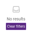
Anything declared inside SyEmpty (its default property) is laid out under the text line, horizontally centered, 4 px below it — typically a SyButton with the action that makes the area non-empty, or a short hint.

Qt capture · image
slot · Default
Default execution
QML code
import QtQuick
import Syidax.Core

Item {
    implicitWidth: Math.max(360, childrenRect.width)
    implicitHeight: childrenRect.height

    SyEmpty {
        width: 320
        text: "No results"
        SyButton { text: "Clear filters"; variant: "primary"; size: "small" }
    }
}

03 icon

icon is the glyph above the text: the inbox glyph (Icons.emptyInbox) by default, or any other Icons.* url or an SVG file url of your own.

Qt capture · image
icon · Default
QML code
import QtQuick
import Syidax.Core

Item {
    implicitWidth: Math.max(360, childrenRect.width)
    implicitHeight: childrenRect.height
    property QtObject settings: QtObject {
        id: storyArgs
        property string glyph: "emptyInbox"
    }


    SyEmpty { width: 320; text: "No results"; icon: Icons[storyArgs.glyph] }
}

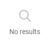
04 Custom empty-state icon

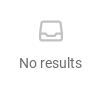
Custom empty-state icon, configured with customIcon.

Qt capture · image
Custom empty-state icon · Result
Default execution
QML code
import QtQuick
import Syidax.Core

Item {
    implicitWidth: Math.max(360, childrenRect.width)
    implicitHeight: childrenRect.height
    id: story

    property QtObject settings: QtObject {
        id: storyArgs
        property string text: "No results"
        property bool showText: true
        property bool customIcon: true
    }


    SyEmpty {
        width: 320
        text: storyArgs.text
        showText: storyArgs.showText
        icon: storyArgs.customIcon ? Icons.inputSearch : Icons.emptyInbox
    }

}

API 13

Hover or select an item for its QML example and copy button.

Properties

PropertyTypeDefaultDescription
list (default property)—Items shown under the text, centered — typically the action that fills the area.
string"No Data"The line under the glyph; also the accessible name. An empty string hides the line.
urlIcons.emptyInboxThe glyph: an Icons.* url or an SVG file url, tinted with the empty-state icon color.
booltruefalse hides the text line while keeping the glyph and the content.

Methods

ItemBehavior / conditions
SyEmpty declares no methods.

Signals

ItemBehavior / conditions
SyEmpty declares no signals; the action is whatever item you declare inside (a SyButton reports its own clicked).

Behavior

ItemBehavior / conditions
a Column centered horizontally in the empty state's width: a 40 × 40 px box with the glyph, the text line (14 px), then the declared content; 4 px between the parts and 4 px of padding above and below. The implicit width is the column's width but at least 120 px; the implicit height follows the parts. Give it the width of the area it stands in so it is centered there.
The line under the glyph; also the accessible name. An empty string hides the line.
false hides the text line while keeping the glyph and the content.
The glyph: an Icons.* url or an SVG file url, tinted with the empty-state icon color.
the default property; items are created even when showText is false and appear under the text (or directly under the glyph).
the empty state itself takes no pointer input; only the content you declare does.

Keyboard

ItemBehavior / conditions
SySkeleton and SySpinner for the loading state before it, SyButton as the usual content, SyIcon / Icons for the glyph.