QML
← All components

Label

Give a control a clear caption, with optional required and help indicators.

import Syidax.Core.Label

Supported QML types

TypeDefinition / role
Label text with required and disabled presentation.

Learn by example

Previews are images of native Qt runs. Use the buttons below each image to view a result.

01 Basic composition

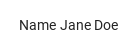
SyLabel is the caption of a control: the title (value) sits in front of the control declared inside the label (or of the item named by target), clicking the title focuses that control

Qt capture · image
Basic composition · Default
Default execution
QML code
import QtQuick
import Syidax.Core

Item {
    implicitWidth: Math.max(360, childrenRect.width)
    implicitHeight: childrenRect.height
    id: story

    property QtObject settings: QtObject {
        id: storyArgs
        property string value: "Name"
        property bool required: false
        property string requiredPosition: "right"
        property string valuePosition: "left"
        property real labelWidth: 0
        property bool disabled: false
    }


    SyLabel {
        value: storyArgs.value
        required: storyArgs.required
        requiredPosition: storyArgs.requiredPosition
        valuePosition: storyArgs.valuePosition
        labelWidth: storyArgs.labelWidth
        disabled: storyArgs.disabled
        TextInput {
            width: 160; text: "Jane Doe"
            font.family: Theme.fontFamily; font.pixelSize: 14; color: Theme.semantic.textDefault
        }
    }

}

02 required · requiredPosition

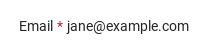
required: true adds a red asterisk (the theme's error color) next to the title, and requiredPosition puts it on the "right" (default) or the "left" of the text.

Qt capture · image
required · requiredPosition · Default
QML code
import QtQuick
import Syidax.Core

Item {
    implicitWidth: Math.max(360, childrenRect.width)
    implicitHeight: childrenRect.height
    // Focused Gallery routes: keep only the selected API and its prerequisites.
    id: featureStory

    property QtObject settings: QtObject {
        id: storyArgs
        property bool required: true
        property string requiredPosition: "right"
    }


    SyLabel { id: featureTarget0;
        value: "Email"
        required: storyArgs.required
        requiredPosition: storyArgs.requiredPosition
        TextInput {
            width: 200; text: "jane@example.com"
            font.family: Theme.fontFamily; font.pixelSize: 14; color: Theme.semantic.textDefault
        }
    }
}

03 valuePosition · labelWidth

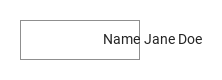
labelWidth fixes the width of the title column (in px; 0 = the title's natural width), and valuePosition aligns the title inside that column: "left" (default), "center" or "right".

Qt capture · image
valuePosition · labelWidth · Default
QML code
import QtQuick
import Syidax.Core

Item {
    implicitWidth: Math.max(360, childrenRect.width)
    implicitHeight: childrenRect.height
    // Focused Gallery routes: keep only the selected API and its prerequisites.

    id: story
    property QtObject settings: QtObject {
        id: storyArgs
        property string valuePosition: "right"
    }


    Item {
        width: 320
        height: 40
        Rectangle {
            width: 120
            height: parent.height
            color: "transparent"
            border.width: 1
            border.color: Theme.semantic.borderBold
        }
        SyLabel { id: featureTarget0;
            anchors.verticalCenter: parent.verticalCenter
            value: "Name"
            labelWidth: 120
            valuePosition: storyArgs.valuePosition
            TextInput {
                width: 160; text: "Jane Doe"
                font.family: Theme.fontFamily; font.pixelSize: 14; color: Theme.semantic.textDefault
            }
        }
    }
}

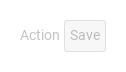
04 disabled

disabled: true dims the title to the subtlest text color, turns the pointer cursor off and makes a click on the title do nothing (no focus, no toggle()).

Qt capture · image
disabled · Default
QML code
import QtQuick
import Syidax.Core

Item {
    implicitWidth: Math.max(360, childrenRect.width)
    implicitHeight: childrenRect.height
    property QtObject settings: QtObject {
        id: storyArgs
        property bool disabled: true
    }


    SyLabel {
        value: "Action"
        disabled: storyArgs.disabled
        SyButton { text: "Save" }
    }
}

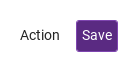
05 target

target names a control declared somewhere else — in another cell of a grid, outside the label's row — instead of inside the label.

Qt capture · image
target · Default
QML code
import QtQuick
import Syidax.Core

Item {
    implicitWidth: Math.max(360, childrenRect.width)
    implicitHeight: childrenRect.height
    property QtObject settings: QtObject {
        id: storyArgs
        property bool disabled: false
    }


    Row {
        spacing: 16
        SyLabel { anchors.verticalCenter: parent.verticalCenter; value: "Action"; target: saveButton; disabled: storyArgs.disabled }
        SyButton { id: saveButton; text: "Save"; variant: "primary" }
    }
}

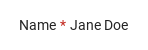
06 Required marker on right

Required marker on right, configured with required, requiredPosition.

Qt capture · image
Required marker on right · Result
Default execution
QML code
import QtQuick
import Syidax.Core

Item {
    implicitWidth: Math.max(360, childrenRect.width)
    implicitHeight: childrenRect.height
    id: story

    property QtObject settings: QtObject {
        id: storyArgs
        property string value: "Name"
        property bool required: true
        property string requiredPosition: "right"
        property string valuePosition: "left"
        property real labelWidth: 0
        property bool disabled: false
    }


    SyLabel {
        value: storyArgs.value
        required: storyArgs.required
        requiredPosition: storyArgs.requiredPosition
        valuePosition: storyArgs.valuePosition
        labelWidth: storyArgs.labelWidth
        disabled: storyArgs.disabled
        TextInput {
            width: 160; text: "Jane Doe"
            font.family: Theme.fontFamily; font.pixelSize: 14; color: Theme.semantic.textDefault
        }
    }

}

API 22

Hover or select an item for its QML example and copy button.

Properties

PropertyTypeDefaultDescription
list (default property)—The control(s) declared inside; the first one is the labelled control unless target is set.
string""The caption text (14 px).
boolfalseShows the asterisk and, when set or when it changes, is written onto the control's required when it has one.
string"right""left" · "right" — the side of the asterisk.
string"left""left" · "center" · "right" — alignment of the title inside the labelWidth column; no visible effect at labelWidth: 0.
real0Fixed width of the title column in px; 0 = the title's natural width. The control starts after the column.
boolfalseDims the title, disables the title click and, when set or when it changes, is written onto the control's disabled when it has one (a control's own disabled: true survives otherwise).
ItemnullA control declared elsewhere; when set it is the labelled control instead of the items inside.
var (read-only)—The item the label works on: target, else the first item inside, else null.

Methods

MethodDescription
Writes the set flags among the label's required and disabled onto the current control (for the properties it has). Called automatically when the control arrives and, writing both flags as they are, whenever required or disabled changes; call it yourself only after changing those properties on the control behind the label's back. No return value.

Signals

ItemBehavior / conditions
SyLabel declares no signals of its own; the property change signals (onControlChanged, onRequiredChanged, …) are available. The title click is not reported — it focuses (and toggles) the control, which reports its own changes.

Behavior

ItemBehavior / conditions
The item the label works on: target, else the first item inside, else null.
A control declared elsewhere; when set it is the labelled control instead of the items inside.
Dims the title, disables the title click and, when set or when it changes, is written onto the control's disabled when it has one (a control's own disabled: true survives otherwise).
Shows the asterisk and, when set or when it changes, is written onto the control's required when it has one.
"left" · "right" — the side of the asterisk.
the title uses the subtlest text color; the control gets its own disabled look only through the hand-over above.
Fixed width of the title column in px; 0 = the title's natural width. The control starts after the column.
"left" · "center" · "right" — alignment of the title inside the labelWidth column; no visible effect at labelWidth: 0.
the label's implicit size is that of the row (title column + 4 px + control); the control keeps its own size.

Keyboard

ItemBehavior / conditions
SyForm and SyFormItem for complete forms; SyInput, SyCheckbox, SySwitch, SySelect as typical controls (the last three are toggled or focused by the title click).