QML
← All components

Form

Group input fields, validate their values and manage form submission in one place.

import Syidax.Core.Form

Supported QML types

TypeDefinition / role
Collects named fields, validates them together and submits their values.
Base for form fields, providing a label, content area, helper/error line and validation state.

Learn by example

Previews are images of native Qt runs. Use the buttons below each image to view a result.

01 Basic composition

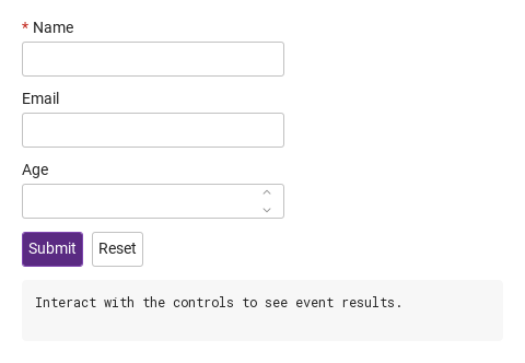
Compare the configuration and result of Basic composition.

Qt capture · image
Basic composition · Default
QML code
import QtQuick
import Syidax.Core

Item {
    component EventLog: Rectangle {
        id: logBox
        property var lines: []
        implicitWidth: 440
        implicitHeight: Math.max(56, logText.implicitHeight + 24)
        radius: 4; color: Theme.semantic.backgroundBold
        function log(value) { lines = lines.slice(-3).concat([String(value)]) }
        Text {
            id: logText; x: 12; y: 12; width: parent.width - 24
            text: logBox.lines.length ? logBox.lines.join("\n") : "Interact with the controls to see event results."
            wrapMode: Text.Wrap; color: Theme.semantic.textDefault
            font.family: Theme.monoFontFamily; font.pixelSize: 12
        }
    }

    implicitWidth: Math.max(360, childrenRect.width)
    implicitHeight: childrenRect.height


    Column {
        spacing: 12
        SyForm {
            id: profile
            onSubmitted: (values) => output.log(("submitted: %1").arg(JSON.stringify(values)))
            Column {
                spacing: 12
                SyInput { name: "name"; label: "Name"; required: true }
                SyInput { name: "email"; label: "Email"; type: "email" }
                SyInputNumber { name: "age"; label: "Age"; min: 0; max: 120 }
                Row {
                    spacing: 8
                    SyButton { id: exampleControl1;  text: "Submit"; variant: "primary"; onClicked: profile.submit() }
                    SyButton { id: exampleControl2;  text: "Reset"; onClicked: profile.reset() }
                }
            }
        }
        EventLog { id: output }
    }

}

02 validation

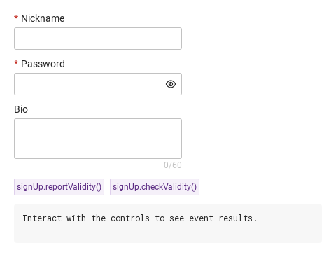
The form validates by asking each field.

Qt capture · image
validation · Default
QML code
import QtQuick
import Syidax.Core

Item {
    component EventLog: Rectangle {
        id: logBox
        property var lines: []
        implicitWidth: 440
        implicitHeight: Math.max(56, logText.implicitHeight + 24)
        radius: 4; color: Theme.semantic.backgroundBold
        function log(value) { lines = lines.slice(-3).concat([String(value)]) }
        Text {
            id: logText; x: 12; y: 12; width: parent.width - 24
            text: logBox.lines.length ? logBox.lines.join("\n") : "Interact with the controls to see event results."
            wrapMode: Text.Wrap; color: Theme.semantic.textDefault
            font.family: Theme.monoFontFamily; font.pixelSize: 12
        }
    }

    implicitWidth: Math.max(360, childrenRect.width)
    implicitHeight: childrenRect.height

    Column {
        spacing: 12
        SyForm {
            id: signUp
            Column {
                spacing: 12
                SyInput { name: "user"; label: "Nickname"; required: true; min: 3 }
                SyInput { name: "password"; label: "Password"; variant: "password"; required: true; min: 8 }
                SyTextarea { name: "bio"; label: "Bio"; rows: 2; max: 60; counter: true }
            }
        }
        Row {
            spacing: 8
            SyButton { id: exampleControl1;  text: "signUp.reportValidity()"; variant: "secondary"; size: "small"; onClicked: output.log("reportValidity() → " + signUp.reportValidity()) }
            SyButton { id: exampleControl2;  text: "signUp.checkValidity()"; variant: "secondary"; size: "small"; onClicked: output.log("checkValidity() → " + signUp.checkValidity()) }
        }
        EventLog { id: output }
    }
}

03 submitted · invalid · didReset

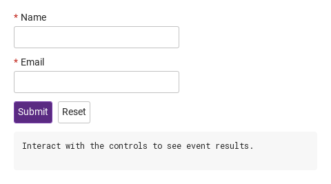
The form has three signals.

Qt capture · image
submitted · invalid · didReset · Default
QML code
import QtQuick
import Syidax.Core

Item {
    component EventLog: Rectangle {
        id: logBox
        property var lines: []
        implicitWidth: 440
        implicitHeight: Math.max(56, logText.implicitHeight + 24)
        radius: 4; color: Theme.semantic.backgroundBold
        function log(value) { lines = lines.slice(-3).concat([String(value)]) }
        Text {
            id: logText; x: 12; y: 12; width: parent.width - 24
            text: logBox.lines.length ? logBox.lines.join("\n") : "Interact with the controls to see event results."
            wrapMode: Text.Wrap; color: Theme.semantic.textDefault
            font.family: Theme.monoFontFamily; font.pixelSize: 12
        }
    }

    implicitWidth: Math.max(360, childrenRect.width)
    implicitHeight: childrenRect.height
    // Focused Gallery routes: keep only the selected API and its prerequisites.
    id: featureStory


    Column {
        spacing: 12
        SyForm {
            id: contact
            onSubmitted: (values) => { if (true) { output.log(("submitted: %1").arg(JSON.stringify(values))) } }
            onInvalid: (fields) => { if (true) { output.log(("invalid: %1").arg(fields.map((f) => f.name).join(", "))) } }
            onDidReset: { if (true) { output.log("reset") } }
            Column {
                spacing: 12
                SyInput { name: "name"; label: "Name"; required: true }
                SyInput { name: "email"; label: "Email"; type: "email"; required: true }
                Row {
                    spacing: 8
                    SyButton { id: exampleControl1;  text: "Submit"; variant: "primary"; onClicked: contact.submit() }
                    SyButton { id: exampleControl2;  text: "Reset"; onClicked: contact.reset() }
                }
            }
        }
        EventLog { id: output }
    }
}

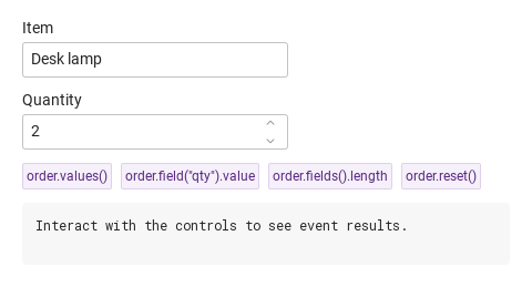
04 values · field · fields · reset

Reading the form from code:

Qt capture · image
values · field · fields · reset · Default
QML code
import QtQuick
import Syidax.Core

Item {
    component EventLog: Rectangle {
        id: logBox
        property var lines: []
        implicitWidth: 440
        implicitHeight: Math.max(56, logText.implicitHeight + 24)
        radius: 4; color: Theme.semantic.backgroundBold
        function log(value) { lines = lines.slice(-3).concat([String(value)]) }
        Text {
            id: logText; x: 12; y: 12; width: parent.width - 24
            text: logBox.lines.length ? logBox.lines.join("\n") : "Interact with the controls to see event results."
            wrapMode: Text.Wrap; color: Theme.semantic.textDefault
            font.family: Theme.monoFontFamily; font.pixelSize: 12
        }
    }

    implicitWidth: Math.max(360, childrenRect.width)
    implicitHeight: childrenRect.height
    // Focused Gallery routes: keep only the selected API and its prerequisites.
    id: featureStory

    Column {
        spacing: 12
        SyForm {
            id: order
            Column {
                spacing: 12
                SyInput { name: "item"; label: "Item"; value: "Desk lamp" }
                SyInputNumber { name: "qty"; label: "Quantity"; value: 2; min: 1 }
            }
        }
        Flow {
            width: 560
            spacing: 8
            SyButton { id: exampleControl1;  visible: true; text: "order.values()"; variant: "secondary"; size: "small"; onClicked: output.log("values() → " + JSON.stringify(order.values())) }
            SyButton { id: exampleControl2;  visible: true; text: "order.field(\"qty\").value"; variant: "secondary"; size: "small"; onClicked: output.log("field(\"qty\").value → " + JSON.stringify(order.field("qty").value)) }
            SyButton { id: exampleControl3;  visible: true; text: "order.fields().length"; variant: "secondary"; size: "small"; onClicked: output.log("fields().length → " + order.fields().length) }
            SyButton { visible: true; text: "order.reset()"; variant: "secondary"; size: "small"; onClicked: order.reset() }
        }
        EventLog { id: output }
    }
}

API 93

Hover or select an item for its QML example and copy button.

Properties · SyForm

PropertyTypeDefaultDescription
Item…—Default property: the items declared inside the form — layouts, fields, buttons.
bool (read-only)trueMarks the item as a form; the fields find their owner by it.

Properties · SyFieldFrame (inherited by every field)

PropertyTypeDefaultDescription
string""The key in values() / submitted. Unnamed fields are validated but not submitted.
var""The field's value — a string for text fields, a number or "" for the number field, a choice value for the radio group; the checkbox and switch keep "on" here and submit it only while checked.
string""The title above the body (beside the track for the switch). Hidden when empty.
boolfalseAdds the * mark and makes an empty / unchecked / unselected field valueMissing.
boolfalseInert field; always valid; skipped by values().
string"medium"small · medium · large — the text and number fields are 24 · 32 · 40 px high; the textarea has its own scale.
string""Helper line under the body; hidden while the error shows.
string""Custom error copy, shown instead of the built-in message while the field is invalid. Setting it does not make the field invalid.
boolfalseTrue once the control lost focus (or after setCustomError()); one of the two gates of invalid.
boolfalseTrue once reportValidity() was called; the other gate of invalid. Cleared by reset().
boolfalseTrue between setCustomError() and clearCustomError(); the status is then custom.
string""The current validity status (see the vocabulary above).
bool (read-only)—validStatus === "".
bool (read-only)—(touched || submitted) && !valid — the state in which the error line and the invalid tone show.
read-only—The copy that would show, and whether the error / helper line is visible right now.
var({}){ min, max, type, step } as the built-in copy needs them; filled by the field.
real240The implicit width when the app sets no width; the body and the lines follow the field's width.
booltrueWhether the title line is drawn.
real4Gap between the title, the body and the message line.
bool (read-only)—False while the field is being created; changed is emitted only once it is true.
var—The value captured when the field finished loading; reset() returns to it.
bool (read-only)trueMarks the item as a field for SyForm.

Methods · SyForm

MethodDescription
Every field declared inside, in tree order, nested forms excluded. Returns a list of items.
The first field whose name matches, or null.
{ name: value } of the named, enabled fields (formValue when the field defines one). No validation.
true when every field's checkValidity() is true; stops at the first failure; shows nothing.
Calls every field's reportValidity() (errors appear), focuses the first invalid field, returns true / false.
reportValidity() then submitted(values()), or invalid(fields) with the failing fields (first one focused). Returns nothing.
Each field's reset(), then didReset().

Methods · SyFieldFrame (available on every field)

MethodDescription
true when the status is "". Silent.
Sets submitted (the error line shows from now on) and returns true / false.
Forces the status to custom and marks the field touched, so the error (error, or "Invalid by custom") shows at once. Takes no message argument.
Lifts the custom status; the ordinary checks apply again. touched stays set.
The current status string, "" when valid.
value back to initialValue; touched, submitted and the custom error cleared.
The SyForm the field is declared in, or null.
The freshly computed status, and the signal payload built from it.
The built-in copy for a status, and the format check used for email · url · tel · number.

Methods · SyFieldFrame (available on every field)

ItemBehavior / conditions
Each field adds its own functions — setFocus() / setBlur() on every field, toggle() on the checkbox and the switch, select() on the radio group, stepUp() / stepDown() / setClear() on the number field.

Signals · SyForm

SignalArgumentsWhen
values: { name: value, … }After submit() when every field is valid. Not emitted by reportValidity().
fields: [field item, …] in tree orderAfter submit() when at least one field failed; the first one has focus and every failing field shows its error. Never together with submitted.
—After reset() has reset every field.

Signals · SyFieldFrame

SignalArgumentsWhen
detail: { value, isValid, status } (textarea adds length; checkbox / switch differ)value changed after load — from the user or from code. Not for the initial value.
same shapeThe control gained active focus.
same shapeThe control lost focus; touched is already true, so a failing field shows its error from now on.

Behavior

ItemBehavior / conditions
Every field declared inside, in tree order, nested forms excluded. Returns a list of items.
Marks the item as a field for SyForm.
{ name: value } of the named, enabled fields (formValue when the field defines one). No validation.
The key in values() / submitted. Unnamed fields are validated but not submitted.
Inert field; always valid; skipped by values().
The field's value — a string for text fields, a number or "" for the number field, a choice value for the radio group; the checkbox and switch keep "on" here and submit it only while checked.
true when every field's checkValidity() is true; stops at the first failure; shows nothing.
Calls every field's reportValidity() (errors appear), focuses the first invalid field, returns true / false. Emits nothing.
reportValidity() then submitted(values()), or invalid(fields) with the failing fields (first one focused). Returns nothing.
True once reportValidity() was called; the other gate of invalid. Cleared by reset().
(touched || submitted) && !valid — the state in which the error line and the invalid tone show.
Each field's reset(), then didReset().
The value captured when the field finished loading; reset() returns to it.
After reset() has reset every field.
The form's implicit size is the bounding box of its content; its content slot is as wide as the form, so give the form a width (or anchors) when the fields inside should fill it.

Behavior · The field contract (SyFieldFrame)

ItemBehavior / conditions
The title above the body (beside the track for the switch). Hidden when empty.
Adds the * mark and makes an empty / unchecked / unselected field valueMissing.
Whether the title line is drawn.
Helper line under the body; hidden while the error shows.
(touched || submitted) && !valid — the state in which the error line and the invalid tone show.
The current validity status (see the vocabulary above).
Forces the status to custom and marks the field touched, so the error (error, or "Invalid by custom") shows at once. Takes no message argument.
validStatus === "".
True once the control lost focus (or after setCustomError()); one of the two gates of invalid.
True once reportValidity() was called; the other gate of invalid. Cleared by reset().
Sets submitted (the error line shows from now on) and returns true / false.
Custom error copy, shown instead of the built-in message while the field is invalid. Setting it does not make the field invalid.
Inert field; always valid; skipped by values().
value changed after load — from the user or from code. Not for the initial value.
The field's value — a string for text fields, a number or "" for the number field, a choice value for the radio group; the checkbox and switch keep "on" here and submit it only while checked.
False while the field is being created; changed is emitted only once it is true.
The control gained active focus.
The control lost focus; touched is already true, so a failing field shows its error from now on.
changed(detail) fires whenever value changes after the field has finished loading — by typing, by the clear button, by a method or by an assignment from code; the initial value never fires it (ready is false until Component.onCompleted). focused(detail) fires when the control gains active focus, blured(detail) when it loses it (and touched becomes true just before). detail is { value, isValid, status } for the text and number fields, { value, length, isValid, status } for the textarea; the checkbox and the switch carry their own shapes (see those pages).

Behavior · The field contract (SyFieldFrame)

StatusCopy
This field is required
Value must be at least {min} characters long
Value cannot exceed {max} characters
Please enter a valid email address / URL / phone number / number (by type), else "Please enter a valid value"
Value must be at least {min}
Value cannot exceed {max}
Value must be a multiple of {step} starting from {min or 0}
Invalid by custom