Run with --diagnose --json to check your Qt version, import path, fonts, runtime and license. No license token is printed.
The Gallery evaluation app is available now. Paid SDK sales and downloads are coming soon. The installation examples above preview the SDK workflow.
Tested Windows configurations
Native window and example smoke checks cover the versions below. Qt 6.8 is a source minimum, not a promise of tested support for every Qt release. Gallery uses software rendering.
Two complete application examples
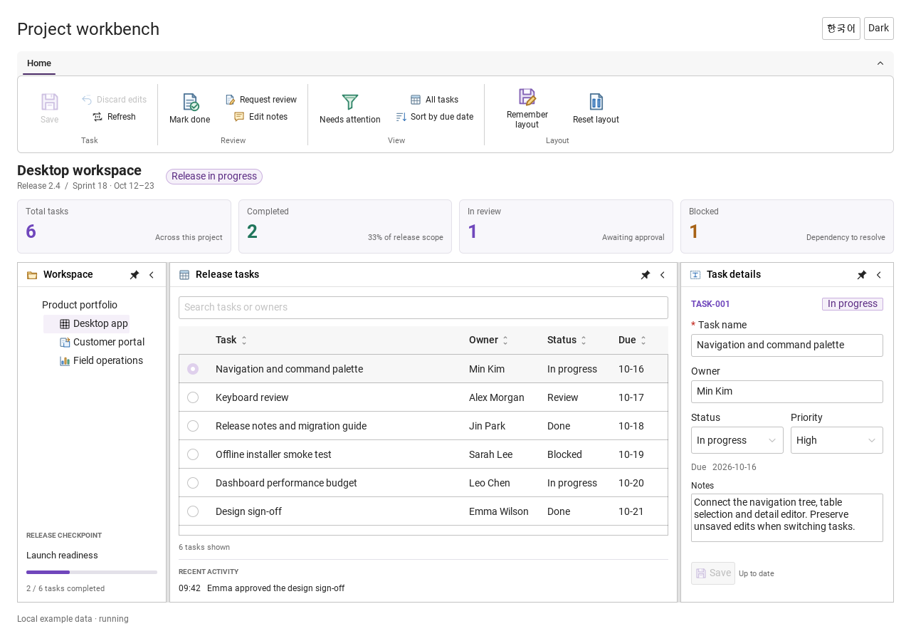
Step-by-step captures from the running Windows applications. Play, pause and inspect each state.
Workbench: mark a task done, save changes and see release progress update.Record Manager: preserve a failed save, retry, search and confirm before deleting.
See the components in context
RibbonPanelFormTableTreeTheme
TRY IT YOURSELF
The native Gallery
Browse examples, inspect properties and switch between light and dark themes in a Windows application. The Gallery is for evaluation; commercial SDK access is separate.
The --qml path must contain the Syidax folder. Python uses qml-pure. Run from the unzipped SDK, independently of the source repository.
License is inactive or frozen
Download your QML Core certificate and pass it with --license. Web Core, Chart and Grid certificates do not activate QML. Monthly use ends at expiry. Annual licenses retain only releases covered by their update period.
Qt or plugin mismatch
Check the Qt version and architecture used to build plugins. Do not mix Python Qt bindings. qml-pure removes the compiled plugin ABI dependency.
PDF or icons missing
PDF requires the optional QtQuick.Pdf module. Other Core components remain usable without it. For icon packs and resource paths, read SDK docs/ICON-PACKS.md.
Save failure or corrupt settings
Examples write only to their application-data folder. Check permissions and disk space. Invalid JSON is backed up before reset. A failed save preserves your draft.
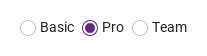
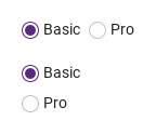
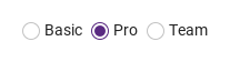
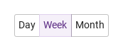
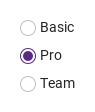
SyRadioButton is a choice drawn as a SyButton: declare them inside a SyRadioGroup instead of SyRadios and the group joins them edge to edge into one segmented control
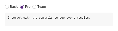
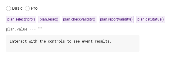
Hover or select an item for its QML example and copy button.
Properties · SyRadioGroup
Item
Behavior / conditions
The shared field properties (name, label, required, disabled, message, error, touched, submitted, customError, validStatus, valid, invalid, showTitle, ready) are described on the Form page.
The shared field properties (name, label, required, disabled, message, error, touched, submitted, customError, validStatus, valid, invalid, showTitle, ready) are described on the Form page.
The shared field properties (name, label, required, disabled, message, error, touched, submitted, customError, validStatus, valid, invalid, showTitle, ready) are described on the Form page.
The shared field properties (name, label, required, disabled, message, error, touched, submitted, customError, validStatus, valid, invalid, showTitle, ready) are described on the Form page.
The shared field properties (name, label, required, disabled, message, error, touched, submitted, customError, validStatus, valid, invalid, showTitle, ready) are described on the Form page.
The shared field properties (name, label, required, disabled, message, error, touched, submitted, customError, validStatus, valid, invalid, showTitle, ready) are described on the Form page.
The shared field properties (name, label, required, disabled, message, error, touched, submitted, customError, validStatus, valid, invalid, showTitle, ready) are described on the Form page.
The shared field properties (name, label, required, disabled, message, error, touched, submitted, customError, validStatus, valid, invalid, showTitle, ready) are described on the Form page.
The shared field properties (name, label, required, disabled, message, error, touched, submitted, customError, validStatus, valid, invalid, showTitle, ready) are described on the Form page.
The shared field properties (name, label, required, disabled, message, error, touched, submitted, customError, validStatus, valid, invalid, showTitle, ready) are described on the Form page.
The shared field properties (name, label, required, disabled, message, error, touched, submitted, customError, validStatus, valid, invalid, showTitle, ready) are described on the Form page.
The shared field properties (name, label, required, disabled, message, error, touched, submitted, customError, validStatus, valid, invalid, showTitle, ready) are described on the Form page.
The shared field properties (name, label, required, disabled, message, error, touched, submitted, customError, validStatus, valid, invalid, showTitle, ready) are described on the Form page.
The shared field properties (name, label, required, disabled, message, error, touched, submitted, customError, validStatus, valid, invalid, showTitle, ready) are described on the Form page.
Properties · SyRadioGroup
Property
Type
Default
Description
string
defaultValue
The selected choice's value; "" when nothing is selected.
string
""
The initial selection and what reset() returns to.
string
"horizontal"
horizontal (row, 8 px gap) · vertical (column, 4 px gap). Segments join with no gap either way.
string
"outlined"
Look of the checked SyRadioButton segment: outlined (secondary) · solid (primary). Pushed as the segments' appearance; ignored by circles.
string
"medium"
Pushed into every choice: circle 14 · 16 · 18 px with 12 · 14 · 16 px text; segment 24 · 32 · 40 px.
bool
false
No selection → valueMissing; adds the * mark to label.
bool
false
Every choice inert and grayed; always valid; not submitted.
bool
false
Selection shown but unchangeable; choices focusable; always valid; still submitted.
string
""
Form key
string
""
title above the group
string
""
helper line
string
""
custom error copy.
list (read-only)
—
The choices declared inside, in order.
bool (read-only)
—
True when the first choice is a SyRadioButton.
real (read-only)
—
The gap in use: 0 for segments, 4 vertical, 8 horizontal.
Item…
—
Default property: the choices. Direct children only.
Properties · SyRadio
Property
Type
Default
Description
string
""
What the group's value becomes when this choice is selected.
string
""
The label beside the circle; clicking it selects too.
Item…
—
Default property: items declared inside go after the label text.
bool
false
Whether this is the selected choice. Written by the group; outside a group a click sets it.
bool
false
This choice only: grayed, inert, skipped by Tab and the arrow keys.
bool
false
This choice only: shown but its click and Space do nothing, and an arrow-key move from a sibling skips it.
string
"medium"
Circle and text scale; overwritten by the group's size.
bool
false
Written by the group; combined with the choice's own flags into effectiveDisabled / effectiveReadonly.
bool
false
Written by the group; combined with the choice's own flags into effectiveDisabled / effectiveReadonly.
read-only
—
The combined state, the focus, the hover and the current tone.
read-only
—
The combined state, the focus, the hover and the current tone.
read-only
—
The combined state, the focus, the hover and the current tone.
read-only
—
The combined state, the focus, the hover and the current tone.
read-only
—
The combined state, the focus, the hover and the current tone.
real (read-only)
—
14 · 16 · 18 and 12 · 14 · 16 by size.
real (read-only)
—
14 · 16 · 18 and 12 · 14 · 16 by size.
Properties · SyRadioButton
Item
Behavior / conditions
A SyButton — every button property (text, icon.source, iconOnly, tooltip, loading, fullWidth, size) is available — plus:
A SyButton — every button property (text, icon.source, iconOnly, tooltip, loading, fullWidth, size) is available — plus:
A SyButton — every button property (text, icon.source, iconOnly, tooltip, loading, fullWidth, size) is available — plus:
A SyButton — every button property (text, icon.source, iconOnly, tooltip, loading, fullWidth, size) is available — plus:
A SyButton — every button property (text, icon.source, iconOnly, tooltip, loading, fullWidth, size) is available — plus:
A SyButton — every button property (text, icon.source, iconOnly, tooltip, loading, fullWidth, size) is available — plus:
A SyButton — every button property (text, icon.source, iconOnly, tooltip, loading, fullWidth, size) is available — plus:
Properties · SyRadioButton
Property
Type
Default
Description
string
""
What the group's value becomes when this segment is selected.
bool
false
Whether this is the selected segment (the button's checked, written by the group).
string
"outlined"
Look when checked: outlined → secondary, solid → primary. Written by the group from its variant.
string
bound
Bound to the state (default · secondary · primary); do not set it yourself.
bool
false
This segment only. The group has the readonly (there is no per-segment readonly).
bool
false
Written by the group.
bool
false
Written by the group.
—
—
Written by the group for the joined corners (see SyButton).
—
—
Written by the group for the joined corners (see SyButton).
bool (read-only)
—
Own disabled or the group's.
Methods · SyRadioGroup
Method
Description
Select from code: marks the group touched and sets value (changed fires). Ignored while disabled or readonly. An unknown value unchecks every choice.
value back to defaultValue; touched, reported and custom flags cleared.
Focus the checked choice, or the first one.
Remove the focus from every choice.
true unless required with no selection (or a custom error). Silent.
Same verdict, and the error line shows from now on.
"" · valueMissing · custom.
Force / lift the custom status; the error shows at once.
Force / lift the custom status; the error shows at once.
Methods · SyRadio · SyRadioButton
Method
Description
The click: emits selected(value) and, outside a group, checks the choice. Ignored while disabled or read-only.
The SyRadioGroup the choice is declared in, or null.
Move the group's selection to the previous (−1) or next (+1) enabled choice — what the arrow keys call.
The group's value changed after load — click, Space, arrow keys, select(), reset(), assignments.
value: string — the choice's own value
The choice was clicked or chosen with Space, before the group updates; also when it was already checked. Not while the choice or its group is disabled or read-only.
Signals
Item
Behavior / conditions
SyRadioGroup declares focused / blured as a field but never emits them.
SyRadioGroup declares focused / blured as a field but never emits them.
SyRadioButton also emits the button's clicked().
Behavior
Item
Behavior / conditions
The group collects the SyRadio and SyRadioButton items that are its direct children (a choice wrapped in a Column or a Row is not found) and lays them out itself: in declaration order, each at its implicit size, in a row with an 8 px gap (horizontal) or a column with a 4 px gap (vertical); segments join with no gap and a one-pixel overlap. Hidden choices are skipped. A group is a button group as soon as its first choice is a SyRadioButton — do not mix the two kinds. Choices added or removed later are picked up automatically.
What the group's value becomes when this choice is selected.
The initial selection and what reset() returns to.
The choice was clicked or chosen with Space, before the group updates; also when it was already checked. Not while the choice or its group is disabled or read-only.
The selected choice's value; "" when nothing is selected. Assignable; every change emits changed.
The click: emits selected(value) and, outside a group, checks the choice. Ignored while disabled or read-only.
The group's value changed after load — click, Space, arrow keys, select(), reset(), assignments. Not for the initial defaultValue, not when the checked choice is clicked again.
Whether this is the selected choice. Written by the group; outside a group a click sets it.
On every change the group writes into each choice: checked, groupDisabled and groupReadonly (from its own disabled / readonly), size, and — for segments only — appearance (from variant).
On every change the group writes into each choice: checked, groupDisabled and groupReadonly (from its own disabled / readonly), size, and — for segments only — appearance (from variant).
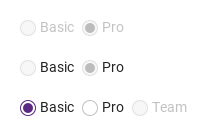
This choice only: grayed, inert, skipped by Tab and the arrow keys.
This choice only: shown but its click and Space do nothing, and an arrow-key move from a sibling skips it.
Circle and text scale; overwritten by the group's size.
Look when checked: outlined → secondary, solid → primary. Written by the group from its variant.
Bound to the state (default · secondary · primary); do not set it yourself.
On every change the group writes into each choice: checked, groupDisabled and groupReadonly (from its own disabled / readonly), size, and — for segments only — appearance (from variant). A size set on one choice is overwritten; a choice's own disabled (and readonly on SyRadio) is respected and combined with the group's.
This segment only. The group has the readonly (there is no per-segment readonly).
Every enabled choice is a Tab stop. Space selects the focused choice (on a segment, Space is the button's click). Left / Up move the selection to the previous enabled choice, Right / Down to the next, wrapping at the ends; the arrow keys skip disabled and read-only choices, and the move selects and focuses the new choice at once. Enter does nothing. The focus ring is drawn around the focused circle or segment while it is not disabled.
No selection → valueMissing; adds the * mark to label.
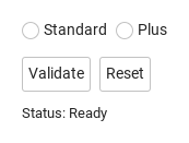
required with an empty value is valueMissing; the error line under the group ("This field is required", or error) appears once the group is touched (the first click) or reported (reportValidity()), and message is hidden meanwhile.
Same verdict, and the error line shows from now on.
required with an empty value is valueMissing; the error line under the group ("This field is required", or error) appears once the group is touched (the first click) or reported (reportValidity()), and message is hidden meanwhile.
label draws a title above the group with the required mark.
A SyRadio or SyRadioButton outside any group checks itself when clicked and stays checked — there is no way to uncheck it by clicking, and the arrow keys do nothing. Use a group for real exclusive choices.
The group is as wide as the row or column of choices (the error and helper lines wrap within that width) unless width is set; a SyRadio row is at least 24 px high, a segment 24 · 32 · 40 px by size.