QML
← All components

Button

Run an action with a text or icon button, such as saving a form or opening a dialog.

import Syidax.Core.Button

Supported QML types

TypeDefinition / role
Command button supporting text, icons, loading and a shared Action.

Learn by example

Previews are images of native Qt runs. Use the buttons below each image to view a result.

01 Basic composition

SyButton is the command control: save, submit, next step.

Qt capture · image
Basic composition · Default
Default execution
QML code
import QtQuick
import Syidax.Core

Item {
    implicitWidth: Math.max(360, childrenRect.width)
    implicitHeight: childrenRect.height

    property QtObject settings: QtObject {
        id: storyArgs
        property string text: "Save"
        property string variant: "primary"
        property string size: "medium"
        property bool disabled: false
        property bool loading: false
        property bool icon: false
        property bool iconOnly: false
        property string tooltip: ""
    }


    SyButton {
        text: storyArgs.text
        variant: storyArgs.variant
        size: storyArgs.size
        disabled: storyArgs.disabled
        loading: storyArgs.loading
        iconOnly: storyArgs.iconOnly
        tooltip: storyArgs.tooltip
        icon.source: storyArgs.icon ? Icons.inputSearch : ""
    }

}

02 variant

variant chooses the palette: default (neutral, bordered), primary (filled with the brand color

Qt capture · image
variant · Default
QML code
import QtQuick
import Syidax.Core

Item {
    implicitWidth: Math.max(360, childrenRect.width)
    implicitHeight: childrenRect.height
    property QtObject settings: QtObject {
        id: storyArgs
        property string variant: "default"
    }


    SyButton { text: "Button"; variant: storyArgs.variant }
}

03 size

size sets the height and the text scale: small is 24 px high with 12 px text, medium (the default) 32 px with 14 px text, large 40 px with 16 px text.

Qt capture · image
size · Default
QML code
import QtQuick
import Syidax.Core

Item {
    implicitWidth: Math.max(360, childrenRect.width)
    implicitHeight: childrenRect.height
    property QtObject settings: QtObject {
        id: storyArgs
        property string size: "medium"
    }


    SyButton { text: "Button"; size: storyArgs.size }
}

04 disabled

disabled: true makes the button inert: its enabled becomes false, so clicks, hover and Space are ignored, Tab skips it, the cursor stays an arrow and setClick() does nothing.

Qt capture · image
disabled · Default
QML code
import QtQuick
import Syidax.Core

Item {
    implicitWidth: Math.max(360, childrenRect.width)
    implicitHeight: childrenRect.height
    property QtObject settings: QtObject {
        id: storyArgs
        property bool disabled: true
        property string variant: "default"
    }


    SyButton { text: "Button"; disabled: storyArgs.disabled; variant: storyArgs.variant }
}

05 loading

loading: true tells the user the button is busy: a spinning arc appears in front of the icon and the text, and the button becomes inert exactly like disabled

Qt capture · image
loading · Default
QML code
import QtQuick
import Syidax.Core

Item {
    implicitWidth: Math.max(360, childrenRect.width)
    implicitHeight: childrenRect.height
    property QtObject settings: QtObject {
        id: storyArgs
        property bool loading: true
        property string size: "medium"
    }


    SyButton { text: "Saving"; loading: storyArgs.loading; size: storyArgs.size }
}

06 fullWidth

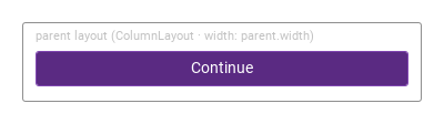
fullWidth: true sets Layout.fillWidth, so inside a Qt Quick layout (ColumnLayout, RowLayout, GridLayout) the button stretches to the layout's full width while the icon and text stay centered.

Qt capture · image
fullWidth · Default
QML code
import QtQuick
import QtQuick.Layouts
import Syidax.Core

Item {
    implicitWidth: Math.max(360, childrenRect.width)
    implicitHeight: childrenRect.height
    id: story
    property QtObject settings: QtObject {
        id: storyArgs
        property bool fullWidth: true
    }


    Rectangle {
        width: story.width
        height: layout.implicitHeight + 40
        color: "transparent"
        radius: Foundation.borderRadiusMedium
        border.width: 1
        border.color: Theme.semantic.borderBold
        Text {
            x: 12
            y: 6
            text: "parent layout (ColumnLayout · width: parent.width)"
            font.family: Theme.fontFamily
            font.pixelSize: 11
            color: Theme.semantic.textSubtlest
        }
        ColumnLayout {
            id: layout
            x: 12
            y: 26
            width: parent.width - 24
            SyButton { text: "Continue"; variant: "primary"; fullWidth: storyArgs.fullWidth }
        }
    }
}

07 icon.source

icon.source places a glyph before the text: any entry of the Icons singleton (Icons.inputSearch, Icons.modalClose, …) or the URL of an SVG file of your own.

Qt capture · image
icon.source · Default
QML code
import QtQuick
import Syidax.Core

Item {
    implicitWidth: Math.max(360, childrenRect.width)
    implicitHeight: childrenRect.height
    property QtObject settings: QtObject {
        id: storyArgs
        property string text: "Search"
        property bool icon: true
        property string variant: "default"
    }


    SyButton { text: storyArgs.text; variant: storyArgs.variant; icon.source: storyArgs.icon ? Icons.inputSearch : "" }
}

08 slot

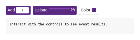
Items written inside SyButton { … } are the button's content slot: they are placed in the content row after the text (right after the icon when text is empty), separated by the button's gap and centered vertically

Qt capture · image
slot · Default
Default execution
QML code
import QtQuick
import Syidax.Core

Item {
    component EventLog: Rectangle {
        id: logBox
        property var lines: []
        implicitWidth: 440
        implicitHeight: Math.max(56, logText.implicitHeight + 24)
        radius: 4; color: Theme.semantic.backgroundBold
        function log(value) { lines = lines.slice(-3).concat([String(value)]) }
        Text {
            id: logText; x: 12; y: 12; width: parent.width - 24
            text: logBox.lines.length ? logBox.lines.join("\n") : "Interact with the controls to see event results."
            wrapMode: Text.Wrap; color: Theme.semantic.textDefault
            font.family: Theme.monoFontFamily; font.pixelSize: 12
        }
    }

    implicitWidth: Math.max(360, childrenRect.width)
    implicitHeight: childrenRect.height

    Column {
        spacing: 12
        Row {
            spacing: 8
            SyButton {
                text: "Add"; variant: "primary"
                onClicked: output.log(("Add: %1 pcs").arg(quantity.text))
                Rectangle {
                    width: 44; height: 22; radius: 3; color: Theme.semantic.backgroundDefault
                    TextInput {
                        id: quantity
                        anchors.fill: parent; horizontalAlignment: TextInput.AlignHCenter; verticalAlignment: TextInput.AlignVCenter
                        text: "1"; selectByMouse: true; font.pixelSize: 12; color: Theme.semantic.textDefault
                        validator: IntValidator { bottom: 1; top: 99 }
                    }
                }
            }
            SyButton {
                id: upload
                property real progress: 0
                text: uploading.running ? "Uploading" : "Upload"; variant: "primary"
                onClicked: uploading.restart()
                NumberAnimation { id: uploading; target: upload; property: "progress"; from: 0; to: 1; duration: 1500; onFinished: output.log("Upload finished") }
                Rectangle {
                    width: 72; height: 6; radius: 3; color: Theme.semantic.backgroundBrandContrastSubtle
                    Rectangle { width: parent.width * upload.progress; height: parent.height; radius: 3; color: Theme.semantic.textInvert }
                }
                Text { text: Math.round(upload.progress * 100) + "%"; font.pixelSize: 11; color: Theme.semantic.textInvert }
            }
            SyButton {
                id: colorButton
                property var swatches: ["#5a2a82", "#e23b31", "#1677ff", "#2f9e44"]
                property int index: 0
                text: "Color"
                onClicked: { index = (index + 1) % swatches.length; output.log(("Color: %1").arg(swatches[index])) }
                Rectangle { width: 16; height: 16; radius: 3; color: colorButton.swatches[colorButton.index]; border.width: 1; border.color: Theme.semantic.borderSubtle }
            }
        }
        EventLog { id: output }
    }
}

09 iconOnly

iconOnly: true hides the text and shows only the glyph from icon.source.

Qt capture · image
iconOnly · Default
QML code
import QtQuick
import Syidax.Core

Item {
    implicitWidth: Math.max(360, childrenRect.width)
    implicitHeight: childrenRect.height
    property QtObject settings: QtObject {
        id: storyArgs
        property bool iconOnly: true
        property string tooltip: "Close"
        property string size: "medium"
    }


    SyButton { text: "Close"; iconOnly: storyArgs.iconOnly; tooltip: storyArgs.tooltip; size: storyArgs.size; icon.source: Icons.modalClose }
}

10 clicked

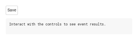
clicked() is the button's own signal.

Qt capture · image
clicked · Default
Default execution
QML code
import QtQuick
import Syidax.Core

Item {
    component EventLog: Rectangle {
        id: logBox
        property var lines: []
        implicitWidth: 440
        implicitHeight: Math.max(56, logText.implicitHeight + 24)
        radius: 4; color: Theme.semantic.backgroundBold
        function log(value) { lines = lines.slice(-3).concat([String(value)]) }
        Text {
            id: logText; x: 12; y: 12; width: parent.width - 24
            text: logBox.lines.length ? logBox.lines.join("\n") : "Interact with the controls to see event results."
            wrapMode: Text.Wrap; color: Theme.semantic.textDefault
            font.family: Theme.monoFontFamily; font.pixelSize: 12
        }
    }

    implicitWidth: Math.max(360, childrenRect.width)
    implicitHeight: childrenRect.height

    Column {
        spacing: 12
        SyButton { text: "Save"; onClicked: output.log("The save button was clicked.") }
        EventLog { id: output }
    }
}

11 setFocus · setBlur · setClick

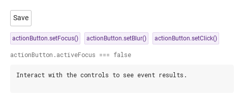
Three functions drive the button from code.

Qt capture · image
setFocus · setBlur · setClick · Default
QML code
import QtQuick
import Syidax.Core

Item {
    component EventLog: Rectangle {
        id: logBox
        property var lines: []
        implicitWidth: 440
        implicitHeight: Math.max(56, logText.implicitHeight + 24)
        radius: 4; color: Theme.semantic.backgroundBold
        function log(value) { lines = lines.slice(-3).concat([String(value)]) }
        Text {
            id: logText; x: 12; y: 12; width: parent.width - 24
            text: logBox.lines.length ? logBox.lines.join("\n") : "Interact with the controls to see event results."
            wrapMode: Text.Wrap; color: Theme.semantic.textDefault
            font.family: Theme.monoFontFamily; font.pixelSize: 12
        }
    }

    implicitWidth: Math.max(360, childrenRect.width)
    implicitHeight: childrenRect.height
    // Focused Gallery routes: keep only the selected API and its prerequisites.
    id: featureStory

    Column {
        spacing: 12
        SyButton { id: actionButton; text: "Save"; onClicked: output.log("The save button was clicked.") }
        Row {
            spacing: 8
            SyButton { id: exampleControl1;  visible: true; text: "actionButton.setFocus()"; variant: "secondary"; size: "small"; onClicked: actionButton.setFocus() }
            SyButton { id: exampleControl2;  visible: true; text: "actionButton.setBlur()"; variant: "secondary"; size: "small"; onClicked: actionButton.setBlur() }
            SyButton { visible: true; text: "actionButton.setClick()"; variant: "secondary"; size: "small"; onClicked: actionButton.setClick() }
        }
        Text {
            text: "actionButton.activeFocus === " + actionButton.activeFocus
            font.family: Theme.monoFontFamily
            font.pixelSize: 12
            color: Theme.semantic.textSubtle
        }
        EventLog { id: output }
    }
}

12 Compact icon action

Compact icon action, configured with size, icon.

Qt capture · image
Compact icon action · Result
Default execution
QML code
import QtQuick
import Syidax.Core

Item {
    implicitWidth: Math.max(360, childrenRect.width)
    implicitHeight: childrenRect.height

    property QtObject settings: QtObject {
        id: storyArgs
        property string text: "Save"
        property string variant: "primary"
        property string size: "small"
        property bool disabled: false
        property bool loading: false
        property bool icon: true
        property bool iconOnly: false
        property string tooltip: ""
    }


    SyButton {
        text: storyArgs.text
        variant: storyArgs.variant
        size: storyArgs.size
        disabled: storyArgs.disabled
        loading: storyArgs.loading
        iconOnly: storyArgs.iconOnly
        tooltip: storyArgs.tooltip
        icon.source: storyArgs.icon ? Icons.inputSearch : ""
    }

}

API 50

Hover or select an item for its QML example and copy button.

Properties

PropertyTypeDefaultDescription
string""The label. Hidden by iconOnly, but still used as the accessible name when there is no tooltip.
string"default"The palette: default · primary · secondary · borderless. Ignored while disabled or loading (the disabled tokens are the default variant's).
string"medium"small (24 px, 12 px text) · medium (32 px, 14 px text) · large (40 px, 16 px text). Scales padding, gap, icon and spinner.
boolfalseMakes the button inert and draws it with the disabled tokens. clicked() and setClick() are blocked.
boolfalseShows the spinner before the content and makes the button inert like disabled. Clear it yourself when the work is done.
boolfalseSets Layout.fillWidth so the button fills a Qt Quick layout's width. No effect outside layouts.
boolfalseHides the text; only the icon is drawn and the button becomes a square. Pair it with tooltip.
url""Glyph before the text — an Icons.* entry or an SVG file URL. Recolored with the variant's icon tone; 14 · 16 · 18 px by size.
string""Tooltip after 500 ms of hovering; the accessible name of an icon-only button.
Item…—Default property: items declared inside the button are placed after the text in the content row, centered vertically.
string""Written by SyButtonGroup: first · middle · last. The corners facing a neighbour are squared. Leave it alone outside a group.
boolfalseWritten by SyButtonGroup when the group is vertical; decides which corners groupPosition squares.
string (read-only)—The current visual state: enabled · hover · focus · active · disabled (also disabled while loading).
bool (read-only)—Derived from groupPosition: whether the leading / trailing corners are squared.

Properties

ItemBehavior / conditions
The standard Qt Quick button properties remain available as well — enabled (false while disabled or loading), hovered, down, pressed, activeFocus, font.

Methods

MethodDescription
Gives the button active focus (Qt.OtherFocusReason); Space will then activate it. The keyboard focus ring is not drawn for this kind of focus.
Removes the focus from the button.
Emits clicked() as a user click would. Ignored while disabled or loading. Returns nothing.

Signals

SignalArgumentsWhen
—Once per completed click: mouse or touch press-and-release, Space while focused, or setClick(). Does not fire while disabled or loading, nor for a press dragged off the button.

Signals

ItemBehavior / conditions
The inherited pressed(), released(), canceled(), pressAndHold() and doubleClicked() signals of the Qt Quick button are also emitted.

Behavior

ItemBehavior / conditions
Makes the button inert and draws it with the disabled tokens. clicked() and setClick() are blocked.
Shows the spinner before the content and makes the button inert like disabled. Clear it yourself when the work is done.
disabled and loading both set the underlying enabled to false: the button ignores clicks, hover and Space, Tab skips it, the cursor stays an arrow, setClick() is a no-op and clicked() does not fire. The order of the visual states is disabled > active (pressed) > focus > hover > enabled; visualState reports the current one as a string.
Emits clicked() as a user click would. Ignored while disabled or loading. Returns nothing.
Once per completed click: mouse or touch press-and-release, Space while focused, or setClick(). Does not fire while disabled or loading, nor for a press dragged off the button.
The palette: default · primary · secondary · borderless. Ignored while disabled or loading (the disabled tokens are the default variant's).
The order of the visual states is disabled > active (pressed) > focus > hover > enabled; visualState reports the current one as a string.
The current visual state: enabled · hover · focus · active · disabled (also disabled while loading).
Gives the button active focus (Qt.OtherFocusReason); Space will then activate it. The keyboard focus ring is not drawn for this kind of focus.
Removes the focus from the button.
Tooltip after 500 ms of hovering; the accessible name of an icon-only button.
Hides the text; only the icon is drawn and the button becomes a square. Pair it with tooltip.
The label. Hidden by iconOnly, but still used as the accessible name when there is no tooltip.
small (24 px, 12 px text) · medium (32 px, 14 px text) · large (40 px, 16 px text). Scales padding, gap, icon and spinner.
Sets Layout.fillWidth so the button fills a Qt Quick layout's width. No effect outside layouts.
fullWidth sets Layout.fillWidth, which only Qt Quick layouts honour — in a Column or an anchored item set width yourself.
Glyph before the text — an Icons.* entry or an SVG file URL. Recolored with the variant's icon tone; 14 · 16 · 18 px by size.
Written by SyButtonGroup: first · middle · last. The corners facing a neighbour are squared. Leave it alone outside a group.
Written by SyButtonGroup when the group is vertical; decides which corners groupPosition squares.
Colors come from the Theme.button tokens and follow Theme.scheme changes live; the spinner animation stops under Theme.reducedMotion.