Run with --diagnose --json to check your Qt version, import path, fonts, runtime and license. No license token is printed.
The Gallery evaluation app is available now. Paid SDK sales and downloads are coming soon. The installation examples above preview the SDK workflow.
Tested Windows configurations
Native window and example smoke checks cover the versions below. Qt 6.8 is a source minimum, not a promise of tested support for every Qt release. Gallery uses software rendering.
Two complete application examples
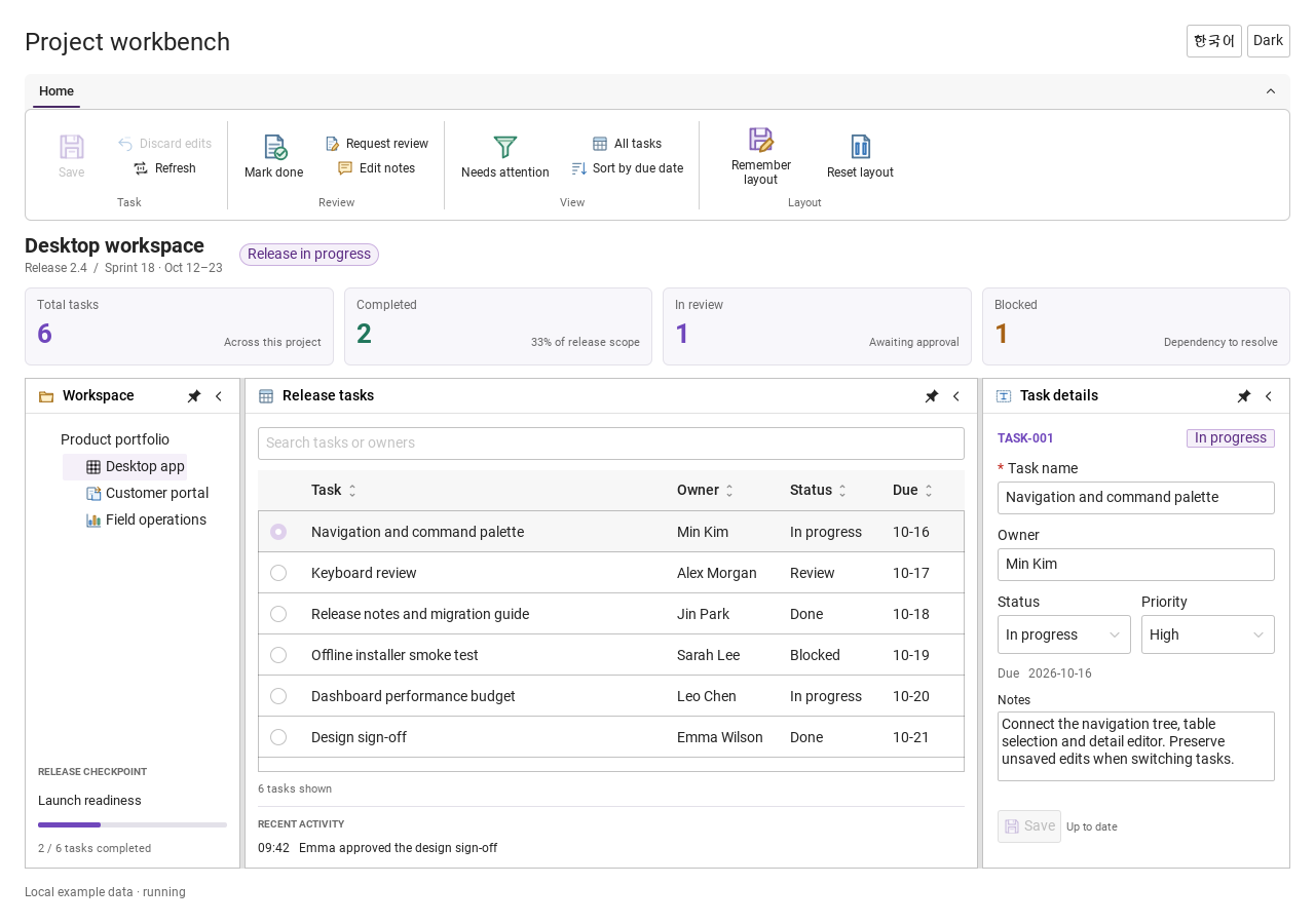
Step-by-step captures from the running Windows applications. Play, pause and inspect each state.
Workbench: mark a task done, save changes and see release progress update.Record Manager: preserve a failed save, retry, search and confirm before deleting.
See the components in context
RibbonPanelFormTableTreeTheme
TRY IT YOURSELF
The native Gallery
Browse examples, inspect properties and switch between light and dark themes in a Windows application. The Gallery is for evaluation; commercial SDK access is separate.
The --qml path must contain the Syidax folder. Python uses qml-pure. Run from the unzipped SDK, independently of the source repository.
License is inactive or frozen
Download your QML Core certificate and pass it with --license. Web Core, Chart and Grid certificates do not activate QML. Monthly use ends at expiry. Annual licenses retain only releases covered by their update period.
Qt or plugin mismatch
Check the Qt version and architecture used to build plugins. Do not mix Python Qt bindings. qml-pure removes the compiled plugin ABI dependency.
PDF or icons missing
PDF requires the optional QtQuick.Pdf module. Other Core components remain usable without it. For icon packs and resource paths, read SDK docs/ICON-PACKS.md.
Save failure or corrupt settings
Examples write only to their application-data folder. Check permissions and disk space. Invalid JSON is backed up before reset. A failed save preserves your draft.
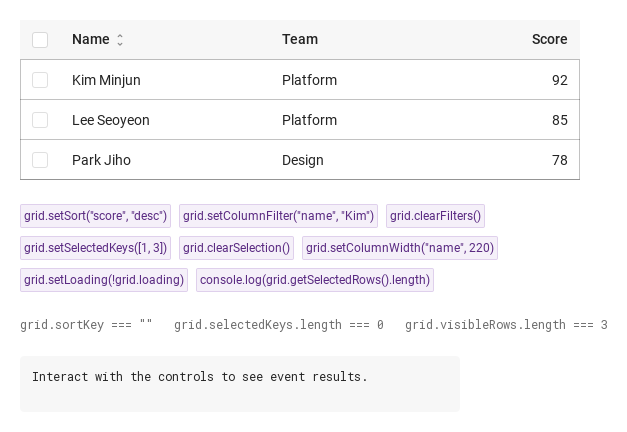
- setSort(key, direction) — sets sortKey and sortDirection (direction defaults to "asc"; "none" leaves the key set but turns sorting off) and emits sortChanged.
"solid" draws the lines with the cells' borders; "dashed" / "dotted" draw them with a dash pattern in one line layer over the body.
bool
false
Shades every second row.
bool
false
32 px rows instead of 40 (header included).
bool
true
Keeps the header above the scrolling rows; false scrolls it away with them.
bool
false
Hides the header row (sorting and filtering become unreachable from the pointer).
bool
false
Draws the first column like a header (background + medium weight).
string
"No data"
Centred in the body when no row is visible and loading is off.
string
""
The sorted column; assign it directly to sort without a signal.
string
"none"
"none" · "asc" · "desc".
var (array)
[]
The selected row keys as strings; assigning it changes the selection without selectionChanged.
bool
false
Shows the spinner overlay over the body.
bool
false
Drag grips at the right edge of every header cell.
var (object)
{}
{ key: text } — the active filters; normally changed through setColumnFilter / clearFilters.
var (object)
{}
{ key: px } — widths set by a drag or setColumnWidth; they override the columns' own width.
var (read-only)
—
The rows after filtering and sorting.
var (read-only)
—
The columns with every default filled in.
var (read-only)
—
{ widths, xs, total } — the column widths in px, their x offsets and the total width.
var (read-only)
—
The drawn cells: { r, c, x, y, w, h, text, merged, align, header }.
bool (read-only)
—
selectionMode !== "none" · no visible row and not loading.
bool (read-only)
—
selectionMode !== "none" · no visible row and not loading.
real (read-only)
—
Row height (40 / 32)
real (read-only)
—
the width of the selection column (40 or 0)
real (read-only)
—
the full content width.
int (read-only)
—
How many visible rows are selected (drives the header box).
var (read-only)
—
Alias of rows.
Methods
Method
Description
Sets sortKey / sortDirection and emits sortChanged; "none" turns the sort off.
Sets (or, with an empty / null value, removes) a column filter and emits filterChanged.
A copy of columnFilters.
Removes every filter and emits filterChanged({ key: "", value: "", filters: {} }).
Replaces the selection (keys converted to strings, not validated) and emits selectionChanged.
Empties the selection and emits selectionChanged.
The row objects whose key is selected, in rows order.
Pins the column to width px (≤ 0 removes the pin) and emits columnResized.
Sets loading.
Scrolls the body to the first row.
Whether the row object is selected
its key as a string.
Signals
Signal
Arguments
When
detail: { key, direction }
A sortable header was clicked or setSort() ran. Not when sortKey / sortDirection are assigned.
detail: { key, value, filters }
Every change in a filter popup, setColumnFilter(), and clearFilters() (then key: "", value: "", filters: {}).
detail: { selectedKeys, selectedRows }
A row / box / header-box click, setSelectedKeys(), clearSelection(). Not when selectedKeys is assigned; never from clicks while selectionMode is "none".
detail: { row, index, key }
Any click on a row body (index among the visible rows), before the selection toggles. Not from the selection cell.
detail: { key, width, widths }
A resize drag ended, or setColumnWidth() ran.
Behavior
Item
Behavior / conditions
[{ key, label, sortable, filterable, width, minWidth, align, cellAlign, autoMerge, render }] — see Behavior for the defaults of each field.
Each entry of columns is normalised: label defaults to the key in title case; sortable, filterable and autoMerge default to false; width (a number, or a numeric string) 0 means *flexible*; minWidth defaults to 80; align ("left" · "center" · "right") positions the header text and is the default for cellAlign, which positions the cells; render(value, row, index) turns a raw value into the text to show (its result is converted to a string). For each column, a resized width wins, then the column's own width, otherwise the column is flexible: the flexible ones share the table width minus the selection column (40 px when selectionMode is not "none") minus the fixed widths, each at least its minWidth.
One object per row, read by the column keys; may carry rowspan / colspan.
The field that identifies a row (compared as a string).
Replaces the selection (keys converted to strings, not validated) and emits selectionChanged.
The rows after filtering and sorting.
{ key: text } — the active filters; normally changed through setColumnFilter / clearFilters.
The sorted column; assign it directly to sort without a signal.
"none" · "asc" · "desc".
A sortable header was clicked or setSort() ran. Not when sortKey / sortDirection are assigned.
Sets (or, with an empty / null value, removes) a column filter and emits filterChanged.
Drag grips at the right edge of every header cell.
{ key: px } — widths set by a drag or setColumnWidth; they override the columns' own width.
Any click on a row body (index among the visible rows), before the selection toggles. Not from the selection cell.
The selected row keys as strings; assigning it changes the selection without selectionChanged.
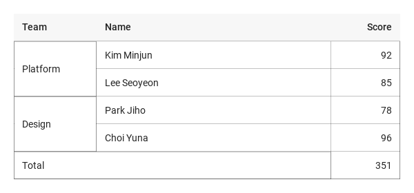
Computed on the visible rows: first the row hints — a row with rowspan > 1 or colspan > 1 makes its column-0 cell cover that many rows and columns and marks the covered cells as taken — then autoMerge columns, where runs of consecutive rows with an identical value (and no taken cell) become one cell. Covered cells are not drawn; a merged cell gets the default background and, with row lines, its own border; its text follows the origin column's cellAlign.
Draws the first column like a header (background + medium weight).
Hides the header row (sorting and filtering become unreachable from the pointer).
"solid" draws the lines with the cells' borders; "dashed" / "dotted" draw them with a dash pattern in one line layer over the body.
Keeps the header above the scrolling rows; false scrolls it away with them.
Shows the spinner overlay over the body.
Centred in the body when no row is visible and loading is off.
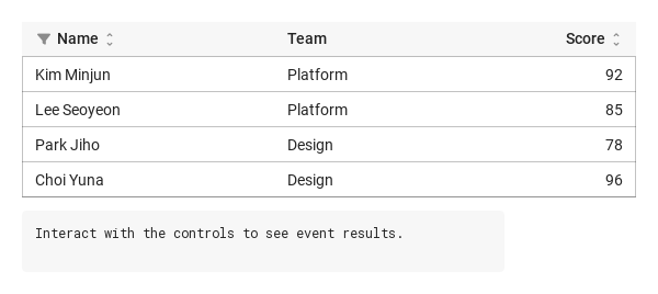
implicitWidth is 480 and implicitHeight is the header plus the rows (at least 64 px).
implicitWidth is 480 and implicitHeight is the header plus the rows (at least 64 px).
Give the table a fixed height to get a scrolling body — the header stays put.
Keyboard
Item
Behavior / conditions
SyCheckbox (the selection boxes), SySpinner (the loading overlay), SyInput (the filter field), SyPagination (to page long data sets), SyTree (hierarchies).
Filter and selection contract
Item
Behavior / conditions
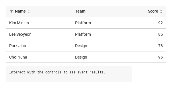
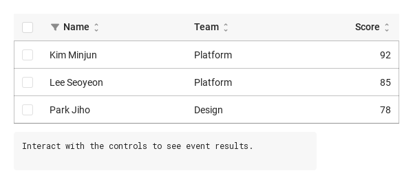
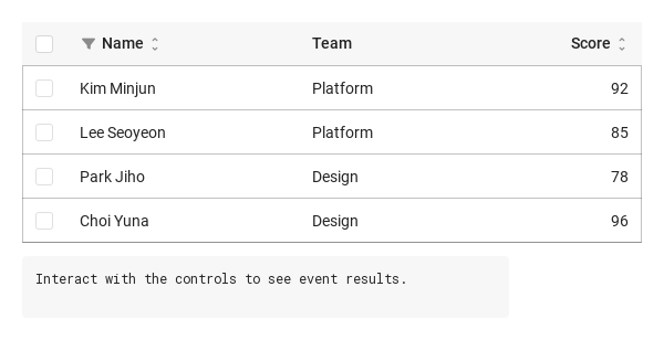
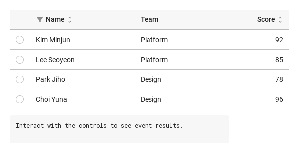
Filters apply as you type. Escape/outside click dismisses without reverting. Reopening restores text without another filterChanged. Filter clicks do not sort. Supply stable unique rowKey values. Missing/duplicate keys use per-row-object identities: sorting/filtering retains selection, replacing objects clears it. width/minWidth use positive logical-pixel numbers; CSS width strings are unsupported.