QML
← All components

Collapse

Organize content into sections that users can expand or collapse as needed.

import Syidax.Core.Collapse

Supported QML types

TypeDefinition / role
Container that coordinates expandable SyCollapsePanel sections.
One section with a clickable header and collapsible content.

Learn by example

Previews are images of native Qt runs. Use the buttons below each image to view a result.

01 Basic composition

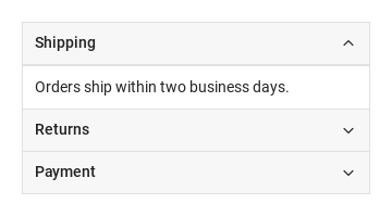
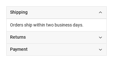
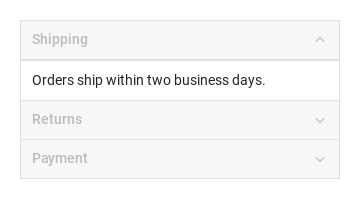
SyCollapse stacks SyCollapsePanel sections: each one is a 40 px header that folds the content declared inside it.

Qt capture · image
Basic composition · Default
Default execution
QML code
import QtQuick
import Syidax.Core

Item {
    implicitWidth: Math.max(360, childrenRect.width)
    implicitHeight: childrenRect.height

    property QtObject settings: QtObject {
        id: storyArgs
        property bool accordion: false
        property bool borderless: false
        property bool ghost: false
        property bool disabled: false
        property bool arrow: false
    }

    readonly property string arrowProp: storyArgs.arrow ? "; arrow: true" : ""
    readonly property string members: [
        "SyCollapsePanel {",
        "    title: " + JSON.stringify("Shipping") + "; active: true" + arrowProp,
        "    Text { text: " + JSON.stringify("Orders ship within two business days.") + " }",
        "}",
        "SyCollapsePanel {",
        "    title: " + JSON.stringify("Returns") + arrowProp,
        "    Text { text: " + JSON.stringify("Returns are accepted within 30 days.") + " }",
        "}",
        "SyCollapsePanel {",
        "    title: " + JSON.stringify("Payment") + arrowProp,
        "    Text { text: " + JSON.stringify("Cards and bank transfer.") + " }",
        "}"
    ].join("\n")

    SyCollapse {
        accordion: storyArgs.accordion
        borderless: storyArgs.borderless
        ghost: storyArgs.ghost
        disabled: storyArgs.disabled
        SyCollapsePanel {
            title: "Shipping"; active: true; arrow: storyArgs.arrow
            Text { text: "Orders ship within two business days."; width: parent.width; wrapMode: Text.Wrap; font.family: Theme.fontFamily; font.pixelSize: 14; color: Theme.semantic.textDefault }
        }
        SyCollapsePanel {
            title: "Returns"; arrow: storyArgs.arrow
            Text { text: "Returns are accepted within 30 days."; width: parent.width; wrapMode: Text.Wrap; font.family: Theme.fontFamily; font.pixelSize: 14; color: Theme.semantic.textDefault }
        }
        SyCollapsePanel {
            title: "Payment"; arrow: storyArgs.arrow
            Text { text: "Cards and bank transfer."; width: parent.width; wrapMode: Text.Wrap; font.family: Theme.fontFamily; font.pixelSize: 14; color: Theme.semantic.textDefault }
        }
    }

}

02 active · arrow · disabled · ghost

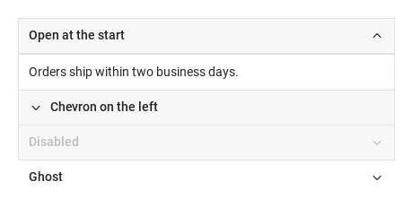
Per panel: active: true opens it at the start (silently — no changed; in an accordion stack declare only one panel active, since a preset active does not close the others).

Qt capture · image
active · arrow · disabled · ghost · Default
Default execution
QML code
import QtQuick
import Syidax.Core

Item {
    implicitWidth: Math.max(360, childrenRect.width)
    implicitHeight: childrenRect.height
    // Focused Gallery routes: keep only the selected API and its prerequisites.
    id: featureStory

    SyCollapse {
        width: 420
        SyCollapsePanel { id: featureTarget0; title: "Open at the start"; active: true; Text { text: "Orders ship within two business days."; width: parent.width; wrapMode: Text.Wrap; font.family: Theme.fontFamily; font.pixelSize: 14; color: Theme.semantic.textDefault } }
        SyCollapsePanel { id: featureTarget1; title: "Chevron on the left"; arrow: true; Text { text: "Returns are accepted within 30 days."; width: parent.width; wrapMode: Text.Wrap; font.family: Theme.fontFamily; font.pixelSize: 14; color: Theme.semantic.textDefault } }
        SyCollapsePanel { id: featureTarget2; title: "Disabled"; disabled: true; Text { text: "Cards and bank transfer."; width: parent.width; wrapMode: Text.Wrap; font.family: Theme.fontFamily; font.pixelSize: 14; color: Theme.semantic.textDefault } }
        SyCollapsePanel { id: featureTarget3; title: "Ghost"; ghost: true; Text { text: "Cards and bank transfer."; width: parent.width; wrapMode: Text.Wrap; font.family: Theme.fontFamily; font.pixelSize: 14; color: Theme.semantic.textDefault } }
    }
}

03 changed

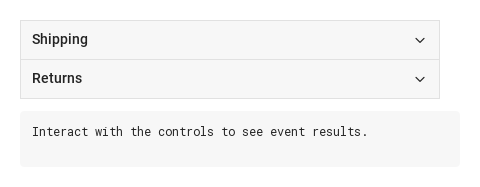
Every SyCollapsePanel emits changed(detail) with detail = { active: bool } when it opens (true) or closes (false)

Qt capture · image
changed · Default
Default execution
QML code
import QtQuick
import Syidax.Core

Item {
    component EventLog: Rectangle {
        id: logBox
        property var lines: []
        implicitWidth: 440
        implicitHeight: Math.max(56, logText.implicitHeight + 24)
        radius: 4; color: Theme.semantic.backgroundBold
        function log(value) { lines = lines.slice(-3).concat([String(value)]) }
        Text {
            id: logText; x: 12; y: 12; width: parent.width - 24
            text: logBox.lines.length ? logBox.lines.join("\n") : "Interact with the controls to see event results."
            wrapMode: Text.Wrap; color: Theme.semantic.textDefault
            font.family: Theme.monoFontFamily; font.pixelSize: 12
        }
    }

    implicitWidth: Math.max(360, childrenRect.width)
    implicitHeight: childrenRect.height


    Column {
        spacing: 12
        SyCollapse {
            width: 420
            SyCollapsePanel {
                id: shipping
                title: "Shipping"
                onChanged: (detail) => output.log(("%1 changed: %2").arg(shipping.title).arg(detail.active))
                Text { text: "Orders ship within two business days."; width: parent.width; wrapMode: Text.Wrap; font.family: Theme.fontFamily; font.pixelSize: 14; color: Theme.semantic.textDefault }
            }
            SyCollapsePanel {
                id: returns
                title: "Returns"
                onChanged: (detail) => output.log(("%1 changed: %2").arg(returns.title).arg(detail.active))
                Text { text: "Returns are accepted within 30 days."; width: parent.width; wrapMode: Text.Wrap; font.family: Theme.fontFamily; font.pixelSize: 14; color: Theme.semantic.textDefault }
            }
        }
        EventLog { id: output }
    }
}

04 openAll · closeAll · openPanel · closePanel · toggle

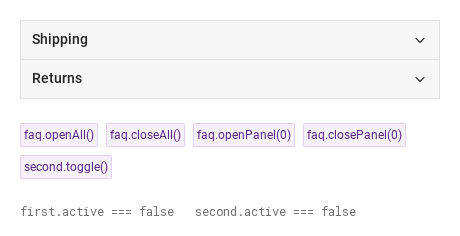
Compare the configuration and result of openAll · closeAll · openPanel · closePanel · toggle.

Qt capture · image
openAll · closeAll · openPanel · closePanel · toggle · Default
QML code
import QtQuick
import Syidax.Core

Item {
    implicitWidth: Math.max(360, childrenRect.width)
    implicitHeight: childrenRect.height
    // Focused Gallery routes: keep only the selected API and its prerequisites.
    id: featureStory

    Column {
        spacing: 24
        SyCollapse {
            id: faq
            width: 420
            SyCollapsePanel { id: first; title: "Shipping"; Text { text: "Orders ship within two business days."; width: parent.width; wrapMode: Text.Wrap; font.family: Theme.fontFamily; font.pixelSize: 14; color: Theme.semantic.textDefault } }
            SyCollapsePanel { id: second; title: "Returns"; Text { text: "Returns are accepted within 30 days."; width: parent.width; wrapMode: Text.Wrap; font.family: Theme.fontFamily; font.pixelSize: 14; color: Theme.semantic.textDefault } }
        }
        Flow {
            width: 460
            spacing: 8
            SyButton { id: exampleControl1;  visible: true; text: "faq.openAll()"; variant: "secondary"; size: "small"; onClicked: faq.openAll() }
            SyButton { id: exampleControl2;  visible: true; text: "faq.closeAll()"; variant: "secondary"; size: "small"; onClicked: faq.closeAll() }
            SyButton { id: exampleControl3;  visible: true; text: "faq.openPanel(0)"; variant: "secondary"; size: "small"; onClicked: faq.openPanel(0) }
            SyButton { visible: true; text: "faq.closePanel(0)"; variant: "secondary"; size: "small"; onClicked: faq.closePanel(0) }
            SyButton { visible: true; text: "second.toggle()"; variant: "secondary"; size: "small"; onClicked: second.toggle() }
        }
        Text {
            text: "first.active === " + first.active + "   second.active === " + second.active
            font.family: Theme.monoFontFamily
            font.pixelSize: 12
            color: Theme.semantic.textSubtle
        }
    }
}

05 Accordion

Accordion, configured with accordion.

Qt capture · image
Accordion · Result
Default execution
QML code
import QtQuick
import Syidax.Core

Item {
    implicitWidth: Math.max(360, childrenRect.width)
    implicitHeight: childrenRect.height

    property QtObject settings: QtObject {
        id: storyArgs
        property bool accordion: true
        property bool borderless: false
        property bool ghost: false
        property bool disabled: false
        property bool arrow: false
    }

    readonly property string arrowProp: storyArgs.arrow ? "; arrow: true" : ""
    readonly property string members: [
        "SyCollapsePanel {",
        "    title: " + JSON.stringify("Shipping") + "; active: true" + arrowProp,
        "    Text { text: " + JSON.stringify("Orders ship within two business days.") + " }",
        "}",
        "SyCollapsePanel {",
        "    title: " + JSON.stringify("Returns") + arrowProp,
        "    Text { text: " + JSON.stringify("Returns are accepted within 30 days.") + " }",
        "}",
        "SyCollapsePanel {",
        "    title: " + JSON.stringify("Payment") + arrowProp,
        "    Text { text: " + JSON.stringify("Cards and bank transfer.") + " }",
        "}"
    ].join("\n")

    SyCollapse {
        accordion: storyArgs.accordion
        borderless: storyArgs.borderless
        ghost: storyArgs.ghost
        disabled: storyArgs.disabled
        SyCollapsePanel {
            title: "Shipping"; active: true; arrow: storyArgs.arrow
            Text { text: "Orders ship within two business days."; width: parent.width; wrapMode: Text.Wrap; font.family: Theme.fontFamily; font.pixelSize: 14; color: Theme.semantic.textDefault }
        }
        SyCollapsePanel {
            title: "Returns"; arrow: storyArgs.arrow
            Text { text: "Returns are accepted within 30 days."; width: parent.width; wrapMode: Text.Wrap; font.family: Theme.fontFamily; font.pixelSize: 14; color: Theme.semantic.textDefault }
        }
        SyCollapsePanel {
            title: "Payment"; arrow: storyArgs.arrow
            Text { text: "Cards and bank transfer."; width: parent.width; wrapMode: Text.Wrap; font.family: Theme.fontFamily; font.pixelSize: 14; color: Theme.semantic.textDefault }
        }
    }

}

06 Ghost panels

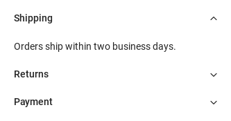
Ghost panels, configured with ghost.

Qt capture · image
Ghost panels · Result
Default execution
QML code
import QtQuick
import Syidax.Core

Item {
    implicitWidth: Math.max(360, childrenRect.width)
    implicitHeight: childrenRect.height

    property QtObject settings: QtObject {
        id: storyArgs
        property bool accordion: false
        property bool borderless: false
        property bool ghost: true
        property bool disabled: false
        property bool arrow: false
    }

    readonly property string arrowProp: storyArgs.arrow ? "; arrow: true" : ""
    readonly property string members: [
        "SyCollapsePanel {",
        "    title: " + JSON.stringify("Shipping") + "; active: true" + arrowProp,
        "    Text { text: " + JSON.stringify("Orders ship within two business days.") + " }",
        "}",
        "SyCollapsePanel {",
        "    title: " + JSON.stringify("Returns") + arrowProp,
        "    Text { text: " + JSON.stringify("Returns are accepted within 30 days.") + " }",
        "}",
        "SyCollapsePanel {",
        "    title: " + JSON.stringify("Payment") + arrowProp,
        "    Text { text: " + JSON.stringify("Cards and bank transfer.") + " }",
        "}"
    ].join("\n")

    SyCollapse {
        accordion: storyArgs.accordion
        borderless: storyArgs.borderless
        ghost: storyArgs.ghost
        disabled: storyArgs.disabled
        SyCollapsePanel {
            title: "Shipping"; active: true; arrow: storyArgs.arrow
            Text { text: "Orders ship within two business days."; width: parent.width; wrapMode: Text.Wrap; font.family: Theme.fontFamily; font.pixelSize: 14; color: Theme.semantic.textDefault }
        }
        SyCollapsePanel {
            title: "Returns"; arrow: storyArgs.arrow
            Text { text: "Returns are accepted within 30 days."; width: parent.width; wrapMode: Text.Wrap; font.family: Theme.fontFamily; font.pixelSize: 14; color: Theme.semantic.textDefault }
        }
        SyCollapsePanel {
            title: "Payment"; arrow: storyArgs.arrow
            Text { text: "Cards and bank transfer."; width: parent.width; wrapMode: Text.Wrap; font.family: Theme.fontFamily; font.pixelSize: 14; color: Theme.semantic.textDefault }
        }
    }

}

07 Borderless panels

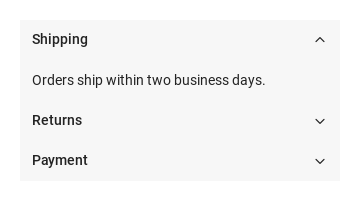
Borderless panels, configured with borderless.

Qt capture · image
Borderless panels · Result
Default execution
QML code
import QtQuick
import Syidax.Core

Item {
    implicitWidth: Math.max(360, childrenRect.width)
    implicitHeight: childrenRect.height

    property QtObject settings: QtObject {
        id: storyArgs
        property bool accordion: false
        property bool borderless: true
        property bool ghost: false
        property bool disabled: false
        property bool arrow: false
    }

    readonly property string arrowProp: storyArgs.arrow ? "; arrow: true" : ""
    readonly property string members: [
        "SyCollapsePanel {",
        "    title: " + JSON.stringify("Shipping") + "; active: true" + arrowProp,
        "    Text { text: " + JSON.stringify("Orders ship within two business days.") + " }",
        "}",
        "SyCollapsePanel {",
        "    title: " + JSON.stringify("Returns") + arrowProp,
        "    Text { text: " + JSON.stringify("Returns are accepted within 30 days.") + " }",
        "}",
        "SyCollapsePanel {",
        "    title: " + JSON.stringify("Payment") + arrowProp,
        "    Text { text: " + JSON.stringify("Cards and bank transfer.") + " }",
        "}"
    ].join("\n")

    SyCollapse {
        accordion: storyArgs.accordion
        borderless: storyArgs.borderless
        ghost: storyArgs.ghost
        disabled: storyArgs.disabled
        SyCollapsePanel {
            title: "Shipping"; active: true; arrow: storyArgs.arrow
            Text { text: "Orders ship within two business days."; width: parent.width; wrapMode: Text.Wrap; font.family: Theme.fontFamily; font.pixelSize: 14; color: Theme.semantic.textDefault }
        }
        SyCollapsePanel {
            title: "Returns"; arrow: storyArgs.arrow
            Text { text: "Returns are accepted within 30 days."; width: parent.width; wrapMode: Text.Wrap; font.family: Theme.fontFamily; font.pixelSize: 14; color: Theme.semantic.textDefault }
        }
        SyCollapsePanel {
            title: "Payment"; arrow: storyArgs.arrow
            Text { text: "Cards and bank transfer."; width: parent.width; wrapMode: Text.Wrap; font.family: Theme.fontFamily; font.pixelSize: 14; color: Theme.semantic.textDefault }
        }
    }

}

08 Disabled panels

Disabled panels, configured with disabled.

Qt capture · image
Disabled panels · Result
Default execution
QML code
import QtQuick
import Syidax.Core

Item {
    implicitWidth: Math.max(360, childrenRect.width)
    implicitHeight: childrenRect.height

    property QtObject settings: QtObject {
        id: storyArgs
        property bool accordion: false
        property bool borderless: false
        property bool ghost: false
        property bool disabled: true
        property bool arrow: false
    }

    readonly property string arrowProp: storyArgs.arrow ? "; arrow: true" : ""
    readonly property string members: [
        "SyCollapsePanel {",
        "    title: " + JSON.stringify("Shipping") + "; active: true" + arrowProp,
        "    Text { text: " + JSON.stringify("Orders ship within two business days.") + " }",
        "}",
        "SyCollapsePanel {",
        "    title: " + JSON.stringify("Returns") + arrowProp,
        "    Text { text: " + JSON.stringify("Returns are accepted within 30 days.") + " }",
        "}",
        "SyCollapsePanel {",
        "    title: " + JSON.stringify("Payment") + arrowProp,
        "    Text { text: " + JSON.stringify("Cards and bank transfer.") + " }",
        "}"
    ].join("\n")

    SyCollapse {
        accordion: storyArgs.accordion
        borderless: storyArgs.borderless
        ghost: storyArgs.ghost
        disabled: storyArgs.disabled
        SyCollapsePanel {
            title: "Shipping"; active: true; arrow: storyArgs.arrow
            Text { text: "Orders ship within two business days."; width: parent.width; wrapMode: Text.Wrap; font.family: Theme.fontFamily; font.pixelSize: 14; color: Theme.semantic.textDefault }
        }
        SyCollapsePanel {
            title: "Returns"; arrow: storyArgs.arrow
            Text { text: "Returns are accepted within 30 days."; width: parent.width; wrapMode: Text.Wrap; font.family: Theme.fontFamily; font.pixelSize: 14; color: Theme.semantic.textDefault }
        }
        SyCollapsePanel {
            title: "Payment"; arrow: storyArgs.arrow
            Text { text: "Cards and bank transfer."; width: parent.width; wrapMode: Text.Wrap; font.family: Theme.fontFamily; font.pixelSize: 14; color: Theme.semantic.textDefault }
        }
    }

}

API 55

Hover or select an item for its QML example and copy button.

Properties · SyCollapse

PropertyTypeDefaultDescription
list (default property)—The panels declared inside, in order
boolfalseOne panel open at a time: opening one closes the others; openAll() ignored
boolfalseNo borders on the panels (backgrounds stay)
boolfalseNo borders and no backgrounds on every panel
boolfalseEvery header inert
boolfalseApplies to every panel (each panel's effectiveFullheight = its own or the stack's)
var[]The collected panels — read panels()

Properties · SyCollapsePanel

PropertyTypeDefaultDescription
list (default property)—The body: what the panel folds
list—Items placed in the header after the title
string""The header text (hidden when empty)
boolfalseOpen. Set it to open or close silently; the user and the methods change it and emit changed
boolfalseThe chevron on the left, before the title, instead of the right end
boolfalseHeader greyed and inert; toggle() / open() ignored, close() allowed
boolfalseThis panel without border and backgrounds
boolfalseThe open body is measured by the children's bounding height alone (min 18 px); effectiveFullheight (read-only) is this or the stack's fullheight
bool (read-only)—The panel's or the stack's disabled · ghost · the stack's borderless
bool (read-only)—Pointer over the header
bool (read-only)—the header has keyboard focus
varnullThe owning stack (set by the stack)

Methods

MethodDescription
open() on every panel; ignored when accordion is on. Disabled panels stay closed
close() on every panel
open() / close() on the panel at index (0-based, among the stack's panels); unknown index: nothing
Returns the panels in order
close() when open, else open(); ignored while disabled
Opens and emits changed({ active: true }); ignored while disabled or already open; closes the others under accordion
Closes and emits changed({ active: false }); ignored when already closed; allowed while disabled

Signals

SignalArgumentsWhen
detail: { active: bool }The panel opened or closed by the user, by its methods, by the stack's methods, or by the accordion rule. Not when active is set from a binding, and not when a call changes nothing

Signals

ItemBehavior / conditions
SyCollapse has no signals of its own.

Behavior

ItemBehavior / conditions
Open. Set it to open or close silently; the user and the methods change it and emit changed
The panel opened or closed by the user, by its methods, by the stack's methods, or by the accordion rule. Not when active is set from a binding, and not when a call changes nothing
One panel open at a time: opening one closes the others; openAll() ignored
Opens and emits changed({ active: true }); ignored while disabled or already open; closes the others under accordion
With accordion: true on the stack, opening a panel (by the user or by open() / openPanel()) closes every other panel, each of which emits changed({ active: false }).
open() on every panel; ignored when accordion is on. Disabled panels stay closed
The chevron on the left, before the title, instead of the right end
The header text (hidden when empty)
Items placed in the header after the title
Give the content a width (width: parent.width) so text wraps.
No borders on the panels (backgrounds stay)
No borders and no backgrounds on every panel
Every header inert
Header greyed and inert; toggle() / open() ignored, close() allowed
close() when open, else open(); ignored while disabled
Closes and emits changed({ active: false }); ignored when already closed; allowed while disabled
close() on every panel
close(), closeAll() and closePanel() still close a disabled panel.
Tab reaches the enabled headers; Space / Enter toggle the focused one.
Applies to every panel (each panel's effectiveFullheight = its own or the stack's)
fullheight on the stack reaches every panel (a panel's effectiveFullheight is its own fullheight or the stack's): the open body is then measured by the children's bounding height alone (at least 18 px) instead of their offset plus height; it rarely makes a visible difference.
The open body is measured by the children's bounding height alone (min 18 px); effectiveFullheight (read-only) is this or the stack's fullheight
Returns the panels in order

Keyboard

ItemBehavior / conditions
SyTabGroup switches views instead of stacking them; SyCard frames a section that is always open.