QML
← All components

Progress Bar

Show the completion percentage of a task along a horizontal bar.

import Syidax.Core.ProgressBar

Supported QML types

TypeDefinition / role
Linear progress indicator with optional value text.

Learn by example

Previews are images of native Qt runs. Use the buttons below each image to view a result.

01 Basic composition

SyProgressBar is a horizontal track filled from the left to percent (0 … 100), with the percentage written on it.

Qt capture · image
Basic composition · Default
Default execution
QML code
import QtQuick
import Syidax.Core

Item {
    implicitWidth: Math.max(360, childrenRect.width)
    implicitHeight: childrenRect.height
    id: story

    property QtObject settings: QtObject {
        id: storyArgs
        property real percent: 40
        property string status: "default"
        property string valuePosition: "center"
        property bool hidePercent: false
        property bool indeterminate: false
    }


    SyProgressBar {
        width: 320
        percent: storyArgs.percent
        status: storyArgs.status
        valuePosition: storyArgs.valuePosition
        hidePercent: storyArgs.hidePercent
        indeterminate: storyArgs.indeterminate
    }

}

02 status

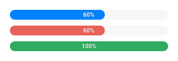
status picks the fill color from the theme's progress tokens: "default" (in progress), "error" and "complete".

Qt capture · image
status · Default
Default execution
QML code
import QtQuick
import Syidax.Core

pragma ComponentBehavior: Bound

Item {
    implicitWidth: Math.max(360, childrenRect.width)
    implicitHeight: childrenRect.height
    id: story
    readonly property var statuses: ["default", "error", "complete"]

    Column {
        spacing: 12
        Repeater {
            model: story.statuses
            delegate: SyProgressBar {
                required property string modelData
                width: 320
                percent: modelData === "complete" ? 100 : 60
                status: modelData
            }
        }
    }
}

03 valuePosition

valuePosition places the percentage label.

Qt capture · image
valuePosition · Default
QML code
import QtQuick
import Syidax.Core

Item {
    implicitWidth: Math.max(360, childrenRect.width)
    implicitHeight: childrenRect.height
    property QtObject settings: QtObject {
        id: storyArgs
        property string valuePosition: "progress-right"
        property real percent: 55
    }


    SyProgressBar { width: 320; percent: storyArgs.percent; valuePosition: storyArgs.valuePosition }
}

04 indeterminate

Compare the configuration and result of indeterminate.

Qt capture · image
indeterminate · Default
QML code
import QtQuick
import Syidax.Core

Item {
    implicitWidth: Math.max(360, childrenRect.width)
    implicitHeight: childrenRect.height
    property QtObject settings: QtObject {
        id: storyArgs
        property bool indeterminate: true
    }


    SyProgressBar { width: 320; percent: 30; indeterminate: storyArgs.indeterminate }
}

05 segment

segment splits the fill into colored parts.

Qt capture · image
segment · Default
Default execution
QML code
import QtQuick
import Syidax.Core

Item {
    implicitWidth: Math.max(360, childrenRect.width)
    implicitHeight: childrenRect.height
    property QtObject settings: QtObject {
        id: storyArgs
        property real percent: 80
    }


    SyProgressBar {
        width: 320; percent: storyArgs.percent
        segment: [{ percent: 30, status: "error" }, { percent: 60, status: "complete" }]
    }
}

06 changed · getValue

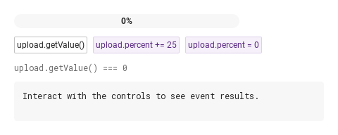
changed(percent) fires whenever the clamped value changes — once per change, with the clamped number: setting percent to 150 reports 100, and setting it to 150 again reports nothing because value did not move.

Qt capture · image
changed · getValue · Default
QML code
import QtQuick
import Syidax.Core

Item {
    component EventLog: Rectangle {
        id: logBox
        property var lines: []
        implicitWidth: 440
        implicitHeight: Math.max(56, logText.implicitHeight + 24)
        radius: 4; color: Theme.semantic.backgroundBold
        function log(value) { lines = lines.slice(-3).concat([String(value)]) }
        Text {
            id: logText; x: 12; y: 12; width: parent.width - 24
            text: logBox.lines.length ? logBox.lines.join("\n") : "Interact with the controls to see event results."
            wrapMode: Text.Wrap; color: Theme.semantic.textDefault
            font.family: Theme.monoFontFamily; font.pixelSize: 12
        }
    }

    implicitWidth: Math.max(360, childrenRect.width)
    implicitHeight: childrenRect.height
    // Focused Gallery routes: keep only the selected API and its prerequisites.
    id: featureStory

    Column {
        spacing: 12
        SyProgressBar {
            id: upload
            width: 320
            onChanged: (percent) => { if (true) { output.log(("changed: %1%").arg(percent)) } }
        }
        Row {
            spacing: 8
            SyButton { id: exampleControl1;  visible: true; text: "upload.getValue()"; size: "small"; onClicked: output.log("getValue() → " + upload.getValue()) }
            SyButton { id: exampleControl2;  text: "upload.percent += 25"; variant: "secondary"; size: "small"; onClicked: upload.percent += 25 }
            SyButton { id: exampleControl3;  text: "upload.percent = 0"; variant: "secondary"; size: "small"; onClicked: upload.percent = 0 }
        }
        Text {
            text: "upload.getValue() === " + upload.getValue()
            font.family: Theme.monoFontFamily
            font.pixelSize: 12
            color: Theme.semantic.textSubtle
        }
        EventLog { id: output }
    }
}

API 36

Hover or select an item for its QML example and copy button.

Properties

PropertyTypeDefaultDescription
real0The progress; clamped to 0 … 100 into value.
boolfalseSliding half-width bar instead of the fill; hides the label.
string"default""default" · "error" · "complete" — the fill color.
string"center""left" · "center" · "right" on the track · "progress-left" · "progress-center" · "progress-right" inside the fill (progress-left while the fill is ≤ 50 px).
boolfalseDo not draw the percentage label.
var (list or string)[]Cumulative stops [{ percent, status }, …] or that as a JSON string; the rest up to 100 is a default part.
string""The accessible name ("Progress" when empty); no visual tooltip.
real (read-only)—The clamped percent.
string (read-only)—The text drawn: "40%", or "" when hidePercent is on.
real (read-only)—The fill's width in px (half the track while indeterminate).
string—The label position after the 50 px fallback, and whether it is one of the track positions.
bool (read-only)—The label position after the 50 px fallback, and whether it is one of the track positions.
color (read-only)—The fill color for status.
var (read-only)—The parsed parts { percent, status } and the parts cut at value as { fraction, status }.

Methods

MethodDescription
Returns the clamped percent (real, 0 … 100) — the same as value. No arguments; works in every state.
Returns the fill color for a status name ("default" · "error" · "complete"); used for the segment parts.
Returns the label's x for the current position given its width; an internal helper you will rarely need.

Signals

SignalArgumentsWhen
percent: real — the clamped value, 0 … 100Whenever value changes. Not emitted when percent moves without changing the clamped value, nor for status, indeterminate or segment.

Behavior

ItemBehavior / conditions
The clamped percent.
The progress; clamped to 0 … 100 into value.
The fill is width × value / 100 wide; the label is Math.round(value) + "%".
Whenever value changes. Not emitted when percent moves without changing the clamped value, nor for status, indeterminate or segment.
Do not draw the percentage label.
Sliding half-width bar instead of the fill; hides the label.
"left" · "center" · "right" on the track · "progress-left" · "progress-center" · "progress-right" inside the fill (progress-left while the fill is ≤ 50 px).
Any progress-* position becomes progress-left while the fill is ≤ 50 px wide; effectivePosition (read-only) tells you which one is in use.
"default" · "error" · "complete" — the fill color.
Cumulative stops [{ percent, status }, …] or that as a JSON string; the rest up to 100 is a default part.
implicit 240 × 20 px; the bar fills the width it is given and is always 20 px tall with fully rounded ends. The track clips the fill.
The accessible name ("Progress" when empty); no visual tooltip.

Keyboard

ItemBehavior / conditions
The progress; clamped to 0 … 100 into value.
"default" · "error" · "complete" — the fill color.
Cumulative stops [{ percent, status }, …] or that as a JSON string; the rest up to 100 is a default part.
Whenever value changes. Not emitted when percent moves without changing the clamped value, nor for status, indeterminate or segment.
Returns the clamped percent (real, 0 … 100) — the same as value. No arguments; works in every state.