QML
← All components

Avatar

Represent a person or account with a photo, icon or initials.

import Syidax.Core.Avatar

Supported QML types

TypeDefinition / role
Displays a profile image, icon, letter or initials.
Arranges avatars in an overlapping group and summarizes overflow.

Learn by example

Previews are images of native Qt runs. Use the buttons below each image to view a result.

01 Basic composition

SyAvatar is a round disc that stands for a person or a thing: a photo (image), a glyph (icon), one or two fixed characters (letter), or

Qt capture · image
Basic composition · Default
Default execution
QML code
import QtQuick
import Syidax.Core

Item {
    component EventLog: Rectangle {
        id: logBox
        property var lines: []
        implicitWidth: 440
        implicitHeight: Math.max(56, logText.implicitHeight + 24)
        radius: 4; color: Theme.semantic.backgroundBold
        function log(value) { lines = lines.slice(-3).concat([String(value)]) }
        Text {
            id: logText; x: 12; y: 12; width: parent.width - 24
            text: logBox.lines.length ? logBox.lines.join("\n") : "Interact with the controls to see event results."
            wrapMode: Text.Wrap; color: Theme.semantic.textDefault
            font.family: Theme.monoFontFamily; font.pixelSize: 12
        }
    }

    implicitWidth: Math.max(360, childrenRect.width)
    implicitHeight: childrenRect.height
    id: story

    property QtObject settings: QtObject {
        id: storyArgs
        property string text: "Jane Doe"
        property string letter: ""
        property string content: "text"
        property string variant: "lightgray"
        property string size: "medium"
        property bool clickable: false
        property bool disabled: false
    }


    Column {
        spacing: 12
        SyAvatar {
            text: storyArgs.text
            letter: storyArgs.letter
            icon: storyArgs.content === "icon" ? Icons.globalHeaderBell : ""
            image: storyArgs.content === "image" ? Qt.resolvedUrl("portrait.svg") : ""
            variant: storyArgs.variant
            size: storyArgs.size
            clickable: storyArgs.clickable
            disabled: storyArgs.disabled
            onSelected: (detail) => output.log(("selected: %1").arg(detail.text))
        }
        EventLog { id: output }
    }

}

02 variant

variant chooses the colour set of the disc

Qt capture · image
variant · Default
Default execution
QML code
import QtQuick
import Syidax.Core

pragma ComponentBehavior: Bound

Item {
    implicitWidth: Math.max(360, childrenRect.width)
    implicitHeight: childrenRect.height
    id: story
    readonly property var variants: ["lightgray", "red", "orange", "yellow", "lime", "green", "teal", "blue", "purple", "magenta", "darkgray"]

    Row {
        spacing: 8
        Repeater {
            model: story.variants
            delegate: Column {
                id: cell
                required property string modelData
                spacing: 6
                SyAvatar { anchors.horizontalCenter: parent.horizontalCenter; text: "Jane Doe"; variant: cell.modelData }
                Text { anchors.horizontalCenter: parent.horizontalCenter; text: cell.modelData; font.family: Theme.fontFamily; font.pixelSize: 10; color: Theme.semantic.textSubtle }
            }
        }
    }
}

03 size

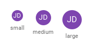
size is a name: small 24 px, medium 32 px (default), large 40 px — the disc's implicitWidth and implicitHeight (diameter).

Qt capture · image
size · Default
Default execution
QML code
import QtQuick
import Syidax.Core

pragma ComponentBehavior: Bound

Item {
    implicitWidth: Math.max(360, childrenRect.width)
    implicitHeight: childrenRect.height
    id: story
    readonly property var sizes: ["small", "medium", "large"]

    Row {
        spacing: 16
        Repeater {
            model: story.sizes
            delegate: Column {
                id: cell
                required property string modelData
                spacing: 6
                SyAvatar { anchors.horizontalCenter: parent.horizontalCenter; text: "Jane Doe"; variant: "purple"; size: cell.modelData }
                Text { anchors.horizontalCenter: parent.horizontalCenter; text: cell.modelData; font.family: Theme.fontFamily; font.pixelSize: 11; color: Theme.semantic.textSubtle }
            }
        }
    }
}

04 image · icon · letter · text

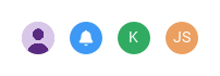
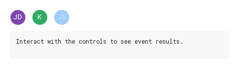
What fills the circle, in priority order:

Qt capture · image
image · icon · letter · text · Default
Default execution
QML code
import QtQuick
import Syidax.Core

Item {
    implicitWidth: Math.max(360, childrenRect.width)
    implicitHeight: childrenRect.height
    // Focused Gallery routes: keep only the selected API and its prerequisites.
    id: featureStory

    Row {
        spacing: 12
        SyAvatar { id: featureTarget0; visible: true; image: Qt.resolvedUrl("portrait.svg"); text: "Jane Doe" }
        SyAvatar { id: featureTarget1; visible: true; icon: Icons.globalHeaderBell; variant: "blue" }
        SyAvatar { id: featureTarget2; visible: true; letter: "k"; variant: "green" }
        SyAvatar { id: featureTarget3; visible: true; text: "John Smith"; variant: "orange" }
    }
}

05 selected

selected(detail) is the avatar's only signal.

Qt capture · image
selected · Default
Default execution
QML code
import QtQuick
import Syidax.Core

Item {
    component EventLog: Rectangle {
        id: logBox
        property var lines: []
        implicitWidth: 440
        implicitHeight: Math.max(56, logText.implicitHeight + 24)
        radius: 4; color: Theme.semantic.backgroundBold
        function log(value) { lines = lines.slice(-3).concat([String(value)]) }
        Text {
            id: logText; x: 12; y: 12; width: parent.width - 24
            text: logBox.lines.length ? logBox.lines.join("\n") : "Interact with the controls to see event results."
            wrapMode: Text.Wrap; color: Theme.semantic.textDefault
            font.family: Theme.monoFontFamily; font.pixelSize: 12
        }
    }

    implicitWidth: Math.max(360, childrenRect.width)
    implicitHeight: childrenRect.height

    Column {
        spacing: 12
        Row {
            spacing: 12
            SyAvatar {
                text: "Jane Doe"; variant: "purple"; clickable: true
                onSelected: (detail) => output.log(("selected: %1").arg(detail.text))
            }
            SyAvatar {
                letter: "k"; variant: "green"; clickable: true
                onSelected: (detail) => output.log(("selected: %1").arg(detail.letter))
            }
            SyAvatar { text: "John Smith"; variant: "blue"; clickable: true; disabled: true }
        }
        EventLog { id: output }
    }
}

06 Image avatar

Image avatar, configured with content.

Qt capture · image
Image avatar · Result
Default execution
QML code
import QtQuick
import Syidax.Core

Item {
    component EventLog: Rectangle {
        id: logBox
        property var lines: []
        implicitWidth: 440
        implicitHeight: Math.max(56, logText.implicitHeight + 24)
        radius: 4; color: Theme.semantic.backgroundBold
        function log(value) { lines = lines.slice(-3).concat([String(value)]) }
        Text {
            id: logText; x: 12; y: 12; width: parent.width - 24
            text: logBox.lines.length ? logBox.lines.join("\n") : "Interact with the controls to see event results."
            wrapMode: Text.Wrap; color: Theme.semantic.textDefault
            font.family: Theme.monoFontFamily; font.pixelSize: 12
        }
    }

    implicitWidth: Math.max(360, childrenRect.width)
    implicitHeight: childrenRect.height
    id: story

    property QtObject settings: QtObject {
        id: storyArgs
        property string text: "Jane Doe"
        property string letter: ""
        property string content: "image"
        property string variant: "lightgray"
        property string size: "medium"
        property bool clickable: false
        property bool disabled: false
    }


    Column {
        spacing: 12
        SyAvatar {
            text: storyArgs.text
            letter: storyArgs.letter
            icon: storyArgs.content === "icon" ? Icons.globalHeaderBell : ""
            image: storyArgs.content === "image" ? Qt.resolvedUrl("portrait.svg") : ""
            variant: storyArgs.variant
            size: storyArgs.size
            clickable: storyArgs.clickable
            disabled: storyArgs.disabled
            onSelected: (detail) => output.log(("selected: %1").arg(detail.text))
        }
        EventLog { id: output }
    }

}

07 Disabled avatar

Disabled avatar, configured with disabled, clickable.

Qt capture · image
Disabled avatar · Result
Default execution
QML code
import QtQuick
import Syidax.Core

Item {
    component EventLog: Rectangle {
        id: logBox
        property var lines: []
        implicitWidth: 440
        implicitHeight: Math.max(56, logText.implicitHeight + 24)
        radius: 4; color: Theme.semantic.backgroundBold
        function log(value) { lines = lines.slice(-3).concat([String(value)]) }
        Text {
            id: logText; x: 12; y: 12; width: parent.width - 24
            text: logBox.lines.length ? logBox.lines.join("\n") : "Interact with the controls to see event results."
            wrapMode: Text.Wrap; color: Theme.semantic.textDefault
            font.family: Theme.monoFontFamily; font.pixelSize: 12
        }
    }

    implicitWidth: Math.max(360, childrenRect.width)
    implicitHeight: childrenRect.height
    id: story

    property QtObject settings: QtObject {
        id: storyArgs
        property string text: "Jane Doe"
        property string letter: ""
        property string content: "text"
        property string variant: "lightgray"
        property string size: "medium"
        property bool clickable: true
        property bool disabled: true
    }


    Column {
        spacing: 12
        SyAvatar {
            text: storyArgs.text
            letter: storyArgs.letter
            icon: storyArgs.content === "icon" ? Icons.globalHeaderBell : ""
            image: storyArgs.content === "image" ? Qt.resolvedUrl("portrait.svg") : ""
            variant: storyArgs.variant
            size: storyArgs.size
            clickable: storyArgs.clickable
            disabled: storyArgs.disabled
            onSelected: (detail) => output.log(("selected: %1").arg(detail.text))
        }
        EventLog { id: output }
    }

}

08 Colored initials

Colored initials, configured with variant.

Qt capture · image
Colored initials · Result
Default execution
QML code
import QtQuick
import Syidax.Core

Item {
    component EventLog: Rectangle {
        id: logBox
        property var lines: []
        implicitWidth: 440
        implicitHeight: Math.max(56, logText.implicitHeight + 24)
        radius: 4; color: Theme.semantic.backgroundBold
        function log(value) { lines = lines.slice(-3).concat([String(value)]) }
        Text {
            id: logText; x: 12; y: 12; width: parent.width - 24
            text: logBox.lines.length ? logBox.lines.join("\n") : "Interact with the controls to see event results."
            wrapMode: Text.Wrap; color: Theme.semantic.textDefault
            font.family: Theme.monoFontFamily; font.pixelSize: 12
        }
    }

    implicitWidth: Math.max(360, childrenRect.width)
    implicitHeight: childrenRect.height
    id: story

    property QtObject settings: QtObject {
        id: storyArgs
        property string text: "Jane Doe"
        property string letter: ""
        property string content: "text"
        property string variant: "purple"
        property string size: "medium"
        property bool clickable: false
        property bool disabled: false
    }


    Column {
        spacing: 12
        SyAvatar {
            text: storyArgs.text
            letter: storyArgs.letter
            icon: storyArgs.content === "icon" ? Icons.globalHeaderBell : ""
            image: storyArgs.content === "image" ? Qt.resolvedUrl("portrait.svg") : ""
            variant: storyArgs.variant
            size: storyArgs.size
            clickable: storyArgs.clickable
            disabled: storyArgs.disabled
            onSelected: (detail) => output.log(("selected: %1").arg(detail.text))
        }
        EventLog { id: output }
    }

}

API 43

Hover or select an item for its QML example and copy button.

Properties · SyAvatar

PropertyTypeDefaultDescription
url—A photo; drawn once loaded, clipped to the circle (cover-scaled).
url—A glyph (Icons.* or a file), used when there is no loaded image.
string""Up to two characters, upper-cased, used before the initials.
string""The name; its initials fill the disc when nothing else does; also the accessible name.
string"lightgray"lightgray · red · orange · yellow · lime · green · teal · blue · purple · magenta · darkgray.
string"medium"small 24 · medium 32 · large 40 px.
boolfalsePointer cursor and selected on tap.
boolfalse50 % opacity, no click.
string""The accessible name (and the "+n" list label) when set; no visible tooltip.
string (read-only)—The two characters that would be drawn.
string (read-only)—tooltipContent, else text, else letter.
real (read-only)—24 / 32 / 40 by size.
bool (read-only)—A loaded photo · a glyph is shown · clickable && !disabled.
color (read-only)—The variant's resolved colours.

Properties · SyAvatarGroup

PropertyTypeDefaultDescription
——The SyAvatar items of the group.
string"stack"stack (overlapping) or grid (spaced).
string"medium"Applied to every avatar.
boolfalseApplied to every avatar; also enables the "+n" list rows.
int0Show at most this many; the rest go into "+n". 0 = all.

Additional properties

NameType / defaultDescription
Selects the sample content source: image, icon, explicit letter or initials from text.

Methods

MethodDescription
The variant's colour for "bg", "border" or "text" (what the read-only colours use).
Re-applies size, clickability and positions to the members (runs automatically).

Signals

SignalArgumentsWhen
detail: { letter, text, icon, image }A tap on a clickable, enabled avatar.
detail: { letter, text, icon, image }Any member avatar was clicked, or a row of the "+n" list (needs the group's clickable).

Behavior

ItemBehavior / conditions
hasImage is true only while image is set and loaded (Image.Ready); then the photo is drawn, scaled to cover the circle and centred, clipped 1 px inside the border.
A photo; drawn once loaded, clipped to the circle (cover-scaled).
Otherwise hasIcon (an icon url) draws the glyph in the variant's text colour; otherwise the text is drawn: letter (trimmed, first two characters, upper-case) when set, else the initials of text (first letter of the first two words, or the first two characters of a single word, upper-case), else nothing.
A glyph (Icons.* or a file), used when there is no loaded image.
Up to two characters, upper-cased, used before the initials.
The name; its initials fill the disc when nothing else does; also the accessible name.
lightgray · red · orange · yellow · lime · green · teal · blue · purple · magenta · darkgray.
small 24 · medium 32 · large 40 px.
50 % opacity, no click.
Pointer cursor and selected on tap.
With clickable and not disabled (interactive), the pointer becomes a hand and a tap emits selected({ letter, text, icon, image }).
A tap on a clickable, enabled avatar.
The accessible name (and the "+n" list label) when set; no visible tooltip.
tooltipContent, else text, else letter.

Keyboard

ItemBehavior / conditions
A glyph (Icons.* or a file), used when there is no loaded image.