QML
← All components

Badge

Attach a count or status dot to an item, such as unread messages on a notification button.

import Syidax.Core.Badge

Supported QML types

TypeDefinition / role
Adds a count, dot or status label to content.

Learn by example

Previews are images of native Qt runs. Use the buttons below each image to view a result.

01 Basic composition

SyBadge pins a small count or a dot to one corner of whatever is declared inside it — a button, an icon, an avatar — or, with no wrapped item, draws the badge inline automatically.

Qt capture · image
Basic composition · Default
Default execution
QML code
import QtQuick
import Syidax.Core

Item {
    implicitWidth: Math.max(360, childrenRect.width)
    implicitHeight: childrenRect.height
    id: story

    property QtObject settings: QtObject {
        id: storyArgs
        property int value: 5
        property int overflowCount: 0
        property bool dot: false
        property bool hidden: false
        property bool standalone: false
        property string position: "topRight"
        property string size: "medium"
        property string variant: "red"
    }


    Item {
        width: 200
        height: 56
        SyBadge {
            x: 12
            y: 12
            value: storyArgs.value
            overflowCount: storyArgs.overflowCount
            dot: storyArgs.dot
            hidden: storyArgs.hidden
            standalone: storyArgs.standalone
            position: storyArgs.position
            size: storyArgs.size
            variant: storyArgs.variant
            SyButton { visible: !storyArgs.standalone; text: "Inbox" }
        }
    }

}

02 variant

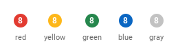
variant picks the badge color from five semantic names: "red" (the default — errors, alerts), "yellow" (warnings), "green" (success), "blue" (information) and "gray" (neutral).

Qt capture · image
variant · Default
Default execution
QML code
import QtQuick
import Syidax.Core

pragma ComponentBehavior: Bound

Item {
    implicitWidth: Math.max(360, childrenRect.width)
    implicitHeight: childrenRect.height
    id: story
    readonly property var variants: ["red", "yellow", "green", "blue", "gray"]

    Row {
        spacing: 24
        Repeater {
            model: story.variants
            delegate: Column {
                id: cell
                required property string modelData
                spacing: 8
                SyBadge { anchors.horizontalCenter: parent.horizontalCenter; standalone: true; value: 8; variant: cell.modelData }
                Text { anchors.horizontalCenter: parent.horizontalCenter; text: cell.modelData; font.family: Theme.fontFamily; font.pixelSize: 11; color: Theme.semantic.textSubtle }
            }
        }
    }
}

03 size

size is "medium" (default, 20 px tall) or "small" (16 px).

Qt capture · image
size · Default
QML code
import QtQuick
import Syidax.Core

Item {
    implicitWidth: Math.max(360, childrenRect.width)
    implicitHeight: childrenRect.height
    property QtObject settings: QtObject {
        id: storyArgs
        property string size: "medium"
    }


    Item {
        width: 200
        height: 56
        SyBadge {
            x: 12
            y: 12
            value: 12
            size: storyArgs.size
            SyButton { text: "Inbox" }
        }
    }
}

04 dot

dot: true replaces the number with a plain dot — 8 px at size: "medium", 6 px at "small" — for "something is here" when the exact count does not matter (unread state, a pending update).

Qt capture · image
dot · Default
QML code
import QtQuick
import Syidax.Core

Item {
    implicitWidth: Math.max(360, childrenRect.width)
    implicitHeight: childrenRect.height
    property QtObject settings: QtObject {
        id: storyArgs
        property bool dot: true
        property string size: "medium"
    }


    Item {
        width: 200
        height: 56
        SyBadge {
            x: 12
            y: 12
            dot: storyArgs.dot
            value: 3
            size: storyArgs.size
            SyButton { text: "Inbox" }
        }
    }
}

05 position

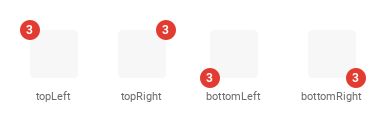
position names the corner of the wrapped content the badge sits on: "topLeft", "topRight" (default), "bottomLeft" or "bottomRight".

Qt capture · image
position · Default
Default execution
QML code
import QtQuick
import Syidax.Core

pragma ComponentBehavior: Bound

Item {
    implicitWidth: Math.max(360, childrenRect.width)
    implicitHeight: childrenRect.height
    id: story
    readonly property var positions: ["topLeft", "topRight", "bottomLeft", "bottomRight"]

    Row {
        spacing: 40
        leftPadding: 12
        topPadding: 12
        bottomPadding: 12
        Repeater {
            model: story.positions
            delegate: Column {
                id: cell
                required property string modelData
                spacing: 12
                SyBadge {
                    anchors.horizontalCenter: parent.horizontalCenter
                    value: 3
                    position: cell.modelData
                    Rectangle { width: 48; height: 48; color: Theme.semantic.backgroundBold; radius: 4 }
                }
                Text { anchors.horizontalCenter: parent.horizontalCenter; text: cell.modelData; font.family: Theme.fontFamily; font.pixelSize: 11; color: Theme.semantic.textSubtle }
            }
        }
    }
}

06 overflowCount

overflowCount caps the number: when it is greater than 0 and value exceeds it, the badge reads the cap followed by "+" (with overflowCount: 99, 120 shows "99+"; 99 itself still shows "99").

Qt capture · image
overflowCount · Default
Default execution
QML code
import QtQuick
import Syidax.Core

Item {
    implicitWidth: Math.max(360, childrenRect.width)
    implicitHeight: childrenRect.height
    property QtObject settings: QtObject {
        id: storyArgs
        property int value: 120
        property int overflowCount: 99
    }


    Item {
        width: 200
        height: 56
        SyBadge {
            x: 12
            y: 12
            value: storyArgs.value
            overflowCount: storyArgs.overflowCount
            SyButton { text: "Inbox" }
        }
    }
}

07 standalone

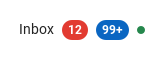
standalone: true draws the badge on its own, with no wrapped content: the item's size becomes the badge's size (20 × 20 px for a one-digit count at medium), so it can sit inline with text or in a Row.

Qt capture · image
standalone · Default
Default execution
QML code
import QtQuick
import Syidax.Core

Item {
    implicitWidth: Math.max(360, childrenRect.width)
    implicitHeight: childrenRect.height

    Row {
        spacing: 8
        Text { anchors.verticalCenter: parent.verticalCenter; text: "Inbox"; font.family: Theme.fontFamily; font.pixelSize: 14; color: Theme.semantic.textDefault }
        SyBadge { anchors.verticalCenter: parent.verticalCenter; standalone: true; value: 12 }
        SyBadge { anchors.verticalCenter: parent.verticalCenter; standalone: true; value: 120; overflowCount: 99; variant: "blue" }
        SyBadge { anchors.verticalCenter: parent.verticalCenter; standalone: true; dot: true; variant: "green" }
    }
}

08 Bottom-left badge

Bottom-left badge, configured with position.

Qt capture · image
Bottom-left badge · Result
Default execution
QML code
import QtQuick
import Syidax.Core

Item {
    implicitWidth: Math.max(360, childrenRect.width)
    implicitHeight: childrenRect.height
    id: story

    property QtObject settings: QtObject {
        id: storyArgs
        property int value: 5
        property int overflowCount: 0
        property bool dot: false
        property bool hidden: false
        property bool standalone: false
        property string position: "bottomLeft"
        property string size: "medium"
        property string variant: "red"
    }


    Item {
        width: 200
        height: 56
        SyBadge {
            x: 12
            y: 12
            value: storyArgs.value
            overflowCount: storyArgs.overflowCount
            dot: storyArgs.dot
            hidden: storyArgs.hidden
            standalone: storyArgs.standalone
            position: storyArgs.position
            size: storyArgs.size
            variant: storyArgs.variant
            SyButton { visible: !storyArgs.standalone; text: "Inbox" }
        }
    }

}

API 27

Hover or select an item for its QML example and copy button.

Properties

PropertyTypeDefaultDescription
list (default property)—The wrapped content; the badge sits on one of its corners and takes its size. Hidden when standalone is on.
int0The count. Shown rounded down; 0 is drawn as "0".
int0Cap: when greater than 0 and value exceeds it, the badge reads "N+" with N = overflowCount.
boolfalseDraw a plain dot (8 / 6 px) instead of the count; value and overflowCount are then ignored.
boolfalseHide the mark, keep the content and the size.
boolautomaticDefaults to true with no wrapped visual item; otherwise false. Explicit true hides wrapped content and uses the mark size.
string"topRight"The corner: "topLeft" · "topRight" · "bottomLeft" · "bottomRight".
string"medium""medium" = 20 px count / 8 px dot · "small" = 16 px count / 6 px dot.
string"red""red" · "yellow" · "green" · "blue" · "gray" — the semantic color.
string (read-only)—The text actually drawn: "" for a dot, "N+" when capped, otherwise the count.
real (read-only)—The mark's height (count) or diameter (dot) for the current size and dot.
real (read-only)—How far the mark's center sits outside the corner.
color (read-only)—The theme colors resolved from variant.

Methods

ItemBehavior / conditions
SyBadge declares no methods.

Signals

ItemBehavior / conditions
SyBadge declares no signals. The property change signals of QML are available — onDisplayValueChanged is the useful one.

Behavior

ItemBehavior / conditions
whatever is declared inside the badge is its content (the default property). The badge's implicitWidth / implicitHeight equal the content's size, so it drops into any layout exactly like the content alone would; the mark overhangs the corner and is not counted, so an ancestor with clip: true cuts it off.
The text actually drawn: "" for a dot, "N+" when capped, otherwise the count.
Cap: when greater than 0 and value exceeds it, the badge reads "N+" with N = overflowCount. 0 = never cap.
The count. Shown rounded down; 0 is drawn as "0".
a count badge is 20 px tall ("medium") or 16 px ("small"), at least as wide as it is tall, and gains 6 px of padding per side from two characters on. A dot is 8 / 6 px. The mark is centered on the corner: offset 10 / 8 px for a count, 4 / 3 px for a dot. The digits are 12 px bold.
The corner: "topLeft" · "topRight" · "bottomLeft" · "bottomRight".
Defaults to true with no wrapped visual item; otherwise false. Explicit true hides wrapped content and uses the mark size.
Hide the mark, keep the content and the size.
"red" · "yellow" · "green" · "blue" · "gray" — the semantic color.
the badge does not handle pointer input; clicks fall through to the content.

Keyboard

ItemBehavior / conditions
SyTag for text labels, SyAvatar and SyIcon as typical content, SyButton for an inbox-style button with a count.