Run with --diagnose --json to check your Qt version, import path, fonts, runtime and license. No license token is printed.
The Gallery evaluation app is available now. Paid SDK sales and downloads are coming soon. The installation examples above preview the SDK workflow.
Tested Windows configurations
Native window and example smoke checks cover the versions below. Qt 6.8 is a source minimum, not a promise of tested support for every Qt release. Gallery uses software rendering.
Two complete application examples
Step-by-step captures from the running Windows applications. Play, pause and inspect each state.
Workbench: mark a task done, save changes and see release progress update.Record Manager: preserve a failed save, retry, search and confirm before deleting.
See the components in context
RibbonPanelFormTableTreeTheme
TRY IT YOURSELF
The native Gallery
Browse examples, inspect properties and switch between light and dark themes in a Windows application. The Gallery is for evaluation; commercial SDK access is separate.
The --qml path must contain the Syidax folder. Python uses qml-pure. Run from the unzipped SDK, independently of the source repository.
License is inactive or frozen
Download your QML Core certificate and pass it with --license. Web Core, Chart and Grid certificates do not activate QML. Monthly use ends at expiry. Annual licenses retain only releases covered by their update period.
Qt or plugin mismatch
Check the Qt version and architecture used to build plugins. Do not mix Python Qt bindings. qml-pure removes the compiled plugin ABI dependency.
PDF or icons missing
PDF requires the optional QtQuick.Pdf module. Other Core components remain usable without it. For icon packs and resource paths, read SDK docs/ICON-PACKS.md.
Save failure or corrupt settings
Examples write only to their application-data folder. Check permissions and disk space. Invalid JSON is backed up before reset. A failed save preserves your draft.
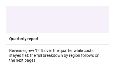
Group related content in a bordered card with a title, cover and optional actions.
import Syidax.Core.Card
Supported QML types
Type
Definition / role
Content container with header, body and footer areas.
Learn by example
Previews are images of native Qt runs. Use the buttons below each image to view a result.
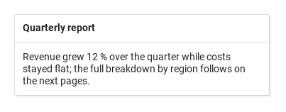
01 Basic composition
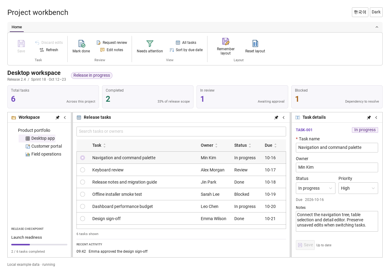
SyCard is a framed panel that groups related content: an optional cover on top, a header with a bold cardTitle (or your own header items) and headerActions at its right end, the body
Qt capture · image
Default execution
QML code
import QtQuick
import Syidax.Core

Item {
    implicitWidth: Math.max(360, childrenRect.width)
    implicitHeight: childrenRect.height
    id: story

    property QtObject settings: QtObject {
        id: storyArgs
        property string cardTitle: "Quarterly report"
        property bool collapsible: false
        property bool active: true
        property bool showFooter: true
        property bool backdrop: false
        property bool showIcon: true
    }


    SyCard {
        width: 360
        cardTitle: storyArgs.cardTitle
        collapsible: storyArgs.collapsible
        active: storyArgs.active
        showFooter: storyArgs.showFooter
        backdrop: storyArgs.backdrop
        showIcon: storyArgs.showIcon
        icon: Icons.pdfViewerDocument
        footer: SyButton { text: "Open"; size: "small"; variant: "primary" }
        Text { width: parent.width; wrapMode: Text.WordWrap; text: "Revenue grew 12 % over the quarter while costs stayed flat; the full breakdown by region follows on the next pages."; font.family: Theme.fontFamily; font.pixelSize: 14; color: Theme.card.bodyTextEnabled }
    }

}
02 collapsible · active
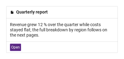
collapsible: true puts a chevron at the left of the header; clicking it folds or unfolds the body.
Qt capture · image
QML code
import QtQuick
import Syidax.Core

Item {
    implicitWidth: Math.max(360, childrenRect.width)
    implicitHeight: childrenRect.height
    // Focused Gallery routes: keep only the selected API and its prerequisites.
    id: featureStory

    property QtObject settings: QtObject {
        id: storyArgs
        property bool collapsible: true
        property bool active: true
    }


    SyCard { id: featureTarget0;
        width: 360; cardTitle: "Quarterly report"; collapsible: storyArgs.collapsible; active: storyArgs.active
        onToggled: (active) => storyArgs.active = active    // keep the control in step with the chevron
        Text { width: parent.width; wrapMode: Text.WordWrap; text: "Revenue grew 12 % over the quarter while costs stayed flat; the full breakdown by region follows on the next pages."; font.family: Theme.fontFamily; font.pixelSize: 14; color: Theme.card.bodyTextEnabled }
    }
}
03 cover · showCover
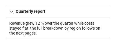
cover takes items shown above the header, edge to edge inside the frame — typically an Image or a coloured band; bind width: parent.width on them and give them a height.
Qt capture · image
QML code
import QtQuick
import Syidax.Core

Item {
    implicitWidth: Math.max(360, childrenRect.width)
    implicitHeight: childrenRect.height
    // Focused Gallery routes: keep only the selected API and its prerequisites.
    id: featureStory

    property QtObject settings: QtObject {
        id: storyArgs
        property bool showCover: true
    }


    SyCard { id: featureTarget0;
        width: 360; cardTitle: "Quarterly report"; showCover: storyArgs.showCover
        cover: Rectangle { width: parent ? parent.width : 0; height: 96; color: Theme.semantic.backgroundBrandDefault }
        Text { width: parent ? parent.width : 0; wrapMode: Text.WordWrap; text: "Revenue grew 12 % over the quarter while costs stayed flat; the full breakdown by region follows on the next pages."; font.family: Theme.fontFamily; font.pixelSize: 14; color: Theme.card.bodyTextEnabled }
    }
}
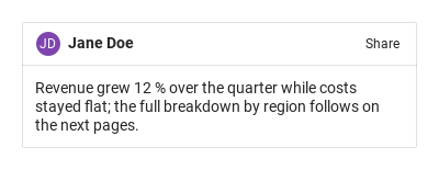
04 header · headerActions
The header row is 40 px high (taller when its content needs it) and sits under the cover.
Qt capture · image
Default execution
QML code
import QtQuick
import Syidax.Core

Item {
    implicitWidth: Math.max(360, childrenRect.width)
    implicitHeight: childrenRect.height
    // Focused Gallery routes: keep only the selected API and its prerequisites.
    id: featureStory

    SyCard { id: featureTarget0;
        width: 360
        header: Row {
            spacing: 6
            SyAvatar { text: "Jane Doe"; size: "small"; variant: "purple" }
            Text { anchors.verticalCenter: parent.verticalCenter; text: "Jane Doe"; font.family: Theme.fontFamily; font.pixelSize: 14; font.weight: Font.Bold; color: Theme.card.headerTextEnabled }
        }
        headerActions: SyButton { text: "Share"; size: "small"; variant: "borderless" }
        Text { width: parent.width; wrapMode: Text.WordWrap; text: "Revenue grew 12 % over the quarter while costs stayed flat; the full breakdown by region follows on the next pages."; font.family: Theme.fontFamily; font.pixelSize: 14; color: Theme.card.bodyTextEnabled }
    }
}
05 backdrop
backdrop: true lifts the card with a soft shadow — three translucent layers offset to the bottom-right, drawn behind the frame.
Qt capture · image
QML code
import QtQuick
import Syidax.Core

Item {
    implicitWidth: Math.max(360, childrenRect.width)
    implicitHeight: childrenRect.height
    property QtObject settings: QtObject {
        id: storyArgs
        property bool backdrop: true
    }


    Item {
        width: 380
        height: card.height + 20
        SyCard {
            id: card
            x: 8
            y: 8
            width: 360; cardTitle: "Quarterly report"; backdrop: storyArgs.backdrop
            Text { width: parent.width; wrapMode: Text.WordWrap; text: "Revenue grew 12 % over the quarter while costs stayed flat; the full breakdown by region follows on the next pages."; font.family: Theme.fontFamily; font.pixelSize: 14; color: Theme.card.bodyTextEnabled }
        }
    }
}
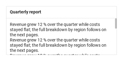
06 showScrollBar
A card follows its content height by default.
Qt capture · image
Default execution
QML code
import QtQuick
import Syidax.Core

Item {
    implicitWidth: Math.max(360, childrenRect.width)
    implicitHeight: childrenRect.height

    SyCard {
        width: 360; height: 160; cardTitle: "Quarterly report"
        Column {
            width: parent.width
            Repeater { model: 8; Text { text: "Revenue grew 12 % over the quarter while costs stayed flat; the full breakdown by region follows on the next pages."; width: parent.width; wrapMode: Text.WordWrap; font.family: Theme.fontFamily; font.pixelSize: 14; color: Theme.card.bodyTextEnabled } }
        }
    }
}
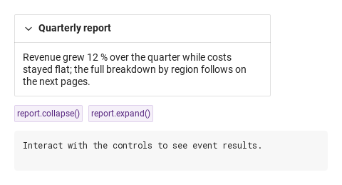
07 toggled
toggled(active) is the card's only custom signal.
Qt capture · image
QML code
import QtQuick
import Syidax.Core

Item {
    component EventLog: Rectangle {
        id: logBox
        property var lines: []
        implicitWidth: 440
        implicitHeight: Math.max(56, logText.implicitHeight + 24)
        radius: 4; color: Theme.semantic.backgroundBold
        function log(value) { lines = lines.slice(-3).concat([String(value)]) }
        Text {
            id: logText; x: 12; y: 12; width: parent.width - 24
            text: logBox.lines.length ? logBox.lines.join("\n") : "Interact with the controls to see event results."
            wrapMode: Text.Wrap; color: Theme.semantic.textDefault
            font.family: Theme.monoFontFamily; font.pixelSize: 12
        }
    }

    implicitWidth: Math.max(360, childrenRect.width)
    implicitHeight: childrenRect.height

    Column {
        spacing: 12
        SyCard {
            id: report
            width: 360; cardTitle: "Quarterly report"; collapsible: true
            onToggled: (active) => output.log(("toggled: active = %1").arg(active))
            Text { width: parent.width; wrapMode: Text.WordWrap; text: "Revenue grew 12 % over the quarter while costs stayed flat; the full breakdown by region follows on the next pages."; font.family: Theme.fontFamily; font.pixelSize: 14; color: Theme.card.bodyTextEnabled }
        }
        Row {
            spacing: 8
            SyButton { id: exampleControl1;  text: "report.collapse()"; variant: "secondary"; size: "small"; onClicked: report.collapse() }
            SyButton { id: exampleControl2;  text: "report.expand()"; variant: "secondary"; size: "small"; onClicked: report.expand() }
        }
        EventLog { id: output }
    }
}
08 toggle · expand · collapse
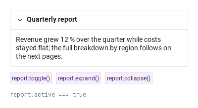
- toggle() — flips active, but only when collapsible is on; otherwise it does nothing (the chevron is not there, so neither is the user action it mirrors).
Qt capture · image
QML code
import QtQuick
import Syidax.Core

Item {
    implicitWidth: Math.max(360, childrenRect.width)
    implicitHeight: childrenRect.height
    // Focused Gallery routes: keep only the selected API and its prerequisites.
    id: featureStory

    Column {
        spacing: 12
        SyCard {
            id: report
            width: 360; cardTitle: "Quarterly report"; collapsible: true; closeDelay: 300
            Text { width: parent.width; wrapMode: Text.WordWrap; text: "Revenue grew 12 % over the quarter while costs stayed flat; the full breakdown by region follows on the next pages."; font.family: Theme.fontFamily; font.pixelSize: 14; color: Theme.card.bodyTextEnabled }
        }
        Row {
            spacing: 8
            SyButton { id: exampleControl1;  visible: true; text: "report.toggle()"; variant: "secondary"; size: "small"; onClicked: report.toggle() }
            SyButton { id: exampleControl2;  visible: true; text: "report.expand()"; variant: "secondary"; size: "small"; onClicked: report.expand() }
            SyButton { id: exampleControl3;  visible: true; text: "report.collapse()"; variant: "secondary"; size: "small"; onClicked: report.collapse() }
        }
        Text {
            text: "report.active === " + report.active
            font.family: Theme.monoFontFamily
            font.pixelSize: 12
            color: Theme.semantic.textSubtle
        }
    }
}
API 52
Hover or select an item for its QML example and copy button.
Properties
Property
Type
Default
Description
—
—
The body items (padded 12 px).
list (alias)
—
Items above the header; drawn when showCover is on.
list (alias)
—
Items replacing the title row.
list (alias)
—
Items at the right end of the header.
list (alias)
—
Items in the footer; drawn when showFooter is on.
string
""
The bold title (hidden when header has items).
bool
false
The chevron; also required by toggle().
bool
true
Expanded (true) or folded (false). Assigning it does not emit toggled.
bool
automatic
Cover content is shown automatically. Set false to temporarily hide it.
bool
true
Draws the footer items.
bool
false
Either one lifts the card with a shadow (lifted).
bool
false
Either one lifts the card with a shadow (lifted).
bool
true
A fixed-height card scrolls overflowing body content by default. Set false to clip instead.
bool
automatic
An assigned icon appears automatically; showIcon: false hides it.
url
—
An assigned icon appears automatically; showIcon: false hides it.
int
0
Milliseconds before an expand / a collapse requested by the chevron or the methods takes effect.
int
0
Milliseconds before an expand / a collapse requested by the chevron or the methods takes effect.
bool (read-only)
—
Whether each part is drawn.
bool (read-only)
—
Whether each part is drawn.
bool (read-only)
—
Whether each part is drawn.
bool (read-only)
—
backdrop || showBackdrop.
real (read-only)
—
The body's natural height (0 when folded)
real (read-only)
—
cover + header + footer.
Methods
Method
Description
Flips active (through the delay); ignored unless collapsible.
Set active to true / false (through openDelay / closeDelay); work without collapsible.
Set active to true / false (through openDelay / closeDelay); work without collapsible.
Signals
Signal
Arguments
When
active: bool
The chevron, toggle(), expand() or collapse() changed active (after the delay). Not on a direct assignment, not when the state was already the requested one.
—
The property's own signal — every change, including assignments.
Behavior
Item
Behavior / conditions
Cover content is shown automatically. Set false to temporarily hide it.
Inside a 1 px frame with 2 px corners, a Column stacks: the cover (when showCover and cover items exist), the header row (when there is a title, showIcon, header items, action items or collapsible), the body, and the footer (when showFooter and footer items exist). Left to right: the chevron (collapsible), then either the title row — an icon (showIcon with icon, 14 px) and the bold 14 px cardTitle, elided — or the header items when there are any, then the headerActions items at the right end.
The chevron; also required by toggle().
Draws the footer items.
Left to right: the chevron (collapsible), then either the title row — an icon (showIcon with icon, 14 px) and the bold 14 px cardTitle, elided — or the header items when there are any, then the headerActions items at the right end.
The bold title (hidden when header has items).
Items replacing the title row.
Items at the right end of the header.
The default property; items land in an inner item padded 12 px on every side, as wide as the card minus the padding — bind width: parent.width on texts and columns. The body's natural height is the height of its children plus 24 px; when active is false it is 0. With a fixed card height the body gets height − cover − header − footer and clips; showScrollBar makes it a scroll area (wheel and drag; a 6 px bar on the right) enabled only while the content is taller than the body.
Expanded (true) or folded (false). Assigning it does not emit toggled.
Flips active (through the delay); ignored unless collapsible.
toggle() is ignored without collapsible; expand() / collapse() always work.
toggle() is ignored without collapsible; expand() / collapse() always work.
Each goes through openDelay / closeDelay (ms): with a delay > 0 the change waits that long, a newer request replaces a pending one, and a zero delay applies immediately and cancels any pending change.
Each goes through openDelay / closeDelay (ms): with a delay > 0 the change waits that long, a newer request replaces a pending one, and a zero delay applies immediately and cancels any pending change.
The chevron, toggle(), expand() or collapse() changed active (after the delay). Not on a direct assignment, not when the state was already the requested one.
The property's own signal — every change, including assignments.
backdrop or showBackdrop draws three translucent layers behind the card, offset 1 – 3 px to the bottom-right — a soft shadow outside the card's bounds.
backdrop or showBackdrop draws three translucent layers behind the card, offset 1 – 3 px to the bottom-right — a soft shadow outside the card's bounds.