Run with --diagnose --json to check your Qt version, import path, fonts, runtime and license. No license token is printed.
The Gallery evaluation app is available now. Paid SDK sales and downloads are coming soon. The installation examples above preview the SDK workflow.
Tested Windows configurations
Native window and example smoke checks cover the versions below. Qt 6.8 is a source minimum, not a promise of tested support for every Qt release. Gallery uses software rendering.
Two complete application examples
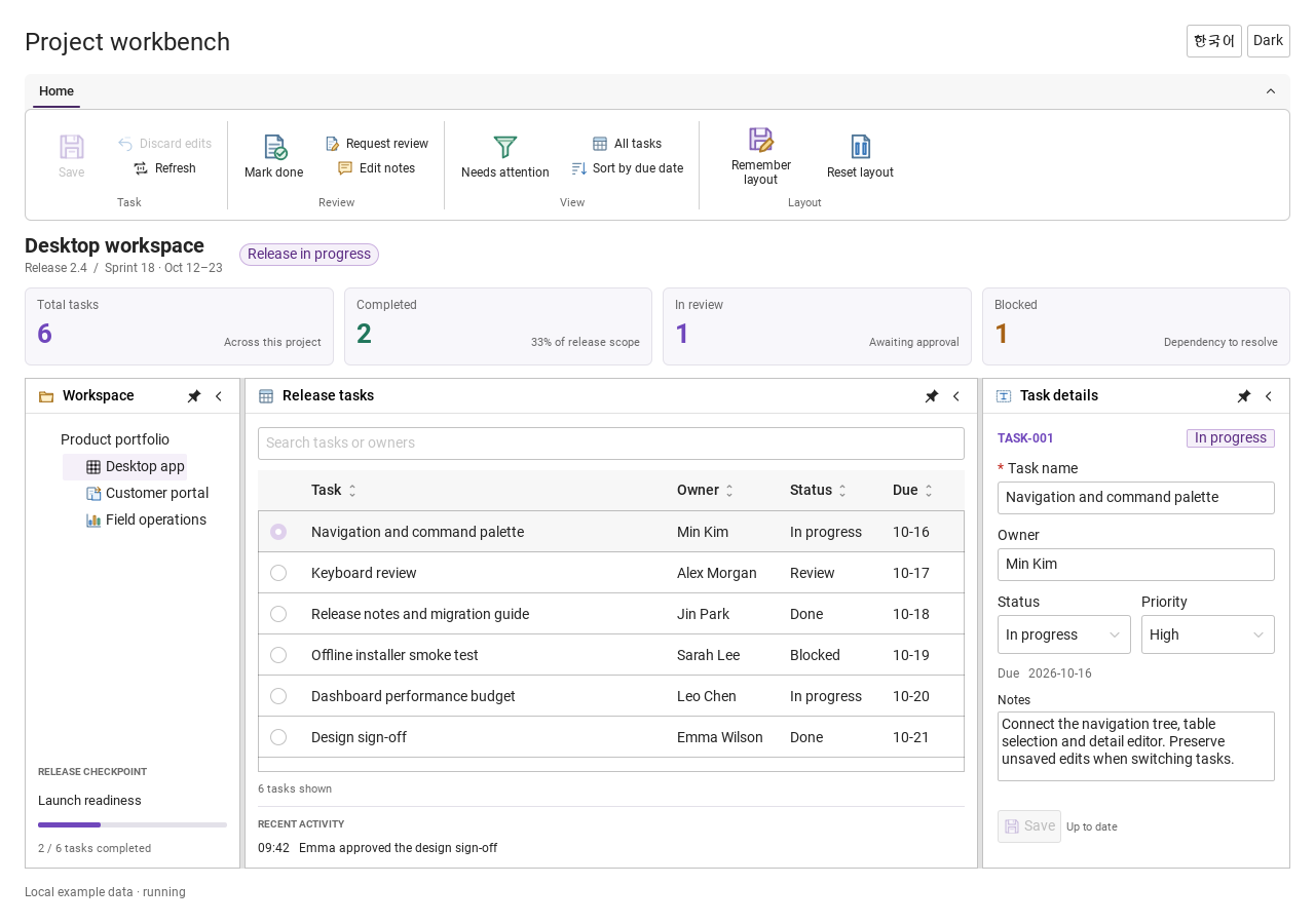
Step-by-step captures from the running Windows applications. Play, pause and inspect each state.
Workbench: mark a task done, save changes and see release progress update.Record Manager: preserve a failed save, retry, search and confirm before deleting.
See the components in context
RibbonPanelFormTableTreeTheme
TRY IT YOURSELF
The native Gallery
Browse examples, inspect properties and switch between light and dark themes in a Windows application. The Gallery is for evaluation; commercial SDK access is separate.
The --qml path must contain the Syidax folder. Python uses qml-pure. Run from the unzipped SDK, independently of the source repository.
License is inactive or frozen
Download your QML Core certificate and pass it with --license. Web Core, Chart and Grid certificates do not activate QML. Monthly use ends at expiry. Annual licenses retain only releases covered by their update period.
Qt or plugin mismatch
Check the Qt version and architecture used to build plugins. Do not mix Python Qt bindings. qml-pure removes the compiled plugin ABI dependency.
PDF or icons missing
PDF requires the optional QtQuick.Pdf module. Other Core components remain usable without it. For icon packs and resource paths, read SDK docs/ICON-PACKS.md.
Save failure or corrupt settings
Examples write only to their application-data folder. Check permissions and disk space. Invalid JSON is backed up before reset. A failed save preserves your draft.
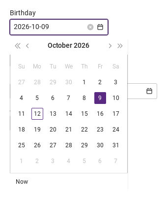
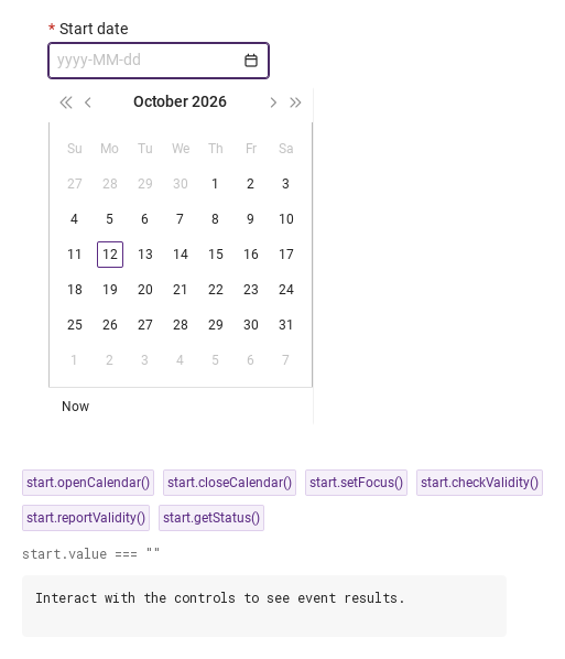
changed(detail) carries the text whenever it is applied: a calendar pick, a typed date committed with Enter or by leaving the box, or a clear (the × or an emptied box, value: "").
Hover or select an item for its QML example and copy button.
Properties · SyDatepicker
Property
Type
Default
Description
string
"date"
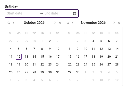
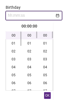
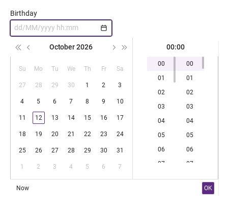
date · datetime · range · time — the surface and the shape of the value.
string
"day"
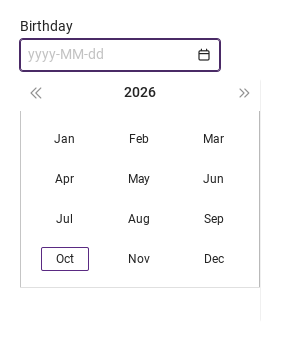
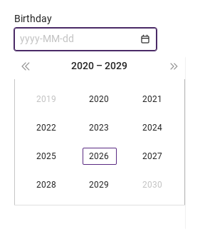
day · month · year — the unit the user picks in the calendar.
string
"yyyy-MM-dd hh:mm:ss"
Display and parse format: yyyyyyMMddhhmmss. date drops the time part, time keeps only it.
string
""
The initial date, read once at creation (when year is set; hour for the time variant).
string
""
The initial date, read once at creation (when year is set; hour for the time variant).
string
""
The initial date, read once at creation (when year is set; hour for the time variant).
string
""
The initial date, read once at creation (when year is set; hour for the time variant).
string
""
The initial date, read once at creation (when year is set; hour for the time variant).
string
""
The initial date, read once at creation (when year is set; hour for the time variant).
object
null
{ year, month, day, hour, minute, second } of the selection (single variants). Read it; set it with applyDate().
object
null
{ year, month, day } of the range ends. Set them with applyRange().
object
null
{ year, month, day } of the range ends. Set them with applyRange().
string or [start, end] (read-only binding)
—
The displayed text in format; what the form submits.
string
""
The texts of the boxes (endText only for the range).
string
""
The texts of the boxes (endText only for the range).
string
"start"
Which range box is being edited: start · end; the mode in the range's changed.
string
""
Replaces the format-derived placeholder (not used by the range boxes).
string
"Su,Mo,Tu,We,Th,Fr,Sa"
Seven comma-separated day names, Sunday first.
bool
false
The week starts on Monday.
bool
false
Five columns, no Saturday / Sunday.
bool
false
Readable, no typing, no calendar; always valid.
bool (read-only)
—
The calendar popup is open.
bool (read-only)
—
variant === "range".
bool (read-only)
—
A box has focus or the calendar is open
bool (read-only)
—
the pointer is over the box.
string (read-only)
—
The placeholder actually shown.
string
""
The frame's title, form key, helper text and custom error copy.
string
""
The frame's title, form key, helper text and custom error copy.
string
""
The frame's title, form key, helper text and custom error copy.
string
""
The frame's title, form key, helper text and custom error copy.
string
"medium"
small · medium · large — box height 24 / 32 / 40 px.
bool
false
Disabled tones and no interaction
bool
false
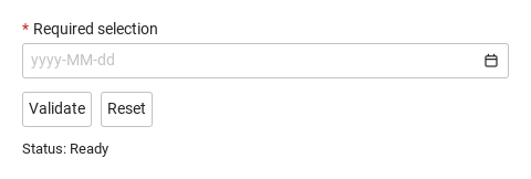
a missing date is valueMissing.
read-only
—
Validity: "" · valueMissing · custom; invalid once touched or reported.
read-only
—
Validity: "" · valueMissing · custom; invalid once touched or reported.
read-only
—
Validity: "" · valueMissing · custom; invalid once touched or reported.
real
200 (300 for the range)
The width when the app sets none.
Properties · SyCalendar (the shell the field opens; inline-capable)
Property
Type
Default
Description
string
"date"
Which surface to load: date · datetime · range · time.
string
"day"
day · month · year — the unit to pick (passed to the surface).
string
"yyyy-MM-dd hh:mm:ss"
Only its time part matters here: which time columns show.
object
null
The selection to show for date · datetime · time.
object
null
The range to show.
object
null
The range to show.
string
"Su,Mo,…"
The grid, passed to the surface.
bool
false
The grid, passed to the surface.
bool
false
The grid, passed to the surface.
Properties · SyDateCalendar (one month grid with its header)
Property
Type
Default
Description
object
null
The selected date (highlighted); its time parts are copied into selected.
string
"day"
What the grid shows now: day · month · year · decade; the title click goes up, picks go down.
string
"day"
The finest unit the user picks: day · month · year. A pick at that level emits selected.
int
today
The month on screen.
int
today
The month on screen.
string
""
"start" / "end" turn on range drawing (shading, entered); empty = single.
object
null
The range and the day under the pointer, for the shading.
object
null
The range and the day under the pointer, for the shading.
object
null
The range and the day under the pointer, for the shading.
string
"Su,Mo,…"
Day names (Sunday first), Monday start, five columns.
bool
false
Day names (Sunday first), Monday start, five columns.
bool
false
Day names (Sunday first), Monday start, five columns.
bool
true
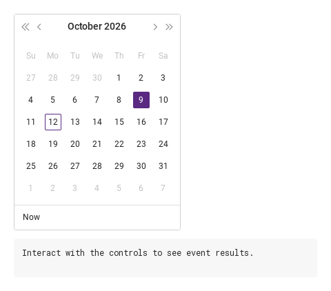
The footer with the Now button (day mode, single).
read-only
—
Today's parts, the header text, the 42 cells on screen, the weekday order, the column count, 32.
read-only
—
Today's parts, the header text, the 42 cells on screen, the weekday order, the column count, 32.
read-only
—
Today's parts, the header text, the 42 cells on screen, the weekday order, the column count, 32.
read-only
—
Today's parts, the header text, the 42 cells on screen, the weekday order, the column count, 32.
read-only
—
Today's parts, the header text, the 42 cells on screen, the weekday order, the column count, 32.
read-only
—
Today's parts, the header text, the 42 cells on screen, the weekday order, the column count, 32.
Properties · SyDateTimeCalendar (grid + time columns + OK)
Property
Type
Default
Description
object
null
The selection; setting it moves the grid and the time columns.
string
"day"
As on SyDateCalendar.
string
"day"
As on SyDateCalendar.
string
"yyyy-MM-dd hh:mm:ss"
Its part after the space names the time columns.
string
"Su,Mo,…"
The grid.
bool
false
The grid.
bool
false
The grid.
object
datetime
The date part picked so far (the time comes from the columns).
Properties · SyRangeCalendar (two month grids for a start and an end)
Property
Type
Default
Description
object
null
The range: { year, month, day } or null.
object
null
The range: { year, month, day } or null.
string
"start"
Which end the next click sets: start · end (alternates after each pick).
string
"day"
The grids' mode.
string
"Su,Mo,…"
The grids.
bool
false
The grids.
bool
false
The grids.
object
null
The day under the pointer while the end is still missing.
int
the start's month, else today
The left grid's month; the right grid shows the following month (rightMonth).
int
the start's month, else today
The left grid's month; the right grid shows the following month (rightMonth).
Properties · SyTimepicker (the time columns)
Property
Type
Default
Description
int
0
The time; each pick writes one of them.
int
0
The time; each pick writes one of them.
int
0
The time; each pick writes one of them.
string
"hh:mm:ss"
Which columns show: the hh · mm · ss tokens.
string
":"
Between the parts in the header text.
bool
false
No OK button (a parent confirms instead).
read-only
—
The header text and which columns exist.
read-only
—
The header text and which columns exist.
read-only
—
The header text and which columns exist.
read-only
—
The header text and which columns exist.
read-only
—
The header text and which columns exist.
Methods · SyDatepicker
Method
Description
Opens the calendar popup. Ignored while disabled, readonly or already open.
Closes it.
Focuses the start box (which opens the calendar)
removes focus from both boxes and closes the calendar.
Helper: sets datetime and the text from { year, month, day, hour, minute, second } without emitting changed.
Helper: sets both range ends ({ year, month, day } or null) and their texts without emitting changed.
Clears the date (both ends in the range), marks the field touched and emits changed with "" — what the clear × does.
Whether the status is "", silently
the same and reveals the error line.
"", "valueMissing" or "custom".
Forces the custom status
clears it.
Clears the date (emits changed) and the touched / submitted / custom flags.
Methods
Item
Behavior / conditions
previous() / next() (a month in day mode, a year / decade / century above), previousFar() / nextFar() (a year in day mode), goMonths(delta), goYears(delta), showMonth(year, month), setMode(m), up() (one level up), pickDay(cell), pickMonth(month), pickYear(year), pickDecade(start), pickToday().
previous() / next() (a month in day mode, a year / decade / century above), previousFar() / nextFar() (a year in day mode), goMonths(delta), goYears(delta), showMonth(year, month), setMode(m), up() (one level up), pickDay(cell), pickMonth(month), pickYear(year), pickDecade(start), pickToday().
previous() / next() (a month in day mode, a year / decade / century above), previousFar() / nextFar() (a year in day mode), goMonths(delta), goYears(delta), showMonth(year, month), setMode(m), up() (one level up), pickDay(cell), pickMonth(month), pickYear(year), pickDecade(start), pickToday().
previous() / next() (a month in day mode, a year / decade / century above), previousFar() / nextFar() (a year in day mode), goMonths(delta), goYears(delta), showMonth(year, month), setMode(m), up() (one level up), pickDay(cell), pickMonth(month), pickYear(year), pickDecade(start), pickToday().
previous() / next() (a month in day mode, a year / decade / century above), previousFar() / nextFar() (a year in day mode), goMonths(delta), goYears(delta), showMonth(year, month), setMode(m), up() (one level up), pickDay(cell), pickMonth(month), pickYear(year), pickDecade(start), pickToday().
previous() / next() (a month in day mode, a year / decade / century above), previousFar() / nextFar() (a year in day mode), goMonths(delta), goYears(delta), showMonth(year, month), setMode(m), up() (one level up), pickDay(cell), pickMonth(month), pickYear(year), pickDecade(start), pickToday().
previous() / next() (a month in day mode, a year / decade / century above), previousFar() / nextFar() (a year in day mode), goMonths(delta), goYears(delta), showMonth(year, month), setMode(m), up() (one level up), pickDay(cell), pickMonth(month), pickYear(year), pickDecade(start), pickToday().
previous() / next() (a month in day mode, a year / decade / century above), previousFar() / nextFar() (a year in day mode), goMonths(delta), goYears(delta), showMonth(year, month), setMode(m), up() (one level up), pickDay(cell), pickMonth(month), pickYear(year), pickDecade(start), pickToday().
previous() / next() (a month in day mode, a year / decade / century above), previousFar() / nextFar() (a year in day mode), goMonths(delta), goYears(delta), showMonth(year, month), setMode(m), up() (one level up), pickDay(cell), pickMonth(month), pickYear(year), pickDecade(start), pickToday().
previous() / next() (a month in day mode, a year / decade / century above), previousFar() / nextFar() (a year in day mode), goMonths(delta), goYears(delta), showMonth(year, month), setMode(m), up() (one level up), pickDay(cell), pickMonth(month), pickYear(year), pickDecade(start), pickToday().
previous() / next() (a month in day mode, a year / decade / century above), previousFar() / nextFar() (a year in day mode), goMonths(delta), goYears(delta), showMonth(year, month), setMode(m), up() (one level up), pickDay(cell), pickMonth(month), pickYear(year), pickDecade(start), pickToday().
previous() / next() (a month in day mode, a year / decade / century above), previousFar() / nextFar() (a year in day mode), goMonths(delta), goYears(delta), showMonth(year, month), setMode(m), up() (one level up), pickDay(cell), pickMonth(month), pickYear(year), pickDecade(start), pickToday().
previous() / next() (a month in day mode, a year / decade / century above), previousFar() / nextFar() (a year in day mode), goMonths(delta), goYears(delta), showMonth(year, month), setMode(m), up() (one level up), pickDay(cell), pickMonth(month), pickYear(year), pickDecade(start), pickToday().
previous() / next() (a month in day mode, a year / decade / century above), previousFar() / nextFar() (a year in day mode), goMonths(delta), goYears(delta), showMonth(year, month), setMode(m), up() (one level up), pickDay(cell), pickMonth(month), pickYear(year), pickDecade(start), pickToday().
current() returns the parts as they stand; confirm() emits selected with closable: true (OK).
current() returns the parts as they stand; confirm() emits selected with closable: true (OK).
pick({ year, month, day }) applies a click; entered(day) updates the hover shading.
pick({ year, month, day }) applies a click; entered(day) updates the hover shading.
pick(part, value) sets "hour" / "minute" / "second" and emits changed + selected; confirm() emits selected with closable: true; scrollToSelection() scrolls the columns to the current time.
pick(part, value) sets "hour" / "minute" / "second" and emits changed + selected; confirm() emits selected with closable: true; scrollToSelection() scrolls the columns to the current time.
pick(part, value) sets "hour" / "minute" / "second" and emits changed + selected; confirm() emits selected with closable: true; scrollToSelection() scrolls the columns to the current time.
Signals · SyDatepicker
Signal
Arguments
When
detail: { value } · range: { mode, value }
The text was applied: a calendar pick, a typed date on Enter / blur, a clear (""). mode is "start" or "end". Not for the initial date, not for rejected text.
The calendar picked (after changed). closable is true on OK in datetime / time. Range ends are { year, month, day } or null.
detail: { value, isValid, status }
A box gained / lost focus; blur commits the text and marks the field touched.
detail: { value, isValid, status }
A box gained / lost focus; blur commits the text and marks the field touched.
Signals
Item
Behavior / conditions
selected(detail) forwards the surface's detail; closed() when the surface asks to close (a day pick, OK, a complete range).
selected(detail) forwards the surface's detail; closed() when the surface asks to close (a day pick, OK, a complete range).
selected({ year, month, day, hour, minute, second }) on a pick at pickerMode level or Now; changed({ year, month }) when the month on screen changes through the arrows; entered({ year, month, day }) when a day is hovered in range mode.
selected({ year, month, day, hour, minute, second }) on a pick at pickerMode level or Now; changed({ year, month }) when the month on screen changes through the arrows; entered({ year, month, day }) when a day is hovered in range mode.
selected({ year, month, day, hour, minute, second }) on a pick at pickerMode level or Now; changed({ year, month }) when the month on screen changes through the arrows; entered({ year, month, day }) when a day is hovered in range mode.
selected({ closable, year, month, day, hour, minute, second }) on every day or time pick and Now (closable: false) and on OK (closable: true).
selected({ rangestart, rangeend }) after every pick.
changed({ hour, minute, second }) on every pick; selected({ closable, hour, minute, second }) on every pick (closable: false) and on OK (closable: true).
changed({ hour, minute, second }) on every pick; selected({ closable, hour, minute, second }) on every pick (closable: false) and on OK (closable: true).
Behavior
Item
Behavior / conditions
give it as strings: year, month, day and, for the time variants, hour, minute, second. They are read once, when the field is created, and only when year is set (the time variant: when hour is set); missing parts default to 1 for month / day and 0 for the time, the time variant takes today's date; an impossible date is ignored. datetime is { year, month, day, hour, minute, second } (numbers) or null; the range keeps rangestart and rangeend as { year, month, day } or null.
give it as strings: year, month, day and, for the time variants, hour, minute, second. They are read once, when the field is created, and only when year is set (the time variant: when hour is set); missing parts default to 1 for month / day and 0 for the time, the time variant takes today's date; an impossible date is ignored. datetime is { year, month, day, hour, minute, second } (numbers) or null; the range keeps rangestart and rangeend as { year, month, day } or null.
give it as strings: year, month, day and, for the time variants, hour, minute, second. They are read once, when the field is created, and only when year is set (the time variant: when hour is set); missing parts default to 1 for month / day and 0 for the time, the time variant takes today's date; an impossible date is ignored. datetime is { year, month, day, hour, minute, second } (numbers) or null; the range keeps rangestart and rangeend as { year, month, day } or null.
give it as strings: year, month, day and, for the time variants, hour, minute, second. They are read once, when the field is created, and only when year is set (the time variant: when hour is set); missing parts default to 1 for month / day and 0 for the time, the time variant takes today's date; an impossible date is ignored. datetime is { year, month, day, hour, minute, second } (numbers) or null; the range keeps rangestart and rangeend as { year, month, day } or null.
give it as strings: year, month, day and, for the time variants, hour, minute, second. datetime is { year, month, day, hour, minute, second } (numbers) or null; the range keeps rangestart and rangeend as { year, month, day } or null.
give it as strings: year, month, day and, for the time variants, hour, minute, second. datetime is { year, month, day, hour, minute, second } (numbers) or null; the range keeps rangestart and rangeend as { year, month, day } or null.
Helper: sets datetime and the text from { year, month, day, hour, minute, second } without emitting changed.
Helper: sets both range ends ({ year, month, day } or null) and their texts without emitting changed.
{ year, month, day, hour, minute, second } of the selection (single variants). Read it; set it with applyDate().
datetime is { year, month, day, hour, minute, second } (numbers) or null; the range keeps rangestart and rangeend as { year, month, day } or null.
datetime is { year, month, day, hour, minute, second } (numbers) or null; the range keeps rangestart and rangeend as { year, month, day } or null.
The displayed text in format; what the form submits.
value is the displayed text — startText in format, or [startText, endText] for the range — and is what SyForm.values() submits.
Display and parse format: yyyyyyMMddhhmmss. date drops the time part, time keeps only it.
value is the displayed text — startText in format, or [startText, endText] for the range — and is what SyForm.values() submits.
value is the displayed text — startText in format, or [startText, endText] for the range — and is what SyForm.values() submits.
The text was applied: a calendar pick, a typed date on Enter / blur, a clear (""). mode is "start" or "end". Not for the initial date, not for rejected text.
Opens the calendar popup. Ignored while disabled, readonly or already open.
Closes it.
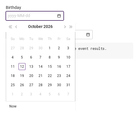
Escape, a press outside, closeCalendar(), setBlur() and the surface's own close request close it — a day pick in date, OK in datetime and time, a complete pair in range.
The selected date (highlighted); its time parts are copied into selected.
"start" / "end" turn on range drawing (shading, entered); empty = single.
The calendar popup is open.
Every pick writes the parts and the text, emits changed and then selected.
Every pick writes the parts and the text, emits changed and then selected.
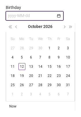
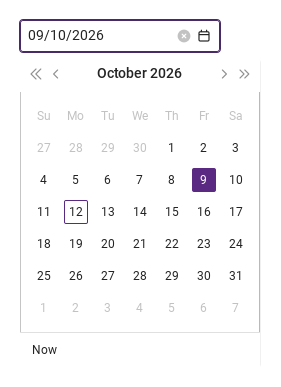
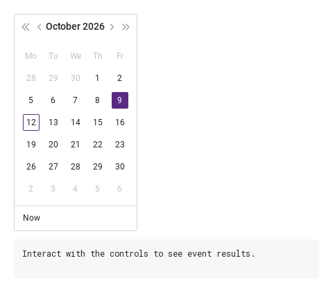
SyDateCalendar draws 7 columns (5 with hideWeekend) of 32 px cells under the day names from dateNames (seven comma-separated names starting with Sunday; mondayStart rotates them); days of the neighbouring months are dimmed and clicking one jumps to that month.
SyDateCalendar draws 7 columns (5 with hideWeekend) of 32 px cells under the day names from dateNames (seven comma-separated names starting with Sunday; mondayStart rotates them); days of the neighbouring months are dimmed and clicking one jumps to that month.
SyDateCalendar draws 7 columns (5 with hideWeekend) of 32 px cells under the day names from dateNames (seven comma-separated names starting with Sunday; mondayStart rotates them); days of the neighbouring months are dimmed and clicking one jumps to that month.
day · month · year — the unit the user picks in the calendar.
Replaces the format-derived placeholder (not used by the range boxes).
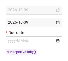
disabled: disabled tones, no focus, no typing, no calendar, no clear ×.
Readable, no typing, no calendar; always valid.
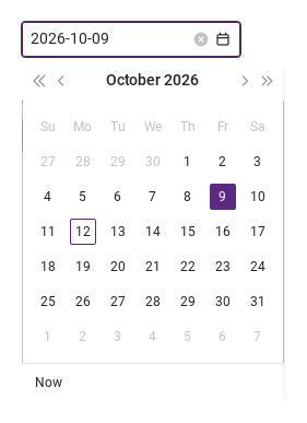
The clear × shows while there is text and the field is interactive; it empties everything (both ends in the range) and emits changed with "".
Tone precedence: disabled > readonly > invalid > focus > hover > enabled; hasFocus is true while a box has focus or the calendar is open.
required and no date (range: either end missing) → valueMissing; setCustomError() → custom; disabled or readonly → always "".
required and no date (range: either end missing) → valueMissing; setCustomError() → custom; disabled or readonly → always "".
The error line shows once a box was left (touched) or after reportValidity().
small · medium · large — box height 24 / 32 / 40 px.
The width when the app sets none.
the box is size high (24 / 32 / 40 px); the width is preferredWidth — 200, or 300 for the range — unless the app sets width.
Keyboard
Item
Behavior / conditions
Keyboard: Tab and Shift+Tab enter and leave the field. Hidden and disabled fields are skipped. Escape closes an open picker before continuing. Textarea uses Tab for focus navigation, including inside a modal; it does not insert indentation.