QML
← All components

Dropdown

Open a floating panel from a trigger to show a menu, custom controls or a small form.

import Syidax.Core.Dropdown

Supported QML types

TypeDefinition / role
Trigger and anchored popup for menu content.

Learn by example

Previews are images of native Qt runs. Use the buttons below each image to view a result.

01 Basic composition

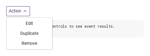
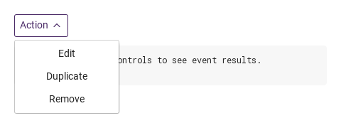
SyDropdown is a titled box with a chevron that opens whatever is declared inside it on a floating surface under (or over) the box — a SyMenu, a column of buttons, a form, anything.

Qt capture · image
Basic composition · Opened
QML code
import QtQuick
import Syidax.Core

Item {
    component EventLog: Rectangle {
        id: logBox
        property var lines: []
        implicitWidth: 440
        implicitHeight: Math.max(56, logText.implicitHeight + 24)
        radius: 4; color: Theme.semantic.backgroundBold
        function log(value) { lines = lines.slice(-3).concat([String(value)]) }
        Text {
            id: logText; x: 12; y: 12; width: parent.width - 24
            text: logBox.lines.length ? logBox.lines.join("\n") : "Interact with the controls to see event results."
            wrapMode: Text.Wrap; color: Theme.semantic.textDefault
            font.family: Theme.monoFontFamily; font.pixelSize: 12
        }
    }

    implicitWidth: Math.max(360, childrenRect.width)
    implicitHeight: childrenRect.height

    property QtObject settings: QtObject {
        id: storyArgs
        property string title: "Action"
        property string size: "medium"
        property bool borderless: false
        property bool disabled: false
        property string position: "bottomLeft"
        property string trigger: "click"
        property string tooltip: ""
    }


    Column {
        spacing: 12
        SyDropdown {
            id: actions
            title: storyArgs.title
            size: storyArgs.size
            borderless: storyArgs.borderless
            disabled: storyArgs.disabled
            position: storyArgs.position
            trigger: storyArgs.trigger
            tooltip: storyArgs.tooltip
            onSelected: (detail) => output.log(detail)
            Column {
                SyButton { id: exampleControl1;  text: "Edit"; variant: "borderless"; width: 140; onClicked: actions.select("edit") }
                SyButton { id: exampleControl2;  text: "Duplicate"; variant: "borderless"; width: 140; onClicked: actions.select("duplicate") }
                SyButton { id: exampleControl3;  text: "Remove"; variant: "borderless"; width: 140; onClicked: actions.select("remove") }
            }
        }
        EventLog { id: output }
    }

}

02 size · borderless

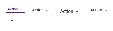
Compare the configuration and result of size · borderless.

Qt capture · image
size · borderless · Opened
QML code
import QtQuick
import Syidax.Core

Item {
    implicitWidth: Math.max(360, childrenRect.width)
    implicitHeight: childrenRect.height
    // Focused Gallery routes: keep only the selected API and its prerequisites.
    id: featureStory

    Row {
        spacing: 16
        SyDropdown { id: featureTarget0; visible: true; title: "Action"; size: "small"; SyButton { text: "…"; variant: "borderless" } }
        SyDropdown { title: "Action"; SyButton { text: "…"; variant: "borderless" } }
        SyDropdown { id: featureTarget1; visible: true; title: "Action"; size: "large"; SyButton { text: "…"; variant: "borderless" } }
        SyDropdown { id: featureTarget2; visible: true; title: "Action"; borderless: true; SyButton { text: "…"; variant: "borderless" } }
    }
}

03 position · trigger

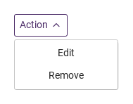
position places the surface relative to the box: "bottomLeft" (the default) and "bottomRight" under it, aligned to the box's left or right edge; "topLeft" and "topRight" over it.

Qt capture · image
position · trigger · Opened
QML code
import QtQuick
import Syidax.Core

Item {
    implicitWidth: Math.max(360, childrenRect.width)
    implicitHeight: childrenRect.height
    // Focused Gallery routes: keep only the selected API and its prerequisites.
    id: featureStory

    property QtObject settings: QtObject {
        id: storyArgs
        property string position: "bottomLeft"
        property string trigger: "click"
    }


    Item {
        width: 360
        height: 160
        SyDropdown { id: featureTarget0;
            anchors.centerIn: parent
            title: "Action"; position: storyArgs.position; trigger: storyArgs.trigger
            Column {
                SyButton { text: "Edit"; variant: "borderless"; width: 140 }
                SyButton { text: "Remove"; variant: "borderless"; width: 140 }
            }
        }
    }
}

04 selected

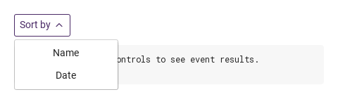
SyDropdown has one signal, selected(detail).

Qt capture · image
selected · Opened
QML code
import QtQuick
import Syidax.Core

Item {
    component EventLog: Rectangle {
        id: logBox
        property var lines: []
        implicitWidth: 440
        implicitHeight: Math.max(56, logText.implicitHeight + 24)
        radius: 4; color: Theme.semantic.backgroundBold
        function log(value) { lines = lines.slice(-3).concat([String(value)]) }
        Text {
            id: logText; x: 12; y: 12; width: parent.width - 24
            text: logBox.lines.length ? logBox.lines.join("\n") : "Interact with the controls to see event results."
            wrapMode: Text.Wrap; color: Theme.semantic.textDefault
            font.family: Theme.monoFontFamily; font.pixelSize: 12
        }
    }

    implicitWidth: Math.max(360, childrenRect.width)
    implicitHeight: childrenRect.height


    Column {
        spacing: 12
        SyDropdown {
            id: sort
            title: "Sort by"
            onSelected: (detail) => output.log(("selected: %1").arg(detail))
            Column {
                SyButton { id: exampleControl1;  text: "Name"; variant: "borderless"; width: 140; onClicked: sort.select("name") }
                SyButton { id: exampleControl2;  text: "Date"; variant: "borderless"; width: 140; onClicked: sort.select("date") }
            }
        }
        EventLog { id: output }
    }
}

05 open · close · select

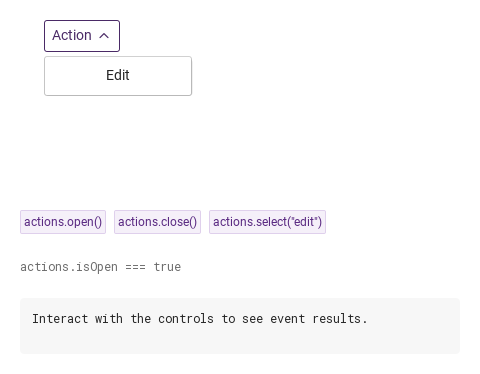
open() shows the surface regardless of trigger; it is refused while the dropdown is disabled.

Qt capture · image
open · close · select · Opened
QML code
import QtQuick
import Syidax.Core

Item {
    component EventLog: Rectangle {
        id: logBox
        property var lines: []
        implicitWidth: 440
        implicitHeight: Math.max(56, logText.implicitHeight + 24)
        radius: 4; color: Theme.semantic.backgroundBold
        function log(value) { lines = lines.slice(-3).concat([String(value)]) }
        Text {
            id: logText; x: 12; y: 12; width: parent.width - 24
            text: logBox.lines.length ? logBox.lines.join("\n") : "Interact with the controls to see event results."
            wrapMode: Text.Wrap; color: Theme.semantic.textDefault
            font.family: Theme.monoFontFamily; font.pixelSize: 12
        }
    }

    implicitWidth: Math.max(360, childrenRect.width)
    implicitHeight: childrenRect.height
    // Focused Gallery routes: keep only the selected API and its prerequisites.
    id: featureStory

    Column {
        spacing: 24
        Item {
            width: 560; height: 190
            SyDropdown {
                x: 24; y: 24
 id: actions; title: "Action"; onSelected: (detail) => output.log(detail); SyButton { visible: true; text: "Edit"; variant: "borderless"; width: 140; onClicked: actions.select("edit") } }
        }
        Row {
            objectName: "exampleCommands"

            spacing: 8
            SyButton { id: exampleControl1;  visible: true; text: "actions.open()"; variant: "secondary"; size: "small"; onClicked: actions.open() }
            SyButton { id: exampleControl2;  visible: true; text: "actions.close()"; variant: "secondary"; size: "small"; onClicked: actions.close() }
            SyButton { id: exampleControl3;  visible: true; text: "actions.select(\"edit\")"; variant: "secondary"; size: "small"; onClicked: actions.select("edit") }
        }
        Text {
            text: "actions.isOpen === " + actions.isOpen
            font.family: Theme.monoFontFamily
            font.pixelSize: 12
            color: Theme.semantic.textSubtle
        }
        EventLog { id: output }
    }
}

06 Compact actions

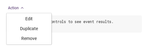
Compact actions, configured with size, borderless.

Qt capture · image
Compact actions · Opened
QML code
import QtQuick
import Syidax.Core

Item {
    component EventLog: Rectangle {
        id: logBox
        property var lines: []
        implicitWidth: 440
        implicitHeight: Math.max(56, logText.implicitHeight + 24)
        radius: 4; color: Theme.semantic.backgroundBold
        function log(value) { lines = lines.slice(-3).concat([String(value)]) }
        Text {
            id: logText; x: 12; y: 12; width: parent.width - 24
            text: logBox.lines.length ? logBox.lines.join("\n") : "Interact with the controls to see event results."
            wrapMode: Text.Wrap; color: Theme.semantic.textDefault
            font.family: Theme.monoFontFamily; font.pixelSize: 12
        }
    }

    implicitWidth: Math.max(360, childrenRect.width)
    implicitHeight: childrenRect.height

    property QtObject settings: QtObject {
        id: storyArgs
        property string title: "Action"
        property string size: "small"
        property bool borderless: true
        property bool disabled: false
        property string position: "bottomLeft"
        property string trigger: "click"
        property string tooltip: ""
    }


    Column {
        spacing: 12
        SyDropdown {
            id: actions
            title: storyArgs.title
            size: storyArgs.size
            borderless: storyArgs.borderless
            disabled: storyArgs.disabled
            position: storyArgs.position
            trigger: storyArgs.trigger
            tooltip: storyArgs.tooltip
            onSelected: (detail) => output.log(detail)
            Column {
                SyButton { text: "Edit"; variant: "borderless"; width: 140; onClicked: actions.select("edit") }
                SyButton { text: "Duplicate"; variant: "borderless"; width: 140; onClicked: actions.select("duplicate") }
                SyButton { text: "Remove"; variant: "borderless"; width: 140; onClicked: actions.select("remove") }
            }
        }
        EventLog { id: output }
    }

}

07 Hover trigger

Hover trigger, configured with trigger.

Qt capture · image
Hover trigger · Opened
QML code
import QtQuick
import Syidax.Core

Item {
    component EventLog: Rectangle {
        id: logBox
        property var lines: []
        implicitWidth: 440
        implicitHeight: Math.max(56, logText.implicitHeight + 24)
        radius: 4; color: Theme.semantic.backgroundBold
        function log(value) { lines = lines.slice(-3).concat([String(value)]) }
        Text {
            id: logText; x: 12; y: 12; width: parent.width - 24
            text: logBox.lines.length ? logBox.lines.join("\n") : "Interact with the controls to see event results."
            wrapMode: Text.Wrap; color: Theme.semantic.textDefault
            font.family: Theme.monoFontFamily; font.pixelSize: 12
        }
    }

    implicitWidth: Math.max(360, childrenRect.width)
    implicitHeight: childrenRect.height

    property QtObject settings: QtObject {
        id: storyArgs
        property string title: "Action"
        property string size: "medium"
        property bool borderless: false
        property bool disabled: false
        property string position: "bottomLeft"
        property string trigger: "hover"
        property string tooltip: ""
    }


    Column {
        spacing: 12
        SyDropdown {
            id: actions
            title: storyArgs.title
            size: storyArgs.size
            borderless: storyArgs.borderless
            disabled: storyArgs.disabled
            position: storyArgs.position
            trigger: storyArgs.trigger
            tooltip: storyArgs.tooltip
            onSelected: (detail) => output.log(detail)
            Column {
                SyButton { text: "Edit"; variant: "borderless"; width: 140; onClicked: actions.select("edit") }
                SyButton { text: "Duplicate"; variant: "borderless"; width: 140; onClicked: actions.select("duplicate") }
                SyButton { text: "Remove"; variant: "borderless"; width: 140; onClicked: actions.select("remove") }
            }
        }
        EventLog { id: output }
    }

}

08 Unavailable actions

Unavailable actions, configured with disabled.

Qt capture · image
Unavailable actions · Result
Default execution
QML code
import QtQuick
import Syidax.Core

Item {
    component EventLog: Rectangle {
        id: logBox
        property var lines: []
        implicitWidth: 440
        implicitHeight: Math.max(56, logText.implicitHeight + 24)
        radius: 4; color: Theme.semantic.backgroundBold
        function log(value) { lines = lines.slice(-3).concat([String(value)]) }
        Text {
            id: logText; x: 12; y: 12; width: parent.width - 24
            text: logBox.lines.length ? logBox.lines.join("\n") : "Interact with the controls to see event results."
            wrapMode: Text.Wrap; color: Theme.semantic.textDefault
            font.family: Theme.monoFontFamily; font.pixelSize: 12
        }
    }

    implicitWidth: Math.max(360, childrenRect.width)
    implicitHeight: childrenRect.height

    property QtObject settings: QtObject {
        id: storyArgs
        property string title: "Action"
        property string size: "medium"
        property bool borderless: false
        property bool disabled: true
        property string position: "bottomLeft"
        property string trigger: "click"
        property string tooltip: ""
    }


    Column {
        spacing: 12
        SyDropdown {
            id: actions
            title: storyArgs.title
            size: storyArgs.size
            borderless: storyArgs.borderless
            disabled: storyArgs.disabled
            position: storyArgs.position
            trigger: storyArgs.trigger
            tooltip: storyArgs.tooltip
            onSelected: (detail) => output.log(detail)
            Column {
                SyButton { text: "Edit"; variant: "borderless"; width: 140; onClicked: actions.select("edit") }
                SyButton { text: "Duplicate"; variant: "borderless"; width: 140; onClicked: actions.select("duplicate") }
                SyButton { text: "Remove"; variant: "borderless"; width: 140; onClicked: actions.select("remove") }
            }
        }
        EventLog { id: output }
    }

}

API 29

Hover or select an item for its QML example and copy button.

Properties

PropertyTypeDefaultDescription
list (default property)—What the surface shows (re-parented into it)
string""The box text; hidden when empty
string"medium"small 24 px · medium 32 px · large 40 px
boolfalseNo background or border until the box has focus
boolfalseGreyed; never opens — clicks, hover, keys and open() ignored
string""Text shown after hovering the box for 500 ms
string"bottomLeft"bottomLeft · bottomRight · topLeft · topRight; flips when there is no room
string"click"click (toggle; closes on Escape or a press outside) · hover (closes 100 ms after the pointer leaves)
bool (read-only)—The surface is showing
bool (read-only)—The box has keyboard focus
bool (read-only)—the pointer is over the box

Methods

MethodDescription
Emits selected(detail) and closes the surface; works while closed too
Shows the surface whatever the trigger; refused while disabled
Hides the surface

Signals

SignalArgumentsWhen
detail (anything)select(detail) was called — by a SyMenu pick inside ({ value, label }) or by your own item; the surface closes right after. Not on open or close

Behavior

ItemBehavior / conditions
The box text; hidden when empty
small 24 px · medium 32 px · large 40 px
Greyed; never opens — clicks, hover, keys and open() ignored
No background or border until the box has focus
Text shown after hovering the box for 500 ms
click (toggle; closes on Escape or a press outside) · hover (closes 100 ms after the pointer leaves)
Shows the surface whatever the trigger; refused while disabled
bottomLeft · bottomRight · topLeft · topRight; flips when there is no room
It has 4 px of padding, is at least as wide as the box and otherwise takes the size of its content; the content is re-parented into it, so parent inside is the surface's content item, not the dropdown — give your items explicit sizes.
Emits selected(detail) and closes the surface; works while closed too
select(detail) was called — by a SyMenu pick inside ({ value, label }) or by your own item; the surface closes right after. Not on open or close
The surface is showing
The box is in the Tab order unless disabled; Space / Enter toggle, Down opens, Escape closes. Keys inside the content belong to the content.

Keyboard

ItemBehavior / conditions
SyMenu is the usual content; SySelect when the box must display the chosen value; SyPopover for a non-interactive surface from any item.