Run with --diagnose --json to check your Qt version, import path, fonts, runtime and license. No license token is printed.
The Gallery evaluation app is available now. Paid SDK sales and downloads are coming soon. The installation examples above preview the SDK workflow.
Tested Windows configurations
Native window and example smoke checks cover the versions below. Qt 6.8 is a source minimum, not a promise of tested support for every Qt release. Gallery uses software rendering.
Two complete application examples
Step-by-step captures from the running Windows applications. Play, pause and inspect each state.
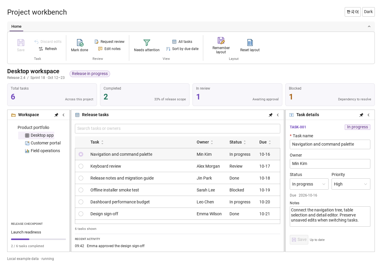
Workbench: mark a task done, save changes and see release progress update.Record Manager: preserve a failed save, retry, search and confirm before deleting.
See the components in context
RibbonPanelFormTableTreeTheme
TRY IT YOURSELF
The native Gallery
Browse examples, inspect properties and switch between light and dark themes in a Windows application. The Gallery is for evaluation; commercial SDK access is separate.
The --qml path must contain the Syidax folder. Python uses qml-pure. Run from the unzipped SDK, independently of the source repository.
License is inactive or frozen
Download your QML Core certificate and pass it with --license. Web Core, Chart and Grid certificates do not activate QML. Monthly use ends at expiry. Annual licenses retain only releases covered by their update period.
Qt or plugin mismatch
Check the Qt version and architecture used to build plugins. Do not mix Python Qt bindings. qml-pure removes the compiled plugin ABI dependency.
PDF or icons missing
PDF requires the optional QtQuick.Pdf module. Other Core components remain usable without it. For icon packs and resource paths, read SDK docs/ICON-PACKS.md.
Save failure or corrupt settings
Examples write only to their application-data folder. Check permissions and disk space. Invalid JSON is backed up before reset. A failed save preserves your draft.
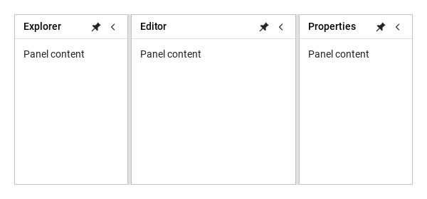
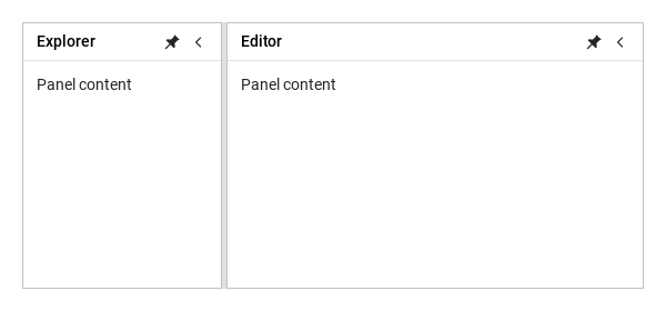
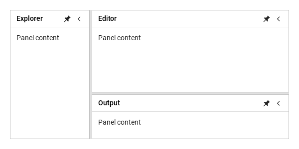
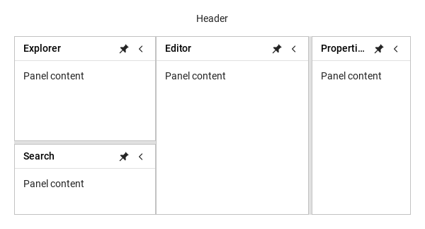
Panels fill the regions a SyLayout gives them: the sider holds a vertical group (explorer over a 100 px search panel), the content a horizontal group (editor beside a 140 px properties panel).
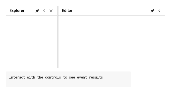
Click, keyboard or hover opens a flyout; pin docks it
One expand button (24 × 24 px)
Expand preserves the pin mode; unpinned expansion opens the flyout
State and controls
Item
Behavior / conditions
Edge used by the collapsed button or unpinned strip: left, right, top or bottom. Orientation still controls sibling layout.
left; direction exposes that resolved value.
Sibling panel layout: horizontal or vertical. Compare the splitter direction and resulting sizes.
remaining panels share the main axis. A collapsed member reserves one button's thickness in that
band and draws only its button. Multiple bands are allocated in declaration order. A standalone
panel reports a reduced implicit size; an explicitly sized host retains ownership of its outer box.
Shows or hides the pin button without changing pinned.
Shows or hides the collapse button without changing collapsed.
Shows or hides the close control. closable must also allow closing.
Shows or removes the splitter handle and its hit area. Independent from resizable.
Allows the user to change pin state. false leaves the pin control visible but disabled.
Allows the user to collapse/expand. false leaves the collapse control visible but disabled.
Allows dragging or keyboard resizing of visible splitters. false keeps a visible handle locked.
Enables the panel close action. Close the panel, then use the sample restore action to test again.
Shows the normal header. Auto-hide title strips and collapsed restore buttons remain available.
true docks the panel. false leaves a title strip; click it to open the flyout and pin it again to dock. collapsed remains independent.
Hides the panel body and leaves an expand button. Expanding preserves the current pin mode.
Both adjacent members and the group must allow a resize handle to be visible. Hidden handles have
8 px, Shift+Arrow moves 80 px, Home/End move to the feasible limits. Escape cancels a drag.
Artwork used while pinned. Choose a glyph, then pin the panel to inspect it; empty uses the built-in icon.
Artwork used while unpinned. Unpin first to inspect it; empty uses the built-in icon.
Artwork for collapse. The component rotates it to match collapseDirection.
Artwork for expand. Collapse the panel to inspect it; rotation follows collapseDirection.
URLs). Empty means the default. Pin artwork is used unchanged. Collapse artwork must point left,
expand artwork right: the component rotates both by 0°/180°/90°/−90° for left/right/top/bottom.
Icon changes do not emit operation events. Interactive icons expose accessible action names and
support Tab, Enter and Space.
Sizes and identity
Item
Behavior / conditions
Set stable, unique, nonempty panelId values for persistence and event consumers.
preferredSize Setting preferredSize returns that member to preferred sizing.
is allocated first; members without one divide the remainder. Dragged/API-sized members retain a
custom basis. Constraints are reapplied iteratively on container, min/max or visibility changes.
If minima exceed available space, minima win and the layout overflows. If all finite maxima are
maximumSize:0 means unlimited; a maximum below the minimum
sizes includes all members (hidden = 0, folded = strip/button thickness). only visible docked members in declaration order; it is not a round trip for sizes when members
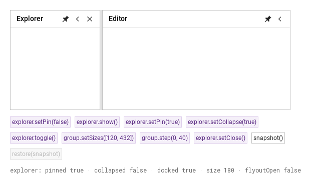
Assigns sizes to visible docked panels in order. Minimum and maximum sizes are enforced; compare the displayed panel sizes.
Captures panel IDs, sizes and state. Resize or fold a panel, take a snapshot, and use restore(snapshot) to compare.
Save a snapshot first, change sizes, then restore it. Restoration matches stable panel IDs and restores saved layout/state.
pin/collapse state, direction and nested groups. Restore rejects empty/duplicate IDs before changes.