QML
← All components

Popover

Open a small panel beside a control for extra information, actions or a compact form.

import Syidax.Core.Popover

Supported QML types

TypeDefinition / role
Anchored popup for explanatory or interactive content.

Learn by example

Previews are images of native Qt runs. Use the buttons below each image to view a result.

01 Basic composition

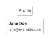
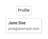
SyPopover is a floating surface for any content — declare it inside the item it belongs to (that item is its anchor) and declare the content inside the popover: a column of texts, a form, a list of checkboxes.

Qt capture · image
Basic composition · Opened
QML code
import QtQuick
import Syidax.Core

Item {
    implicitWidth: Math.max(360, childrenRect.width)
    implicitHeight: childrenRect.height

    property QtObject settings: QtObject {
        id: storyArgs
        property string position: "bottom"
        property string trigger: "hover"
        property bool arrow: true
        property bool sticky: false
        property int opendelay: 0
        property int closedelay: 100
        property string animation: "none"
    }


    Item {
        width: 320
        height: 140
        SyButton {
            anchors.centerIn: parent
            text: "Profile"
            SyPopover { id: exampleControl1; 
                position: storyArgs.position
                trigger: storyArgs.trigger
                arrow: storyArgs.arrow
                sticky: storyArgs.sticky
                opendelay: storyArgs.opendelay
                closedelay: storyArgs.closedelay
                animation: storyArgs.animation
                Column {
                    spacing: 4
                    Text { text: "Jane Doe"; font.weight: Font.Medium; font.family: Theme.fontFamily; font.pixelSize: 14; color: Theme.popover.textEnabled }
                    Text { text: "jane@example.com"; color: Theme.semantic.textSubtle; font.family: Theme.fontFamily; font.pixelSize: 12 }
                }
            }
        }
    }

}

02 position · arrow

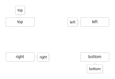
Compare the configuration and result of position · arrow.

Qt capture · image
position · arrow · Default
Default execution
QML code
import QtQuick
import Syidax.Core

pragma ComponentBehavior: Bound

Item {
    implicitWidth: Math.max(360, childrenRect.width)
    implicitHeight: childrenRect.height
    // Focused Gallery routes: keep only the selected API and its prerequisites.

    id: story
    readonly property var positions: ["top", "left", "right", "bottom"]

    Item {
        width: 420
        height: 260
        Grid {
            anchors.centerIn: parent
            columns: 2
            columnSpacing: 160
            rowSpacing: 90
            Repeater {
                model: story.positions
                delegate: SyButton {
                    id: cell
                    required property string modelData
                    text: cell.modelData
                    width: 100
                    SyPopover { id: featureTarget0;
                        position: cell.modelData; arrow: true; trigger: "none"
                        Component.onCompleted: { Qt.callLater(setOpen);  }
                        Text { text: cell.modelData; font.family: Theme.fontFamily; font.pixelSize: 13; color: Theme.popover.textEnabled }
                    }
                }
            }
        }
    }
}

03 trigger

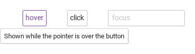
Compare the results of pointer hover, a button click and field focus.

Qt capture · image
trigger · Hover result
QML code
import QtQuick
import Syidax.Core

Item {
    width: 520; height: 180
    Row {
        x: 24; y: 28; spacing: 40
        SyButton {
            id: hoverTarget; text: "hover"
            SyPopover { id: hoverPopup; position: "bottom"; Text { text: "Shown while the pointer is over the button"; font.family: Theme.fontFamily; font.pixelSize: 13; color: Theme.popover.textEnabled } }
        }
        SyButton {
            id: clickTarget; text: "click"
            SyPopover { id: clickPopup; trigger: "click"; position: "bottom"; Text { text: "Shown after clicking the button"; font.family: Theme.fontFamily; font.pixelSize: 13; color: Theme.popover.textEnabled } }
        }
        FocusScope {
            id: focusAnchor; width: 150; height: focusTarget.height
            SyInput {
                id: focusTarget; placeholder: "focus"; width: parent.width
                SyPopover { id: focusPopup; anchor: focusAnchor; trigger: "focus"; position: "bottom"; Text { text: "Shown while the field has focus"; font.family: Theme.fontFamily; font.pixelSize: 13; color: Theme.popover.textEnabled } }
            }
        }
    }
}

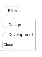
04 sticky

sticky: true switches every automatic close off: Escape, a press outside and leaving the anchor are all ignored, and the popover stays until setClose() (or close()) is called

Qt capture · image
sticky · Opened
QML code
import QtQuick
import Syidax.Core

Item {
    implicitWidth: Math.max(360, childrenRect.width)
    implicitHeight: childrenRect.height

    SyButton {
        text: "Filters"
        SyPopover {
            id: filters
            trigger: "click"; sticky: true; arrow: true
            Column {
                spacing: 8
                SyCheckbox { text: "Design" }
                SyCheckbox { text: "Development" }
                SyButton { text: "Close"; size: "small"; onClicked: filters.setClose() }
            }
        }
    }
}

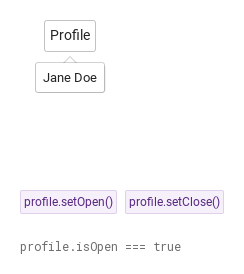
05 setOpen · setClose

setOpen() opens the popover and setClose() closes it from code, whatever the trigger

Qt capture · image
setOpen · setClose · Opened
QML code
import QtQuick
import Syidax.Core

Item {
    implicitWidth: Math.max(360, childrenRect.width)
    implicitHeight: childrenRect.height
    // Focused Gallery routes: keep only the selected API and its prerequisites.
    id: featureStory

    Column {
        spacing: 24
        Item {
            width: 560; height: 170
            SyButton {
                x: 24; y: 24
 text: "Profile"; SyPopover { id: profile; trigger: "none"; arrow: true; Text { text: "Jane Doe"; font.family: Theme.fontFamily; font.pixelSize: 13; color: Theme.popover.textEnabled } } }
        }
        Row {
            objectName: "exampleCommands"

            spacing: 8
            SyButton { id: exampleControl1;  visible: true; text: "profile.setOpen()"; variant: "secondary"; size: "small"; onClicked: profile.setOpen() }
            SyButton { id: exampleControl2;  visible: true; text: "profile.setClose()"; variant: "secondary"; size: "small"; onClicked: profile.setClose() }
        }
        Text {
            text: "profile.isOpen === " + profile.isOpen
            font.family: Theme.monoFontFamily
            font.pixelSize: 12
            color: Theme.semantic.textSubtle
        }
    }
}

06 Keyboard focus trigger

Keyboard focus trigger, configured with trigger.

Qt capture · image
Keyboard focus trigger · Opened
QML code
import QtQuick
import Syidax.Core

Item {
    implicitWidth: Math.max(360, childrenRect.width)
    implicitHeight: childrenRect.height

    property QtObject settings: QtObject {
        id: storyArgs
        property string position: "bottom"
        property string trigger: "focus"
        property bool arrow: true
        property bool sticky: false
        property int opendelay: 0
        property int closedelay: 100
        property string animation: "none"
    }


    Item {
        width: 320
        height: 140
        SyButton {
            anchors.centerIn: parent
            text: "Profile"
            SyPopover { id: exampleControl1; 
                position: storyArgs.position
                trigger: storyArgs.trigger
                arrow: storyArgs.arrow
                sticky: storyArgs.sticky
                opendelay: storyArgs.opendelay
                closedelay: storyArgs.closedelay
                animation: storyArgs.animation
                Column {
                    spacing: 4
                    Text { text: "Jane Doe"; font.weight: Font.Medium; font.family: Theme.fontFamily; font.pixelSize: 14; color: Theme.popover.textEnabled }
                    Text { text: "jane@example.com"; color: Theme.semantic.textSubtle; font.family: Theme.fontFamily; font.pixelSize: 12 }
                }
            }
        }
    }

}

API 57

Hover or select an item for its QML example and copy button.

Properties

PropertyTypeDefaultDescription
list (default property)—The items declared inside; they size the popover.
string"bottom""top" · "topLeft" · "topRight" · "bottom" · "bottomLeft" · "bottomRight" · "left" · "leftTop" · "leftBottom" · "right" · "rightTop" · "rightBottom".
string"hover""hover" · "click" · "focus" · "none" ("null" is mapped to "none").
boolfalseShow the pointer towards the anchor.
boolfalseNever closes by itself; setClose() / close() / click toggle only.
int0Milliseconds before opening / closing.
int100Milliseconds before opening / closing.
string"none""none" · "fade"; speed "x-fast" · "fast" · "medium" · "slow" · "x-slow".
string"fast""none" · "fade"; speed "x-fast" · "fast" · "medium" · "slow" · "x-slow".
Itemthe item it is declared inThe item it follows (resolved to the nearest ancestor with hovered within three levels).
bool (read-only)—The popover is visible.
string (read-only)—The side after flipping, with -start / -end.
colorpopover tokensThe surface look.
colorsubtle borderThe surface look.
real3The surface look.
booltrueThe surface look.
real8Space between the content and the edge.
real10 / 4Base popup geometry.
booltrueBase popup geometry.
boolfalseBase popup geometry.
read-only—The resolved speed, the current side, whether the anchor accepts opening, the anchor's rectangle in overlay coordinates.

Methods

MethodDescription
Cancels pending delays and opens, whatever the trigger — unless the anchor is disabled / readonly / not enabled.
Cancels pending delays and closes, even when sticky.
The base popup's immediate open / close (open() ignores the anchor checks; close() also cancels a pending opendelay, as Escape and an outside press do).
setClose() when open, otherwise a trigger-style open request.
Re-computes the placement; automatic on anchor, size and window changes.

Signals

ItemBehavior / conditions
Emitted just before the popup is shown.
Emitted after the popup finishes its enter transition.
Emitted just before the popup is hidden.
Emitted after the popup finishes its exit transition.
Property notification emitted when visible changes.
Property notification emitted when isOpen changes.

Behavior

ItemBehavior / conditions
The item it follows (resolved to the nearest ancestor with hovered within three levels).
the items declared inside (the default property); the popover's size is the content's bounding box plus 8 px of padding on each side. Items must have a size of their own (a Column, a Text, a fixed-size Item). The surface sets no text color — use Theme.popover.textEnabled on your texts.
Interactive anchor — opens only while the anchor is enabled and neither disabled nor readonly; applies to every trigger and to setOpen().
Cancels pending delays and opens, whatever the trigger — unless the anchor is disabled / readonly / not enabled.
"hover" · "click" · "focus" · "none" ("null" is mapped to "none").
trigger — hover: opens on pointer enter, closes closedelay after the pointer leaves the anchor or the popover (hovering the popover holds it). Delays — opendelay (0) and closedelay (100) in ms; an opposite event during a pending delay cancels it.
Cancels pending delays and closes, even when sticky.
Delays — opendelay (0) and closedelay (100) in ms; an opposite event during a pending delay cancels it.
Closing by any route — Escape, an outside press, close() — cancels a pending delayed open. sticky — no automatic close (no Escape, no outside press, leaving is ignored); setClose(), close() or a click-trigger toggle close it.
Never closes by itself; setClose() / close() / click toggle only.
The side after flipping, with -start / -end.
Show the pointer towards the anchor.
Animation — animation: "fade" (any name other than "none") fades over animationMs (x-fast 100 · fast 150 · medium 250 · slow 350 · x-slow 500); none under Theme.reducedMotion.
The popover is visible.
State — isOpen is the popup's visible; the base popup emits aboutToShow(), opened(), aboutToHide(), closed().
Emitted just before the popup is shown.
Emitted after the popup finishes its enter transition.
Emitted just before the popup is hidden.
Emitted after the popup finishes its exit transition.

Keyboard

ItemBehavior / conditions
SyTooltip for one line of text, SyPopconfirm for a question with buttons, SyDropdown for a menu, SyInlineMessage for field feedback; SyButton, SyAvatar, SyIcon as typical anchors.