QML
← All components

Select

Choose one or more values from a dropdown list of options.

import Syidax.Core.Select

Supported QML types

TypeDefinition / role
Data-only option declared in SySelect; provides value, label and availability.
Single or multiple choice form field that displays its SyOption entries in a popup.

Learn by example

Previews are images of native Qt runs. Use the buttons below each image to view a result.

01 Basic composition

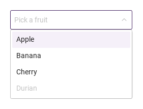
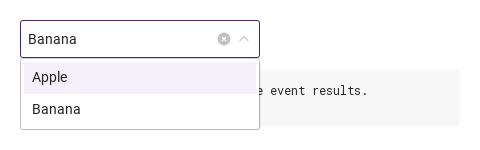
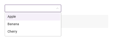
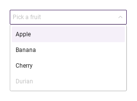
SySelect is a form field whose box opens a list of choices under it.

Qt capture · image
Basic composition · Opened
QML code
import QtQuick
import Syidax.Core

Item {
    implicitWidth: Math.max(360, childrenRect.width)
    implicitHeight: childrenRect.height

    property QtObject settings: QtObject {
        id: storyArgs
        property string mode: "default"
        property string placeholder: "Pick a fruit"
        property string size: "medium"
        property bool clearable: false
        property bool disabled: false
        property bool readonly: false
        property bool required: false
        property string status: "default"
        property bool loading: false
        property bool empty: false
        property bool hide: false
        property int maxTagCount: 0
    }


    SySelect { id: exampleControl1; 
        mode: storyArgs.mode
        placeholder: storyArgs.placeholder
        size: storyArgs.size
        clearable: storyArgs.clearable
        disabled: storyArgs.disabled
        readonly: storyArgs.readonly
        required: storyArgs.required
        status: storyArgs.status
        loading: storyArgs.loading
        empty: storyArgs.empty
        hide: storyArgs.hide
        maxTagCount: storyArgs.maxTagCount
        SyOption { value: "apple"; label: "Apple" }
        SyOption { value: "banana"; label: "Banana" }
        SyOption { value: "cherry"; label: "Cherry" }
        SyOption { value: "durian"; label: "Durian"; disabled: true }
    }

}

02 mode

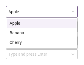
mode sets how the user picks.

Qt capture · image
mode · Opened
QML code
import QtQuick
import Syidax.Core

Item {
    implicitWidth: Math.max(360, childrenRect.width)
    implicitHeight: childrenRect.height
    readonly property var fruit: ["apple", "banana", "cherry"]


    Column {
        spacing: 12
        SySelect { id: exampleControl1; 
            defaultValue: "apple"
            SyOption { value: "apple"; label: "Apple" }
            SyOption { value: "banana"; label: "Banana" }
            SyOption { value: "cherry"; label: "Cherry" }
        }
        SySelect {
            mode: "searchable"; placeholder: "Type to filter"
            SyOption { value: "apple"; label: "Apple" }
            SyOption { value: "banana"; label: "Banana" }
            SyOption { value: "cherry"; label: "Cherry" }
        }
        SySelect {
            mode: "multiple"; defaultValue: ["apple", "cherry"]
            SyOption { value: "apple"; label: "Apple" }
            SyOption { value: "banana"; label: "Banana" }
            SyOption { value: "cherry"; label: "Cherry" }
        }
        SySelect {
            mode: "tag"; placeholder: "Type and press Enter"
            SyOption { value: "apple"; label: "Apple" }
            SyOption { value: "banana"; label: "Banana" }
            SyOption { value: "cherry"; label: "Cherry" }
        }
    }
}

03 size

size sets the box height — small 24 px · medium 32 px (the default) · large 40 px — together with the font, the padding and the icon size, and the tags of the multi modes take the same size.

Qt capture · image
size · Opened
QML code
import QtQuick
import Syidax.Core

Item {
    implicitWidth: Math.max(360, childrenRect.width)
    implicitHeight: childrenRect.height
    property QtObject settings: QtObject {
        id: storyArgs
        property string size: "medium"
    }


    Column {
        spacing: 12
        SySelect { id: exampleControl1;  defaultValue: "apple"; size: storyArgs.size; SyOption { value: "apple"; label: "Apple" } }
        SySelect {
            mode: "multiple"; defaultValue: ["apple", "banana"]; size: storyArgs.size
            SyOption { value: "apple"; label: "Apple" }
            SyOption { value: "banana"; label: "Banana" }
        }
    }
}

04 clearable

clearable: true shows an × at the right of the box as soon as something is selected (never while disabled or readonly).

Qt capture · image
clearable · Opened
QML code
import QtQuick
import Syidax.Core

Item {
    component EventLog: Rectangle {
        id: logBox
        property var lines: []
        implicitWidth: 440
        implicitHeight: Math.max(56, logText.implicitHeight + 24)
        radius: 4; color: Theme.semantic.backgroundBold
        function log(value) { lines = lines.slice(-3).concat([String(value)]) }
        Text {
            id: logText; x: 12; y: 12; width: parent.width - 24
            text: logBox.lines.length ? logBox.lines.join("\n") : "Interact with the controls to see event results."
            wrapMode: Text.Wrap; color: Theme.semantic.textDefault
            font.family: Theme.monoFontFamily; font.pixelSize: 12
        }
    }

    implicitWidth: Math.max(360, childrenRect.width)
    implicitHeight: childrenRect.height

    Column {
        spacing: 12
        SySelect { id: exampleControl1; 
            clearable: true; defaultValue: "banana"
            onCleared: output.log("cleared")
            SyOption { value: "apple"; label: "Apple" }
            SyOption { value: "banana"; label: "Banana" }
        }
        EventLog { id: output }
    }
}

05 disabled · readonly · status · required

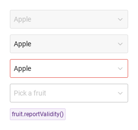
disabled draws the disabled tones; nothing opens, nothing is typed, the clear × and the tags' × are gone.

Qt capture · image
disabled · readonly · status · required · Default
Default execution
QML code
import QtQuick
import Syidax.Core

Item {
    implicitWidth: Math.max(360, childrenRect.width)
    implicitHeight: childrenRect.height
    // Focused Gallery routes: keep only the selected API and its prerequisites.
    id: featureStory

    Column {
        spacing: 12
        SySelect { id: featureTarget0; visible: true; defaultValue: "apple"; disabled: true; SyOption { value: "apple"; label: "Apple" } }
        SySelect { id: featureTarget1; visible: true; defaultValue: "apple"; readonly: true; SyOption { value: "apple"; label: "Apple" } }
        SySelect { id: featureTarget2; visible: true; defaultValue: "apple"; status: "error"; SyOption { value: "apple"; label: "Apple" } }
        SySelect { visible: true; id: fruit; required: true; placeholder: "Pick a fruit"; SyOption { value: "apple"; label: "Apple" } }
        SyButton { visible: true; text: "fruit.reportValidity()"; variant: "secondary"; size: "small"; onClicked: fruit.reportValidity() }
    }
}

06 loading · empty

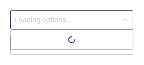
loading: true replaces the rows with a single spinner row — the options are still there but cannot be picked, and the keys do nothing; use it while options are being fetched.

Qt capture · image
loading · empty · Opened
QML code
import QtQuick
import Syidax.Core

Item {
    implicitWidth: Math.max(360, childrenRect.width)
    implicitHeight: childrenRect.height
    // Focused Gallery routes: keep only the selected API and its prerequisites.
    id: featureStory

    Column {
        spacing: 12
        SySelect { id: featureTarget0; visible: true; loading: true; placeholder: "Loading options…"; SyOption { value: "apple"; label: "Apple" } }
        SySelect { id: featureTarget1; visible: true; empty: true; placeholder: "No options" }
    }
}

07 maxTagCount · hide

maxTagCount limits how many tags the multi-mode box shows: beyond that number the rest fold into one "+n" tag that cannot be removed (the picks are still selected and value still lists them); 0 shows every tag.

Qt capture · image
maxTagCount · hide · Opened
QML code
import QtQuick
import Syidax.Core

Item {
    implicitWidth: Math.max(360, childrenRect.width)
    implicitHeight: childrenRect.height
    // Focused Gallery routes: keep only the selected API and its prerequisites.
    id: featureStory

    property QtObject settings: QtObject {
        id: storyArgs
        property int maxTagCount: 2
        property bool hide: true
    }


    SySelect { id: featureTarget0;
        mode: "multiple"; defaultValue: ["apple", "banana", "cherry"]
        maxTagCount: storyArgs.maxTagCount; hide: storyArgs.hide
        SyOption { value: "apple"; label: "Apple" }
        SyOption { value: "banana"; label: "Banana" }
        SyOption { value: "cherry"; label: "Cherry" }
        SyOption { value: "durian"; label: "Durian" }
    }
}

08 opened · selected · removed · cleared · inputChanged

opened() — the list opened (click, keys, typing or openDropdown()); there is no closed signal, watch the read-only open.

Qt capture · image
opened · selected · removed · cleared · inputChanged · Opened
QML code
import QtQuick
import Syidax.Core

Item {
    component EventLog: Rectangle {
        id: logBox
        property var lines: []
        implicitWidth: 440
        implicitHeight: Math.max(56, logText.implicitHeight + 24)
        radius: 4; color: Theme.semantic.backgroundBold
        function log(value) { lines = lines.slice(-3).concat([String(value)]) }
        Text {
            id: logText; x: 12; y: 12; width: parent.width - 24
            text: logBox.lines.length ? logBox.lines.join("\n") : "Interact with the controls to see event results."
            wrapMode: Text.Wrap; color: Theme.semantic.textDefault
            font.family: Theme.monoFontFamily; font.pixelSize: 12
        }
    }

    implicitWidth: Math.max(360, childrenRect.width)
    implicitHeight: childrenRect.height
    // Focused Gallery routes: keep only the selected API and its prerequisites.
    id: featureStory


    Column {
        spacing: 12
        SySelect { id: exampleControl1; 
            mode: "multiple"; clearable: true
            onOpened: { if (true) { output.log("opened") } }
            onSelected: (detail) => { if (true) { output.log(("selected: %1").arg(detail.selectedOptions.map((o) => o.label).join(", "))) } }
            onRemoved: (detail) => { if (true) { output.log(("removed: %1").arg(detail.item.label)) } }
            onCleared: { if (true) { output.log("cleared") } }
            onInputChanged: (text) => { if (true) { output.log(("input: %1").arg(text)) } }
            SyOption { value: "apple"; label: "Apple" }
            SyOption { value: "banana"; label: "Banana" }
            SyOption { value: "cherry"; label: "Cherry" }
        }
        EventLog { id: output }
    }
}

09 setValue · clearValue · openDropdown · closeDropdown

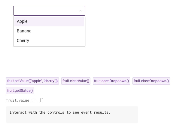
setValue(value | values) selects from code: a single option value, or a list of values in the multi modes (a list in a single mode applies its first known value).

Qt capture · image
setValue · clearValue · openDropdown · closeDropdown · Opened
QML code
import QtQuick
import Syidax.Core

Item {
    component EventLog: Rectangle {
        id: logBox
        property var lines: []
        implicitWidth: 440
        implicitHeight: Math.max(56, logText.implicitHeight + 24)
        radius: 4; color: Theme.semantic.backgroundBold
        function log(value) { lines = lines.slice(-3).concat([String(value)]) }
        Text {
            id: logText; x: 12; y: 12; width: parent.width - 24
            text: logBox.lines.length ? logBox.lines.join("\n") : "Interact with the controls to see event results."
            wrapMode: Text.Wrap; color: Theme.semantic.textDefault
            font.family: Theme.monoFontFamily; font.pixelSize: 12
        }
    }

    implicitWidth: Math.max(360, childrenRect.width)
    implicitHeight: childrenRect.height
    // Focused Gallery routes: keep only the selected API and its prerequisites.
    id: featureStory

    Column {
        spacing: 12
        Item {
            width: 560; height: 250
            SySelect {
                x: 24; y: 24

            id: fruit
            mode: "multiple"
            SyOption { value: "apple"; label: "Apple" }
            SyOption { value: "banana"; label: "Banana" }
            SyOption { value: "cherry"; label: "Cherry" }
        }
        }
        Flow {
            objectName: "exampleCommands"

            width: 560
            spacing: 8
            SyButton { id: exampleControl1;  visible: true; text: "fruit.setValue([\"apple\", \"cherry\"])"; variant: "secondary"; size: "small"; onClicked: fruit.setValue(["apple", "cherry"]) }
            SyButton { id: exampleControl2;  visible: true; text: "fruit.clearValue()"; variant: "secondary"; size: "small"; onClicked: fruit.clearValue() }
            SyButton { id: exampleControl3;  visible: true; text: "fruit.openDropdown()"; variant: "secondary"; size: "small"; onClicked: fruit.openDropdown() }
            SyButton { id: exampleControl4;  visible: true; text: "fruit.closeDropdown()"; variant: "secondary"; size: "small"; onClicked: fruit.closeDropdown() }
            SyButton { id: exampleControl5;  visible: true; text: "fruit.getStatus()"; variant: "secondary"; size: "small"; onClicked: output.log("getStatus() → " + JSON.stringify(fruit.getStatus())) }
        }
        Text {
            text: "fruit.value === " + JSON.stringify(fruit.value)
            font.family: Theme.monoFontFamily
            font.pixelSize: 12
            color: Theme.semantic.textSubtle
        }
        EventLog { id: output }
    }
}

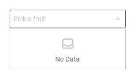
10 Empty options

Empty options, configured with empty.

Qt capture · image
Empty options · Opened
QML code
import QtQuick
import Syidax.Core

Item {
    implicitWidth: Math.max(360, childrenRect.width)
    implicitHeight: childrenRect.height

    property QtObject settings: QtObject {
        id: storyArgs
        property string mode: "default"
        property string placeholder: "Pick a fruit"
        property string size: "medium"
        property bool clearable: false
        property bool disabled: false
        property bool readonly: false
        property bool required: false
        property string status: "default"
        property bool loading: false
        property bool empty: true
        property bool hide: false
        property int maxTagCount: 0
    }


    SySelect { id: exampleControl1; 
        mode: storyArgs.mode
        placeholder: storyArgs.placeholder
        size: storyArgs.size
        clearable: storyArgs.clearable
        disabled: storyArgs.disabled
        readonly: storyArgs.readonly
        required: storyArgs.required
        status: storyArgs.status
        loading: storyArgs.loading
        empty: storyArgs.empty
        hide: storyArgs.hide
        maxTagCount: storyArgs.maxTagCount
        SyOption { value: "apple"; label: "Apple" }
        SyOption { value: "banana"; label: "Banana" }
        SyOption { value: "cherry"; label: "Cherry" }
        SyOption { value: "durian"; label: "Durian"; disabled: true }
    }

}

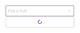
11 Loading options

Loading options, configured with loading.

Qt capture · image
Loading options · Opened
QML code
import QtQuick
import Syidax.Core

Item {
    implicitWidth: Math.max(360, childrenRect.width)
    implicitHeight: childrenRect.height

    property QtObject settings: QtObject {
        id: storyArgs
        property string mode: "default"
        property string placeholder: "Pick a fruit"
        property string size: "medium"
        property bool clearable: false
        property bool disabled: false
        property bool readonly: false
        property bool required: false
        property string status: "default"
        property bool loading: true
        property bool empty: false
        property bool hide: false
        property int maxTagCount: 0
    }


    SySelect { id: exampleControl1; 
        mode: storyArgs.mode
        placeholder: storyArgs.placeholder
        size: storyArgs.size
        clearable: storyArgs.clearable
        disabled: storyArgs.disabled
        readonly: storyArgs.readonly
        required: storyArgs.required
        status: storyArgs.status
        loading: storyArgs.loading
        empty: storyArgs.empty
        hide: storyArgs.hide
        maxTagCount: storyArgs.maxTagCount
        SyOption { value: "apple"; label: "Apple" }
        SyOption { value: "banana"; label: "Banana" }
        SyOption { value: "cherry"; label: "Cherry" }
        SyOption { value: "durian"; label: "Durian"; disabled: true }
    }

}

12 Collapsed selected tags

Collapsed selected tags, configured with mode, maxTagCount.

Qt capture · image
Collapsed selected tags · Opened
QML code
import QtQuick
import Syidax.Core

Item {
    implicitWidth: Math.max(360, childrenRect.width)
    implicitHeight: childrenRect.height

    property QtObject settings: QtObject {
        id: storyArgs
        property string mode: "multiple"
        property string placeholder: "Pick a fruit"
        property string size: "medium"
        property bool clearable: false
        property bool disabled: false
        property bool readonly: false
        property bool required: false
        property string status: "default"
        property bool loading: false
        property bool empty: false
        property bool hide: false
        property int maxTagCount: 2
    }


    SySelect { id: exampleControl1; 
        defaultValue: ["apple", "banana", "cherry"]
        mode: storyArgs.mode
        placeholder: storyArgs.placeholder
        size: storyArgs.size
        clearable: storyArgs.clearable
        disabled: storyArgs.disabled
        readonly: storyArgs.readonly
        required: storyArgs.required
        status: storyArgs.status
        loading: storyArgs.loading
        empty: storyArgs.empty
        hide: storyArgs.hide
        maxTagCount: storyArgs.maxTagCount
        SyOption { value: "apple"; label: "Apple" }
        SyOption { value: "banana"; label: "Banana" }
        SyOption { value: "cherry"; label: "Cherry" }
        SyOption { value: "durian"; label: "Durian"; disabled: true }
    }

}

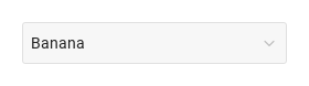
13 Read-only selection

Read-only selection, configured with readonly.

Qt capture · image
Read-only selection · Result
Default execution
QML code
import QtQuick
import Syidax.Core

Item {
    implicitWidth: Math.max(360, childrenRect.width)
    implicitHeight: childrenRect.height

    property QtObject settings: QtObject {
        id: storyArgs
        property string mode: "default"
        property string placeholder: "Pick a fruit"
        property string size: "medium"
        property bool clearable: false
        property bool disabled: false
        property bool readonly: true
        property bool required: false
        property string status: "default"
        property bool loading: false
        property bool empty: false
        property bool hide: false
        property int maxTagCount: 0
    }


    SySelect {
        defaultValue: "banana"
        mode: storyArgs.mode
        placeholder: storyArgs.placeholder
        size: storyArgs.size
        clearable: storyArgs.clearable
        disabled: storyArgs.disabled
        readonly: storyArgs.readonly
        required: storyArgs.required
        status: storyArgs.status
        loading: storyArgs.loading
        empty: storyArgs.empty
        hide: storyArgs.hide
        maxTagCount: storyArgs.maxTagCount
        SyOption { value: "apple"; label: "Apple" }
        SyOption { value: "banana"; label: "Banana" }
        SyOption { value: "cherry"; label: "Cherry" }
        SyOption { value: "durian"; label: "Durian"; disabled: true }
    }

}

14 Compact searchable field

Compact searchable field, configured with mode, size.

Qt capture · image
Compact searchable field · Opened
QML code
import QtQuick
import Syidax.Core

Item {
    implicitWidth: Math.max(360, childrenRect.width)
    implicitHeight: childrenRect.height

    property QtObject settings: QtObject {
        id: storyArgs
        property string mode: "searchable"
        property string placeholder: "Pick a fruit"
        property string size: "small"
        property bool clearable: false
        property bool disabled: false
        property bool readonly: false
        property bool required: false
        property string status: "default"
        property bool loading: false
        property bool empty: false
        property bool hide: false
        property int maxTagCount: 0
    }


    SySelect { id: exampleControl1; 
        mode: storyArgs.mode
        placeholder: storyArgs.placeholder
        size: storyArgs.size
        clearable: storyArgs.clearable
        disabled: storyArgs.disabled
        readonly: storyArgs.readonly
        required: storyArgs.required
        status: storyArgs.status
        loading: storyArgs.loading
        empty: storyArgs.empty
        hide: storyArgs.hide
        maxTagCount: storyArgs.maxTagCount
        SyOption { value: "apple"; label: "Apple" }
        SyOption { value: "banana"; label: "Banana" }
        SyOption { value: "cherry"; label: "Cherry" }
        SyOption { value: "durian"; label: "Durian"; disabled: true }
    }

}

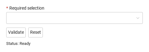
15 Required field and reset

Compare the untouched field, validation error and reset result.

Qt capture · image
Required field and reset · Untouched
QML code
import QtQuick
import Syidax.Core

Column {
    width: 440; spacing: 12
    SySelect {
        id: field; width: parent.width; name: "selection"; required: true
        label: "Required selection"; SyOption { label: "Design"; value: "design" } SyOption { label: "Development"; value: "dev" }
        
        error: "Complete this field before continuing."
    }
    Row {
        spacing: 8
        SyButton { id: check; text: "Validate"; onClicked: field.reportValidity() }
        SyButton { id: reset; text: "Reset"; onClicked: field.reset() }
    }
    Text { text: "Status: " + (field.invalid ? "Invalid" : "Ready"); color: Theme.semantic.textDefault }
}

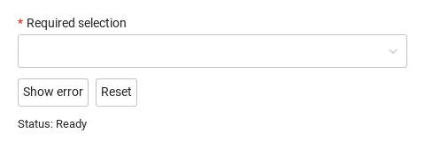
16 Custom error

Show an application-specific error, then reset the field.

Qt capture · image
Custom error · Untouched
QML code
import QtQuick
import Syidax.Core

Column {
    width: 440; spacing: 12
    SySelect {
        id: field; width: parent.width; name: "selection"; required: true
        label: "Required selection"; SyOption { label: "Design"; value: "design" } SyOption { label: "Development"; value: "dev" }
        
        error: "This selection is currently unavailable. Choose another."
    }
    Row {
        spacing: 8
        SyButton { id: check; text: "Show error"; onClicked: field.setCustomError() }
        SyButton { id: reset; text: "Reset"; onClicked: field.reset() }
    }
    Text { text: "Status: " + (field.invalid ? "Invalid" : "Ready"); color: Theme.semantic.textDefault }
}

API 102

Hover or select an item for its QML example and copy button.

Properties · SySelect

PropertyTypeDefaultDescription
string"default"default · searchable · multiple · tag — see Behavior.
string or list (read-only binding)—The selected option value ("" when none) or, in the multi modes, the list of values. Do not assign; use defaultValue / setValue().
var""The selection to apply at creation and whenever it changes: a value, or a list of values (multi modes). reset() returns to it.
list[]The selection with labels: [{ value, label, isCustomTag }].
string""Shown in the box while nothing is selected.
string"medium"Box height small 24 · medium 32 · large 40 px; the tags follow.
string"default"default · error — error forces the error tones without changing validity.
boolfalseAn × that empties the selection (cleared) while something is selected and the select is not disabled / readonly.
boolfalseDisabled tones; nothing opens or types; always valid.
boolfalseReadable selection, nothing opens, tags lose the ×; always valid.
boolfalseAn empty selection is valueMissing.
boolfalseThe list shows a spinner row instead of the options.
boolfalseThe list shows the empty state instead of the options.
boolfalseSelected options leave the list.
int0Tags shown before the rest fold into "+n"; 0 shows all.
string""The text typed in a searchable / multi box (cleared when the list closes).
int-1The highlighted row in visibleOptions.
list[]The SyOption objects collected at creation.
read-only—The rows the list shows now (not hidden, matching the typed text) and their count.
bool (read-only)—The list is open.
bool (read-only)—Focus (or open list)
bool (read-only)—pointer over the box.
bool (read-only)—mode is multiple / tag · mode is not default.
string""The frame's title, form key, helper text and custom error copy.
read-only—Validity: "" · valueMissing · custom; invalid is true once touched or reported.
real240The width when the app sets none.

Properties · SyOption (declared inside the select)

PropertyTypeDefaultDescription
string""What the select reports for this option; must be unique.
string""What the row and the box show; empty → value is shown.
string (read-only)—label when set, else value.
boolfalseDrawn in the disabled tone; the user cannot pick it (setValue() can).
boolfalseSame as disabled for a row.
boolfalseNever listed; still selectable from code.
boolfalseWritten by the select to mirror the selection.
boolfalseTrue on the entries the user typed in tag mode.
boolfalseDeclared for parity; the select does not use it yet.

Methods

MethodDescription
Replaces the selection from code — a value, or a list in the multi modes. Unknown values are dropped (tag mode: they become custom tags); a list in a single mode applies its first known value. No signal; works while disabled / readonly.
Empties the selection and the typed text, emits cleared. Ignored while disabled / readonly.
Opens the list (highlighting the first row) and emits opened. Ignored while disabled, readonly or already open.
Closes the list
opens or closes it.
Focuses the box
removes focus and closes the list.
Returns whether the status is "" (silent).
Same, and reveals the error line.
"", "valueMissing" or "custom".
Sets the status to custom (and marks the field touched)
clears it.
Selects defaultValue again and clears the touched / submitted / custom flags.

Signals

SignalArgumentsWhen
—The list opened (click, keys, typing, openDropdown()). No counterpart for closing — read open.
detail: { selectedOptions, isValid, status }A user pick (click or Enter) or a custom tag added with Enter. Not for setValue(), defaultValue or reset().
detail: { item, selectedOptions, isValid, status }A tag left: its ×, Backspace in the empty box, or a selected row picked again (multi modes). item is the entry that left. Not for clearValue().
—The clear × or clearValue() emptied the selection.
text: stringThe user edited the box text (searchable / multiple / tag).
detail: { selectedOptions, isValid, status }The box gained / lost focus; detail is the field's detail() object.

Behavior

ItemBehavior / conditions
Selected options leave the list.
The selected option value ("" when none) or, in the multi modes, the list of values. Do not assign; use defaultValue / setValue().
On each option, value is what the select reports, label what the list and the box show (empty label → the value is shown; the read-only text gives that resolved label), disabled and readonly draw the row in the disabled tone and make it unpickable, hide keeps it out of the list, selected is written by the select, isCustomTag marks a tag the user typed. selectedOptions — the same selection with labels, [{ value, label, isCustomTag }]; this is what selected and removed carry.
label when set, else value.
Drawn in the disabled tone; the user cannot pick it (setValue() can).
Same as disabled for a row.
Never listed; still selectable from code.
Written by the select to mirror the selection.
True on the entries the user typed in tag mode.
Replaces the selection from code — a value, or a list in the multi modes. Unknown values are dropped (tag mode: they become custom tags); a list in a single mode applies its first known value. No signal; works while disabled / readonly.
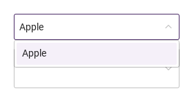
value is derived from the selection: in default / searchable it is the selected option's value or ""; in multiple / tag it is the list of values. searchable: the box is editable; typing filters the rows (label contains the text, case-insensitive), emits inputChanged and opens the list; a pick replaces and closes; when the list closes the typed text is dropped and the label comes back.
The selection to apply at creation and whenever it changes: a value, or a list of values (multi modes). reset() returns to it.
Selects defaultValue again and clears the touched / submitted / custom flags.
The selection with labels: [{ value, label, isCustomTag }].
A tag left: its ×, Backspace in the empty box, or a selected row picked again (multi modes). item is the entry that left. Not for clearValue().
default · searchable · multiple · tag — see Behavior.
The user edited the box text (searchable / multiple / tag).
What the select reports for this option; must be unique.
What the row and the box show; empty → value is shown.
Opens the list (highlighting the first row) and emits opened. Ignored while disabled, readonly or already open.
The list opened (click, keys, typing, openDropdown()). No counterpart for closing — read open.
It closes on Escape, a press outside, a pick in the single modes, when the box loses focus, or closeDropdown(); there is no closed signal, read open.
The list is open.
The highlighted row in visibleOptions.
The list shows a spinner row instead of the options.
The list shows the empty state instead of the options.
Box height small 24 · medium 32 · large 40 px; the tags follow.
Readable selection, nothing opens, tags lose the ×; always valid.
Tags shown before the rest fold into "+n"; 0 shows all.
Disabled tones; nothing opens or types; always valid.
Empties the selection and the typed text, emits cleared. Ignored while disabled / readonly.
default · error — error forces the error tones without changing validity.
status: "error" forces the error tones. required with an empty selection gives the status valueMissing; setCustomError() gives custom (shown as "Invalid by custom" or your error text); disabled or readonly selects are always valid.
hasFocus is true while the box has focus or the list is open.
An empty selection is valueMissing.
required with an empty selection gives the status valueMissing; setCustomError() gives custom (shown as "Invalid by custom" or your error text); disabled or readonly selects are always valid.
Same, and reveals the error line.
name keys the field in SyForm.values(): value as is (a string, or a list in the multi modes).

Keyboard

ItemBehavior / conditions
Keyboard: Tab and Shift+Tab enter and leave the field. Hidden and disabled fields are skipped. Escape closes an open picker before continuing. Textarea uses Tab for focus navigation, including inside a modal; it does not insert indentation.