Run with --diagnose --json to check your Qt version, import path, fonts, runtime and license. No license token is printed.
The Gallery evaluation app is available now. Paid SDK sales and downloads are coming soon. The installation examples above preview the SDK workflow.
Tested Windows configurations
Native window and example smoke checks cover the versions below. Qt 6.8 is a source minimum, not a promise of tested support for every Qt release. Gallery uses software rendering.
Two complete application examples
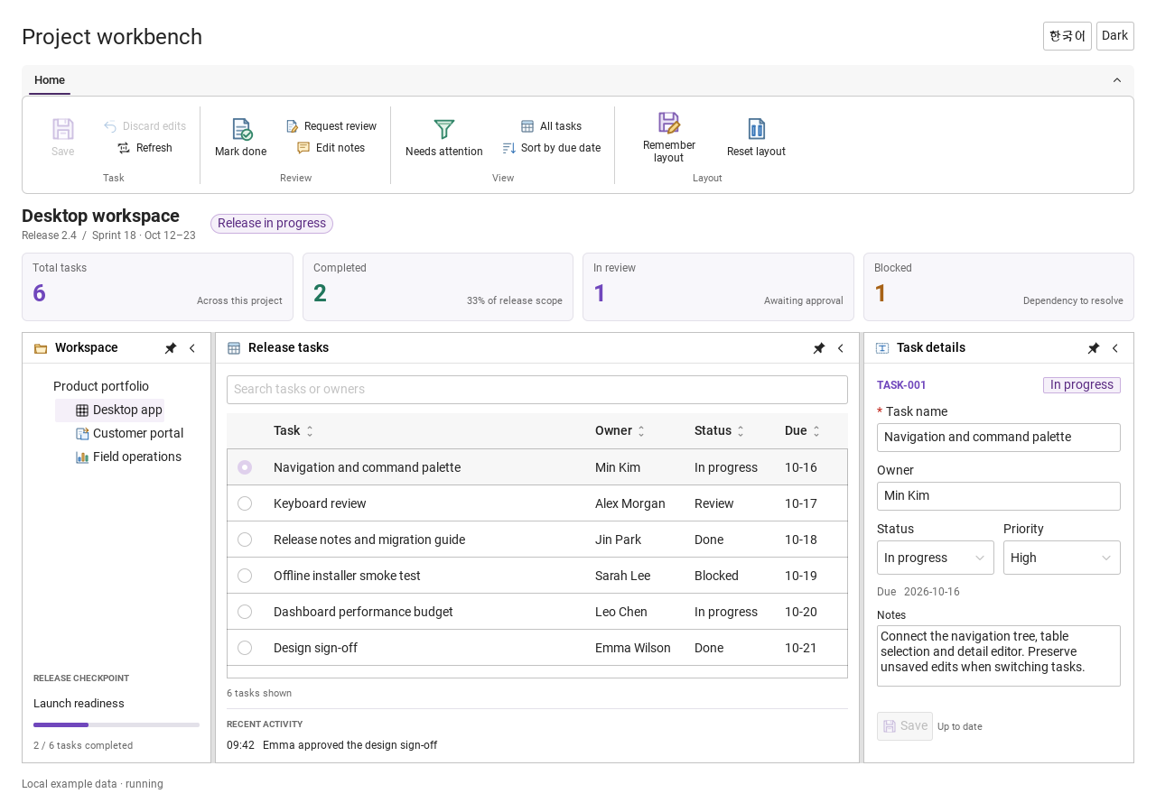
Step-by-step captures from the running Windows applications. Play, pause and inspect each state.
Workbench: mark a task done, save changes and see release progress update.Record Manager: preserve a failed save, retry, search and confirm before deleting.
See the components in context
RibbonPanelFormTableTreeTheme
TRY IT YOURSELF
The native Gallery
Browse examples, inspect properties and switch between light and dark themes in a Windows application. The Gallery is for evaluation; commercial SDK access is separate.
The --qml path must contain the Syidax folder. Python uses qml-pure. Run from the unzipped SDK, independently of the source repository.
License is inactive or frozen
Download your QML Core certificate and pass it with --license. Web Core, Chart and Grid certificates do not activate QML. Monthly use ends at expiry. Annual licenses retain only releases covered by their update period.
Qt or plugin mismatch
Check the Qt version and architecture used to build plugins. Do not mix Python Qt bindings. qml-pure removes the compiled plugin ABI dependency.
PDF or icons missing
PDF requires the optional QtQuick.Pdf module. Other Core components remain usable without it. For icon packs and resource paths, read SDK docs/ICON-PACKS.md.
Save failure or corrupt settings
Examples write only to their application-data folder. Check permissions and disk space. Invalid JSON is backed up before reset. A failed save preserves your draft.
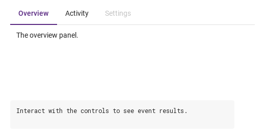
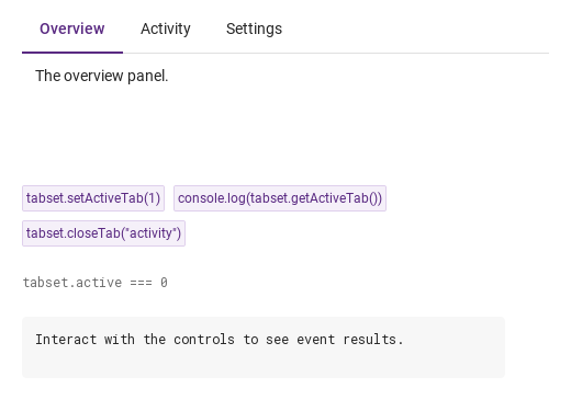
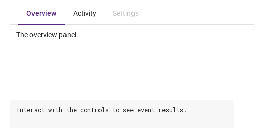
setActiveTab(index) makes the tab at that index active and emits selected and tabSelected; it is ignored when the index is out of range or the tab is disabled.
Hover or select an item for its QML example and copy button.
Properties · SyTabGroup
Property
Type
Default
Description
list (default property)
—
The SyTab headers and SyTabContent panels declared inside, in order
list
—
Items placed at the right end of the strip (horizontal only)
int
first enabled
The active header's index; set it to switch silently, read it to know. −1 when no header is enabled
string
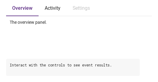
"line"
line (2 px marker) · card (bordered cards)
string
"medium"
Header height and text: small 36 / 12 px · medium 44 / 14 px · large 52 / 16 px
string
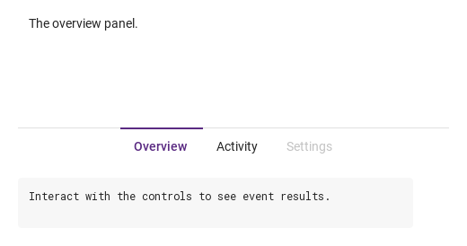
"top"
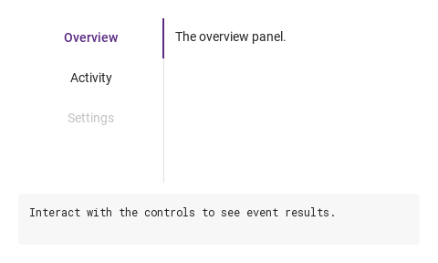
The strip's side: top · bottom · left · right (left / right: a 160 px rail, no folding)
string
"left"
left · center — centering applies while every header fits
string
"none"
Space before the first header: none 0 · small 8 · medium 12 · large 16 px
bool
false
Every header and the + button inert
bool
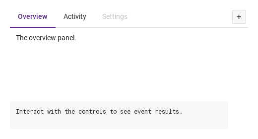
false
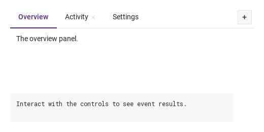
A 28 px + button after extra that emits tabAdded()
bool
false
Headers can be dragged along the strip to reorder them (not while the group is disabled); ordered fires on release
var
[]
The collected headers
var
[]
panels, in order (maintained by the group)
var
[]
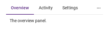
The headers currently folded into the ⋯ list
var (read-only)
[]
The tabkeys in the order set by a drag or reorder(), kept across re-collects ([] = declaration order; maintained by the group)
read-only
—
position is left / right · 160 · the header height in px · the padding in px
read-only
—
position is left / right · 160 · the header height in px · the padding in px
read-only
—
position is left / right · 160 · the header height in px · the padding in px
read-only
—
position is left / right · 160 · the header height in px · the padding in px
Properties · SyTab
Property
Type
Default
Description
list (default property)
—
Items placed after the text (before the ×)
string
""
The header's key; its panel is the SyTabContent with the same name
string
""
The label (hidden when empty)
bool
false
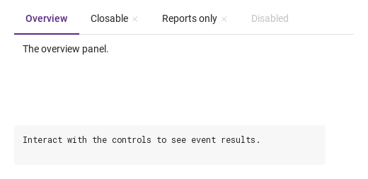
An × after the text that closes the tab
bool
false
The × only reports closed; the tab stays until setClose(true) / closeTab()
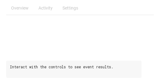
bool
false
Greyed, inert; never the default active tab
bool · int · string
—
Set by the group: whether this header is active, its index, and the group's look
bool · int · string
—
Set by the group: whether this header is active, its index, and the group's look
bool · int · string
—
Set by the group: whether this header is active, its index, and the group's look
bool · int · string
—
Set by the group: whether this header is active, its index, and the group's look
bool · int · string
—
Set by the group: whether this header is active, its index, and the group's look
bool (read-only)
—
disabled on the header or on the group
bool (read-only)
—
Pointer over the header
bool (read-only)
—
keyboard focus
var
null
The owning group (set by the group)
Properties · SyTabContent
Property
Type
Default
Description
list (default property)
—
The panel's items
string
""
Pairs the panel with the SyTab whose tabkey equals it
bool
false
Set by the group: the panel is the visible one
bool
false
The panel is dimmed to 50 % and its items ignore input
Additional properties
Name
Type / default
Description
Tab-strip width in logical pixels. Reduce it to move excess tabs into overflow.
Methods
Method
Description
Activates the header at index and emits selected + tabSelected; ignored for an unknown index or a disabled header
Returns active (int)
Finds the header by tabkey (string) or index (number) and calls its setClose(true): reports and removes it, even with manualClose or disabled. Unknown: nothing
Moves the header at from to to (indices in tabs), re-indexes the headers, keeps active on the same header and emits ordered; ignored when an index is out of range or from equals to
What a click does: activates the tab and reports. Ignored while disabled
Emits closed; removes the tab unless manualClose without force. Without force a disabled tab does nothing
Signals
Signal
Arguments
When
detail: { tabkey, index }
A header became active by a click, Space / Enter, the arrow keys, the ⋯ list or setActiveTab(). Not when active is set from a binding
detail: { index, value }
Same moment, right after selected; value is the tabkey
detail: { tabkey, index }
A tab's × was clicked (enabled tab), or setClose() / closeTab() ran — also under manualClose, where the tab stays
detail: { index, value }
Same moment, right after closed
—
The + button was clicked (addNewTab); not while the group is disabled
tabs
A drag (isDraggable) was released after headers swapped places, or reorder() ran; tabs holds the new order
detail: { tabkey, index }
The header's own signals, just before the group's
detail: { tabkey, index }
The header's own signals, just before the group's
Behavior
Item
Behavior / conditions
The active header's index; set it to switch silently, read it to know. −1 when no header is enabled
active is an index into the headers in declaration order. It starts at the first enabled header (or −1 when none is enabled); an active that points past the end or at a disabled header is replaced by the first enabled one when the group collects its children. A click, Space or Enter on an enabled header, Left / Right (or Up / Down) on a focused header, a pick in the ⋯ list, or setActiveTab(index) makes a header active and emits selected({ tabkey, index }) then tabSelected({ index, value }). Setting active from a binding switches silently. The panel whose name equals the active header's tabkey is visible; the others are hidden. The × calls setClose(false): the tab emits closed({ tabkey, index }); then, unless manualClose, the group removes the header and its panel, re-indexes the remaining headers, clamps active to the last index (the header now at that index is active) and emits closed and tabClosed({ index, value }).
Activates the header at index and emits selected + tabSelected; ignored for an unknown index or a disabled header
A header became active by a click, Space / Enter, the arrow keys, the ⋯ list or setActiveTab(). Not when active is set from a binding
Same moment, right after selected; value is the tabkey
Pairs the panel with the SyTab whose tabkey equals it
The header's key; its panel is the SyTabContent with the same name
The label (hidden when empty)
An × after the text that closes the tab
Header height and text: small 36 / 12 px · medium 44 / 14 px · large 52 / 16 px
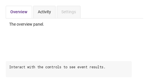
line (2 px marker) · card (bordered cards)
type: "line" draws a 2 px marker on the content side of the active header and a 1 px rule along the strip; type: "card" draws every header as a bordered card, rounded on the outer side, 4 px apart.
Space before the first header: none 0 · small 8 · medium 12 · large 16 px
Items placed at the right end of the strip (horizontal only)
A 28 px + button after extra that emits tabAdded()
The + button was clicked (addNewTab); not while the group is disabled
The headers currently folded into the ⋯ list
left · center — centering applies while every header fits
Headers can be dragged along the strip to reorder them (not while the group is disabled); ordered fires on release
A drag (isDraggable) was released after headers swapped places, or reorder() ran; tabs holds the new order
Moves the header at from to to (indices in tabs), re-indexes the headers, keeps active on the same header and emits ordered; ignored when an index is out of range or from equals to
With isDraggable: true (and the group not disabled) a header can be dragged along the strip: crossing a neighbour's middle swaps the two, and ordered(tabs) fires once on release with the headers in the new order. reorder(from, to) (indices in tabs) moves a header from code and emits ordered too. type, size and position changes re-collect the headers; tabs and contents are rebuilt then (in the order tabOrder remembers when headers were reordered).
The tabkeys in the order set by a drag or reorder(), kept across re-collects ([] = declaration order; maintained by the group)
Emits closed; removes the tab unless manualClose without force. Without force a disabled tab does nothing
The × calls setClose(false): the tab emits closed({ tabkey, index }); then, unless manualClose, the group removes the header and its panel, re-indexes the remaining headers, clamps active to the last index (the header now at that index is active) and emits closed and tabClosed({ index, value }).
The × only reports closed; the tab stays until setClose(true) / closeTab()
Same moment, right after closed
Finds the header by tabkey (string) or index (number) and calls its setClose(true): reports and removes it, even with manualClose or disabled. Unknown: nothing
Every header and the + button inert
Tab-strip width in logical pixels. Reduce it to move excess tabs into overflow.
Give the group a width and a height (its implicit size is 480 × strip + panels).
Tab reaches the enabled headers. On a focused header Left / Up go to the previous enabled header, Right / Down to the next (wrapping; the move activates it), Space / Enter select it.
The strip's side: top · bottom · left · right (left / right: a 160 px rail, no folding)
type, size and position changes re-collect the headers; tabs and contents are rebuilt then (in the order tabOrder remembers when headers were reordered).
Keyboard
Item
Behavior / conditions
SyGlobalHeader hosts SyTab headers in the app bar; SyCollapse folds sections in place; SyNav moves between screens.