QML
← All components

Tag

Label an item with a compact chip for categories, keywords or status.

import Syidax.Core.Tag

Supported QML types

TypeDefinition / role
Compact text label with a tone and optional close action.

Learn by example

Previews are images of native Qt runs. Use the buttons below each image to view a result.

01 Basic composition

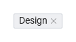
SyTag is a small label chip: a short text in one of eight color palettes, three heights (size) and optional pill corners (rounded).

Qt capture · image
Basic composition · Default
Default execution
QML code
import QtQuick
import Syidax.Core

Item {
    implicitWidth: Math.max(360, childrenRect.width)
    implicitHeight: childrenRect.height
    id: story

    property QtObject settings: QtObject {
        id: storyArgs
        property string text: "Design"
        property string color: "gray"
        property string size: "medium"
        property bool rounded: false
        property bool removable: false
        property bool selectable: false
        property bool disabled: false
        property bool readonly: false
        property bool manualClose: false
    }


    SyTag {
        text: storyArgs.text
        color: storyArgs.color
        size: storyArgs.size
        rounded: storyArgs.rounded
        removable: storyArgs.removable
        selectable: storyArgs.selectable
        disabled: storyArgs.disabled
        readonly: storyArgs.readonly
        manualClose: storyArgs.manualClose
        onRemoved: (manual) => { if (!manual) visible = true }   // the playground keeps its tag
    }

}

02 color

color picks the palette of a plain tag: gray (the default) · purple · blue · green · cyan · yellow · orange · red.

Qt capture · image
color · Default
Default execution
QML code
import QtQuick
import Syidax.Core

pragma ComponentBehavior: Bound

Item {
    implicitWidth: Math.max(360, childrenRect.width)
    implicitHeight: childrenRect.height
    id: story
    readonly property var colors: ["gray", "purple", "blue", "green", "cyan", "yellow", "orange", "red"]

    Row {
        spacing: 8
        Repeater {
            model: story.colors
            delegate: SyTag {
                required property string modelData
                text: modelData
                color: modelData
            }
        }
    }
}

03 size

size sets the chip height: small 18 px · medium 22 px (the default) · large 26 px.

Qt capture · image
size · Default
Default execution
QML code
import QtQuick
import Syidax.Core

pragma ComponentBehavior: Bound

Item {
    implicitWidth: Math.max(360, childrenRect.width)
    implicitHeight: childrenRect.height
    id: story
    readonly property var sizes: ["small", "medium", "large"]

    Row {
        spacing: 8
        Repeater {
            model: story.sizes
            delegate: SyTag {
                required property string modelData
                anchors.verticalCenter: parent.verticalCenter
                text: "Design"
                size: modelData
            }
        }
    }
}

04 rounded

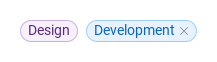
rounded: true draws the chip as a pill — the corner radius becomes half the height — instead of the default small radius.

Qt capture · image
rounded · Default
QML code
import QtQuick
import Syidax.Core

Item {
    implicitWidth: Math.max(360, childrenRect.width)
    implicitHeight: childrenRect.height
    property QtObject settings: QtObject {
        id: storyArgs
        property bool rounded: true
    }


    Row {
        spacing: 8
        SyTag { text: "Design"; color: "purple"; rounded: storyArgs.rounded }
        SyTag { text: "Development"; color: "blue"; rounded: storyArgs.rounded; removable: true; onRemoved: visible = true }
    }
}

05 disabled · readonly

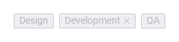
disabled freezes the tag in the gray disabled tones: the × cannot be clicked, a selectable tag cannot be toggled, and setRemove() is ignored.

Qt capture · image
disabled · readonly · Default
QML code
import QtQuick
import Syidax.Core

Item {
    implicitWidth: Math.max(360, childrenRect.width)
    implicitHeight: childrenRect.height
    // Focused Gallery routes: keep only the selected API and its prerequisites.
    id: featureStory

    property QtObject settings: QtObject {
        id: storyArgs
        property bool disabled: true
        property bool readonly: false
    }


    Row {
        spacing: 8
        SyTag { id: featureTarget0; text: "Design"; color: "green"; disabled: storyArgs.disabled; readonly: storyArgs.readonly }
        SyTag { id: featureTarget1; text: "Development"; color: "blue"; removable: true; disabled: storyArgs.disabled; readonly: storyArgs.readonly; onRemoved: visible = true }
        SyTag { id: featureTarget2; text: "QA"; selectable: true; checked: true; disabled: storyArgs.disabled; readonly: storyArgs.readonly }
    }
}

06 selected · removed

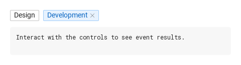
selected() — emitted by a selectable tag after a click flipped checked; the signal carries no arguments, the handler reads the new state from checked.

Qt capture · image
selected · removed · Default
QML code
import QtQuick
import Syidax.Core

Item {
    component EventLog: Rectangle {
        id: logBox
        property var lines: []
        implicitWidth: 440
        implicitHeight: Math.max(56, logText.implicitHeight + 24)
        radius: 4; color: Theme.semantic.backgroundBold
        function log(value) { lines = lines.slice(-3).concat([String(value)]) }
        Text {
            id: logText; x: 12; y: 12; width: parent.width - 24
            text: logBox.lines.length ? logBox.lines.join("\n") : "Interact with the controls to see event results."
            wrapMode: Text.Wrap; color: Theme.semantic.textDefault
            font.family: Theme.monoFontFamily; font.pixelSize: 12
        }
    }

    implicitWidth: Math.max(360, childrenRect.width)
    implicitHeight: childrenRect.height
    // Focused Gallery routes: keep only the selected API and its prerequisites.
    id: featureStory


    Column {
        spacing: 12
        Row {
            spacing: 8
            SyTag {
                id: design
                text: "Design"; selectable: true
                onSelected: { if (true) { output.log(("selected: %1 · checked: %2").arg(design.text).arg(design.checked)) } }
            }
            SyTag {
                id: development
                text: "Development"; color: "blue"; removable: true
                onRemoved: (isManualRemove) => { if (true) { output.log(("removed: %1 · manual: %2").arg(development.text).arg(isManualRemove)) } }
            }
            SyButton { id: exampleControl1;  visible: !development.visible; size: "small"; variant: "borderless"; text: "restore"; onClicked: development.visible = true }
        }
        EventLog { id: output }
    }
}

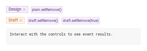
07 setRemove

setRemove(force) removes a tag from code.

Qt capture · image
setRemove · Default
QML code
import QtQuick
import Syidax.Core

Item {
    component EventLog: Rectangle {
        id: logBox
        property var lines: []
        implicitWidth: 440
        implicitHeight: Math.max(56, logText.implicitHeight + 24)
        radius: 4; color: Theme.semantic.backgroundBold
        function log(value) { lines = lines.slice(-3).concat([String(value)]) }
        Text {
            id: logText; x: 12; y: 12; width: parent.width - 24
            text: logBox.lines.length ? logBox.lines.join("\n") : "Interact with the controls to see event results."
            wrapMode: Text.Wrap; color: Theme.semantic.textDefault
            font.family: Theme.monoFontFamily; font.pixelSize: 12
        }
    }

    implicitWidth: Math.max(360, childrenRect.width)
    implicitHeight: childrenRect.height


    Column {
        spacing: 12
        Row {
            spacing: 8
            SyTag {
                id: plain
                text: "Design"; color: "purple"; removable: true
                onRemoved: (isManualRemove) => output.log(("removed: %1 · manual: %2").arg(plain.text).arg(isManualRemove))
            }
            SyButton { id: exampleControl1;  text: "plain.setRemove()"; variant: "secondary"; size: "small"; enabled: plain.visible; onClicked: plain.setRemove() }
            SyButton { id: exampleControl2;  visible: !plain.visible; size: "small"; variant: "borderless"; text: "restore"; onClicked: plain.visible = true }
        }
        Row {
            spacing: 8
            SyTag {
                id: draft
                text: "Draft"; color: "orange"; removable: true; manualClose: true
                onRemoved: (isManualRemove) => output.log(("removed: %1 · manual: %2").arg(draft.text).arg(isManualRemove))
            }
            SyButton { id: exampleControl3;  text: "draft.setRemove()"; variant: "secondary"; size: "small"; enabled: draft.visible; onClicked: draft.setRemove() }
            SyButton { text: "draft.setRemove(true)"; variant: "secondary"; size: "small"; enabled: draft.visible; onClicked: draft.setRemove(true) }
            SyButton { visible: !draft.visible; size: "small"; variant: "borderless"; text: "restore"; onClicked: draft.visible = true }
        }
        EventLog { id: output }
    }
}

08 Manual removal

Manual removal, configured with removable, manualClose.

Qt capture · image
Manual removal · Result
Default execution
QML code
import QtQuick
import Syidax.Core

Item {
    implicitWidth: Math.max(360, childrenRect.width)
    implicitHeight: childrenRect.height
    id: story

    property QtObject settings: QtObject {
        id: storyArgs
        property string text: "Design"
        property string color: "gray"
        property string size: "medium"
        property bool rounded: false
        property bool removable: true
        property bool selectable: false
        property bool disabled: false
        property bool readonly: false
        property bool manualClose: true
    }


    SyTag {
        text: storyArgs.text
        color: storyArgs.color
        size: storyArgs.size
        rounded: storyArgs.rounded
        removable: storyArgs.removable
        selectable: storyArgs.selectable
        disabled: storyArgs.disabled
        readonly: storyArgs.readonly
        manualClose: storyArgs.manualClose
        onRemoved: (manual) => { if (!manual) visible = true }   // the playground keeps its tag
    }

}

API 30

Hover or select an item for its QML example and copy button.

Properties

PropertyTypeDefaultDescription
string""The label. The width follows it.
string"gray"Palette of a plain tag: gray · purple · blue · green · cyan · yellow · orange · red. Unknown values fall back to gray. Ignored while disabled and on a selectable tag.
string"medium"Height: small 18 · medium 22 · large 26 px. The label stays 14 px.
boolfalsePill corners (radius = half the height) instead of the small radius.
boolfalseShows the ×. Without it removed never fires and setRemove() is ignored.
boolfalseThe × and setRemove() only emit removed(true) and leave the tag in place; the app removes it with setRemove(true).
boolfalseToggle mode: a click flips checked and emits selected; drawn in the selectable palette.
boolfalseThe toggle state of a selectable tag — flipped by clicks, settable from code (no signal then). No visual effect while selectable is false.
boolfalseGray disabled tones; the × and the toggle are inert; setRemove() is ignored. Wins over readonly.
boolfalseReadable but inert: the × and the toggle do nothing; setRemove() is ignored. A selectable tag takes the readonly tones, a plain one keeps its color.
bool (read-only)—selectable && !disabled && !readonly — whether a click toggles.
bool (read-only)—The pointer is over the tag.
real (read-only)—The height that size resolves to (18 / 22 / 26).

Methods

MethodDescription
Removes from code; returns nothing. Without force (or with false) it behaves like the ×: emits removed(false) and hides the tag — or, with manualClose, only emits removed(true) and leaves it. With force === true it ignores manualClose: emits removed(false) and hides the tag. Ignored while disabled, readonly or not removable.

Signals

SignalArgumentsWhen
—A click toggled a selectable tag; checked already holds the new state. Does not fire when checked is set from code, nor while disabled / readonly.
isManualRemove: booltrue: manualClose is on and nothing was removed — call setRemove(true) to remove it.

Behavior

ItemBehavior / conditions
Palette of a plain tag: gray · purple · blue · green · cyan · yellow · orange · red. Unknown values fall back to gray. Ignored while disabled and on a selectable tag.
Height: small 18 · medium 22 · large 26 px. The label stays 14 px.
Pill corners (radius = half the height) instead of the small radius.
Shows the ×. Without it removed never fires and setRemove() is ignored.
Removes from code; returns nothing. Without force (or with false) it behaves like the ×: emits removed(false) and hides the tag — or, with manualClose, only emits removed(true) and leaves it. With force === true it ignores manualClose: emits removed(false) and hides the tag. Ignored while disabled, readonly or not removable.
The × and setRemove() only emit removed(true) and leave the tag in place; the app removes it with setRemove(true).
The × was clicked or setRemove() was called on a removable tag. false: the tag hid itself right after emitting. true: manualClose is on and nothing was removed — call setRemove(true) to remove it. Never while disabled / readonly / not removable.
manualClose: false (the default): the tag emits removed(false) and immediately sets its own visible to false. It is hidden, not destroyed — set visible = true to bring it back, or destroy it yourself.
Gray disabled tones; the × and the toggle are inert; setRemove() is ignored. Wins over readonly.
Readable but inert: the × and the toggle do nothing; setRemove() is ignored. A selectable tag takes the readonly tones, a plain one keeps its color.
Toggle mode: a click flips checked and emits selected; drawn in the selectable palette.
The toggle state of a selectable tag — flipped by clicks, settable from code (no signal then). No visual effect while selectable is false.
A click toggled a selectable tag; checked already holds the new state. Does not fire when checked is set from code, nor while disabled / readonly.
a tag has no keyboard handling; the toggle and the × answer to the pointer. Hovering a selectable tag shows its hover tones; hovering an active × tints it.