QML
← 전체 컴포넌트

Badge

아이템에 숫자나 상태 점을 붙여 알림 수 또는 상태를 표시합니다.

import Syidax.Core.Badge

지원 QML 타입

타입정의 / 역할
콘텐츠에 개수·점·상태 표시를 덧붙입니다.

예제로 보기

미리보기는 Qt 실행 화면의 이미지입니다. 아래 버튼으로 결과를 전환하세요.

01 기본 구성

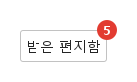
SyBadge는 안에 선언한 요소 — 버튼, 아이콘, 아바타 — 의 한 모서리에 작은 숫자나 점을 붙이거나, standalone: true로 배지만 다른 내용과 나란히 그립니다.

Qt 실행 화면 · 이미지
기본 구성 · 기본
기본 실행 화면
QML 코드
import QtQuick
import Syidax.Core

Item {
    implicitWidth: Math.max(360, childrenRect.width)
    implicitHeight: childrenRect.height
    id: story

    property QtObject settings: QtObject {
        id: storyArgs
        property int value: 5
        property int overflowCount: 0
        property bool dot: false
        property bool hidden: false
        property bool standalone: false
        property string position: "topRight"
        property string size: "medium"
        property string variant: "red"
    }


    Item {
        width: 200
        height: 56
        SyBadge {
            x: 12
            y: 12
            value: storyArgs.value
            overflowCount: storyArgs.overflowCount
            dot: storyArgs.dot
            hidden: storyArgs.hidden
            standalone: storyArgs.standalone
            position: storyArgs.position
            size: storyArgs.size
            variant: storyArgs.variant
            SyButton { visible: !storyArgs.standalone; text: "받은 편지함" }
        }
    }

}

02 variant

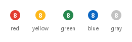
variant는 다섯 가지 의미 이름 중에서 배지 색을 고릅니다: "red"(기본 — 오류, 알림), "yellow"(경고), "green"(성공), "blue"(정보), "gray"(중립).

Qt 실행 화면 · 이미지
variant · 기본
기본 실행 화면
QML 코드
import QtQuick
import Syidax.Core

pragma ComponentBehavior: Bound

Item {
    implicitWidth: Math.max(360, childrenRect.width)
    implicitHeight: childrenRect.height
    id: story
    readonly property var variants: ["red", "yellow", "green", "blue", "gray"]

    Row {
        spacing: 24
        Repeater {
            model: story.variants
            delegate: Column {
                id: cell
                required property string modelData
                spacing: 8
                SyBadge { anchors.horizontalCenter: parent.horizontalCenter; standalone: true; value: 8; variant: cell.modelData }
                Text { anchors.horizontalCenter: parent.horizontalCenter; text: cell.modelData; font.family: Theme.fontFamily; font.pixelSize: 11; color: Theme.semantic.textSubtle }
            }
        }
    }
}

03 size

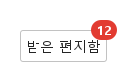
size는 "medium"(기본, 높이 20 px) 또는 "small"(16 px)입니다.

Qt 실행 화면 · 이미지
size · 기본
QML 코드
import QtQuick
import Syidax.Core

Item {
    implicitWidth: Math.max(360, childrenRect.width)
    implicitHeight: childrenRect.height
    property QtObject settings: QtObject {
        id: storyArgs
        property string size: "medium"
    }


    Item {
        width: 200
        height: 56
        SyBadge {
            x: 12
            y: 12
            value: 12
            size: storyArgs.size
            SyButton { text: "받은 편지함" }
        }
    }
}

04 dot

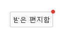
dot: true는 숫자 대신 단순한 점을 그립니다 — size: "medium"에서 8 px, "small"에서 6 px.

Qt 실행 화면 · 이미지
dot · 기본
QML 코드
import QtQuick
import Syidax.Core

Item {
    implicitWidth: Math.max(360, childrenRect.width)
    implicitHeight: childrenRect.height
    property QtObject settings: QtObject {
        id: storyArgs
        property bool dot: true
        property string size: "medium"
    }


    Item {
        width: 200
        height: 56
        SyBadge {
            x: 12
            y: 12
            dot: storyArgs.dot
            value: 3
            size: storyArgs.size
            SyButton { text: "받은 편지함" }
        }
    }
}

05 position

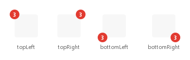
position은 감싼 내용의 어느 모서리에 배지가 놓일지 정합니다: "topLeft", "topRight"(기본), "bottomLeft", "bottomRight".

Qt 실행 화면 · 이미지
position · 기본
기본 실행 화면
QML 코드
import QtQuick
import Syidax.Core

pragma ComponentBehavior: Bound

Item {
    implicitWidth: Math.max(360, childrenRect.width)
    implicitHeight: childrenRect.height
    id: story
    readonly property var positions: ["topLeft", "topRight", "bottomLeft", "bottomRight"]

    Row {
        spacing: 40
        leftPadding: 12
        topPadding: 12
        bottomPadding: 12
        Repeater {
            model: story.positions
            delegate: Column {
                id: cell
                required property string modelData
                spacing: 12
                SyBadge {
                    anchors.horizontalCenter: parent.horizontalCenter
                    value: 3
                    position: cell.modelData
                    Rectangle { width: 48; height: 48; color: Theme.semantic.backgroundBold; radius: 4 }
                }
                Text { anchors.horizontalCenter: parent.horizontalCenter; text: cell.modelData; font.family: Theme.fontFamily; font.pixelSize: 11; color: Theme.semantic.textSubtle }
            }
        }
    }
}

06 overflowCount

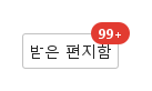
overflowCount는 숫자를 제한합니다: 0보다 크고 value가 그 값을 넘으면 배지는 제한값 뒤에 "+"를 붙여 보여 줍니다(overflowCount: 99이면 120은 "99+", 99는 그대로 "99").

Qt 실행 화면 · 이미지
overflowCount · 기본
기본 실행 화면
QML 코드
import QtQuick
import Syidax.Core

Item {
    implicitWidth: Math.max(360, childrenRect.width)
    implicitHeight: childrenRect.height
    property QtObject settings: QtObject {
        id: storyArgs
        property int value: 120
        property int overflowCount: 99
    }


    Item {
        width: 200
        height: 56
        SyBadge {
            x: 12
            y: 12
            value: storyArgs.value
            overflowCount: storyArgs.overflowCount
            SyButton { text: "받은 편지함" }
        }
    }
}

07 standalone

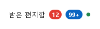
standalone: true는 감싸는 내용 없이 배지만 그립니다: 아이템의 크기가 배지의 크기(medium 한 자리 숫자는 20 × 20 px)가 되어 글자 옆이나 Row 안에 나란히 둘 수 있습니다.

Qt 실행 화면 · 이미지
standalone · 기본
기본 실행 화면
QML 코드
import QtQuick
import Syidax.Core

Item {
    implicitWidth: Math.max(360, childrenRect.width)
    implicitHeight: childrenRect.height

    Row {
        spacing: 8
        Text { anchors.verticalCenter: parent.verticalCenter; text: "받은 편지함"; font.family: Theme.fontFamily; font.pixelSize: 14; color: Theme.semantic.textDefault }
        SyBadge { anchors.verticalCenter: parent.verticalCenter; standalone: true; value: 12 }
        SyBadge { anchors.verticalCenter: parent.verticalCenter; standalone: true; value: 120; overflowCount: 99; variant: "blue" }
        SyBadge { anchors.verticalCenter: parent.verticalCenter; standalone: true; dot: true; variant: "green" }
    }
}

08 왼쪽 아래 배지

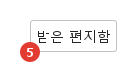
position 설정을 적용한 왼쪽 아래 배지 예제입니다.

Qt 실행 화면 · 이미지
왼쪽 아래 배지 · 실행 결과
기본 실행 화면
QML 코드
import QtQuick
import Syidax.Core

Item {
    implicitWidth: Math.max(360, childrenRect.width)
    implicitHeight: childrenRect.height
    id: story

    property QtObject settings: QtObject {
        id: storyArgs
        property int value: 5
        property int overflowCount: 0
        property bool dot: false
        property bool hidden: false
        property bool standalone: false
        property string position: "bottomLeft"
        property string size: "medium"
        property string variant: "red"
    }


    Item {
        width: 200
        height: 56
        SyBadge {
            x: 12
            y: 12
            value: storyArgs.value
            overflowCount: storyArgs.overflowCount
            dot: storyArgs.dot
            hidden: storyArgs.hidden
            standalone: storyArgs.standalone
            position: storyArgs.position
            size: storyArgs.size
            variant: storyArgs.variant
            SyButton { visible: !storyArgs.standalone; text: "받은 편지함" }
        }
    }

}

API 27

항목을 가리키거나 선택하면 QML 예제와 복사 버튼이 나타납니다.

속성

속성타입기본값설명
list (기본 속성)—감싸는 내용. 배지는 그 모서리 중 하나에 놓이고 그 크기를 가집니다. standalone이면 숨겨집니다.
int0개수. 내림해서 표시하며 0은 "0"으로 그려집니다.
int0제한: 0보다 크고 value가 넘으면 N = overflowCount인 "N+"로 표시합니다.
boolfalse숫자 대신 점(8 / 6 px)을 그립니다. value와 overflowCount는 무시됩니다.
boolfalse표시만 숨기고 내용과 크기는 유지합니다.
bool자동감싼 시각 항목이 없으면 true, 있으면 false입니다. true를 명시하면 내용을 숨기고 배지 자체 크기를 사용합니다.
string"topRight"모서리: "topLeft" · "topRight" · "bottomLeft" · "bottomRight".
string"medium""medium" = 숫자 20 px / 점 8 px · "small" = 숫자 16 px / 점 6 px.
string"red""red" · "yellow" · "green" · "blue" · "gray" — 의미 색.
string (읽기 전용)—실제로 그려지는 글자: 점이면 "", 제한되면 "N+", 그 밖에는 개수.
real (읽기 전용)—현재 size와 dot에 따른 표시의 높이(숫자) 또는 지름(점).
real (읽기 전용)—표시의 중심이 모서리 밖으로 나가는 거리.
color (읽기 전용)—variant에서 결정된 테마 색.

메서드

항목동작 / 조건
SyBadge는 메서드를 선언하지 않습니다.

시그널

항목동작 / 조건
SyBadge는 자체 시그널을 선언하지 않습니다. QML의 속성 변경 시그널은 쓸 수 있으며 onDisplayValueChanged가 유용합니다.

동작

항목동작 / 조건
배지 안에 선언한 것이 내용입니다(기본 속성). 배지의 implicitWidth / implicitHeight는 내용의 크기와 같아 내용만 있을 때와 똑같이 레이아웃에 들어갑니다. 표시는 모서리 밖으로 걸치며 크기에 포함되지 않으므로, 조상에 clip: true가 있으면 잘립니다.
실제로 그려지는 글자: 점이면 "", 제한되면 "N+", 그 밖에는 개수.
제한: 0보다 크고 value가 넘으면 N = overflowCount인 "N+"로 표시합니다. 0 = 제한 없음.
개수. 내림해서 표시하며 0은 "0"으로 그려집니다.
숫자 배지의 높이는 20 px("medium") 또는 16 px("small")이고 최소한 높이만큼 넓으며, 두 글자부터 양쪽에 6 px 여백이 붙습니다. 점은 8 / 6 px입니다. 표시는 모서리에 중심을 두며 오프셋은 숫자 10 / 8 px, 점 4 / 3 px입니다. 숫자는 12 px 굵은 글씨입니다.
모서리: "topLeft" · "topRight" · "bottomLeft" · "bottomRight".
감싼 시각 항목이 없으면 true, 있으면 false입니다. true를 명시하면 내용을 숨기고 배지 자체 크기를 사용합니다.
표시만 숨기고 내용과 크기는 유지합니다.
"red" · "yellow" · "green" · "blue" · "gray" — 의미 색.
배지는 포인터 입력을 처리하지 않습니다. 클릭은 내용으로 전달됩니다.

키보드

항목동작 / 조건
글자 라벨에는 SyTag, 흔한 내용으로 SyAvatar와 SyIcon, 개수가 붙는 받은 편지함식 버튼에는 SyButton.