QML
← 전체 컴포넌트

Card

제목, 이미지, 내용과 동작을 하나의 카드로 묶습니다. 관련 정보를 독립된 단위로 보여 줄 때 사용합니다.

import Syidax.Core.Card

지원 QML 타입

타입정의 / 역할
머리말·본문·꼬리말을 담는 콘텐츠 상자입니다.

예제로 보기

미리보기는 Qt 실행 화면의 이미지입니다. 아래 버튼으로 결과를 전환하세요.

01 기본 구성

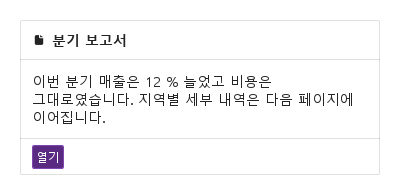
SyCard는 관련된 내용을 묶는 테두리 패널입니다: 위의 선택적인 커버, 굵은 cardTitle(또는 직접 만든 header 아이템)과 오른쪽 끝의 headerActions가 있는 헤더, 카드 안에 선언한 본문, 그리고 푸터.

Qt 실행 화면 · 이미지
기본 구성 · 기본
기본 실행 화면
QML 코드
import QtQuick
import Syidax.Core

Item {
    implicitWidth: Math.max(360, childrenRect.width)
    implicitHeight: childrenRect.height
    id: story

    property QtObject settings: QtObject {
        id: storyArgs
        property string cardTitle: "분기 보고서"
        property bool collapsible: false
        property bool active: true
        property bool showFooter: true
        property bool backdrop: false
        property bool showIcon: true
    }


    SyCard {
        width: 360
        cardTitle: storyArgs.cardTitle
        collapsible: storyArgs.collapsible
        active: storyArgs.active
        showFooter: storyArgs.showFooter
        backdrop: storyArgs.backdrop
        showIcon: storyArgs.showIcon
        icon: Icons.pdfViewerDocument
        footer: SyButton { text: "열기"; size: "small"; variant: "primary" }
        Text { width: parent.width; wrapMode: Text.WordWrap; text: "이번 분기 매출은 12 % 늘었고 비용은 그대로였습니다. 지역별 세부 내역은 다음 페이지에 이어집니다."; font.family: Theme.fontFamily; font.pixelSize: 14; color: Theme.card.bodyTextEnabled }
    }

}

02 collapsible · active

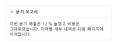
collapsible: true는 헤더 왼쪽에 셰브론을 둡니다.

Qt 실행 화면 · 이미지
collapsible · active · 기본
QML 코드
import QtQuick
import Syidax.Core

Item {
    implicitWidth: Math.max(360, childrenRect.width)
    implicitHeight: childrenRect.height
    // Focused Gallery routes: keep only the selected API and its prerequisites.
    id: featureStory

    property QtObject settings: QtObject {
        id: storyArgs
        property bool collapsible: true
        property bool active: true
    }


    SyCard { id: featureTarget0;
        width: 360; cardTitle: "분기 보고서"; collapsible: storyArgs.collapsible; active: storyArgs.active
        onToggled: (active) => storyArgs.active = active    // keep the control in step with the chevron
        Text { width: parent.width; wrapMode: Text.WordWrap; text: "이번 분기 매출은 12 % 늘었고 비용은 그대로였습니다. 지역별 세부 내역은 다음 페이지에 이어집니다."; font.family: Theme.fontFamily; font.pixelSize: 14; color: Theme.card.bodyTextEnabled }
    }
}

03 cover · showCover

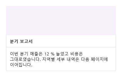
cover는 헤더 위에 테두리 안을 끝에서 끝까지 채워 보이는 아이템을 받습니다 — 보통 Image나 색 띠입니다.

Qt 실행 화면 · 이미지
cover · showCover · 기본
QML 코드
import QtQuick
import Syidax.Core

Item {
    implicitWidth: Math.max(360, childrenRect.width)
    implicitHeight: childrenRect.height
    // Focused Gallery routes: keep only the selected API and its prerequisites.
    id: featureStory

    property QtObject settings: QtObject {
        id: storyArgs
        property bool showCover: true
    }


    SyCard { id: featureTarget0;
        width: 360; cardTitle: "분기 보고서"; showCover: storyArgs.showCover
        cover: Rectangle { width: parent ? parent.width : 0; height: 96; color: Theme.semantic.backgroundBrandDefault }
        Text { width: parent ? parent.width : 0; wrapMode: Text.WordWrap; text: "이번 분기 매출은 12 % 늘었고 비용은 그대로였습니다. 지역별 세부 내역은 다음 페이지에 이어집니다."; font.family: Theme.fontFamily; font.pixelSize: 14; color: Theme.card.bodyTextEnabled }
    }
}

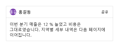
04 header · headerActions

헤더 행은 40 px 높이(내용이 필요하면 더 높게)로 커버 아래에 있습니다.

Qt 실행 화면 · 이미지
header · headerActions · 기본
기본 실행 화면
QML 코드
import QtQuick
import Syidax.Core

Item {
    implicitWidth: Math.max(360, childrenRect.width)
    implicitHeight: childrenRect.height
    // Focused Gallery routes: keep only the selected API and its prerequisites.
    id: featureStory

    SyCard { id: featureTarget0;
        width: 360
        header: Row {
            spacing: 6
            SyAvatar { text: "홍길동"; size: "small"; variant: "purple" }
            Text { anchors.verticalCenter: parent.verticalCenter; text: "홍길동"; font.family: Theme.fontFamily; font.pixelSize: 14; font.weight: Font.Bold; color: Theme.card.headerTextEnabled }
        }
        headerActions: SyButton { text: "공유"; size: "small"; variant: "borderless" }
        Text { width: parent.width; wrapMode: Text.WordWrap; text: "이번 분기 매출은 12 % 늘었고 비용은 그대로였습니다. 지역별 세부 내역은 다음 페이지에 이어집니다."; font.family: Theme.fontFamily; font.pixelSize: 14; color: Theme.card.bodyTextEnabled }
    }
}

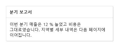
05 backdrop

backdrop: true는 부드러운 그림자로 카드를 띄웁니다 — 오른쪽 아래로 어긋난 반투명 층 셋이 테두리 뒤에 그려집니다.

Qt 실행 화면 · 이미지
backdrop · 기본
QML 코드
import QtQuick
import Syidax.Core

Item {
    implicitWidth: Math.max(360, childrenRect.width)
    implicitHeight: childrenRect.height
    property QtObject settings: QtObject {
        id: storyArgs
        property bool backdrop: true
    }


    Item {
        width: 380
        height: card.height + 20
        SyCard {
            id: card
            x: 8
            y: 8
            width: 360; cardTitle: "분기 보고서"; backdrop: storyArgs.backdrop
            Text { width: parent.width; wrapMode: Text.WordWrap; text: "이번 분기 매출은 12 % 늘었고 비용은 그대로였습니다. 지역별 세부 내역은 다음 페이지에 이어집니다."; font.family: Theme.fontFamily; font.pixelSize: 14; color: Theme.card.bodyTextEnabled }
        }
    }
}

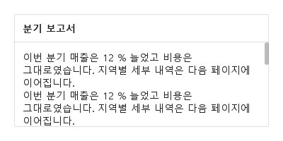
06 showScrollBar

카드는 기본적으로 내용 높이에 맞춰집니다.

Qt 실행 화면 · 이미지
showScrollBar · 기본
기본 실행 화면
QML 코드
import QtQuick
import Syidax.Core

Item {
    implicitWidth: Math.max(360, childrenRect.width)
    implicitHeight: childrenRect.height

    SyCard {
        width: 360; height: 160; cardTitle: "분기 보고서"
        Column {
            width: parent.width
            Repeater { model: 8; Text { text: "이번 분기 매출은 12 % 늘었고 비용은 그대로였습니다. 지역별 세부 내역은 다음 페이지에 이어집니다."; width: parent.width; wrapMode: Text.WordWrap; font.family: Theme.fontFamily; font.pixelSize: 14; color: Theme.card.bodyTextEnabled } }
        }
    }
}

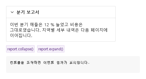
07 toggled

toggled(active)는 카드의 유일한 사용자 정의 시그널입니다.

Qt 실행 화면 · 이미지
toggled · 기본
QML 코드
import QtQuick
import Syidax.Core

Item {
    component EventLog: Rectangle {
        id: logBox
        property var lines: []
        implicitWidth: 440
        implicitHeight: Math.max(56, logText.implicitHeight + 24)
        radius: 4; color: Theme.semantic.backgroundBold
        function log(value) { lines = lines.slice(-3).concat([String(value)]) }
        Text {
            id: logText; x: 12; y: 12; width: parent.width - 24
            text: logBox.lines.length ? logBox.lines.join("\n") : "컨트롤을 조작하면 이벤트 결과가 표시됩니다."
            wrapMode: Text.Wrap; color: Theme.semantic.textDefault
            font.family: Theme.monoFontFamily; font.pixelSize: 12
        }
    }

    implicitWidth: Math.max(360, childrenRect.width)
    implicitHeight: childrenRect.height

    Column {
        spacing: 12
        SyCard {
            id: report
            width: 360; cardTitle: "분기 보고서"; collapsible: true
            onToggled: (active) => output.log(("toggled: active = %1").arg(active))
            Text { width: parent.width; wrapMode: Text.WordWrap; text: "이번 분기 매출은 12 % 늘었고 비용은 그대로였습니다. 지역별 세부 내역은 다음 페이지에 이어집니다."; font.family: Theme.fontFamily; font.pixelSize: 14; color: Theme.card.bodyTextEnabled }
        }
        Row {
            spacing: 8
            SyButton { id: exampleControl1;  text: "report.collapse()"; variant: "secondary"; size: "small"; onClicked: report.collapse() }
            SyButton { id: exampleControl2;  text: "report.expand()"; variant: "secondary"; size: "small"; onClicked: report.expand() }
        }
        EventLog { id: output }
    }
}

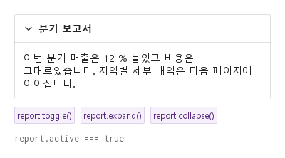
08 toggle · expand · collapse

- toggle() — active를 뒤집되 collapsible이 켜져 있을 때만.

Qt 실행 화면 · 이미지
toggle · expand · collapse · 기본
QML 코드
import QtQuick
import Syidax.Core

Item {
    implicitWidth: Math.max(360, childrenRect.width)
    implicitHeight: childrenRect.height
    // Focused Gallery routes: keep only the selected API and its prerequisites.
    id: featureStory

    Column {
        spacing: 12
        SyCard {
            id: report
            width: 360; cardTitle: "분기 보고서"; collapsible: true; closeDelay: 300
            Text { width: parent.width; wrapMode: Text.WordWrap; text: "이번 분기 매출은 12 % 늘었고 비용은 그대로였습니다. 지역별 세부 내역은 다음 페이지에 이어집니다."; font.family: Theme.fontFamily; font.pixelSize: 14; color: Theme.card.bodyTextEnabled }
        }
        Row {
            spacing: 8
            SyButton { id: exampleControl1;  visible: true; text: "report.toggle()"; variant: "secondary"; size: "small"; onClicked: report.toggle() }
            SyButton { id: exampleControl2;  visible: true; text: "report.expand()"; variant: "secondary"; size: "small"; onClicked: report.expand() }
            SyButton { id: exampleControl3;  visible: true; text: "report.collapse()"; variant: "secondary"; size: "small"; onClicked: report.collapse() }
        }
        Text {
            text: "report.active === " + report.active
            font.family: Theme.monoFontFamily
            font.pixelSize: 12
            color: Theme.semantic.textSubtle
        }
    }
}

API 52

항목을 가리키거나 선택하면 QML 예제와 복사 버튼이 나타납니다.

속성

속성타입기본값설명
——본문 아이템(12 px 여백).
list (alias)—헤더 위의 아이템. showCover일 때 그려짐.
list (alias)—제목 행을 대신하는 아이템.
list (alias)—헤더 오른쪽 끝의 아이템.
list (alias)—푸터의 아이템. showFooter일 때 그려짐.
string""굵은 제목(header에 아이템이 있으면 숨김).
boolfalse셰브론. toggle()에도 필요.
booltrue펼침(true) 또는 접힘(false). 대입해도 toggled는 없음.
bool자동cover 콘텐츠가 있으면 자동으로 표시합니다. false로 일시적으로 숨길 수 있습니다.
booltrue푸터 아이템을 그림.
boolfalse둘 중 하나가 카드를 그림자로 띄움(lifted).
booltrue높이가 고정된 카드에서는 넘치는 본문을 기본으로 스크롤합니다. false로 설정하면 잘라냅니다.
bool자동icon을 지정하면 표시합니다. showIcon: false로 일시적으로 숨깁니다.
url—icon을 지정하면 표시합니다. showIcon: false로 일시적으로 숨깁니다.
int0셰브론이나 메서드가 요청한 펼치기 / 접기가 적용되기까지의 밀리초.
bool (읽기 전용)—각 부분이 그려지는지.
bool (읽기 전용)—backdrop || showBackdrop.
real (읽기 전용)—본문의 자연 높이(접히면 0)
real (읽기 전용)—커버 + 헤더 + 푸터.

메서드

메서드설명
active를 뒤집음(지연을 거쳐). collapsible이 아니면 무시.
active를 true / false로(openDelay / closeDelay를 거쳐). collapsible 없이도 동작.

시그널

시그널인자시점
active: bool셰브론, toggle(), expand(), collapse()가 active를 바꿈(지연 뒤). 직접 대입에는 없음. 이미 요청한 상태였으면 없음.
—속성 자체의 시그널 — 대입을 포함한 모든 변화.

동작

항목동작 / 조건
cover 콘텐츠가 있으면 자동으로 표시합니다. false로 일시적으로 숨길 수 있습니다.
2 px 모서리의 1 px 테두리 안에 Column이 쌓습니다: 커버(showCover이고 커버 아이템이 있을 때), 헤더 행(제목, showIcon, 헤더 아이템, 동작 아이템, 또는 collapsible이 있을 때), 본문, 푸터(showFooter이고 푸터 아이템이 있을 때). 왼쪽부터: 셰브론(collapsible), 그다음 제목 행 — 아이콘(showIcon과 icon, 14 px)과 굵은 14 px cardTitle, 생략 — 또는 header 아이템이 있으면 그것, 그다음 오른쪽 끝의 headerActions 아이템.
셰브론. toggle()에도 필요.
푸터 아이템을 그림.
왼쪽부터: 셰브론(collapsible), 그다음 제목 행 — 아이콘(showIcon과 icon, 14 px)과 굵은 14 px cardTitle, 생략 — 또는 header 아이템이 있으면 그것, 그다음 오른쪽 끝의 headerActions 아이템.
굵은 제목(header에 아이템이 있으면 숨김).
제목 행을 대신하는 아이템.
헤더 오른쪽 끝의 아이템.
기본 속성입니다. 아이템은 사방 12 px 여백의 안쪽 아이템에 놓이며 폭은 카드에서 여백을 뺀 만큼입니다 — 글자와 컬럼에 width: parent.width를 바인딩하십시오. 본문의 자연 높이는 자식 높이 더하기 24 px이고, active가 false면 0입니다. 카드 height가 고정되면 본문은 height − 커버 − 헤더 − 푸터를 얻고 잘립니다. showScrollBar는 본문을 스크롤 영역(휠과 끌기; 오른쪽의 6 px 막대)으로 만들며, 내용이 본문보다 길 때만 켜집니다.
펼침(true) 또는 접힘(false). 대입해도 toggled는 없음.
active를 뒤집음(지연을 거쳐). collapsible이 아니면 무시.
toggle()은 collapsible 없이는 무시되고, expand() / collapse()는 항상 동작합니다.
각각 openDelay / closeDelay(ms)를 지납니다: 지연이 0보다 크면 그만큼 기다리고, 새 요청이 대기 중인 요청을 대체하며, 지연 0은 즉시 적용되고 대기 중인 변화를 취소합니다.
셰브론, toggle(), expand(), collapse()가 active를 바꿈(지연 뒤). 직접 대입에는 없음. 이미 요청한 상태였으면 없음.
속성 자체의 시그널 — 대입을 포함한 모든 변화.
backdrop이나 showBackdrop은 카드 뒤에 오른쪽 아래로 1 – 3 px 어긋난 반투명 층 셋을 그립니다 — 카드 경계 밖의 부드러운 그림자.
implicitWidth 320.
implicitHeight = 커버 + 헤더 + 푸터(chromeHeight) + 본문(bodyHeight).

키보드

항목동작 / 조건
SyCollapse(목록의 접히는 구역), SyAvatar / SyButton / SyTag(흔한 헤더와 푸터 아이템), SyModeless(떠 있는 카드 같은 창).