Button
저장, 확인, 창 열기 등의 작업을 실행하는 버튼입니다. 텍스트와 아이콘으로 동작을 표시합니다.
import Syidax.Core.Button
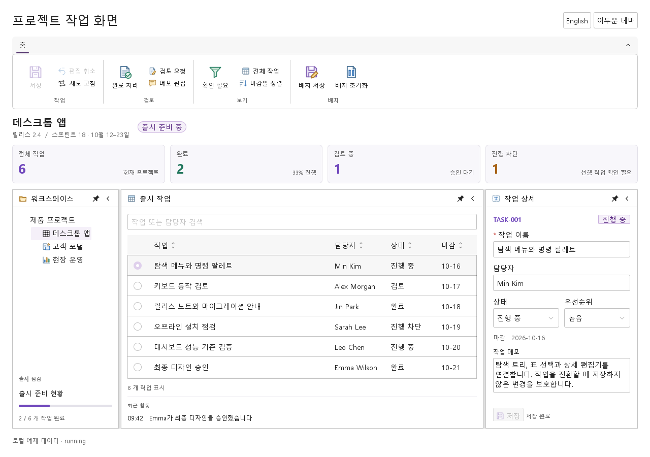
미리보기는 Qt 실행 화면의 이미지입니다. 아래 버튼으로 결과를 전환하세요.
01 기본 구성
SyButton은 명령 컨트롤입니다 — 저장, 제출, 다음 단계.
Qt 실행 화면 · 이미지기본 실행 화면
QML 코드
import QtQuick
import Syidax.Core

Item {
    implicitWidth: Math.max(360, childrenRect.width)
    implicitHeight: childrenRect.height

    property QtObject settings: QtObject {
        id: storyArgs
        property string text: "저장하기"
        property string variant: "primary"
        property string size: "medium"
        property bool disabled: false
        property bool loading: false
        property bool icon: false
        property bool iconOnly: false
        property string tooltip: ""
    }


    SyButton {
        text: storyArgs.text
        variant: storyArgs.variant
        size: storyArgs.size
        disabled: storyArgs.disabled
        loading: storyArgs.loading
        iconOnly: storyArgs.iconOnly
        tooltip: storyArgs.tooltip
        icon.source: storyArgs.icon ? Icons.inputSearch : ""
    }

}
02 variant
variant가 팔레트를 고릅니다.
Qt 실행 화면 · 이미지QML 코드
import QtQuick
import Syidax.Core

Item {
    implicitWidth: Math.max(360, childrenRect.width)
    implicitHeight: childrenRect.height
    property QtObject settings: QtObject {
        id: storyArgs
        property string variant: "default"
    }


    SyButton { text: "Button"; variant: storyArgs.variant }
}
03 size
size가 높이와 글자 크기를 정합니다.
Qt 실행 화면 · 이미지QML 코드
import QtQuick
import Syidax.Core

Item {
    implicitWidth: Math.max(360, childrenRect.width)
    implicitHeight: childrenRect.height
    property QtObject settings: QtObject {
        id: storyArgs
        property string size: "medium"
    }


    SyButton { text: "Button"; size: storyArgs.size }
}
04 disabled
disabled: true는 버튼을 반응하지 않게 만듭니다.
Qt 실행 화면 · 이미지QML 코드
import QtQuick
import Syidax.Core

Item {
    implicitWidth: Math.max(360, childrenRect.width)
    implicitHeight: childrenRect.height
    property QtObject settings: QtObject {
        id: storyArgs
        property bool disabled: true
        property string variant: "default"
    }


    SyButton { text: "Button"; disabled: storyArgs.disabled; variant: storyArgs.variant }
}
05 loading
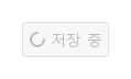
loading: true는 버튼이 작업 중임을 알립니다.
Qt 실행 화면 · 이미지QML 코드
import QtQuick
import Syidax.Core

Item {
    implicitWidth: Math.max(360, childrenRect.width)
    implicitHeight: childrenRect.height
    property QtObject settings: QtObject {
        id: storyArgs
        property bool loading: true
        property string size: "medium"
    }


    SyButton { text: "저장 중"; loading: storyArgs.loading; size: storyArgs.size }
}
06 fullWidth
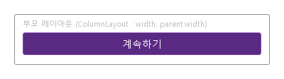
fullWidth: true는 Layout.fillWidth를 설정하므로 Qt Quick 레이아웃(ColumnLayout, RowLayout, GridLayout) 안에서 버튼이 레이아웃의 전체 너비로 늘어나며 아이콘과 텍스트는 가운데에 남습니다.
Qt 실행 화면 · 이미지QML 코드
import QtQuick
import QtQuick.Layouts
import Syidax.Core

Item {
    implicitWidth: Math.max(360, childrenRect.width)
    implicitHeight: childrenRect.height
    id: story
    property QtObject settings: QtObject {
        id: storyArgs
        property bool fullWidth: true
    }


    Rectangle {
        width: story.width
        height: layout.implicitHeight + 40
        color: "transparent"
        radius: Foundation.borderRadiusMedium
        border.width: 1
        border.color: Theme.semantic.borderBold
        Text {
            x: 12
            y: 6
            text: "부모 레이아웃 (ColumnLayout · width: parent.width)"
            font.family: Theme.fontFamily
            font.pixelSize: 11
            color: Theme.semantic.textSubtlest
        }
        ColumnLayout {
            id: layout
            x: 12
            y: 26
            width: parent.width - 24
            SyButton { text: "계속하기"; variant: "primary"; fullWidth: storyArgs.fullWidth }
        }
    }
}
07 icon.source
icon.source는 텍스트 앞에 글리프를 놓습니다.
Qt 실행 화면 · 이미지QML 코드
import QtQuick
import Syidax.Core

Item {
    implicitWidth: Math.max(360, childrenRect.width)
    implicitHeight: childrenRect.height
    property QtObject settings: QtObject {
        id: storyArgs
        property string text: "검색"
        property bool icon: true
        property string variant: "default"
    }


    SyButton { text: storyArgs.text; variant: storyArgs.variant; icon.source: storyArgs.icon ? Icons.inputSearch : "" }
}
08 slot
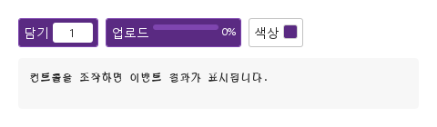
SyButton { … } 안에 쓴 아이템은 버튼의 콘텐츠 슬롯입니다.
Qt 실행 화면 · 이미지기본 실행 화면
QML 코드
import QtQuick
import Syidax.Core

Item {
    component EventLog: Rectangle {
        id: logBox
        property var lines: []
        implicitWidth: 440
        implicitHeight: Math.max(56, logText.implicitHeight + 24)
        radius: 4; color: Theme.semantic.backgroundBold
        function log(value) { lines = lines.slice(-3).concat([String(value)]) }
        Text {
            id: logText; x: 12; y: 12; width: parent.width - 24
            text: logBox.lines.length ? logBox.lines.join("\n") : "컨트롤을 조작하면 이벤트 결과가 표시됩니다."
            wrapMode: Text.Wrap; color: Theme.semantic.textDefault
            font.family: Theme.monoFontFamily; font.pixelSize: 12
        }
    }

    implicitWidth: Math.max(360, childrenRect.width)
    implicitHeight: childrenRect.height

    Column {
        spacing: 12
        Row {
            spacing: 8
            SyButton {
                text: "담기"; variant: "primary"
                onClicked: output.log(("담기: %1개").arg(quantity.text))
                Rectangle {
                    width: 44; height: 22; radius: 3; color: Theme.semantic.backgroundDefault
                    TextInput {
                        id: quantity
                        anchors.fill: parent; horizontalAlignment: TextInput.AlignHCenter; verticalAlignment: TextInput.AlignVCenter
                        text: "1"; selectByMouse: true; font.pixelSize: 12; color: Theme.semantic.textDefault
                        validator: IntValidator { bottom: 1; top: 99 }
                    }
                }
            }
            SyButton {
                id: upload
                property real progress: 0
                text: uploading.running ? "업로드 중" : "업로드"; variant: "primary"
                onClicked: uploading.restart()
                NumberAnimation { id: uploading; target: upload; property: "progress"; from: 0; to: 1; duration: 1500; onFinished: output.log("업로드 완료") }
                Rectangle {
                    width: 72; height: 6; radius: 3; color: Theme.semantic.backgroundBrandContrastSubtle
                    Rectangle { width: parent.width * upload.progress; height: parent.height; radius: 3; color: Theme.semantic.textInvert }
                }
                Text { text: Math.round(upload.progress * 100) + "%"; font.pixelSize: 11; color: Theme.semantic.textInvert }
            }
            SyButton {
                id: colorButton
                property var swatches: ["#5a2a82", "#e23b31", "#1677ff", "#2f9e44"]
                property int index: 0
                text: "색상"
                onClicked: { index = (index + 1) % swatches.length; output.log(("색상: %1").arg(swatches[index])) }
                Rectangle { width: 16; height: 16; radius: 3; color: colorButton.swatches[colorButton.index]; border.width: 1; border.color: Theme.semantic.borderSubtle }
            }
        }
        EventLog { id: output }
    }
}
09 iconOnly
iconOnly: true는 텍스트를 숨기고 icon.source의 글리프만 보입니다.
Qt 실행 화면 · 이미지QML 코드
import QtQuick
import Syidax.Core

Item {
    implicitWidth: Math.max(360, childrenRect.width)
    implicitHeight: childrenRect.height
    property QtObject settings: QtObject {
        id: storyArgs
        property bool iconOnly: true
        property string tooltip: "닫기"
        property string size: "medium"
    }


    SyButton { text: "닫기"; iconOnly: storyArgs.iconOnly; tooltip: storyArgs.tooltip; size: storyArgs.size; icon.source: Icons.modalClose }
}
10 clicked
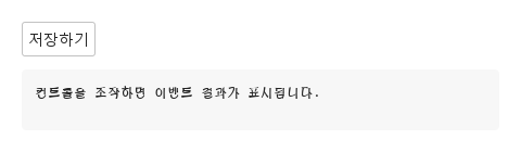
clicked()는 버튼의 고유 시그널입니다.
Qt 실행 화면 · 이미지기본 실행 화면
QML 코드
import QtQuick
import Syidax.Core

Item {
    component EventLog: Rectangle {
        id: logBox
        property var lines: []
        implicitWidth: 440
        implicitHeight: Math.max(56, logText.implicitHeight + 24)
        radius: 4; color: Theme.semantic.backgroundBold
        function log(value) { lines = lines.slice(-3).concat([String(value)]) }
        Text {
            id: logText; x: 12; y: 12; width: parent.width - 24
            text: logBox.lines.length ? logBox.lines.join("\n") : "컨트롤을 조작하면 이벤트 결과가 표시됩니다."
            wrapMode: Text.Wrap; color: Theme.semantic.textDefault
            font.family: Theme.monoFontFamily; font.pixelSize: 12
        }
    }

    implicitWidth: Math.max(360, childrenRect.width)
    implicitHeight: childrenRect.height

    Column {
        spacing: 12
        SyButton { text: "저장하기"; onClicked: output.log("저장 버튼을 눌렀습니다.") }
        EventLog { id: output }
    }
}
11 setFocus · setBlur · setClick
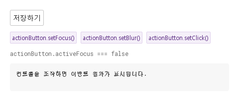
세 함수로 코드에서 버튼을 움직입니다.
Qt 실행 화면 · 이미지QML 코드
import QtQuick
import Syidax.Core

Item {
    component EventLog: Rectangle {
        id: logBox
        property var lines: []
        implicitWidth: 440
        implicitHeight: Math.max(56, logText.implicitHeight + 24)
        radius: 4; color: Theme.semantic.backgroundBold
        function log(value) { lines = lines.slice(-3).concat([String(value)]) }
        Text {
            id: logText; x: 12; y: 12; width: parent.width - 24
            text: logBox.lines.length ? logBox.lines.join("\n") : "컨트롤을 조작하면 이벤트 결과가 표시됩니다."
            wrapMode: Text.Wrap; color: Theme.semantic.textDefault
            font.family: Theme.monoFontFamily; font.pixelSize: 12
        }
    }

    implicitWidth: Math.max(360, childrenRect.width)
    implicitHeight: childrenRect.height
    // Focused Gallery routes: keep only the selected API and its prerequisites.
    id: featureStory

    Column {
        spacing: 12
        SyButton { id: actionButton; text: "저장하기"; onClicked: output.log("저장 버튼을 눌렀습니다.") }
        Row {
            spacing: 8
            SyButton { id: exampleControl1;  visible: true; text: "actionButton.setFocus()"; variant: "secondary"; size: "small"; onClicked: actionButton.setFocus() }
            SyButton { id: exampleControl2;  visible: true; text: "actionButton.setBlur()"; variant: "secondary"; size: "small"; onClicked: actionButton.setBlur() }
            SyButton { visible: true; text: "actionButton.setClick()"; variant: "secondary"; size: "small"; onClicked: actionButton.setClick() }
        }
        Text {
            text: "actionButton.activeFocus === " + actionButton.activeFocus
            font.family: Theme.monoFontFamily
            font.pixelSize: 12
            color: Theme.semantic.textSubtle
        }
        EventLog { id: output }
    }
}
12 작은 아이콘 명령
size · icon 설정을 적용한 작은 아이콘 명령 예제입니다.
Qt 실행 화면 · 이미지기본 실행 화면
QML 코드
import QtQuick
import Syidax.Core

Item {
    implicitWidth: Math.max(360, childrenRect.width)
    implicitHeight: childrenRect.height

    property QtObject settings: QtObject {
        id: storyArgs
        property string text: "저장하기"
        property string variant: "primary"
        property string size: "small"
        property bool disabled: false
        property bool loading: false
        property bool icon: true
        property bool iconOnly: false
        property string tooltip: ""
    }


    SyButton {
        text: storyArgs.text
        variant: storyArgs.variant
        size: storyArgs.size
        disabled: storyArgs.disabled
        loading: storyArgs.loading
        iconOnly: storyArgs.iconOnly
        tooltip: storyArgs.tooltip
        icon.source: storyArgs.icon ? Icons.inputSearch : ""
    }

}
API 50
항목을 가리키거나 선택하면 QML 예제와 복사 버튼이 나타납니다.