QML
← 전체 컴포넌트

Textarea

메모, 설명, 댓글처럼 여러 줄의 긴 텍스트를 입력하는 필드입니다.

import Syidax.Core.Textarea

지원 QML 타입

타입정의 / 역할
라벨·검증·글자 수 제한·카운터와 선택적 크기 조절 손잡이를 갖춘 여러 줄 텍스트 필드입니다.

예제로 보기

미리보기는 Qt 실행 화면의 이미지입니다. 아래 버튼으로 결과를 전환하세요.

01 기본 구성

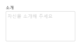
SyTextarea는 여러 줄 텍스트 필드입니다.

Qt 실행 화면 · 이미지
기본 구성 · 기본
기본 실행 화면
QML 코드
import QtQuick
import Syidax.Core

Item {
    implicitWidth: Math.max(360, childrenRect.width)
    implicitHeight: childrenRect.height

    property QtObject settings: QtObject {
        id: storyArgs
        property string label: "소개"
        property string placeholder: "자신을 소개해 주세요"
        property string value: ""
        property int rows: 4
        property string size: "medium"
        property string status: "default"
        property string resize: "none"
        property bool required: false
        property bool disabled: false
        property bool readonly: false
        property bool clearable: false
        property bool counter: false
        property int max: 0
        property string message: ""
    }


    SyTextarea {
        label: storyArgs.label
        placeholder: storyArgs.placeholder
        value: storyArgs.value
        rows: storyArgs.rows
        size: storyArgs.size
        status: storyArgs.status
        resize: storyArgs.resize
        required: storyArgs.required
        disabled: storyArgs.disabled
        readonly: storyArgs.readonly
        clearable: storyArgs.clearable
        counter: storyArgs.counter
        max: storyArgs.max
        message: storyArgs.message
        onValueChanged: if (storyArgs.value !== value) storyArgs.value = value
    }

}

02 rows

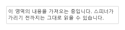
rows는 상자 높이를 텍스트 줄 수로 정합니다.

Qt 실행 화면 · 이미지
rows · 기본
기본 실행 화면
QML 코드
import QtQuick
import Syidax.Core

Item {
    implicitWidth: Math.max(360, childrenRect.width)
    implicitHeight: childrenRect.height
    property QtObject settings: QtObject {
        id: storyArgs
        property int rows: 2
    }


    SyTextarea { rows: storyArgs.rows; value: "이 영역의 내용을 가져오는 중입니다. 스피너가 가리기 전까지는 그대로 읽을 수 있습니다."; width: 360 }
}

03 size

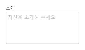
size는 텍스트에어리어 고유의 글자 크기 체계를 정합니다 — 입력처럼 상자 높이를 바꾸지 않습니다.

Qt 실행 화면 · 이미지
size · 기본
QML 코드
import QtQuick
import Syidax.Core

Item {
    implicitWidth: Math.max(360, childrenRect.width)
    implicitHeight: childrenRect.height
    property QtObject settings: QtObject {
        id: storyArgs
        property string size: "medium"
    }


    SyTextarea { label: "소개"; placeholder: "자신을 소개해 주세요"; size: storyArgs.size }
}

04 counter · max

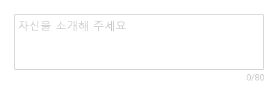
counter: true는 상자 아래 오른쪽 정렬로 "n/max" — 현재 길이 / 제한 — 를 보이며, max가 설정되어 있어야 합니다.

Qt 실행 화면 · 이미지
counter · max · 기본
기본 실행 화면
QML 코드
import QtQuick
import Syidax.Core

Item {
    implicitWidth: Math.max(360, childrenRect.width)
    implicitHeight: childrenRect.height
    // Focused Gallery routes: keep only the selected API and its prerequisites.
    id: featureStory

    SyTextarea { id: featureTarget0; counter: true; max: 80; rows: 3; placeholder: "자신을 소개해 주세요"; width: 360 }
}

05 resize

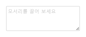
resize는 상자의 오른쪽 아래 모서리에 드래그 손잡이를 더합니다.

Qt 실행 화면 · 이미지
resize · 기본
QML 코드
import QtQuick
import Syidax.Core

Item {
    implicitWidth: Math.max(360, childrenRect.width)
    implicitHeight: childrenRect.height
    property QtObject settings: QtObject {
        id: storyArgs
        property string resize: "both"
    }


    SyTextarea { resize: storyArgs.resize; rows: 3; placeholder: "모서리를 끌어 보세요" }
}

06 disabled · readonly · status

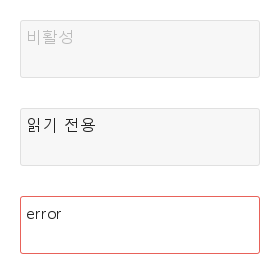
상태와 색조는 입력과 같습니다.

Qt 실행 화면 · 이미지
disabled · readonly · status · 기본
기본 실행 화면
QML 코드
import QtQuick
import Syidax.Core

Item {
    implicitWidth: Math.max(360, childrenRect.width)
    implicitHeight: childrenRect.height
    // Focused Gallery routes: keep only the selected API and its prerequisites.
    id: featureStory

    Column {
        spacing: 12
        SyTextarea { id: featureTarget0; visible: true; value: "비활성"; disabled: true; rows: 2 }
        SyTextarea { id: featureTarget1; visible: true; value: "읽기 전용"; readonly: true; rows: 2 }
        SyTextarea { id: featureTarget2; visible: true; value: "error"; status: "error"; rows: 2 }
    }
}

07 changed · focused · blured

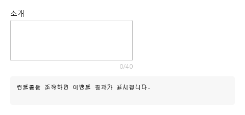
필드에는 시그널이 넷 있습니다.

Qt 실행 화면 · 이미지
changed · focused · blured · 기본
기본 실행 화면
QML 코드
import QtQuick
import Syidax.Core

Item {
    component EventLog: Rectangle {
        id: logBox
        property var lines: []
        implicitWidth: 440
        implicitHeight: Math.max(56, logText.implicitHeight + 24)
        radius: 4; color: Theme.semantic.backgroundBold
        function log(value) { lines = lines.slice(-3).concat([String(value)]) }
        Text {
            id: logText; x: 12; y: 12; width: parent.width - 24
            text: logBox.lines.length ? logBox.lines.join("\n") : "컨트롤을 조작하면 이벤트 결과가 표시됩니다."
            wrapMode: Text.Wrap; color: Theme.semantic.textDefault
            font.family: Theme.monoFontFamily; font.pixelSize: 12
        }
    }

    implicitWidth: Math.max(360, childrenRect.width)
    implicitHeight: childrenRect.height
    // Focused Gallery routes: keep only the selected API and its prerequisites.
    id: featureStory


    Column {
        spacing: 12
        SyTextarea {
            label: "소개"; rows: 3; max: 40; counter: true
            onChanged: (detail) => { if (true) { output.log(("changed: %1자 (valid: %2)").arg(detail.length).arg(detail.isValid)) } }
            onFocused: (detail) => { if (true) { output.log("focused") } }
            onBlured: (detail) => { if (true) { output.log(("blured: status %1").arg(detail.status)) } }
        }
        EventLog { id: output }
    }
}

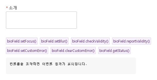
08 setFocus · checkValidity · reportValidity · …

입력과 같은 함수들입니다.

Qt 실행 화면 · 이미지
setFocus · checkValidity · reportValidity · … · 기본
QML 코드
import QtQuick
import Syidax.Core

Item {
    component EventLog: Rectangle {
        id: logBox
        property var lines: []
        implicitWidth: 440
        implicitHeight: Math.max(56, logText.implicitHeight + 24)
        radius: 4; color: Theme.semantic.backgroundBold
        function log(value) { lines = lines.slice(-3).concat([String(value)]) }
        Text {
            id: logText; x: 12; y: 12; width: parent.width - 24
            text: logBox.lines.length ? logBox.lines.join("\n") : "컨트롤을 조작하면 이벤트 결과가 표시됩니다."
            wrapMode: Text.Wrap; color: Theme.semantic.textDefault
            font.family: Theme.monoFontFamily; font.pixelSize: 12
        }
    }

    implicitWidth: Math.max(360, childrenRect.width)
    implicitHeight: childrenRect.height
    // Focused Gallery routes: keep only the selected API and its prerequisites.
    id: featureStory

    Column {
        spacing: 12
        SyTextarea { id: bioField; label: "소개"; rows: 2; required: true }
        Flow {
            width: 560
            spacing: 8
            SyButton { id: exampleControl1;  visible: true; text: "bioField.setFocus()"; variant: "secondary"; size: "small"; onClicked: bioField.setFocus() }
            SyButton { id: exampleControl2;  visible: true; text: "bioField.setBlur()"; variant: "secondary"; size: "small"; onClicked: bioField.setBlur() }
            SyButton { id: exampleControl3;  visible: true; text: "bioField.checkValidity()"; variant: "secondary"; size: "small"; onClicked: output.log("checkValidity() → " + bioField.checkValidity()) }
            SyButton { visible: true; text: "bioField.reportValidity()"; variant: "secondary"; size: "small"; onClicked: output.log("reportValidity() → " + bioField.reportValidity()) }
            SyButton { visible: true; text: "bioField.setCustomError()"; variant: "secondary"; size: "small"; onClicked: bioField.setCustomError() }
            SyButton { visible: true; text: "bioField.clearCustomError()"; variant: "secondary"; size: "small"; onClicked: bioField.clearCustomError() }
            SyButton { visible: true; text: "bioField.getStatus()"; variant: "secondary"; size: "small"; onClicked: output.log("getStatus() → " + JSON.stringify(bioField.getStatus())) }
        }
        EventLog { id: output }
    }
}

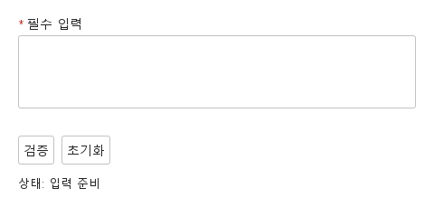
09 필수 입력과 초기화

검증 전·오류 표시·초기화 결과를 비교합니다.

Qt 실행 화면 · 이미지
필수 입력과 초기화 · 입력 전
QML 코드
import QtQuick
import Syidax.Core

Column {
    width: 440; spacing: 12
    SyTextarea {
        id: field; width: parent.width; name: "selection"; required: true
        label: "필수 입력"; rows: 3; max: 120
        
        error: "계속하려면 이 항목을 입력하세요."
    }
    Row {
        spacing: 8
        SyButton { id: check; text: "검증"; onClicked: field.reportValidity() }
        SyButton { id: reset; text: "초기화"; onClicked: field.reset() }
    }
    Text { text: "상태: " + (field.invalid ? "오류" : "입력 준비"); color: Theme.semantic.textDefault }
}

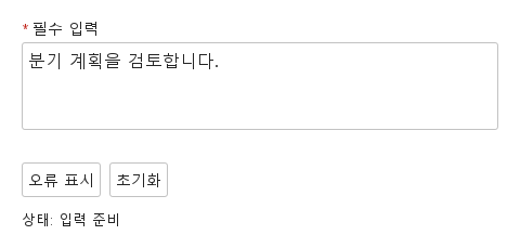
10 사용자 지정 오류

업무 규칙에 맞는 오류를 표시하고 초기화합니다.

Qt 실행 화면 · 이미지
사용자 지정 오류 · 입력 전
QML 코드
import QtQuick
import Syidax.Core

Column {
    width: 440; spacing: 12
    SyTextarea {
        id: field; width: parent.width; name: "selection"; required: true
        label: "필수 입력"; rows: 3; max: 120
        value: "분기 계획을 검토합니다."
        error: "현재 사용할 수 없는 선택입니다. 다른 값을 선택하세요."
    }
    Row {
        spacing: 8
        SyButton { id: check; text: "오류 표시"; onClicked: field.setCustomError() }
        SyButton { id: reset; text: "초기화"; onClicked: field.reset() }
    }
    Text { text: "상태: " + (field.invalid ? "오류" : "입력 준비"); color: Theme.semantic.textDefault }
}

API 90

항목을 가리키거나 선택하면 QML 예제와 복사 버튼이 나타납니다.

속성

항목동작 / 조건
공통 필드 속성(name, label, required, disabled, size, message, error, touched, submitted, customError, validStatus, valid, invalid, preferredWidth, showTitle, ready)은 Form 페이지에 설명되어 있습니다.

속성

속성타입기본값설명
string""텍스트. 편집할 때마다, 그리고 대입할 때 바뀝니다.
int4현재 글자 크기의 줄 수로 나타낸 상자 높이.
string"medium"글자 크기 체계: small 14 px(줄 20 px) · medium 16 px(줄 23 px) · large 20 px(줄 28 px). 줄 높이를 통해 상자 높이를 바꿉니다.
realrows × 줄 + 패딩상자의 현재 높이(최소 32). 손잡이가 쓰며, 직접 쓸 수도 있습니다.
string""값이 비어 있는 동안 표시.
string""상자 위 제목
string""도움말 줄
string""사용자 정의 오류 문구
string""소속 SyForm의 키.
string"default"default · warning · error · success — 검증과 무관한 색조.
boolfalse빈 값 → valueMissing. * 표시를 더합니다.
boolfalse반응 없음, 항상 유효, 제출되지 않음. ×와 손잡이를 숨깁니다.
boolfalse선택·스크롤·크기 조절은 되지만 편집은 안 됨. 항상 유효하며 제출됩니다.
boolfalse값이 있는 동안 오른쪽 위에 ×를 보입니다(포커스 불필요).
boolfalse상자가 포커스되거나 무효가 되기 전까지 테두리 없음.
boolfalse상자 아래에 "n/max"를 보입니다. max > 0이어야 합니다.
int0비어 있지 않은 값의 최소 길이(tooShort). 0 = 없음.
int0최대 길이. 타이핑과 붙여넣기가 거기서 멈추고 코드의 더 긴 값은 tooLong. 0 = 없음.
string"none"none · horizontal · vertical · both — 모서리 손잡이가 허용하는 방향.
boolfalse필드가 만들어지자마자 상자에 포커스.
int(읽기 전용)—현재 글자 수.
bool(읽기 전용)—상자가 활성 포커스를 가짐
bool(읽기 전용)—포인터가 위에 있음.
string(읽기 전용)—문자열로서의 value.
real(읽기 전용)—현재 size의 크기 값들.
읽기 전용—지금 무엇이 보이는지 / 허용되는지, 그리고 현재 색조.

메서드

메서드설명
텍스트 상자에 포커스(focused 발생, 링 표시).
포커스 해제(blured 발생, touched 설정).
상태가 ""이면 true. 화면 변화 없음.
같은 결과를 돌려주고 필드를 보고됨으로 표시해 이제부터 오류 줄이 보이게 합니다.
상태 "custom"과 touched — 오류가 즉시 보입니다. 인자 없음.
custom 상태 해제.
"" · valueMissing · tooShort · tooLong · custom.
초기값으로. touched·보고·custom 플래그를 지웁니다. 손잡이로 정한 너비 / 높이는 남습니다.

시그널

시그널인자발생 시점
detail: { value: string, length: int, isValid: bool, status: string }로딩 뒤 value가 바뀜 — 편집마다, ×, 코드의 대입. 초기값에는 발생하지 않음.
같음상자가 활성 포커스를 얻음.
같음상자가 포커스를 잃음. 먼저 touched가 설정됨.
—×를 누른 뒤. value는 이미 "". 코드가 값을 비울 때는 발생하지 않음.

동작

항목동작 / 조건
텍스트. 편집할 때마다, 그리고 대입할 때 바뀝니다.
로딩 뒤 value가 바뀜 — 편집마다, ×, 코드의 대입. 초기값에는 발생하지 않음.
값이 비어 있는 동안 표시.
현재 글자 수.
현재 글자 크기의 줄 수로 나타낸 상자 높이.
글자 크기 체계: small 14 px(줄 20 px) · medium 16 px(줄 23 px) · large 20 px(줄 28 px). 줄 높이를 통해 상자 높이를 바꿉니다.
상자의 현재 높이(최소 32). 손잡이가 쓰며, 직접 쓸 수도 있습니다.
none · horizontal · vertical · both — 모서리 손잡이가 허용하는 방향.
resize(horizontal · vertical · both)는 오른쪽 아래 모서리에 12 px 손잡이를 보이고, 끌면 필드의 width(최소 80)나 boxHeight(최소 32)가 바뀝니다. width를 정하지(또는 끌지) 않으면 240 px 너비이고 제목·상자·카운터·메시지 줄이 그 너비를 따릅니다.
비어 있지 않은 값의 최소 길이(tooShort). 0 = 없음.
최대 길이. 타이핑과 붙여넣기가 거기서 멈추고 코드의 더 긴 값은 tooLong. 0 = 없음.
빈 값 → valueMissing. * 표시를 더합니다.
오류 줄은 필드가 invalid(touched 또는 보고됨)가 되면 기본 문구나 error를 보이고, 그동안 message는 숨겨집니다. disabled > readonly > invalid > status(warning · error · success) > focus > hover > enabled.
오류 줄은 필드가 invalid(touched 또는 보고됨)가 되면 기본 문구나 error를 보이고, 그동안 message는 숨겨집니다.
상자 아래에 "n/max"를 보입니다. max > 0이어야 합니다.
반응 없음, 항상 유효, 제출되지 않음. ×와 손잡이를 숨깁니다.
선택·스크롤·크기 조절은 되지만 편집은 안 됨. 항상 유효하며 제출됩니다.
default · warning · error · success — 검증과 무관한 색조.
disabled > readonly > invalid > status(warning · error · success) > focus > hover > enabled.
상자가 포커스되거나 무효가 되기 전까지 테두리 없음.
상자가 활성 포커스를 얻음.
상자가 포커스를 잃음. 먼저 touched가 설정됨.
떠나면 blured가 발생하고 touched가 설정됩니다.
값이 있는 동안 오른쪽 위에 ×를 보입니다(포커스 불필요).
×를 누른 뒤. value는 이미 "". 코드가 값을 비울 때는 발생하지 않음.
disabled는 포커스·타이핑·×·손잡이를 막고 SyForm.values()에서 필드를 건너뜁니다.
색은 Theme.textarea에서 오고(warning · error · success 색조는 입력과 공유) Theme.scheme을 따릅니다. 손잡이는 스킴이 바뀌면 다시 그립니다.

키보드

항목동작 / 조건
키보드: Tab과 Shift+Tab으로 필드에 진입하고 이동합니다. 숨김·비활성 필드는 건너뜁니다. 열린 선택기는 Escape로 닫을 수 있습니다. Textarea의 Tab은 들여쓰기 대신 포커스를 이동하며 Modal 안에서는 포커스 경계를 유지합니다.