QML
← 전체 컴포넌트

Tabs

탭을 선택해 같은 영역의 콘텐츠를 전환합니다. 관련 화면을 가로나 세로 탭으로 묶을 때 사용합니다.

import Syidax.Core.Tabs

지원 QML 타입

타입정의 / 역할
SyTab 헤더와 연결된 SyTabContent 본문의 선택을 관리합니다.
tabkey로 식별하는 탭 헤더이며 같은 name의 SyTabContent와 연결합니다.
연결된 SyTab이 선택되었을 때 표시되는 본문 패널입니다.

예제로 보기

미리보기는 Qt 실행 화면의 이미지입니다. 아래 버튼으로 결과를 전환하세요.

01 기본 구성

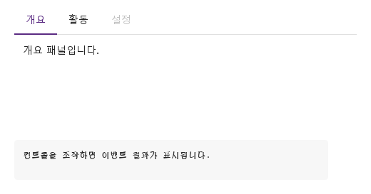
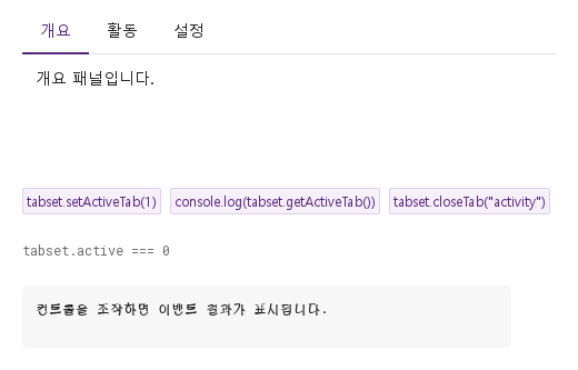
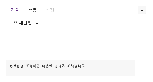
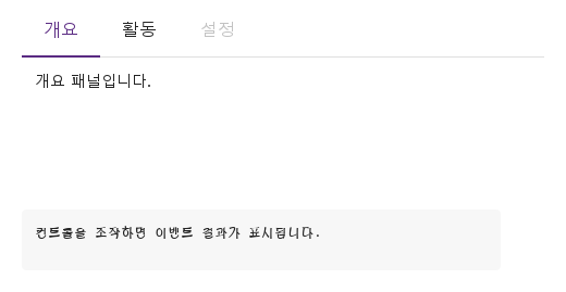
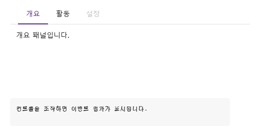
SyTabGroup은 패널을 전환합니다: 안에 선언한 SyTab 헤더들이 position(top · bottom · left · right) 쪽의 스트립에 늘어서고, name이 활성 탭의 tabkey와 같은 SyTabContent 패널이 보입니다.

Qt 실행 화면 · 이미지
기본 구성 · 기본
기본 실행 화면
QML 코드
import QtQuick
import Syidax.Core

Item {
    component EventLog: Rectangle {
        id: logBox
        property var lines: []
        implicitWidth: 440
        implicitHeight: Math.max(56, logText.implicitHeight + 24)
        radius: 4; color: Theme.semantic.backgroundBold
        function log(value) { lines = lines.slice(-3).concat([String(value)]) }
        Text {
            id: logText; x: 12; y: 12; width: parent.width - 24
            text: logBox.lines.length ? logBox.lines.join("\n") : "컨트롤을 조작하면 이벤트 결과가 표시됩니다."
            wrapMode: Text.Wrap; color: Theme.semantic.textDefault
            font.family: Theme.monoFontFamily; font.pixelSize: 12
        }
    }

    implicitWidth: Math.max(360, childrenRect.width)
    implicitHeight: childrenRect.height

    property QtObject settings: QtObject {
        id: storyArgs
        property string type: "line"
        property string size: "medium"
        property string position: "top"
        property string align: "left"
        property string padding: "none"
        property bool disabled: false
        property bool addNewTab: false
    }

    readonly property string members: [
        "SyTab { tabkey: \"overview\"; text: " + JSON.stringify("개요") + " }",
        "SyTab { tabkey: \"activity\"; text: " + JSON.stringify("활동") + " }",
        "SyTab { tabkey: \"settings\"; text: " + JSON.stringify("설정") + "; disabled: true }",
        "SyTabContent { name: \"overview\"; Text { text: " + JSON.stringify("개요 패널입니다.") + " } }",
        "SyTabContent { name: \"activity\"; Text { text: " + JSON.stringify("활동 패널입니다.") + " } }",
        "SyTabContent { name: \"settings\"; Text { text: " + JSON.stringify("설정 패널입니다.") + " } }"
    ].join("\n")

    Column {
        spacing: 12
        SyTabGroup {
            width: 480
            height: 180
            type: storyArgs.type
            size: storyArgs.size
            position: storyArgs.position
            align: storyArgs.align
            padding: storyArgs.padding
            disabled: storyArgs.disabled
            addNewTab: storyArgs.addNewTab
            onSelected: (detail) => output.log(detail.tabkey)
            SyTab { tabkey: "overview"; text: "개요" }
            SyTab { tabkey: "activity"; text: "활동" }
            SyTab { tabkey: "settings"; text: "설정"; disabled: true }
            SyTabContent { name: "overview"; Text { text: "개요 패널입니다."; padding: 12; font.family: Theme.fontFamily; font.pixelSize: 14; color: Theme.semantic.textDefault } }
            SyTabContent { name: "activity"; Text { text: "활동 패널입니다."; padding: 12; font.family: Theme.fontFamily; font.pixelSize: 14; color: Theme.semantic.textDefault } }
            SyTabContent { name: "settings"; Text { text: "설정 패널입니다."; padding: 12; font.family: Theme.fontFamily; font.pixelSize: 14; color: Theme.semantic.textDefault } }
        }
        EventLog { id: output }
    }

}

02 closable · manualClose · disabled

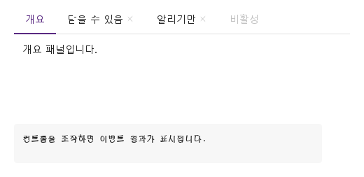
closable은 헤더 글자 뒤에 ×를 그립니다(호버하거나 활성이기 전까지는 흐림).

Qt 실행 화면 · 이미지
closable · manualClose · disabled · 기본
기본 실행 화면
QML 코드
import QtQuick
import Syidax.Core

Item {
    component EventLog: Rectangle {
        id: logBox
        property var lines: []
        implicitWidth: 440
        implicitHeight: Math.max(56, logText.implicitHeight + 24)
        radius: 4; color: Theme.semantic.backgroundBold
        function log(value) { lines = lines.slice(-3).concat([String(value)]) }
        Text {
            id: logText; x: 12; y: 12; width: parent.width - 24
            text: logBox.lines.length ? logBox.lines.join("\n") : "컨트롤을 조작하면 이벤트 결과가 표시됩니다."
            wrapMode: Text.Wrap; color: Theme.semantic.textDefault
            font.family: Theme.monoFontFamily; font.pixelSize: 12
        }
    }

    implicitWidth: Math.max(360, childrenRect.width)
    implicitHeight: childrenRect.height
    // Focused Gallery routes: keep only the selected API and its prerequisites.
    id: featureStory


    Column {
        spacing: 12
        SyTabGroup {
            width: 480; height: 160
            onClosed: (detail) => output.log(("closed: %1").arg(detail.tabkey))
            SyTab { tabkey: "overview"; text: "개요" }
            SyTab { id: featureTarget0; tabkey: "closable"; text: "닫을 수 있음"; closable: true }
            SyTab { id: featureTarget1; tabkey: "manual"; text: "알리기만"; closable: true; manualClose: true }
            SyTab { id: featureTarget2; tabkey: "off"; text: "비활성"; disabled: true }
            SyTabContent { name: "overview"; Text { text: "개요 패널입니다."; padding: 12; font.family: Theme.fontFamily; font.pixelSize: 14; color: Theme.semantic.textDefault } }
            SyTabContent { name: "closable"; Text { text: "×가 이 탭을 지웁니다."; padding: 12; font.family: Theme.fontFamily; font.pixelSize: 14; color: Theme.semantic.textDefault } }
            SyTabContent { name: "manual"; Text { text: "×는 알리기만 하고 탭은 남습니다."; padding: 12; font.family: Theme.fontFamily; font.pixelSize: 14; color: Theme.semantic.textDefault } }
        }
        EventLog { id: output }
    }
}

03 overflow

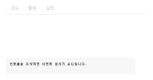
스트립은 헤더를 왼쪽부터 오른쪽으로 배치합니다.

Qt 실행 화면 · 이미지
overflow · 기본
기본 실행 화면
QML 코드
import QtQuick
import Syidax.Core

Item {
    implicitWidth: Math.max(360, childrenRect.width)
    implicitHeight: childrenRect.height
    property QtObject settings: QtObject {
        id: storyArgs
        property int width: 320
    }

    readonly property var names: ["overview", "activity", "settings", "members", "billing", "history"]

    SyTabGroup {
        width: storyArgs.width
        height: 140
        SyTab { tabkey: "overview"; text: "개요" }
        SyTab { tabkey: "activity"; text: "활동" }
        SyTab { tabkey: "settings"; text: "설정" }
        SyTab { tabkey: "members"; text: "구성원" }
        SyTab { tabkey: "billing"; text: "결제" }
        SyTab { tabkey: "history"; text: "기록" }
        SyTabContent { name: "overview"; Text { text: "개요 패널입니다."; padding: 12; font.family: Theme.fontFamily; font.pixelSize: 14; color: Theme.semantic.textDefault } }
    }
}

04 selected · tabSelected · closed · tabClosed · tabAdded

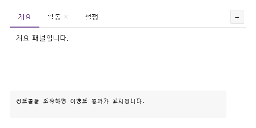
SyTabGroup에는 시그널이 여섯 있습니다:

Qt 실행 화면 · 이미지
selected · tabSelected · closed · tabClosed · tabAdded · 기본
기본 실행 화면
QML 코드
import QtQuick
import Syidax.Core

Item {
    component EventLog: Rectangle {
        id: logBox
        property var lines: []
        implicitWidth: 440
        implicitHeight: Math.max(56, logText.implicitHeight + 24)
        radius: 4; color: Theme.semantic.backgroundBold
        function log(value) { lines = lines.slice(-3).concat([String(value)]) }
        Text {
            id: logText; x: 12; y: 12; width: parent.width - 24
            text: logBox.lines.length ? logBox.lines.join("\n") : "컨트롤을 조작하면 이벤트 결과가 표시됩니다."
            wrapMode: Text.Wrap; color: Theme.semantic.textDefault
            font.family: Theme.monoFontFamily; font.pixelSize: 12
        }
    }

    implicitWidth: Math.max(360, childrenRect.width)
    implicitHeight: childrenRect.height
    // Focused Gallery routes: keep only the selected API and its prerequisites.
    id: featureStory


    Column {
        spacing: 12
        SyTabGroup {
            width: 480; height: 160
            addNewTab: true
            onSelected: (detail) => { if (true) { output.log(("selected: %1").arg(detail.tabkey)) } }
            onTabSelected: (detail) => { if (true) { output.log(("tabSelected: %1").arg(detail.index)) } }
            onClosed: (detail) => { if (true) { output.log(("closed: %1").arg(detail.tabkey)) } }
            onTabClosed: (detail) => { if (true) { output.log(("tabClosed: %1").arg(detail.index)) } }
            onTabAdded: { if (true) { output.log("tabAdded") } }
            SyTab { tabkey: "overview"; text: "개요" }
            SyTab { tabkey: "activity"; text: "활동"; closable: true }
            SyTab { tabkey: "settings"; text: "설정" }
            SyTabContent { name: "overview"; Text { text: "개요 패널입니다."; padding: 12; font.family: Theme.fontFamily; font.pixelSize: 14; color: Theme.semantic.textDefault } }
            SyTabContent { name: "activity"; Text { text: "활동 패널입니다."; padding: 12; font.family: Theme.fontFamily; font.pixelSize: 14; color: Theme.semantic.textDefault } }
            SyTabContent { name: "settings"; Text { text: "설정 패널입니다."; padding: 12; font.family: Theme.fontFamily; font.pixelSize: 14; color: Theme.semantic.textDefault } }
        }
        EventLog { id: output }
    }
}

05 setActiveTab · getActiveTab · closeTab

setActiveTab(index)는 그 인덱스의 탭을 활성화하고 selected와 tabSelected를 발생시킵니다.

Qt 실행 화면 · 이미지
setActiveTab · getActiveTab · closeTab · 기본
QML 코드
import QtQuick
import Syidax.Core

Item {
    component EventLog: Rectangle {
        id: logBox
        property var lines: []
        implicitWidth: 440
        implicitHeight: Math.max(56, logText.implicitHeight + 24)
        radius: 4; color: Theme.semantic.backgroundBold
        function log(value) { lines = lines.slice(-3).concat([String(value)]) }
        Text {
            id: logText; x: 12; y: 12; width: parent.width - 24
            text: logBox.lines.length ? logBox.lines.join("\n") : "컨트롤을 조작하면 이벤트 결과가 표시됩니다."
            wrapMode: Text.Wrap; color: Theme.semantic.textDefault
            font.family: Theme.monoFontFamily; font.pixelSize: 12
        }
    }

    implicitWidth: Math.max(360, childrenRect.width)
    implicitHeight: childrenRect.height
    // Focused Gallery routes: keep only the selected API and its prerequisites.
    id: featureStory

    Column {
        spacing: 24
        SyTabGroup {
            id: tabset
            width: 480; height: 140
            SyTab { tabkey: "overview"; text: "개요" }
            SyTab { tabkey: "activity"; text: "활동" }
            SyTab { tabkey: "settings"; text: "설정" }
            SyTabContent { name: "overview"; Text { text: "개요 패널입니다."; padding: 12; font.family: Theme.fontFamily; font.pixelSize: 14; color: Theme.semantic.textDefault } }
            SyTabContent { name: "activity"; Text { text: "활동 패널입니다."; padding: 12; font.family: Theme.fontFamily; font.pixelSize: 14; color: Theme.semantic.textDefault } }
            SyTabContent { name: "settings"; Text { text: "설정 패널입니다."; padding: 12; font.family: Theme.fontFamily; font.pixelSize: 14; color: Theme.semantic.textDefault } }
        }
        Flow {
            width: 480
            spacing: 8
            SyButton { id: exampleControl1;  visible: true; text: "tabset.setActiveTab(1)"; variant: "secondary"; size: "small"; onClicked: tabset.setActiveTab(1) }
            SyButton { id: exampleControl2;  visible: true; text: "console.log(tabset.getActiveTab())"; variant: "secondary"; size: "small"; onClicked: output.log(tabset.getActiveTab()) }
            SyButton { id: exampleControl3;  visible: true; text: "tabset.closeTab(\"activity\")"; variant: "secondary"; size: "small"; onClicked: tabset.closeTab("activity") }
        }
        Text {
            text: "tabset.active === " + tabset.active
            font.family: Theme.monoFontFamily
            font.pixelSize: 12
            color: Theme.semantic.textSubtle
        }
        EventLog { id: output }
    }
}

06 카드형 탭

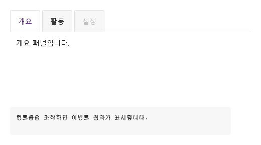
type 설정을 적용한 카드형 탭 예제입니다.

Qt 실행 화면 · 이미지
카드형 탭 · 실행 결과
기본 실행 화면
QML 코드
import QtQuick
import Syidax.Core

Item {
    component EventLog: Rectangle {
        id: logBox
        property var lines: []
        implicitWidth: 440
        implicitHeight: Math.max(56, logText.implicitHeight + 24)
        radius: 4; color: Theme.semantic.backgroundBold
        function log(value) { lines = lines.slice(-3).concat([String(value)]) }
        Text {
            id: logText; x: 12; y: 12; width: parent.width - 24
            text: logBox.lines.length ? logBox.lines.join("\n") : "컨트롤을 조작하면 이벤트 결과가 표시됩니다."
            wrapMode: Text.Wrap; color: Theme.semantic.textDefault
            font.family: Theme.monoFontFamily; font.pixelSize: 12
        }
    }

    implicitWidth: Math.max(360, childrenRect.width)
    implicitHeight: childrenRect.height

    property QtObject settings: QtObject {
        id: storyArgs
        property string type: "card"
        property string size: "medium"
        property string position: "top"
        property string align: "left"
        property string padding: "none"
        property bool disabled: false
        property bool addNewTab: false
    }

    readonly property string members: [
        "SyTab { tabkey: \"overview\"; text: " + JSON.stringify("개요") + " }",
        "SyTab { tabkey: \"activity\"; text: " + JSON.stringify("활동") + " }",
        "SyTab { tabkey: \"settings\"; text: " + JSON.stringify("설정") + "; disabled: true }",
        "SyTabContent { name: \"overview\"; Text { text: " + JSON.stringify("개요 패널입니다.") + " } }",
        "SyTabContent { name: \"activity\"; Text { text: " + JSON.stringify("활동 패널입니다.") + " } }",
        "SyTabContent { name: \"settings\"; Text { text: " + JSON.stringify("설정 패널입니다.") + " } }"
    ].join("\n")

    Column {
        spacing: 12
        SyTabGroup {
            width: 480
            height: 180
            type: storyArgs.type
            size: storyArgs.size
            position: storyArgs.position
            align: storyArgs.align
            padding: storyArgs.padding
            disabled: storyArgs.disabled
            addNewTab: storyArgs.addNewTab
            onSelected: (detail) => output.log(detail.tabkey)
            SyTab { tabkey: "overview"; text: "개요" }
            SyTab { tabkey: "activity"; text: "활동" }
            SyTab { tabkey: "settings"; text: "설정"; disabled: true }
            SyTabContent { name: "overview"; Text { text: "개요 패널입니다."; padding: 12; font.family: Theme.fontFamily; font.pixelSize: 14; color: Theme.semantic.textDefault } }
            SyTabContent { name: "activity"; Text { text: "활동 패널입니다."; padding: 12; font.family: Theme.fontFamily; font.pixelSize: 14; color: Theme.semantic.textDefault } }
            SyTabContent { name: "settings"; Text { text: "설정 패널입니다."; padding: 12; font.family: Theme.fontFamily; font.pixelSize: 14; color: Theme.semantic.textDefault } }
        }
        EventLog { id: output }
    }

}

07 세로 탭

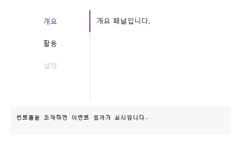
position 설정을 적용한 세로 탭 예제입니다.

Qt 실행 화면 · 이미지
세로 탭 · 실행 결과
기본 실행 화면
QML 코드
import QtQuick
import Syidax.Core

Item {
    component EventLog: Rectangle {
        id: logBox
        property var lines: []
        implicitWidth: 440
        implicitHeight: Math.max(56, logText.implicitHeight + 24)
        radius: 4; color: Theme.semantic.backgroundBold
        function log(value) { lines = lines.slice(-3).concat([String(value)]) }
        Text {
            id: logText; x: 12; y: 12; width: parent.width - 24
            text: logBox.lines.length ? logBox.lines.join("\n") : "컨트롤을 조작하면 이벤트 결과가 표시됩니다."
            wrapMode: Text.Wrap; color: Theme.semantic.textDefault
            font.family: Theme.monoFontFamily; font.pixelSize: 12
        }
    }

    implicitWidth: Math.max(360, childrenRect.width)
    implicitHeight: childrenRect.height

    property QtObject settings: QtObject {
        id: storyArgs
        property string type: "line"
        property string size: "medium"
        property string position: "left"
        property string align: "left"
        property string padding: "none"
        property bool disabled: false
        property bool addNewTab: false
    }

    readonly property string members: [
        "SyTab { tabkey: \"overview\"; text: " + JSON.stringify("개요") + " }",
        "SyTab { tabkey: \"activity\"; text: " + JSON.stringify("활동") + " }",
        "SyTab { tabkey: \"settings\"; text: " + JSON.stringify("설정") + "; disabled: true }",
        "SyTabContent { name: \"overview\"; Text { text: " + JSON.stringify("개요 패널입니다.") + " } }",
        "SyTabContent { name: \"activity\"; Text { text: " + JSON.stringify("활동 패널입니다.") + " } }",
        "SyTabContent { name: \"settings\"; Text { text: " + JSON.stringify("설정 패널입니다.") + " } }"
    ].join("\n")

    Column {
        spacing: 12
        SyTabGroup {
            width: 480
            height: 180
            type: storyArgs.type
            size: storyArgs.size
            position: storyArgs.position
            align: storyArgs.align
            padding: storyArgs.padding
            disabled: storyArgs.disabled
            addNewTab: storyArgs.addNewTab
            onSelected: (detail) => output.log(detail.tabkey)
            SyTab { tabkey: "overview"; text: "개요" }
            SyTab { tabkey: "activity"; text: "활동" }
            SyTab { tabkey: "settings"; text: "설정"; disabled: true }
            SyTabContent { name: "overview"; Text { text: "개요 패널입니다."; padding: 12; font.family: Theme.fontFamily; font.pixelSize: 14; color: Theme.semantic.textDefault } }
            SyTabContent { name: "activity"; Text { text: "활동 패널입니다."; padding: 12; font.family: Theme.fontFamily; font.pixelSize: 14; color: Theme.semantic.textDefault } }
            SyTabContent { name: "settings"; Text { text: "설정 패널입니다."; padding: 12; font.family: Theme.fontFamily; font.pixelSize: 14; color: Theme.semantic.textDefault } }
        }
        EventLog { id: output }
    }

}

08 아래쪽 가운데 탭

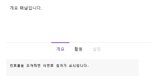
position · align 설정을 적용한 아래쪽 가운데 탭 예제입니다.

Qt 실행 화면 · 이미지
아래쪽 가운데 탭 · 실행 결과
기본 실행 화면
QML 코드
import QtQuick
import Syidax.Core

Item {
    component EventLog: Rectangle {
        id: logBox
        property var lines: []
        implicitWidth: 440
        implicitHeight: Math.max(56, logText.implicitHeight + 24)
        radius: 4; color: Theme.semantic.backgroundBold
        function log(value) { lines = lines.slice(-3).concat([String(value)]) }
        Text {
            id: logText; x: 12; y: 12; width: parent.width - 24
            text: logBox.lines.length ? logBox.lines.join("\n") : "컨트롤을 조작하면 이벤트 결과가 표시됩니다."
            wrapMode: Text.Wrap; color: Theme.semantic.textDefault
            font.family: Theme.monoFontFamily; font.pixelSize: 12
        }
    }

    implicitWidth: Math.max(360, childrenRect.width)
    implicitHeight: childrenRect.height

    property QtObject settings: QtObject {
        id: storyArgs
        property string type: "line"
        property string size: "medium"
        property string position: "bottom"
        property string align: "center"
        property string padding: "none"
        property bool disabled: false
        property bool addNewTab: false
    }

    readonly property string members: [
        "SyTab { tabkey: \"overview\"; text: " + JSON.stringify("개요") + " }",
        "SyTab { tabkey: \"activity\"; text: " + JSON.stringify("활동") + " }",
        "SyTab { tabkey: \"settings\"; text: " + JSON.stringify("설정") + "; disabled: true }",
        "SyTabContent { name: \"overview\"; Text { text: " + JSON.stringify("개요 패널입니다.") + " } }",
        "SyTabContent { name: \"activity\"; Text { text: " + JSON.stringify("활동 패널입니다.") + " } }",
        "SyTabContent { name: \"settings\"; Text { text: " + JSON.stringify("설정 패널입니다.") + " } }"
    ].join("\n")

    Column {
        spacing: 12
        SyTabGroup {
            width: 480
            height: 180
            type: storyArgs.type
            size: storyArgs.size
            position: storyArgs.position
            align: storyArgs.align
            padding: storyArgs.padding
            disabled: storyArgs.disabled
            addNewTab: storyArgs.addNewTab
            onSelected: (detail) => output.log(detail.tabkey)
            SyTab { tabkey: "overview"; text: "개요" }
            SyTab { tabkey: "activity"; text: "활동" }
            SyTab { tabkey: "settings"; text: "설정"; disabled: true }
            SyTabContent { name: "overview"; Text { text: "개요 패널입니다."; padding: 12; font.family: Theme.fontFamily; font.pixelSize: 14; color: Theme.semantic.textDefault } }
            SyTabContent { name: "activity"; Text { text: "활동 패널입니다."; padding: 12; font.family: Theme.fontFamily; font.pixelSize: 14; color: Theme.semantic.textDefault } }
            SyTabContent { name: "settings"; Text { text: "설정 패널입니다."; padding: 12; font.family: Theme.fontFamily; font.pixelSize: 14; color: Theme.semantic.textDefault } }
        }
        EventLog { id: output }
    }

}

09 탭 추가 버튼

addNewTab 설정을 적용한 탭 추가 버튼 예제입니다.

Qt 실행 화면 · 이미지
탭 추가 버튼 · 실행 결과
기본 실행 화면
QML 코드
import QtQuick
import Syidax.Core

Item {
    component EventLog: Rectangle {
        id: logBox
        property var lines: []
        implicitWidth: 440
        implicitHeight: Math.max(56, logText.implicitHeight + 24)
        radius: 4; color: Theme.semantic.backgroundBold
        function log(value) { lines = lines.slice(-3).concat([String(value)]) }
        Text {
            id: logText; x: 12; y: 12; width: parent.width - 24
            text: logBox.lines.length ? logBox.lines.join("\n") : "컨트롤을 조작하면 이벤트 결과가 표시됩니다."
            wrapMode: Text.Wrap; color: Theme.semantic.textDefault
            font.family: Theme.monoFontFamily; font.pixelSize: 12
        }
    }

    implicitWidth: Math.max(360, childrenRect.width)
    implicitHeight: childrenRect.height

    property QtObject settings: QtObject {
        id: storyArgs
        property string type: "line"
        property string size: "medium"
        property string position: "top"
        property string align: "left"
        property string padding: "none"
        property bool disabled: false
        property bool addNewTab: true
    }

    readonly property string members: [
        "SyTab { tabkey: \"overview\"; text: " + JSON.stringify("개요") + " }",
        "SyTab { tabkey: \"activity\"; text: " + JSON.stringify("활동") + " }",
        "SyTab { tabkey: \"settings\"; text: " + JSON.stringify("설정") + "; disabled: true }",
        "SyTabContent { name: \"overview\"; Text { text: " + JSON.stringify("개요 패널입니다.") + " } }",
        "SyTabContent { name: \"activity\"; Text { text: " + JSON.stringify("활동 패널입니다.") + " } }",
        "SyTabContent { name: \"settings\"; Text { text: " + JSON.stringify("설정 패널입니다.") + " } }"
    ].join("\n")

    Column {
        spacing: 12
        SyTabGroup {
            width: 480
            height: 180
            type: storyArgs.type
            size: storyArgs.size
            position: storyArgs.position
            align: storyArgs.align
            padding: storyArgs.padding
            disabled: storyArgs.disabled
            addNewTab: storyArgs.addNewTab
            onSelected: (detail) => output.log(detail.tabkey)
            SyTab { tabkey: "overview"; text: "개요" }
            SyTab { tabkey: "activity"; text: "활동" }
            SyTab { tabkey: "settings"; text: "설정"; disabled: true }
            SyTabContent { name: "overview"; Text { text: "개요 패널입니다."; padding: 12; font.family: Theme.fontFamily; font.pixelSize: 14; color: Theme.semantic.textDefault } }
            SyTabContent { name: "activity"; Text { text: "활동 패널입니다."; padding: 12; font.family: Theme.fontFamily; font.pixelSize: 14; color: Theme.semantic.textDefault } }
            SyTabContent { name: "settings"; Text { text: "설정 패널입니다."; padding: 12; font.family: Theme.fontFamily; font.pixelSize: 14; color: Theme.semantic.textDefault } }
        }
        EventLog { id: output }
    }

}

10 비활성 탭

disabled 설정을 적용한 비활성 탭 예제입니다.

Qt 실행 화면 · 이미지
비활성 탭 · 실행 결과
기본 실행 화면
QML 코드
import QtQuick
import Syidax.Core

Item {
    component EventLog: Rectangle {
        id: logBox
        property var lines: []
        implicitWidth: 440
        implicitHeight: Math.max(56, logText.implicitHeight + 24)
        radius: 4; color: Theme.semantic.backgroundBold
        function log(value) { lines = lines.slice(-3).concat([String(value)]) }
        Text {
            id: logText; x: 12; y: 12; width: parent.width - 24
            text: logBox.lines.length ? logBox.lines.join("\n") : "컨트롤을 조작하면 이벤트 결과가 표시됩니다."
            wrapMode: Text.Wrap; color: Theme.semantic.textDefault
            font.family: Theme.monoFontFamily; font.pixelSize: 12
        }
    }

    implicitWidth: Math.max(360, childrenRect.width)
    implicitHeight: childrenRect.height

    property QtObject settings: QtObject {
        id: storyArgs
        property string type: "line"
        property string size: "medium"
        property string position: "top"
        property string align: "left"
        property string padding: "none"
        property bool disabled: true
        property bool addNewTab: false
    }

    readonly property string members: [
        "SyTab { tabkey: \"overview\"; text: " + JSON.stringify("개요") + " }",
        "SyTab { tabkey: \"activity\"; text: " + JSON.stringify("활동") + " }",
        "SyTab { tabkey: \"settings\"; text: " + JSON.stringify("설정") + "; disabled: true }",
        "SyTabContent { name: \"overview\"; Text { text: " + JSON.stringify("개요 패널입니다.") + " } }",
        "SyTabContent { name: \"activity\"; Text { text: " + JSON.stringify("활동 패널입니다.") + " } }",
        "SyTabContent { name: \"settings\"; Text { text: " + JSON.stringify("설정 패널입니다.") + " } }"
    ].join("\n")

    Column {
        spacing: 12
        SyTabGroup {
            width: 480
            height: 180
            type: storyArgs.type
            size: storyArgs.size
            position: storyArgs.position
            align: storyArgs.align
            padding: storyArgs.padding
            disabled: storyArgs.disabled
            addNewTab: storyArgs.addNewTab
            onSelected: (detail) => output.log(detail.tabkey)
            SyTab { tabkey: "overview"; text: "개요" }
            SyTab { tabkey: "activity"; text: "활동" }
            SyTab { tabkey: "settings"; text: "설정"; disabled: true }
            SyTabContent { name: "overview"; Text { text: "개요 패널입니다."; padding: 12; font.family: Theme.fontFamily; font.pixelSize: 14; color: Theme.semantic.textDefault } }
            SyTabContent { name: "activity"; Text { text: "활동 패널입니다."; padding: 12; font.family: Theme.fontFamily; font.pixelSize: 14; color: Theme.semantic.textDefault } }
            SyTabContent { name: "settings"; Text { text: "설정 패널입니다."; padding: 12; font.family: Theme.fontFamily; font.pixelSize: 14; color: Theme.semantic.textDefault } }
        }
        EventLog { id: output }
    }

}

11 큰 탭 컨트롤

size 설정을 적용한 큰 탭 컨트롤 예제입니다.

Qt 실행 화면 · 이미지
큰 탭 컨트롤 · 실행 결과
기본 실행 화면
QML 코드
import QtQuick
import Syidax.Core

Item {
    component EventLog: Rectangle {
        id: logBox
        property var lines: []
        implicitWidth: 440
        implicitHeight: Math.max(56, logText.implicitHeight + 24)
        radius: 4; color: Theme.semantic.backgroundBold
        function log(value) { lines = lines.slice(-3).concat([String(value)]) }
        Text {
            id: logText; x: 12; y: 12; width: parent.width - 24
            text: logBox.lines.length ? logBox.lines.join("\n") : "컨트롤을 조작하면 이벤트 결과가 표시됩니다."
            wrapMode: Text.Wrap; color: Theme.semantic.textDefault
            font.family: Theme.monoFontFamily; font.pixelSize: 12
        }
    }

    implicitWidth: Math.max(360, childrenRect.width)
    implicitHeight: childrenRect.height

    property QtObject settings: QtObject {
        id: storyArgs
        property string type: "line"
        property string size: "large"
        property string position: "top"
        property string align: "left"
        property string padding: "none"
        property bool disabled: false
        property bool addNewTab: false
    }

    readonly property string members: [
        "SyTab { tabkey: \"overview\"; text: " + JSON.stringify("개요") + " }",
        "SyTab { tabkey: \"activity\"; text: " + JSON.stringify("활동") + " }",
        "SyTab { tabkey: \"settings\"; text: " + JSON.stringify("설정") + "; disabled: true }",
        "SyTabContent { name: \"overview\"; Text { text: " + JSON.stringify("개요 패널입니다.") + " } }",
        "SyTabContent { name: \"activity\"; Text { text: " + JSON.stringify("활동 패널입니다.") + " } }",
        "SyTabContent { name: \"settings\"; Text { text: " + JSON.stringify("설정 패널입니다.") + " } }"
    ].join("\n")

    Column {
        spacing: 12
        SyTabGroup {
            width: 480
            height: 180
            type: storyArgs.type
            size: storyArgs.size
            position: storyArgs.position
            align: storyArgs.align
            padding: storyArgs.padding
            disabled: storyArgs.disabled
            addNewTab: storyArgs.addNewTab
            onSelected: (detail) => output.log(detail.tabkey)
            SyTab { tabkey: "overview"; text: "개요" }
            SyTab { tabkey: "activity"; text: "활동" }
            SyTab { tabkey: "settings"; text: "설정"; disabled: true }
            SyTabContent { name: "overview"; Text { text: "개요 패널입니다."; padding: 12; font.family: Theme.fontFamily; font.pixelSize: 14; color: Theme.semantic.textDefault } }
            SyTabContent { name: "activity"; Text { text: "활동 패널입니다."; padding: 12; font.family: Theme.fontFamily; font.pixelSize: 14; color: Theme.semantic.textDefault } }
            SyTabContent { name: "settings"; Text { text: "설정 패널입니다."; padding: 12; font.family: Theme.fontFamily; font.pixelSize: 14; color: Theme.semantic.textDefault } }
        }
        EventLog { id: output }
    }

}

12 탭 본문 여백

padding 설정을 적용한 탭 본문 여백 예제입니다.

Qt 실행 화면 · 이미지
탭 본문 여백 · 실행 결과
기본 실행 화면
QML 코드
import QtQuick
import Syidax.Core

Item {
    component EventLog: Rectangle {
        id: logBox
        property var lines: []
        implicitWidth: 440
        implicitHeight: Math.max(56, logText.implicitHeight + 24)
        radius: 4; color: Theme.semantic.backgroundBold
        function log(value) { lines = lines.slice(-3).concat([String(value)]) }
        Text {
            id: logText; x: 12; y: 12; width: parent.width - 24
            text: logBox.lines.length ? logBox.lines.join("\n") : "컨트롤을 조작하면 이벤트 결과가 표시됩니다."
            wrapMode: Text.Wrap; color: Theme.semantic.textDefault
            font.family: Theme.monoFontFamily; font.pixelSize: 12
        }
    }

    implicitWidth: Math.max(360, childrenRect.width)
    implicitHeight: childrenRect.height

    property QtObject settings: QtObject {
        id: storyArgs
        property string type: "line"
        property string size: "medium"
        property string position: "top"
        property string align: "left"
        property string padding: "large"
        property bool disabled: false
        property bool addNewTab: false
    }

    readonly property string members: [
        "SyTab { tabkey: \"overview\"; text: " + JSON.stringify("개요") + " }",
        "SyTab { tabkey: \"activity\"; text: " + JSON.stringify("활동") + " }",
        "SyTab { tabkey: \"settings\"; text: " + JSON.stringify("설정") + "; disabled: true }",
        "SyTabContent { name: \"overview\"; Text { text: " + JSON.stringify("개요 패널입니다.") + " } }",
        "SyTabContent { name: \"activity\"; Text { text: " + JSON.stringify("활동 패널입니다.") + " } }",
        "SyTabContent { name: \"settings\"; Text { text: " + JSON.stringify("설정 패널입니다.") + " } }"
    ].join("\n")

    Column {
        spacing: 12
        SyTabGroup {
            width: 480
            height: 180
            type: storyArgs.type
            size: storyArgs.size
            position: storyArgs.position
            align: storyArgs.align
            padding: storyArgs.padding
            disabled: storyArgs.disabled
            addNewTab: storyArgs.addNewTab
            onSelected: (detail) => output.log(detail.tabkey)
            SyTab { tabkey: "overview"; text: "개요" }
            SyTab { tabkey: "activity"; text: "활동" }
            SyTab { tabkey: "settings"; text: "설정"; disabled: true }
            SyTabContent { name: "overview"; Text { text: "개요 패널입니다."; padding: 12; font.family: Theme.fontFamily; font.pixelSize: 14; color: Theme.semantic.textDefault } }
            SyTabContent { name: "activity"; Text { text: "활동 패널입니다."; padding: 12; font.family: Theme.fontFamily; font.pixelSize: 14; color: Theme.semantic.textDefault } }
            SyTabContent { name: "settings"; Text { text: "설정 패널입니다."; padding: 12; font.family: Theme.fontFamily; font.pixelSize: 14; color: Theme.semantic.textDefault } }
        }
        EventLog { id: output }
    }

}

API 90

항목을 가리키거나 선택하면 QML 예제와 복사 버튼이 나타납니다.

속성 · SyTabGroup

속성타입기본값설명
list (기본 속성)—안에 선언한 SyTab 헤더와 SyTabContent 패널, 순서대로
list—스트립 오른쪽 끝에 놓이는 아이템(가로만)
int첫 사용 가능 탭활성 헤더의 인덱스; 설정하면 조용히 전환, 읽어서 알 수 있음. 사용 가능한 헤더가 없으면 −1
string"line"line(2 px 마커) · card(테두리 카드)
string"medium"헤더 높이와 글자: small 36 / 12 px · medium 44 / 14 px · large 52 / 16 px
string"top"스트립 쪽: top · bottom · left · right(left / right: 160 px 레일, 접힘 없음)
string"left"left · center — 가운데 정렬은 모든 헤더가 들어갈 때 적용
string"none"첫 헤더 앞 여백: none 0 · small 8 · medium 12 · large 16 px
boolfalse모든 헤더와 + 버튼 멈춤
boolfalseextra 뒤의 28 px + 버튼, tabAdded() 발생
boolfalse헤더를 스트립을 따라 끌어 순서를 바꿀 수 있음(그룹이 비활성이면 불가); 놓을 때 ordered 발생
var[]수집된 헤더
var[]패널, 순서대로(그룹이 유지)
var[]지금 ⋯ 목록으로 접힌 헤더들
var (읽기 전용)[]드래그나 reorder()로 정해진 순서의 tabkey 목록, 다시 수집해도 유지([] = 선언 순서; 그룹이 유지)
읽기 전용—position이 left / right · 160 · 헤더 높이 px · 여백 px

속성 · SyTab

속성타입기본값설명
list (기본 속성)—글자 뒤(× 앞)에 놓이는 아이템
string""헤더의 키; 패널은 name이 같은 SyTabContent
string""라벨(비어 있으면 숨김)
boolfalse글자 뒤의 ×, 탭을 닫음
boolfalse×가 closed만 보고; setClose(true) / closeTab()까지 탭이 남음
boolfalse회색, 멈춤; 기본 활성 탭이 되지 않음
bool · int · string—그룹이 설정: 이 헤더가 활성인지, 인덱스, 그룹의 모양
bool (읽기 전용)—헤더 또는 그룹의 disabled
bool (읽기 전용)—포인터가 헤더 위에 있음
bool (읽기 전용)—키보드 포커스
varnull소유하는 그룹(그룹이 설정)

속성 · SyTabContent

속성타입기본값설명
list (기본 속성)—패널의 아이템
string""tabkey가 같은 SyTab과 패널을 짝지음
boolfalse그룹이 설정: 이 패널이 보이는 패널
boolfalse패널이 50 %로 흐려지고 안의 아이템이 입력을 무시

추가 속성

이름타입 / 기본값설명
탭 막대 너비(논리 픽셀)입니다. 줄이면 남는 탭이 넘침 메뉴로 이동합니다.

메서드

메서드설명
index의 헤더를 활성화하고 selected + tabSelected 발생; 모르는 인덱스나 비활성 헤더면 무시
active(int) 반환
tabkey(문자열) 또는 인덱스(숫자)로 헤더를 찾아 setClose(true) 호출: 보고하고 제거, manualClose나 비활성이어도. 모르면 아무 일 없음
from의 헤더를 to로 옮기고(tabs의 인덱스) 헤더 인덱스를 다시 매기며 active를 같은 헤더에 유지하고 ordered 발생; 인덱스가 범위 밖이거나 from과 to가 같으면 무시
클릭이 하는 일: 탭을 활성화하고 보고. 비활성이면 무시
closed 발생; force 없는 manualClose가 아니면 탭 제거. force 없이는 비활성 탭에서 아무 일 없음

시그널

시그널인자시점
detail: { tabkey, index }클릭, Space / Enter, 방향키, ⋯ 목록, setActiveTab()으로 헤더가 활성화됨. 바인딩으로 active를 설정할 때는 아님
detail: { index, value }같은 순간, selected 직후; value는 tabkey
detail: { tabkey, index }탭의 ×가 클릭됨(사용 가능한 탭), 또는 setClose() / closeTab() 실행 — 탭이 남는 manualClose에서도
detail: { index, value }같은 순간, closed 직후
—+ 버튼 클릭(addNewTab); 그룹이 disabled이면 아님
tabs드래그(isDraggable)가 헤더 자리를 바꾼 뒤 놓였거나 reorder()가 실행됨; tabs가 새 순서
detail: { tabkey, index }헤더 자신의 시그널, 그룹의 것 직전

동작

항목동작 / 조건
활성 헤더의 인덱스; 설정하면 조용히 전환, 읽어서 알 수 있음. 사용 가능한 헤더가 없으면 −1
index의 헤더를 활성화하고 selected + tabSelected 발생; 모르는 인덱스나 비활성 헤더면 무시
클릭, Space / Enter, 방향키, ⋯ 목록, setActiveTab()으로 헤더가 활성화됨. 바인딩으로 active를 설정할 때는 아님
같은 순간, selected 직후; value는 tabkey
tabkey가 같은 SyTab과 패널을 짝지음
헤더의 키; 패널은 name이 같은 SyTabContent
라벨(비어 있으면 숨김)
글자 뒤의 ×, 탭을 닫음
헤더 폭은 내용 + 양쪽 12 / 16 / 20 px 여백이고 높이는 36 / 44 / 52 px입니다(size small · medium · large).
type: "line"은 활성 헤더의 내용 쪽에 2 px 마커와 스트립을 따라 1 px 선을 그리고, type: "card"는 모든 헤더를 바깥쪽이 둥근 테두리 카드로 4 px 간격으로 그립니다.
첫 헤더 앞 여백: none 0 · small 8 · medium 12 · large 16 px
스트립 오른쪽 끝에 놓이는 아이템(가로만)
extra 뒤의 28 px + 버튼, tabAdded() 발생
+ 버튼 클릭(addNewTab); 그룹이 disabled이면 아님
지금 ⋯ 목록으로 접힌 헤더들
left · center — 가운데 정렬은 모든 헤더가 들어갈 때 적용
헤더를 스트립을 따라 끌어 순서를 바꿀 수 있음(그룹이 비활성이면 불가); 놓을 때 ordered 발생
드래그(isDraggable)가 헤더 자리를 바꾼 뒤 놓였거나 reorder()가 실행됨; tabs가 새 순서
from의 헤더를 to로 옮기고(tabs의 인덱스) 헤더 인덱스를 다시 매기며 active를 같은 헤더에 유지하고 ordered 발생; 인덱스가 범위 밖이거나 from과 to가 같으면 무시
isDraggable: true이면(그리고 그룹이 비활성이 아니면) 헤더를 스트립을 따라 끌 수 있습니다: 이웃 헤더의 가운데를 넘으면 둘이 자리를 바꾸고, 놓을 때 ordered(tabs)가 새 순서의 헤더들과 함께 한 번 발생합니다. reorder(from, to)(tabs의 인덱스)는 코드에서 헤더를 옮기며 역시 ordered를 발생시킵니다. type, size, position이 바뀌면 헤더를 다시 수집하며 그때 tabs와 contents가 다시 만들어집니다(헤더 순서를 바꿨다면 tabOrder가 기억하는 순서로).
드래그나 reorder()로 정해진 순서의 tabkey 목록, 다시 수집해도 유지([] = 선언 순서; 그룹이 유지)
closed 발생; force 없는 manualClose가 아니면 탭 제거. force 없이는 비활성 탭에서 아무 일 없음
×는 setClose(false)를 호출합니다: 탭이 closed({ tabkey, index })를 발생시키고, manualClose가 아니면 그룹이 헤더와 패널을 제거하고 남은 헤더의 인덱스를 다시 매기며 active를 마지막 인덱스 이내로 제한하고(이제 그 인덱스에 있는 헤더가 활성) closed와 tabClosed({ index, value })를 발생시킵니다.
×가 closed만 보고; setClose(true) / closeTab()까지 탭이 남음
×는 setClose(false)를 호출합니다: 탭이 closed({ tabkey, index })를 발생시키고, manualClose가 아니면 그룹이 헤더와 패널을 제거하고 남은 헤더의 인덱스를 다시 매기며 active를 마지막 인덱스 이내로 제한하고(이제 그 인덱스에 있는 헤더가 활성) closed와 tabClosed({ index, value })를 발생시킵니다.
같은 순간, closed 직후
tabkey(문자열) 또는 인덱스(숫자)로 헤더를 찾아 setClose(true) 호출: 보고하고 제거, manualClose나 비활성이어도. 모르면 아무 일 없음
모든 헤더와 + 버튼 멈춤
탭 막대 너비(논리 픽셀)입니다. 줄이면 남는 탭이 넘침 메뉴로 이동합니다.
그룹에 width와 height를 주십시오(암시 크기는 480 × 스트립 + 패널).
Tab이 사용 가능한 헤더에 도달합니다. 포커스된 헤더에서 Left / Up은 이전 사용 가능한 헤더로, Right / Down은 다음으로(순환; 이동이 곧 활성화), Space / Enter는 선택.
line(2 px 마커) · card(테두리 카드)
헤더 높이와 글자: small 36 / 12 px · medium 44 / 14 px · large 52 / 16 px
스트립 쪽: top · bottom · left · right(left / right: 160 px 레일, 접힘 없음)
type, size, position이 바뀌면 헤더를 다시 수집하며 그때 tabs와 contents가 다시 만들어집니다(헤더 순서를 바꿨다면 tabOrder가 기억하는 순서로).

키보드

항목동작 / 조건
SyGlobalHeader는 앱 바에 SyTab 헤더를 품고, SyCollapse는 구역을 제자리에서 접으며, SyNav는 화면 사이를 이동합니다.