QML
← 전체 컴포넌트

Label

컨트롤의 이름이나 용도를 표시하는 라벨입니다. 필수 입력 표시와 도움말을 함께 제공할 수 있습니다.

import Syidax.Core.Label

지원 QML 타입

타입정의 / 역할
필수 입력 표시와 비활성 상태를 지원하는 라벨입니다.

예제로 보기

미리보기는 Qt 실행 화면의 이미지입니다. 아래 버튼으로 결과를 전환하세요.

01 기본 구성

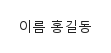
SyLabel은 컨트롤의 캡션입니다: 제목(value)이 라벨 안에 선언한 컨트롤(또는 target으로 가리킨 아이템) 앞에 놓이고, 제목을 클릭하면 그 컨트롤에 포커스가 가며 — 체크박스나 스위치처럼 toggle() 함수가 있으면 토글까지 — 라벨의 required와 disabled가 켜져 있으면 컨트롤에 기록되어 캡션과 컨트롤이 어긋나지 않습니다.

Qt 실행 화면 · 이미지
기본 구성 · 기본
기본 실행 화면
QML 코드
import QtQuick
import Syidax.Core

Item {
    implicitWidth: Math.max(360, childrenRect.width)
    implicitHeight: childrenRect.height
    id: story

    property QtObject settings: QtObject {
        id: storyArgs
        property string value: "이름"
        property bool required: false
        property string requiredPosition: "right"
        property string valuePosition: "left"
        property real labelWidth: 0
        property bool disabled: false
    }


    SyLabel {
        value: storyArgs.value
        required: storyArgs.required
        requiredPosition: storyArgs.requiredPosition
        valuePosition: storyArgs.valuePosition
        labelWidth: storyArgs.labelWidth
        disabled: storyArgs.disabled
        TextInput {
            width: 160; text: "홍길동"
            font.family: Theme.fontFamily; font.pixelSize: 14; color: Theme.semantic.textDefault
        }
    }

}

02 required · requiredPosition

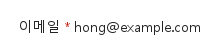
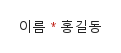
required: true는 제목 옆에 붉은 별표(테마의 오류 색)를 더하고, requiredPosition이 그것을 글자의 "right"(기본) 또는 "left"에 둡니다.

Qt 실행 화면 · 이미지
required · requiredPosition · 기본
QML 코드
import QtQuick
import Syidax.Core

Item {
    implicitWidth: Math.max(360, childrenRect.width)
    implicitHeight: childrenRect.height
    // Focused Gallery routes: keep only the selected API and its prerequisites.
    id: featureStory

    property QtObject settings: QtObject {
        id: storyArgs
        property bool required: true
        property string requiredPosition: "right"
    }


    SyLabel { id: featureTarget0;
        value: "이메일"
        required: storyArgs.required
        requiredPosition: storyArgs.requiredPosition
        TextInput {
            width: 200; text: "hong@example.com"
            font.family: Theme.fontFamily; font.pixelSize: 14; color: Theme.semantic.textDefault
        }
    }
}

03 valuePosition · labelWidth

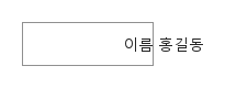
labelWidth는 제목 열의 너비를 px로 고정하고(0 = 제목의 자연 너비), valuePosition은 그 열 안에서 제목을 정렬합니다: "left"(기본), "center", "right".

Qt 실행 화면 · 이미지
valuePosition · labelWidth · 기본
QML 코드
import QtQuick
import Syidax.Core

Item {
    implicitWidth: Math.max(360, childrenRect.width)
    implicitHeight: childrenRect.height
    // Focused Gallery routes: keep only the selected API and its prerequisites.

    id: story
    property QtObject settings: QtObject {
        id: storyArgs
        property string valuePosition: "right"
    }


    Item {
        width: 320
        height: 40
        Rectangle {
            width: 120
            height: parent.height
            color: "transparent"
            border.width: 1
            border.color: Theme.semantic.borderBold
        }
        SyLabel { id: featureTarget0;
            anchors.verticalCenter: parent.verticalCenter
            value: "이름"
            labelWidth: 120
            valuePosition: storyArgs.valuePosition
            TextInput {
                width: 160; text: "홍길동"
                font.family: Theme.fontFamily; font.pixelSize: 14; color: Theme.semantic.textDefault
            }
        }
    }
}

04 disabled

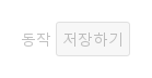
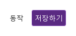
disabled: true는 제목을 가장 옅은 글자색으로 흐리게 하고, 포인터 커서를 끄며, 제목 클릭이 아무 일도 하지 않게 합니다(포커스도 toggle()도 없음).

Qt 실행 화면 · 이미지
disabled · 기본
QML 코드
import QtQuick
import Syidax.Core

Item {
    implicitWidth: Math.max(360, childrenRect.width)
    implicitHeight: childrenRect.height
    property QtObject settings: QtObject {
        id: storyArgs
        property bool disabled: true
    }


    SyLabel {
        value: "동작"
        disabled: storyArgs.disabled
        SyButton { text: "저장하기" }
    }
}

05 target

target은 라벨 안이 아니라 다른 곳 — 그리드의 다른 칸, 라벨 행 바깥 — 에 선언한 컨트롤을 가리킵니다.

Qt 실행 화면 · 이미지
target · 기본
QML 코드
import QtQuick
import Syidax.Core

Item {
    implicitWidth: Math.max(360, childrenRect.width)
    implicitHeight: childrenRect.height
    property QtObject settings: QtObject {
        id: storyArgs
        property bool disabled: false
    }


    Row {
        spacing: 16
        SyLabel { anchors.verticalCenter: parent.verticalCenter; value: "동작"; target: saveButton; disabled: storyArgs.disabled }
        SyButton { id: saveButton; text: "저장하기"; variant: "primary" }
    }
}

06 오른쪽 필수 표시

required · requiredPosition 설정을 적용한 오른쪽 필수 표시 예제입니다.

Qt 실행 화면 · 이미지
오른쪽 필수 표시 · 실행 결과
기본 실행 화면
QML 코드
import QtQuick
import Syidax.Core

Item {
    implicitWidth: Math.max(360, childrenRect.width)
    implicitHeight: childrenRect.height
    id: story

    property QtObject settings: QtObject {
        id: storyArgs
        property string value: "이름"
        property bool required: true
        property string requiredPosition: "right"
        property string valuePosition: "left"
        property real labelWidth: 0
        property bool disabled: false
    }


    SyLabel {
        value: storyArgs.value
        required: storyArgs.required
        requiredPosition: storyArgs.requiredPosition
        valuePosition: storyArgs.valuePosition
        labelWidth: storyArgs.labelWidth
        disabled: storyArgs.disabled
        TextInput {
            width: 160; text: "홍길동"
            font.family: Theme.fontFamily; font.pixelSize: 14; color: Theme.semantic.textDefault
        }
    }

}

API 22

항목을 가리키거나 선택하면 QML 예제와 복사 버튼이 나타납니다.

속성

속성타입기본값설명
list (기본 속성)—안에 선언한 컨트롤. target이 없으면 첫 번째가 라벨이 붙는 컨트롤입니다.
string""캡션 글자(14 px).
boolfalse별표를 보이고, 켜져 있거나 바뀔 때 컨트롤에 required가 있으면 거기에 기록합니다.
string"right""left" · "right" — 별표의 위치.
string"left""left" · "center" · "right" — labelWidth 열 안에서의 제목 정렬. labelWidth: 0이면 눈에 띄는 효과 없음.
real0제목 열의 고정 너비(px). 0 = 제목의 자연 너비. 컨트롤은 열 뒤에서 시작합니다.
boolfalse제목을 흐리게 하고 제목 클릭을 막으며, 켜져 있거나 바뀔 때 컨트롤에 disabled가 있으면 거기에 기록합니다(아니면 컨트롤 자신의 disabled: true가 유지됨).
Itemnull다른 곳에 선언한 컨트롤. 설정되면 안의 아이템 대신 이것이 라벨이 붙는 컨트롤입니다.
var (읽기 전용)—라벨이 작용하는 아이템: target, 아니면 안의 첫 아이템, 아니면 null.

메서드

메서드설명
라벨의 required와 disabled 가운데 켜진 플래그를 현재 컨트롤에(그 컨트롤이 가진 속성에 한해) 기록합니다. 컨트롤이 들어올 때 자동으로 호출되고, required나 disabled가 바뀔 때는 두 플래그를 있는 그대로 기록하며 호출됩니다. 라벨 모르게 컨트롤의 그 속성을 바꾼 뒤에만 직접 호출하십시오. 반환값 없음.

시그널

항목동작 / 조건
SyLabel은 자체 시그널을 선언하지 않습니다. 속성 변경 시그널(onControlChanged, onRequiredChanged, …)은 쓸 수 있습니다. 제목 클릭은 알리지 않습니다 — 컨트롤에 포커스를 주고(토글하고) 컨트롤이 자기 변화를 알립니다.

동작

항목동작 / 조건
라벨이 작용하는 아이템: target, 아니면 안의 첫 아이템, 아니면 null.
다른 곳에 선언한 컨트롤. 설정되면 안의 아이템 대신 이것이 라벨이 붙는 컨트롤입니다.
제목을 흐리게 하고 제목 클릭을 막으며, 켜져 있거나 바뀔 때 컨트롤에 disabled가 있으면 거기에 기록합니다(아니면 컨트롤 자신의 disabled: true가 유지됨).
별표를 보이고, 켜져 있거나 바뀔 때 컨트롤에 required가 있으면 거기에 기록합니다.
"left" · "right" — 별표의 위치.
제목은 가장 옅은 글자색을 씁니다. 컨트롤은 위의 전달을 통해서만 자체 비활성 모양을 갖습니다.
제목 열의 고정 너비(px). 0 = 제목의 자연 너비. 컨트롤은 열 뒤에서 시작합니다.
"left" · "center" · "right" — labelWidth 열 안에서의 제목 정렬. labelWidth: 0이면 눈에 띄는 효과 없음.
라벨의 암시적 크기는 행(제목 열 + 4 px + 컨트롤)의 크기이며 컨트롤은 자기 크기를 유지합니다.

키보드

항목동작 / 조건
완전한 폼에는 SyForm과 SyFormItem; 흔한 컨트롤로 SyInput, SyCheckbox, SySwitch, SySelect(뒤의 셋은 제목 클릭으로 토글되거나 포커스를 받습니다).