QML
← 전체 컴포넌트

Switch

알림이나 자동 저장처럼 켜기와 끄기를 전환하는 설정에 사용하는 스위치입니다.

import Syidax.Core.Switch

지원 QML 타입

타입정의 / 역할
슬라이딩 스위치 모양의 켜기·끄기 폼 필드입니다.

예제로 보기

미리보기는 Qt 실행 화면의 이미지입니다. 아래 버튼으로 결과를 전환하세요.

01 기본 구성

SySwitch는 켜기 / 끄기 토글입니다.

Qt 실행 화면 · 이미지
기본 구성 · 기본
기본 실행 화면
QML 코드
import QtQuick
import Syidax.Core

Item {
    implicitWidth: Math.max(360, childrenRect.width)
    implicitHeight: childrenRect.height

    property QtObject settings: QtObject {
        id: storyArgs
        property string label: "알림"
        property bool checked: true
        property string size: "medium"
        property bool loading: false
        property bool disabled: false
        property bool readonly: false
        property bool required: false
    }


    SySwitch {
        label: storyArgs.label
        checked: storyArgs.checked
        size: storyArgs.size
        loading: storyArgs.loading
        disabled: storyArgs.disabled
        readonly: storyArgs.readonly
        required: storyArgs.required
        onCheckedChanged: if (storyArgs.checked !== checked) storyArgs.checked = checked
    }

}

02 size

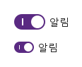
size는 값이 둘입니다.

Qt 실행 화면 · 이미지
size · 기본
기본 실행 화면
QML 코드
import QtQuick
import Syidax.Core

Item {
    implicitWidth: Math.max(360, childrenRect.width)
    implicitHeight: childrenRect.height

    Column {
        spacing: 12
        SySwitch { label: "알림"; checked: true }
        SySwitch { label: "알림"; checked: true; size: "small" }
    }
}

03 loading

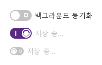
loading: true는 손잡이 안에 가는 링과 회전하는 호를 그리고 스위치를 반응하지 않게 만듭니다.

Qt 실행 화면 · 이미지
loading · 기본
기본 실행 화면
QML 코드
import QtQuick
import Syidax.Core

Item {
    implicitWidth: Math.max(360, childrenRect.width)
    implicitHeight: childrenRect.height

    Column {
        spacing: 12
        SySwitch {
            id: sync
            label: "백그라운드 동기화"
            onChanged: (checked) => { loading = true; saveTimer.restart() }
        }
        Timer { id: saveTimer; interval: 1500; onTriggered: sync.loading = false }
        SySwitch { label: "저장 중…"; checked: true; loading: true }
        SySwitch { label: "저장 중…"; loading: true; size: "small" }
    }
}

04 disabled · readonly

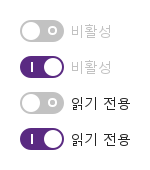
disabled: true는 트랙과 라벨을 회색으로 만들고 스위치를 반응하지 않게 합니다.

Qt 실행 화면 · 이미지
disabled · readonly · 기본
기본 실행 화면
QML 코드
import QtQuick
import Syidax.Core

Item {
    implicitWidth: Math.max(360, childrenRect.width)
    implicitHeight: childrenRect.height
    // Focused Gallery routes: keep only the selected API and its prerequisites.
    id: featureStory

    Column {
        spacing: 12
        SySwitch { id: featureTarget0; visible: true; label: "비활성"; disabled: true }
        SySwitch { id: featureTarget1; visible: true; label: "비활성"; disabled: true; checked: true }
        SySwitch { id: featureTarget2; visible: true; label: "읽기 전용"; readonly: true }
        SySwitch { id: featureTarget3; visible: true; label: "읽기 전용"; readonly: true; checked: true }
    }
}

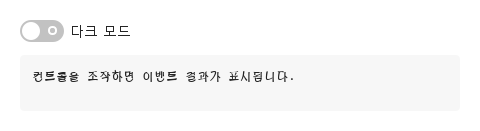
05 changed

스위치에는 시그널이 셋 있으며, 모두 객체가 아니라 현재 checked 불리언을 전달합니다.

Qt 실행 화면 · 이미지
changed · 기본
기본 실행 화면
QML 코드
import QtQuick
import Syidax.Core

Item {
    component EventLog: Rectangle {
        id: logBox
        property var lines: []
        implicitWidth: 440
        implicitHeight: Math.max(56, logText.implicitHeight + 24)
        radius: 4; color: Theme.semantic.backgroundBold
        function log(value) { lines = lines.slice(-3).concat([String(value)]) }
        Text {
            id: logText; x: 12; y: 12; width: parent.width - 24
            text: logBox.lines.length ? logBox.lines.join("\n") : "컨트롤을 조작하면 이벤트 결과가 표시됩니다."
            wrapMode: Text.Wrap; color: Theme.semantic.textDefault
            font.family: Theme.monoFontFamily; font.pixelSize: 12
        }
    }

    implicitWidth: Math.max(360, childrenRect.width)
    implicitHeight: childrenRect.height


    Column {
        spacing: 12
        SySwitch {
            label: "다크 모드"
            onChanged: (checked) => output.log(("changed: %1").arg(checked))
        }
        EventLog { id: output }
    }
}

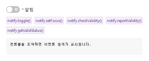
06 toggle · setFocus · checkValidity · …

스위치의 함수들입니다.

Qt 실행 화면 · 이미지
toggle · setFocus · checkValidity · … · 기본
QML 코드
import QtQuick
import Syidax.Core

Item {
    component EventLog: Rectangle {
        id: logBox
        property var lines: []
        implicitWidth: 440
        implicitHeight: Math.max(56, logText.implicitHeight + 24)
        radius: 4; color: Theme.semantic.backgroundBold
        function log(value) { lines = lines.slice(-3).concat([String(value)]) }
        Text {
            id: logText; x: 12; y: 12; width: parent.width - 24
            text: logBox.lines.length ? logBox.lines.join("\n") : "컨트롤을 조작하면 이벤트 결과가 표시됩니다."
            wrapMode: Text.Wrap; color: Theme.semantic.textDefault
            font.family: Theme.monoFontFamily; font.pixelSize: 12
        }
    }

    implicitWidth: Math.max(360, childrenRect.width)
    implicitHeight: childrenRect.height
    // Focused Gallery routes: keep only the selected API and its prerequisites.
    id: featureStory

    Column {
        spacing: 12
        SySwitch { id: notify; label: "알림"; required: true }
        Flow {
            width: 560
            spacing: 8
            SyButton { id: exampleControl1;  visible: true; text: "notify.toggle()"; variant: "secondary"; size: "small"; onClicked: notify.toggle() }
            SyButton { id: exampleControl2;  visible: true; text: "notify.setFocus()"; variant: "secondary"; size: "small"; onClicked: notify.setFocus() }
            SyButton { id: exampleControl3;  visible: true; text: "notify.checkValidity()"; variant: "secondary"; size: "small"; onClicked: output.log("checkValidity() → " + notify.checkValidity()) }
            SyButton { visible: true; text: "notify.reportValidity()"; variant: "secondary"; size: "small"; onClicked: output.log("reportValidity() → " + notify.reportValidity()) }
            SyButton { visible: true; text: "notify.getValidStatus()"; variant: "secondary"; size: "small"; onClicked: output.log("getValidStatus() → " + JSON.stringify(notify.getValidStatus())) }
        }
        EventLog { id: output }
    }
}

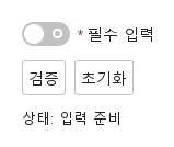
07 필수 입력과 초기화

검증 전·오류 표시·초기화 결과를 비교합니다.

Qt 실행 화면 · 이미지
필수 입력과 초기화 · 입력 전
QML 코드
import QtQuick
import Syidax.Core

Column {
    width: 440; spacing: 12
    SySwitch {
        id: field; width: parent.width; name: "selection"; required: true
        label: "필수 입력"
        
        error: "계속하려면 이 항목을 입력하세요."
    }
    Row {
        spacing: 8
        SyButton { id: check; text: "검증"; onClicked: field.reportValidity() }
        SyButton { id: reset; text: "초기화"; onClicked: field.reset() }
    }
    Text { text: "상태: " + (field.invalid ? "오류" : "입력 준비"); color: Theme.semantic.textDefault }
}

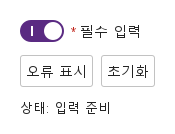
08 사용자 지정 오류

업무 규칙에 맞는 오류를 표시하고 초기화합니다.

Qt 실행 화면 · 이미지
사용자 지정 오류 · 입력 전
QML 코드
import QtQuick
import Syidax.Core

Column {
    width: 440; spacing: 12
    SySwitch {
        id: field; width: parent.width; name: "selection"; required: true
        label: "필수 입력"
        checked: true
        error: "현재 사용할 수 없는 선택입니다. 다른 값을 선택하세요."
    }
    Row {
        spacing: 8
        SyButton { id: check; text: "오류 표시"; onClicked: field.setCustomError() }
        SyButton { id: reset; text: "초기화"; onClicked: field.reset() }
    }
    Text { text: "상태: " + (field.invalid ? "오류" : "입력 준비"); color: Theme.semantic.textDefault }
}

API 73

항목을 가리키거나 선택하면 QML 예제와 복사 버튼이 나타납니다.

속성

항목동작 / 조건
공통 필드 속성(name, required, disabled, message, error, touched, submitted, customError, validStatus, valid, invalid, ready)은 Form 페이지에 설명되어 있습니다.

속성

속성타입기본값설명
boolfalse상태. 트랙 클릭, Space / Enter, toggle()이 뒤집고 바뀔 때마다 changed 발생.
string""트랙 옆 텍스트. required이면 *가 붙음. 비어 있으면 숨김.
string"medium"medium(44 × 22 px) · small(28 × 16 px). 그 밖의 값은 medium으로 그림.
boolfalse손잡이 안 스피너. 끌 때까지 모든 뒤집기를 무시. checked는 바꾸지 않음.
string"on"켜진 동안 소속 SyForm이 name으로 제출하는 값.
var(읽기 전용)—켜지면 value, 아니면 null — SyForm.values()가 저장하는 것.
string""소속 SyForm의 values()에서의 키.
boolfalse꺼짐 → valueMissing. * 표시를 더함.
boolfalse반응 없고 회색. Tab 정지점 아님. 항상 유효. 제출되지 않음.
boolfalse포커스는 되지만 바꿀 수 없음. 항상 유효. 제출됨.
string""스위치 아래 도움말 줄
string""필수 검사의 사용자 정의 오류 문구.
bool(읽기 전용)—트랙이 활성 포커스를 가짐
bool(읽기 전용)—포인터가 위에 있음(disabled에서는 false)
bool(읽기 전용)—누르는 중.
bool(읽기 전용)—disabled·readonly·loading이 아님 — 뒤집기 가능.
읽기 전용—현재 size의 기하.
읽기 전용—현재 size의 기하.
읽기 전용—현재 size의 기하.
읽기 전용—현재 size의 기하.
string(읽기 전용)—enabled · hover · focus · pressed · loading · readonly · disabled.
boolfalse필드 베이스의 제목 줄. 스위치에서는 꺼져 있음(라벨이 트랙 옆에 있음).

메서드

메서드설명
클릭: checked를 뒤집음(changed 발생). disabled·readonly·loading 동안 무시.
트랙에 키보드 포커스를 주기 / 거두기(focused / blured 발생, 블러는 touched 설정).
필수 스위치가 꺼진 경우(또는 사용자 정의 오류)가 아니면 true. 조용히.
같은 결과, 그리고 이제부터 오류 줄이 보임.
"" · valueMissing · custom.
custom 상태 강제 / 해제. 오류가 즉시 보임.
checked(생성 시 값 initialChecked)와 value를 복원하고 touched·보고·custom 플래그를 지움.

시그널

시그널인자발생 시점
checked: bool — 새 상태로딩 뒤 checked가 바뀜 — 사용자든 코드든. 초기값과, disabled·readonly·loading이 뒤집기를 막는 동안에는 발생하지 않음.
checked: bool — 현재 상태트랙이 활성 포커스를 얻음.
checked: bool — 현재 상태트랙이 포커스를 잃음. 먼저 touched가 설정됨.

동작

항목동작 / 조건
상태. 트랙 클릭, Space / Enter, toggle()이 뒤집고 바뀔 때마다 changed 발생.
클릭: checked를 뒤집음(changed 발생). disabled·readonly·loading 동안 무시.
로딩 뒤 checked가 바뀜 — 사용자든 코드든. 초기값과, disabled·readonly·loading이 뒤집기를 막는 동안에는 발생하지 않음.
손잡이 안 스피너. 끌 때까지 모든 뒤집기를 무시. checked는 바꾸지 않음.
켜진 동안 소속 SyForm이 name으로 제출하는 값.
켜지면 value, 아니면 null — SyForm.values()가 저장하는 것.
소속 SyForm의 values()에서의 키.
꺼짐 → valueMissing. * 표시를 더함.
required는 꺼진 스위치를 valueMissing으로 만들고, 스위치 아래 오류 줄("This field is required" 또는 error)은 스위치를 떠난(touched) 뒤나 보고된(submitted) 뒤 나타납니다.
message는 아래에 도움말 줄을 그립니다.
반응 없고 회색. Tab 정지점 아님. 항상 유효. 제출되지 않음.
포커스는 되지만 바꿀 수 없음. 항상 유효. 제출됨.
disabled가 아니면 Tab이 트랙에 멈춥니다(읽기 전용 스위치도 Tab 정지점). Space, Return, Enter가 토글합니다. 포커스 링은 트랙이 포커스를 갖고 disabled가 아닌 동안 트랙 바깥 2 px에 그려집니다. 스위치가 상호작용 가능하면(disabled·readonly·loading이 아니면) 손 모양 커서가 보입니다.
손잡이는 200 ms에 미끄러지고 트랙 색은 200 ms에 교차 전환됩니다. 트랙을 누르고 있는 동안 손잡이가 알약 모양으로 늘어나고(6 px, small은 4 px) 떼면 되돌아옵니다. 모두 Theme.reducedMotion에서 생략됩니다.
disabled는 모든 것을 회색으로 만들고 모든 상호작용과 Tab 정지를 막으며 SyForm.values()가 건너뜁니다.

색조: disabled > readonly > loading > pressed > focus > hover > enabled, 체크 또는 해제 팔레트에서.
트랙이 활성 포커스를 얻음.
트랙이 포커스를 잃음. 먼저 touched가 설정됨.
medium(44 × 22 px) · small(28 × 16 px). 그 밖의 값은 medium으로 그림.
size는 medium(44 × 22, 손잡이 18) 또는 small(28 × 16, 손잡이 12)이고 라벨은 둘 다 14 px입니다.
트랙 옆 텍스트. required이면 *가 붙음. 비어 있으면 숨김.
색은 상태별 Theme.switchFamily에서 오고 Theme.scheme을 따릅니다. 손잡이는 페이지 배경색입니다.