QML
← 전체 컴포넌트

Popover

컨트롤 옆에 추가 정보나 버튼, 간단한 입력 폼을 담는 작은 패널을 띄웁니다.

import Syidax.Core.Popover

지원 QML 타입

타입정의 / 역할
설명이나 조작 가능한 콘텐츠를 트리거 주변에 표시하는 팝업입니다.

예제로 보기

미리보기는 Qt 실행 화면의 이미지입니다. 아래 버튼으로 결과를 전환하세요.

01 기본 구성

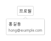
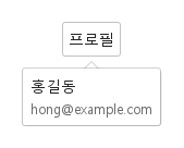
SyPopover는 어떤 내용이든 띄우는 면입니다 — 속할 아이템 안에 선언하고(그 아이템이 앵커) 팝오버 안에 내용을 선언하십시오: 글의 열, 폼, 체크박스 목록.

Qt 실행 화면 · 이미지
기본 구성 · 열린 화면
QML 코드
import QtQuick
import Syidax.Core

Item {
    implicitWidth: Math.max(360, childrenRect.width)
    implicitHeight: childrenRect.height

    property QtObject settings: QtObject {
        id: storyArgs
        property string position: "bottom"
        property string trigger: "hover"
        property bool arrow: true
        property bool sticky: false
        property int opendelay: 0
        property int closedelay: 100
        property string animation: "none"
    }


    Item {
        width: 320
        height: 140
        SyButton {
            anchors.centerIn: parent
            text: "프로필"
            SyPopover { id: exampleControl1; 
                position: storyArgs.position
                trigger: storyArgs.trigger
                arrow: storyArgs.arrow
                sticky: storyArgs.sticky
                opendelay: storyArgs.opendelay
                closedelay: storyArgs.closedelay
                animation: storyArgs.animation
                Column {
                    spacing: 4
                    Text { text: "홍길동"; font.weight: Font.Medium; font.family: Theme.fontFamily; font.pixelSize: 14; color: Theme.popover.textEnabled }
                    Text { text: "hong@example.com"; color: Theme.semantic.textSubtle; font.family: Theme.fontFamily; font.pixelSize: 12 }
                }
            }
        }
    }

}

02 position · arrow

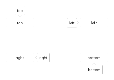
position · arrow의 설정과 실행 결과를 비교합니다.

Qt 실행 화면 · 이미지
position · arrow · 기본
기본 실행 화면
QML 코드
import QtQuick
import Syidax.Core

pragma ComponentBehavior: Bound

Item {
    implicitWidth: Math.max(360, childrenRect.width)
    implicitHeight: childrenRect.height
    // Focused Gallery routes: keep only the selected API and its prerequisites.

    id: story
    readonly property var positions: ["top", "left", "right", "bottom"]

    Item {
        width: 420
        height: 260
        Grid {
            anchors.centerIn: parent
            columns: 2
            columnSpacing: 160
            rowSpacing: 90
            Repeater {
                model: story.positions
                delegate: SyButton {
                    id: cell
                    required property string modelData
                    text: cell.modelData
                    width: 100
                    SyPopover { id: featureTarget0;
                        position: cell.modelData; arrow: true; trigger: "none"
                        Component.onCompleted: { Qt.callLater(setOpen);  }
                        Text { text: cell.modelData; font.family: Theme.fontFamily; font.pixelSize: 13; color: Theme.popover.textEnabled }
                    }
                }
            }
        }
    }
}

03 trigger

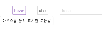
마우스 진입, 클릭, 입력란 포커스에 따른 결과 화면을 비교합니다.

Qt 실행 화면 · 이미지
trigger · 호버 결과
QML 코드
import QtQuick
import Syidax.Core

Item {
    width: 520; height: 180
    Row {
        x: 24; y: 28; spacing: 40
        SyButton {
            id: hoverTarget; text: "hover"
            SyPopover { id: hoverPopup; position: "bottom"; Text { text: "마우스를 올려 표시한 도움말"; font.family: Theme.fontFamily; font.pixelSize: 13; color: Theme.popover.textEnabled } }
        }
        SyButton {
            id: clickTarget; text: "click"
            SyPopover { id: clickPopup; trigger: "click"; position: "bottom"; Text { text: "버튼을 클릭해 표시한 도움말"; font.family: Theme.fontFamily; font.pixelSize: 13; color: Theme.popover.textEnabled } }
        }
        FocusScope {
            id: focusAnchor; width: 150; height: focusTarget.height
            SyInput {
                id: focusTarget; placeholder: "focus"; width: parent.width
                SyPopover { id: focusPopup; anchor: focusAnchor; trigger: "focus"; position: "bottom"; Text { text: "입력란에 포커스가 있는 동안 표시"; font.family: Theme.fontFamily; font.pixelSize: 13; color: Theme.popover.textEnabled } }
            }
        }
    }
}

04 sticky

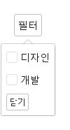
sticky: true는 모든 자동 닫힘을 끕니다: Escape, 바깥 누름, 앵커 떠남이 모두 무시되고 팝오버는 setClose()(또는 close())를 부를 때까지 — 이 페이지처럼 안의 버튼에서, 또는 직접 만든 로직에서 — 남습니다.

Qt 실행 화면 · 이미지
sticky · 열린 화면
QML 코드
import QtQuick
import Syidax.Core

Item {
    implicitWidth: Math.max(360, childrenRect.width)
    implicitHeight: childrenRect.height

    SyButton {
        text: "필터"
        SyPopover {
            id: filters
            trigger: "click"; sticky: true; arrow: true
            Column {
                spacing: 8
                SyCheckbox { text: "디자인" }
                SyCheckbox { text: "개발" }
                SyButton { text: "닫기"; size: "small"; onClicked: filters.setClose() }
            }
        }
    }
}

05 setOpen · setClose

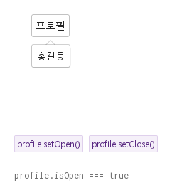
setOpen()은 팝오버를 열고 setClose()는 닫습니다 — trigger와 상관없이 코드에서.

Qt 실행 화면 · 이미지
setOpen · setClose · 열린 화면
QML 코드
import QtQuick
import Syidax.Core

Item {
    implicitWidth: Math.max(360, childrenRect.width)
    implicitHeight: childrenRect.height
    // Focused Gallery routes: keep only the selected API and its prerequisites.
    id: featureStory

    Column {
        spacing: 24
        Item {
            width: 560; height: 170
            SyButton {
                x: 24; y: 24
 text: "프로필"; SyPopover { id: profile; trigger: "none"; arrow: true; Text { text: "홍길동"; font.family: Theme.fontFamily; font.pixelSize: 13; color: Theme.popover.textEnabled } } }
        }
        Row {
            objectName: "exampleCommands"

            spacing: 8
            SyButton { id: exampleControl1;  visible: true; text: "profile.setOpen()"; variant: "secondary"; size: "small"; onClicked: profile.setOpen() }
            SyButton { id: exampleControl2;  visible: true; text: "profile.setClose()"; variant: "secondary"; size: "small"; onClicked: profile.setClose() }
        }
        Text {
            text: "profile.isOpen === " + profile.isOpen
            font.family: Theme.monoFontFamily
            font.pixelSize: 12
            color: Theme.semantic.textSubtle
        }
    }
}

06 키보드 포커스로 열기

trigger 설정을 적용한 키보드 포커스로 열기 예제입니다.

Qt 실행 화면 · 이미지
키보드 포커스로 열기 · 열린 화면
QML 코드
import QtQuick
import Syidax.Core

Item {
    implicitWidth: Math.max(360, childrenRect.width)
    implicitHeight: childrenRect.height

    property QtObject settings: QtObject {
        id: storyArgs
        property string position: "bottom"
        property string trigger: "focus"
        property bool arrow: true
        property bool sticky: false
        property int opendelay: 0
        property int closedelay: 100
        property string animation: "none"
    }


    Item {
        width: 320
        height: 140
        SyButton {
            anchors.centerIn: parent
            text: "프로필"
            SyPopover { id: exampleControl1; 
                position: storyArgs.position
                trigger: storyArgs.trigger
                arrow: storyArgs.arrow
                sticky: storyArgs.sticky
                opendelay: storyArgs.opendelay
                closedelay: storyArgs.closedelay
                animation: storyArgs.animation
                Column {
                    spacing: 4
                    Text { text: "홍길동"; font.weight: Font.Medium; font.family: Theme.fontFamily; font.pixelSize: 14; color: Theme.popover.textEnabled }
                    Text { text: "hong@example.com"; color: Theme.semantic.textSubtle; font.family: Theme.fontFamily; font.pixelSize: 12 }
                }
            }
        }
    }

}

API 57

항목을 가리키거나 선택하면 QML 예제와 복사 버튼이 나타납니다.

속성

속성타입기본값설명
list (기본 속성)—안에 선언한 아이템. 팝오버의 크기를 정합니다.
string"bottom""top" · "topLeft" · "topRight" · "bottom" · "bottomLeft" · "bottomRight" · "left" · "leftTop" · "leftBottom" · "right" · "rightTop" · "rightBottom".
string"hover""hover" · "click" · "focus" · "none"("null"은 "none"으로 바뀜).
boolfalse앵커를 향한 포인터를 보입니다.
boolfalse스스로 닫히지 않음. setClose() / close() / click 토글만.
int0열기 / 닫기까지의 밀리초.
int100열기 / 닫기까지의 밀리초.
string"none""none" · "fade"; 속도 "x-fast" · "fast" · "medium" · "slow" · "x-slow".
string"fast""none" · "fade"; 속도 "x-fast" · "fast" · "medium" · "slow" · "x-slow".
Item선언된 아이템따라다닐 아이템(세 단계 안에서 hovered를 가진 가장 가까운 조상으로 결정).
bool (읽기 전용)—팝오버가 보임.
string (읽기 전용)—뒤집기 뒤의 쪽, -start / -end 포함.
color팝오버 토큰면의 모양.
color옅은 테두리면의 모양.
real3면의 모양.
booltrue면의 모양.
real8내용과 가장자리 사이의 공간.
real10 / 4베이스 팝업 기하.
booltrue베이스 팝업 기하.
boolfalse베이스 팝업 기하.
읽기 전용—계산된 속도, 현재 쪽, 앵커가 열기를 받는지, 오버레이 좌표의 앵커 사각형.

메서드

메서드설명
대기 중인 지연을 취소하고 트리거와 상관없이 엽니다 — 앵커가 disabled / readonly / 비활성이면 제외.
대기 중인 지연을 취소하고 sticky여도 닫습니다.
베이스 팝업의 즉시 열기 / 닫기(open()은 앵커 검사를 무시하고, close()는 Escape나 바깥 누름처럼 대기 중인 opendelay도 취소합니다).
열려 있으면 setClose(), 아니면 트리거식 열기 요청.
배치를 다시 계산합니다. 앵커·크기·창 변화에 자동입니다.

시그널

항목동작 / 조건
팝업이 표시되기 직전에 발생합니다.
팝업의 열기 전환이 끝나면 발생합니다.
팝업이 숨겨지기 직전에 발생합니다.
팝업의 닫기 전환이 끝나면 발생합니다.
visible 값이 바뀌면 발생하는 속성 변경 알림입니다.
isOpen 값이 바뀌면 발생하는 속성 변경 알림입니다.

동작

항목동작 / 조건
따라다닐 아이템(세 단계 안에서 hovered를 가진 가장 가까운 조상으로 결정).
안에 선언한 아이템(기본 속성). 팝오버의 크기는 내용의 경계 상자에 사방 8 px 여백을 더한 것입니다. 아이템은 자체 크기가 있어야 합니다(Column, Text, 고정 크기 Item). 면은 글자색을 정하지 않으므로 글에 Theme.popover.textEnabled를 쓰십시오.
상호작용 가능한 앵커 — 앵커가 enabled이고 disabled도 readonly도 아닐 때만 열립니다.
대기 중인 지연을 취소하고 트리거와 상관없이 엽니다 — 앵커가 disabled / readonly / 비활성이면 제외.
"hover" · "click" · "focus" · "none"("null"은 "none"으로 바뀜).
trigger — hover: 포인터가 들어오면 열리고, 앵커나 팝오버를 떠난 뒤 closedelay가 지나면 닫힙니다(팝오버 위의 호버가 유지시킴). 지연 — opendelay(0)와 closedelay(100), ms.
대기 중인 지연을 취소하고 sticky여도 닫습니다.
지연 — opendelay(0)와 closedelay(100), ms.
어떤 경로로든 — Escape, 바깥 누름, close() — 닫히면 대기 중인 지연 열기가 취소됩니다. setClose(), close() 또는 click 트리거의 토글이 닫습니다.
스스로 닫히지 않음. setClose() / close() / click 토글만.
뒤집기 뒤의 쪽, -start / -end 포함.
앵커를 향한 포인터를 보입니다.
애니메이션 — animation: "fade"("none"이 아닌 모든 이름)는 animationMs(x-fast 100 · fast 150 · medium 250 · slow 350 · x-slow 500)에 걸쳐 페이드합니다.
팝오버가 보임.
상태 — isOpen은 팝업의 visible입니다.
팝업이 표시되기 직전에 발생합니다.
팝업의 열기 전환이 끝나면 발생합니다.
팝업이 숨겨지기 직전에 발생합니다.
팝업의 닫기 전환이 끝나면 발생합니다.

키보드

항목동작 / 조건
한 줄 글에는 SyTooltip, 버튼이 있는 질문에는 SyPopconfirm, 메뉴에는 SyDropdown, 필드 피드백에는 SyInlineMessage; 흔한 앵커로 SyButton, SyAvatar, SyIcon.