QML
← 전체 컴포넌트

Panel

작업 화면을 크기 조절이 가능한 패널로 나눕니다. 패널을 중첩하거나 접어 복잡한 도구 화면을 구성할 수 있습니다.

import Syidax.Core.Panel

지원 QML 타입

타입정의 / 역할
고정·접기·닫기와 선택적 헤더 동작을 갖춘 콘텐츠 영역입니다.
패널을 배치하고 공간을 분배하며 크기 조절 분할선을 제공합니다.

예제로 보기

미리보기는 Qt 실행 화면의 이미지입니다. 아래 버튼으로 결과를 전환하세요.

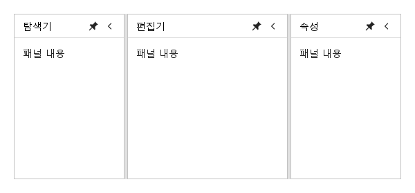
01 기본 구성

핀·접기·닫기·리사이즈 표시를 독립적으로 제어하는 앱 영역입니다.

Qt 실행 화면 · 이미지
기본 구성 · 기본
기본 실행 화면
QML 코드
import QtQuick
import Syidax.Core

Item {
    implicitWidth: Math.max(360, childrenRect.width)
    implicitHeight: childrenRect.height
    id: story

    property QtObject settings: QtObject {
        id: storyArgs
        property string orientation: "horizontal"
        property int gripSize: 4
        property bool resizable: true
        property bool disabled: false
        property bool resizeHandleVisible: true
    }


    SyPanelGroup {
        width: 560
        height: 240
        orientation: storyArgs.orientation
        gripSize: storyArgs.gripSize
        resizable: storyArgs.resizable
        disabled: storyArgs.disabled
        resizeHandleVisible: storyArgs.resizeHandleVisible
        SyPanel { title: "탐색기"; preferredSize: 160; Text { x: 12; y: 12; text: "패널 내용"; font.family: Theme.fontFamily; font.pixelSize: 14; color: Theme.semantic.textDefault } }
        SyPanel { title: "편집기"; Text { x: 12; y: 12; text: "패널 내용"; font.family: Theme.fontFamily; font.pixelSize: 14; color: Theme.semantic.textDefault } }
        SyPanel { title: "속성"; preferredSize: 160; Text { x: 12; y: 12; text: "패널 내용"; font.family: Theme.fontFamily; font.pixelSize: 14; color: Theme.semantic.textDefault } }
    }

}

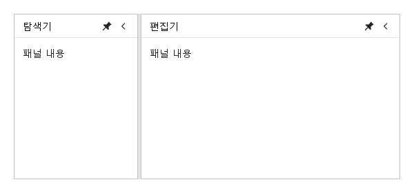
02 pinned · collapsed

핀을 해제하면 제목 strip이, 접으면 펼침 버튼만 남습니다.

Qt 실행 화면 · 이미지
pinned · collapsed · 기본
QML 코드
import QtQuick
import Syidax.Core

Item {
    implicitWidth: Math.max(360, childrenRect.width)
    implicitHeight: childrenRect.height
    // Focused Gallery routes: keep only the selected API and its prerequisites.

    id: story
    property QtObject settings: QtObject {
        id: storyArgs
        property bool pinned: true
        property bool collapsed: false
        property bool closable: false
        property bool pinnable: true
        property bool collapsible: true
        property string orientation: "horizontal"
        property string collapseDirection: "left"
        property bool headerVisible: true
        property bool pinVisible: true
        property bool collapseVisible: true
        property bool closeVisible: true
        property bool resizeHandleVisible: true
        property string pinnedIcon: ""
        property string unpinnedIcon: ""
        property string collapseIcon: ""
        property string expandIcon: ""
    }


    SyPanelGroup {
        width: 560
        height: 240
        orientation: storyArgs.orientation
        SyPanel {
            id: explorer
            title: "탐색기"
            preferredSize: 180
            panelId: "explorer"
            collapseDirection: storyArgs.collapseDirection
            headerVisible: storyArgs.headerVisible
            pinVisible: storyArgs.pinVisible
            collapseVisible: storyArgs.collapseVisible
            closeVisible: storyArgs.closeVisible
            resizeHandleVisible: storyArgs.resizeHandleVisible
            pinnedIcon: storyArgs.pinnedIcon
            unpinnedIcon: storyArgs.unpinnedIcon
            collapseIcon: storyArgs.collapseIcon
            expandIcon: storyArgs.expandIcon
            closable: storyArgs.closable
            pinnable: storyArgs.pinnable
            collapsible: storyArgs.collapsible
            Binding on pinned { value: storyArgs.pinned }
            Binding on collapsed { value: storyArgs.collapsed }
            Text { x: 12; y: 12; text: "패널 내용"; font.family: Theme.fontFamily; font.pixelSize: 14; color: Theme.semantic.textDefault }
        }
        SyPanel { title: "편집기"; Text { x: 12; y: 12; text: "패널 내용"; font.family: Theme.fontFamily; font.pixelSize: 14; color: Theme.semantic.textDefault } }
    }
}

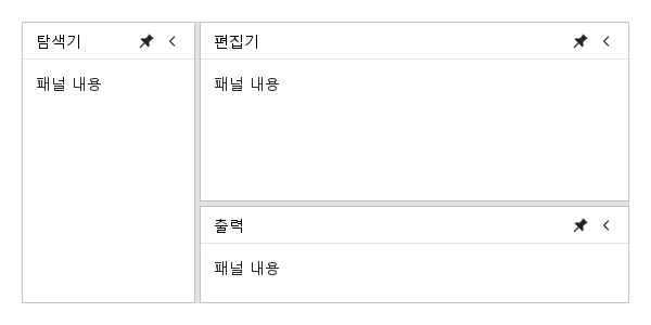
03 중첩 그룹

SyPanelGroup은 그 자체로 그룹의 멤버입니다: 그룹 안에 그룹을 선언해 열을 더 나눕니다.

Qt 실행 화면 · 이미지
중첩 그룹 · 기본
기본 실행 화면
QML 코드
import QtQuick
import Syidax.Core

Item {
    implicitWidth: Math.max(360, childrenRect.width)
    implicitHeight: childrenRect.height
    id: story


    SyPanelGroup {
        width: 560
        height: 260
        SyPanel { title: "탐색기"; preferredSize: 160; Text { x: 12; y: 12; text: "패널 내용"; font.family: Theme.fontFamily; font.pixelSize: 14; color: Theme.semantic.textDefault } }
        SyPanelGroup {
            orientation: "vertical"
            SyPanel { title: "편집기"; Text { x: 12; y: 12; text: "패널 내용"; font.family: Theme.fontFamily; font.pixelSize: 14; color: Theme.semantic.textDefault } }
            SyPanel { title: "출력"; preferredSize: 90; Text { x: 12; y: 12; text: "패널 내용"; font.family: Theme.fontFamily; font.pixelSize: 14; color: Theme.semantic.textDefault } }
        }
    }
}

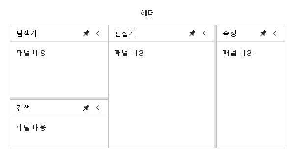
04 SyLayout 조합

패널은 SyLayout이 주는 영역을 채웁니다: 사이더에는 세로 그룹(탐색기 위, 100 px 검색 패널 아래), 콘텐츠에는 가로 그룹(편집기 옆 140 px 속성 패널)이 들어갑니다.

Qt 실행 화면 · 이미지
SyLayout 조합 · 기본
기본 실행 화면
QML 코드
import QtQuick
import Syidax.Core

Item {
    implicitWidth: Math.max(360, childrenRect.width)
    implicitHeight: childrenRect.height
    id: story


    SyLayout {
        width: 560
        height: 300
        SyLayoutHeader { size: "small"; Text { anchors.centerIn: parent; text: "헤더"; font.family: Theme.fontFamily; font.pixelSize: 14; color: Theme.semantic.textDefault } }
        SyLayoutSider {
            size: 200
            SyPanelGroup {
                anchors.fill: parent
                orientation: "vertical"
                SyPanel { title: "탐색기"; Text { x: 12; y: 12; text: "패널 내용"; font.family: Theme.fontFamily; font.pixelSize: 14; color: Theme.semantic.textDefault } }
                SyPanel { title: "검색"; preferredSize: 100; Text { x: 12; y: 12; text: "패널 내용"; font.family: Theme.fontFamily; font.pixelSize: 14; color: Theme.semantic.textDefault } }
            }
        }
        SyLayoutContent {
            SyPanelGroup {
                anchors.fill: parent
                SyPanel { title: "편집기"; Text { x: 12; y: 12; text: "패널 내용"; font.family: Theme.fontFamily; font.pixelSize: 14; color: Theme.semantic.textDefault } }
                SyPanel { title: "속성"; preferredSize: 140; Text { x: 12; y: 12; text: "패널 내용"; font.family: Theme.fontFamily; font.pixelSize: 14; color: Theme.semantic.textDefault } }
            }
        }
    }
}

05 상태 · 리사이즈 단계 · payload

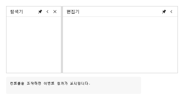
콘솔에서 레이아웃 후 상태 이벤트와 리사이즈 시작·진행·종료 payload를 확인합니다.

Qt 실행 화면 · 이미지
상태 · 리사이즈 단계 · payload · 기본
QML 코드
import QtQuick
import Syidax.Core

Item {
    component EventLog: Rectangle {
        id: logBox
        property var lines: []
        implicitWidth: 440
        implicitHeight: Math.max(56, logText.implicitHeight + 24)
        radius: 4; color: Theme.semantic.backgroundBold
        function log(value) { lines = lines.slice(-3).concat([String(value)]) }
        Text {
            id: logText; x: 12; y: 12; width: parent.width - 24
            text: logBox.lines.length ? logBox.lines.join("\n") : "컨트롤을 조작하면 이벤트 결과가 표시됩니다."
            wrapMode: Text.Wrap; color: Theme.semantic.textDefault
            font.family: Theme.monoFontFamily; font.pixelSize: 12
        }
    }

    implicitWidth: Math.max(360, childrenRect.width)
    implicitHeight: childrenRect.height
    // Focused Gallery routes: keep only the selected API and its prerequisites.
    id: featureStory


    Column {
        spacing: 12
        SyPanelGroup {
            width: 560
            height: 220
            onResizeStarted: (detail) => { if (true) { output.log("resizeStarted " + JSON.stringify(detail)) } }
            onResizing: (detail) => { if (true) { output.log("resizing " + JSON.stringify(detail)) } }
            onResizeFinished: (detail) => { if (true) { output.log("resizeFinished " + JSON.stringify(detail)) } }
            onResized: (sizes) => { if (true) { output.log(("group resized: %1").arg(sizes.map(Math.round).join(" / "))) } }
            SyPanel {
                id: explorer
                panelId: "explorer"
                onPinToggled: (detail) => { if (true) { output.log("pinToggled " + JSON.stringify(detail)) } }
                onCollapseToggled: (detail) => { if (true) { output.log("collapseToggled " + JSON.stringify(detail)) } }
                title: "탐색기"; preferredSize: 180; closable: true
                onResized: (size) => { if (true) { output.log(("resized: %1 px").arg(Math.round(size))) } }
                onPinnedChanged: { if (true) { output.log(("pinned: %1").arg(pinned)) } }
                onCollapsedChanged: { if (true) { output.log(("collapsed: %1").arg(collapsed)) } }
                onShown: { if (true) { output.log("플라이아웃 열림") } }
                onHidden: { if (true) { output.log("플라이아웃 닫힘") } }
                onClosed: { if (true) { output.log("닫힘") } }
            }
            SyPanel { panelId: "editor"; title: "편집기" }
        }
        SyButton { id: exampleControl1;  visible: !explorer.visible; size: "small"; variant: "borderless"; text: "되살리기"; onClicked: explorer.visible = true }
        EventLog { id: output }
    }
}

06 setPin · setCollapse · setSizes

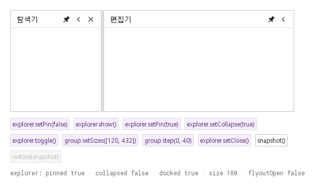
외부 toolbar에서 패널을 제어하고 snapshot()을 저장하여 panelId로 복원합니다.

Qt 실행 화면 · 이미지
setPin · setCollapse · setSizes · 기본
QML 코드
import QtQuick
import Syidax.Core

Item {
    implicitWidth: Math.max(360, childrenRect.width)
    implicitHeight: childrenRect.height
    // Focused Gallery routes: keep only the selected API and its prerequisites.

    id: story
    property var savedLayout: []

    Column {
        spacing: 12
        SyPanelGroup {
            id: group
            width: 560
            height: 200
            SyPanel { id: explorer; panelId: "explorer"; title: "탐색기"; preferredSize: 180; closable: true }
            SyPanel { panelId: "editor"; title: "편집기" }
        }
        Flow {
            width: 560
            spacing: 8
            SyButton { id: exampleControl1;  visible: true; text: "explorer.setPin(false)"; variant: "secondary"; size: "small"; onClicked: explorer.setPin(false) }
            SyButton { id: exampleControl2;  visible: true; text: "explorer.show()"; variant: "secondary"; size: "small"; onClicked: explorer.show() }
            SyButton { id: exampleControl3;  visible: true; text: "explorer.setPin(true)"; variant: "secondary"; size: "small"; onClicked: explorer.setPin(true) }
            SyButton { visible: true; text: "explorer.setCollapse(true)"; variant: "secondary"; size: "small"; onClicked: explorer.setCollapse(true) }
            SyButton { visible: true; text: "explorer.toggle()"; variant: "secondary"; size: "small"; onClicked: explorer.toggle() }
            SyButton { visible: true; text: "group.setSizes([120, 432])"; variant: "secondary"; size: "small"; onClicked: group.setSizes([120, 432]) }
            SyButton { visible: true; text: "group.step(0, 40)"; variant: "secondary"; size: "small"; onClicked: group.step(0, 40) }
            SyButton { visible: true; text: "explorer.setClose()"; variant: "secondary"; size: "small"; enabled: explorer.visible; onClicked: explorer.setClose() }
            SyButton { visible: true; text: "snapshot()"; size: "small"; onClicked: story.savedLayout = group.snapshot() }
            SyButton { visible: true; text: "restore(snapshot)"; size: "small"; enabled: story.savedLayout.length > 0; onClicked: group.restore(story.savedLayout) }
            SyButton { visible: !explorer.visible; size: "small"; variant: "borderless"; text: "되살리기"; onClicked: explorer.visible = true }
        }
        Text {
            text: "explorer: pinned " + explorer.pinned + " · collapsed " + explorer.collapsed + " · docked " + explorer.docked + " · size " + Math.round(explorer.size) + " · flyoutOpen " + explorer.flyoutOpen
            font.family: Theme.monoFontFamily
            font.pixelSize: 12
            color: Theme.semantic.textSubtle
        }
    }
}

API 64

항목을 가리키거나 선택하면 QML 예제와 복사 버튼이 나타납니다.

속성

속성기본값의미
true버튼 표시. 상태와 크기 기억값은 변경하지 않음
true그룹과 양쪽 멤버 모두 허용할 때 grip 표시. 숨기면 공간·hit area·Tab 정지도 제거
true사용자 조작 가능 여부. API는 호스트 제어를 위해 허용
false닫기 버튼 opt-in
true일반 헤더만 제어. strip과 펼침 버튼은 유지
빈 문자열이벤트·상태 저장용 고유 ID
빈 URL빈 값은 기본 아이콘. Icons.* 또는 SVG URL
0그룹 주축 선호 크기. 0은 남은 공간 배분
80크기 제약. maximumSize=0은 무제한
0크기 제약. maximumSize=0은 무제한
빈 값 · 0제목·장식 아이콘·헤더 추가 항목·본문 여백

속성

항목동작 / 조건
이전 pinnable:false / collapsible:false는 버튼을 숨겼지만 이제 비활성화합니다. 숨기려면 대응하는 Visible 속성을 사용하세요. pin 아이콘은 그대로 사용합니다. 접기 아이콘은 왼쪽, 펼침 아이콘은 오른쪽을 향하도록 준비하며 left/right/top/bottom에 따라 함께 0°/180°/90°/−90° 회전합니다. 아이콘 교체만으로 작업 이벤트가 발생하지 않습니다.

추가 속성

이름타입 / 기본값설명
인접 패널의 가로·세로 배치입니다. 분할선 방향과 크기 변화를 비교하세요.
분할선 손잡이 두께(논리 픽셀)입니다. 패널 사이에 이 공간이 확보됩니다.
패널 그룹의 사용자 입력을 막습니다. 포인터와 키보드 동작을 비교하세요.
접기 버튼이나 고정 해제 띠가 놓이는 가장자리입니다. left/right/top/bottom을 비교하세요. 인접 패널 배치는 orientation이 결정합니다.

추가 메서드

이름타입 / 기본값설명
setPin(false)는 제목 띠로 전환하고 setPin(true)는 다시 고정합니다. 실제 상태가 바뀌면 배치 후 pinToggled가 발생합니다.
setCollapse(true)로 패널을 접습니다. Toggle로 다시 펼친 뒤 반복해서 비교할 수 있습니다.
보이는 고정 패널에 순서대로 크기를 지정합니다. 최소·최대 크기 제약이 적용되며 아래 크기 표시에서 결과를 확인합니다.
먼저 고정을 해제한 뒤 show()로 플라이아웃을 엽니다. 다시 고정하면 본문이 배치 영역으로 돌아옵니다.
접힘과 펼침을 전환하며 고정 상태는 유지합니다.
step(0, 40)은 첫 번째 분할선을 40 논리 픽셀 이동합니다. 양쪽 패널의 크기 제약을 지킵니다.
패널을 숨기고 closed를 한 번 발생시킵니다. 복원 버튼으로 다시 표시해 반복해서 테스트할 수 있습니다.
패널 ID·크기·상태를 저장합니다. 크기나 접힘 상태를 바꿔 저장한 후 restore(snapshot)으로 비교합니다.
먼저 스냅샷을 저장하고 크기를 바꾼 다음 복원합니다. 안정적인 패널 ID를 기준으로 배치와 상태를 복원합니다.

이벤트

신호payload / 시점
레이아웃 후 panelId, pinned, previousPinned, collapseDirection, source
레이아웃 후 panelId, collapsed, previousCollapsed, collapseDirection, source
beforeId, afterId, orientation, startSizes, source
실제 변화 시 sizes, previousSizes와 양쪽 ID, source
sizes, startSizes, changed, cancelled와 양쪽 ID, source
geometry/상태 변경 시 members[{id,size,visible,docked,collapseDirection,x,y,width,height}], reason
실제 변경된 패널만 변경 완료 시 발생하는 호환 신호
visible=false 이후. 반복 닫기는 무동작
flyout 상태 변경. pin/collapse와 별개

이벤트

항목동작 / 조건
source는 pointer, keyboard, api, property입니다. 직접 대입에도 상세 상태 이벤트가 발생하지만 초기 생성이나 같은 값 반복 설정에는 발생하지 않습니다. pinnedChanged/collapsedChanged는 일반 QML 알림이므로 handler에서 property를 읽으세요. 컨테이너 resize는 layoutChanged(reason:container)이며 사용자 resize 완료로 보고하지 않습니다. 방향 변경은 property 알림과 실제 레이아웃만 변경합니다.

추가 시그널

이름타입 / 기본값설명
pinned 값이 바뀌면 발생하는 속성 변경 알림입니다.
헤더에서 접기·펼치기를 실행하면 발생합니다. 핸들러에서 collapsed 속성을 읽으세요.

상태와 표시

상태남는 화면복원
헤더와 본문docked 상태
36 px 제목 strip클릭·Enter·Space·hover로 flyout, pin으로 고정
24 × 24 px 펼침 버튼만pin 상태 유지. unpinned이면 펼친 후 flyout 표시

상태와 표시

항목동작 / 조건
collapseDirection은 left(기본), right, top, bottom입니다. 잘못된 값은 left로 해석합니다. 물리 방향이므로 RTL이나 그룹 orientation과 무관합니다. 그룹 축과 직교하는 strip은 해당 가장자리 band를 먼저 확보하고 나머지에 형제를 배치합니다. 여러 band는 선언 순서로 확보합니다. 접힘 상태도 band 두께만 확보하며 실제 화면에는 버튼만 그립니다. 단독 패널의 implicit 크기는 줄지만 명시한 width/height는 호스트 소유입니다.

크기와 저장

항목동작 / 조건
preferredSize를 먼저 배정하고 지정하지 않은 멤버가 남은 공간을 나눕니다. drag/API로 변경한 멤버는 별도 기준 크기를 기억합니다. min/max·컨테이너·visibility 변경마다 제약을 반복 적용합니다. 최소 합이 공간을 초과하면 최소를 유지하여 넘치며, 모든 최대에 도달하면 뒤쪽 여백을 남깁니다. 최대가 최소보다 작으면 최소로 해석합니다. preferredSize를 새로 지정하면 해당 멤버는 preferred 배분으로 돌아갑니다.
sizes는 숨김=0, 축소=strip/버튼 두께를 포함하는 전체 목록입니다. setSizes(values)는 표시 중인 docked 멤버만 대상으로 하므로 일반적인 왕복 저장 형식이 아닙니다. snapshot()/restore(snapshot)은 ID·docked 크기·visibility·pin·collapse·방향·중첩 그룹을 저장합니다. 빈 ID나 중복 ID는 거부합니다.

키보드와 메서드

항목동작 / 조건
아이콘은 Tab·Enter·Space, grip은 방향키 8 px·Shift+방향키 80 px·Home/End(가능한 한계)·Escape(drag 취소)를 지원합니다. setPin(value), setCollapse(value), toggle(), setClose(), show(), hide()와 그룹 setSizes(values), step(index,delta), snapshot(), restore(snapshot)을 제공합니다. 닫힌 패널은 visible=true로 다시 표시합니다.

키보드와 메서드

항목호출 예시
import QtQuick import Syidax.Core.Panel SyPanelGroup { id: regions width: 640; height: 360 property var savedLayout: [] onResizeFinished: (detail) => console.log(JSON.stringify(detail)) SyPanel { panelId: "explorer"; title: "탐색기"; preferredSize: 180; collapseDirection: "left" } SyPanel { panelId: "editor"; title: "편집기" } // 외부 toolbar: savedLayout = regions.snapshot(); regions.restore(savedLayout) }
sizes, startSizes, changed, cancelled와 양쪽 ID, source
import QtQuick import Syidax.Core.Panel SyPanelGroup { id: regions width: 640; height: 360 property var savedLayout: [] onResizeFinished: (detail) => console.log(JSON.stringify(detail)) SyPanel { panelId: "explorer"; title: "탐색기"; preferredSize: 180; collapseDirection: "left" } SyPanel { panelId: "editor"; title: "편집기" } // 외부 toolbar: savedLayout = regions.snapshot(); regions.restore(savedLayout) }
그룹 주축 선호 크기. 0은 남은 공간 배분
접기 버튼이나 고정 해제 띠가 놓이는 가장자리입니다. left/right/top/bottom을 비교하세요. 인접 패널 배치는 orientation이 결정합니다.
이벤트·상태 저장용 고유 ID