QML
← 전체 컴포넌트

Radio

여러 옵션 중 하나를 고르는 선택 컨트롤입니다. 라디오 버튼이나 이어진 버튼 형태로 표시할 수 있습니다.

import Syidax.Core.Radio

지원 QML 타입

타입정의 / 역할
SyRadioGroup 안에서 사용하는 기본 라디오 선택 항목입니다.
SyRadioGroup 안에서 사용하는 버튼 모양의 단일 선택 항목입니다.
여러 라디오 항목 중 하나의 선택 값과 검증 상태를 관리하는 폼 필드입니다.

예제로 보기

미리보기는 Qt 실행 화면의 이미지입니다. 아래 버튼으로 결과를 전환하세요.

01 기본 구성

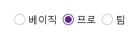
라디오 패밀리는 세 타입입니다.

Qt 실행 화면 · 이미지
기본 구성 · 기본
기본 실행 화면
QML 코드
import QtQuick
import Syidax.Core

Item {
    implicitWidth: Math.max(360, childrenRect.width)
    implicitHeight: childrenRect.height

    property QtObject settings: QtObject {
        id: storyArgs
        property string defaultValue: "pro"
        property string position: "horizontal"
        property string size: "medium"
        property bool disabled: false
        property bool readonly: false
        property bool required: false
    }


    SyRadioGroup {
        defaultValue: storyArgs.defaultValue
        position: storyArgs.position
        size: storyArgs.size
        disabled: storyArgs.disabled
        readonly: storyArgs.readonly
        required: storyArgs.required
        SyRadio { value: "basic"; text: "베이직" }
        SyRadio { value: "pro"; text: "프로" }
        SyRadio { value: "team"; text: "팀" }
    }

}

02 position

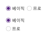
position이 선택지를 배치합니다.

Qt 실행 화면 · 이미지
position · 기본
기본 실행 화면
QML 코드
import QtQuick
import Syidax.Core

Item {
    implicitWidth: Math.max(360, childrenRect.width)
    implicitHeight: childrenRect.height

    Column {
        spacing: 16
        SyRadioGroup {
            defaultValue: "basic"
            SyRadio { value: "basic"; text: "베이직" }
            SyRadio { value: "pro"; text: "프로" }
        }
        SyRadioGroup {
            defaultValue: "basic"; position: "vertical"
            SyRadio { value: "basic"; text: "베이직" }
            SyRadio { value: "pro"; text: "프로" }
        }
    }
}

03 size

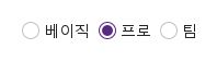
그룹의 size는 모든 선택지에 밀어 넣어집니다.

Qt 실행 화면 · 이미지
size · 기본
QML 코드
import QtQuick
import Syidax.Core

Item {
    implicitWidth: Math.max(360, childrenRect.width)
    implicitHeight: childrenRect.height
    property QtObject settings: QtObject {
        id: storyArgs
        property string size: "medium"
    }


    SyRadioGroup {
        defaultValue: "pro"; size: storyArgs.size
        SyRadio { value: "basic"; text: "베이직" }
        SyRadio { value: "pro"; text: "프로" }
        SyRadio { value: "team"; text: "팀" }
    }
}

04 SyRadioButton

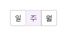
SyRadioButton은 SyButton으로 그려지는 선택지입니다.

Qt 실행 화면 · 이미지
SyRadioButton · 기본
QML 코드
import QtQuick
import Syidax.Core

Item {
    implicitWidth: Math.max(360, childrenRect.width)
    implicitHeight: childrenRect.height
    // Focused Gallery routes: keep only the selected API and its prerequisites.
    id: featureStory

    property QtObject settings: QtObject {
        id: storyArgs
        property string variant: "outlined"
        property string size: "medium"
        property string position: "horizontal"
    }


    SyRadioGroup { id: featureTarget0;
        defaultValue: "week"; variant: storyArgs.variant; size: storyArgs.size; position: storyArgs.position
        SyRadioButton { value: "day"; text: "일" }
        SyRadioButton { value: "week"; text: "주" }
        SyRadioButton { value: "month"; text: "월" }
    }
}

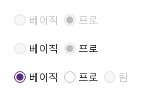
05 disabled · readonly

그룹의 disabled와 readonly는 모든 선택지에 밀어 넣어집니다.

Qt 실행 화면 · 이미지
disabled · readonly · 기본
기본 실행 화면
QML 코드
import QtQuick
import Syidax.Core

Item {
    implicitWidth: Math.max(360, childrenRect.width)
    implicitHeight: childrenRect.height
    // Focused Gallery routes: keep only the selected API and its prerequisites.
    id: featureStory

    Column {
        spacing: 16
        SyRadioGroup { id: featureTarget0; visible: true;
            defaultValue: "pro"; disabled: true
            SyRadio { value: "basic"; text: "베이직" }
            SyRadio { value: "pro"; text: "프로" }
        }
        SyRadioGroup { id: featureTarget1; visible: true;
            defaultValue: "pro"; readonly: true
            SyRadio { value: "basic"; text: "베이직" }
            SyRadio { value: "pro"; text: "프로" }
        }
        SyRadioGroup {
            defaultValue: "basic"
            SyRadio { value: "basic"; text: "베이직" }
            SyRadio { value: "pro"; text: "프로" }
            SyRadio { id: featureTarget2; value: "team"; text: "팀"; disabled: true }
        }
    }
}

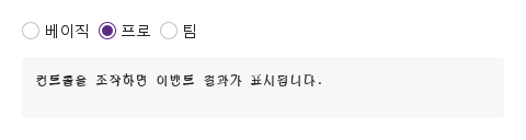
06 changed · selected

그룹은 로딩 뒤 value가 바뀔 때마다 — 선택지의 클릭이나 Space, 화살표 키, select(value), reset(), 코드의 대입 — changed(detail)를 발생시킵니다.

Qt 실행 화면 · 이미지
changed · selected · 기본
기본 실행 화면
QML 코드
import QtQuick
import Syidax.Core

Item {
    component EventLog: Rectangle {
        id: logBox
        property var lines: []
        implicitWidth: 440
        implicitHeight: Math.max(56, logText.implicitHeight + 24)
        radius: 4; color: Theme.semantic.backgroundBold
        function log(value) { lines = lines.slice(-3).concat([String(value)]) }
        Text {
            id: logText; x: 12; y: 12; width: parent.width - 24
            text: logBox.lines.length ? logBox.lines.join("\n") : "컨트롤을 조작하면 이벤트 결과가 표시됩니다."
            wrapMode: Text.Wrap; color: Theme.semantic.textDefault
            font.family: Theme.monoFontFamily; font.pixelSize: 12
        }
    }

    implicitWidth: Math.max(360, childrenRect.width)
    implicitHeight: childrenRect.height
    // Focused Gallery routes: keep only the selected API and its prerequisites.
    id: featureStory


    Column {
        spacing: 12
        SyRadioGroup {
            defaultValue: "pro"
            onChanged: (detail) => { if (true) { output.log(("changed: %1").arg(detail.value)) } }
            SyRadio { value: "basic"; text: "베이직" }
            SyRadio { value: "pro"; text: "프로" }
            SyRadio { value: "team"; text: "팀"; onSelected: (value) => { if (true) { output.log(("selected: %1").arg(value)) } } }
        }
        EventLog { id: output }
    }
}

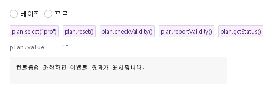
07 select · reset · checkValidity · …

그룹의 함수들입니다.

Qt 실행 화면 · 이미지
select · reset · checkValidity · … · 기본
QML 코드
import QtQuick
import Syidax.Core

Item {
    component EventLog: Rectangle {
        id: logBox
        property var lines: []
        implicitWidth: 440
        implicitHeight: Math.max(56, logText.implicitHeight + 24)
        radius: 4; color: Theme.semantic.backgroundBold
        function log(value) { lines = lines.slice(-3).concat([String(value)]) }
        Text {
            id: logText; x: 12; y: 12; width: parent.width - 24
            text: logBox.lines.length ? logBox.lines.join("\n") : "컨트롤을 조작하면 이벤트 결과가 표시됩니다."
            wrapMode: Text.Wrap; color: Theme.semantic.textDefault
            font.family: Theme.monoFontFamily; font.pixelSize: 12
        }
    }

    implicitWidth: Math.max(360, childrenRect.width)
    implicitHeight: childrenRect.height
    // Focused Gallery routes: keep only the selected API and its prerequisites.
    id: featureStory

    Column {
        spacing: 12
        SyRadioGroup {
            id: plan
            required: true
            SyRadio { value: "basic"; text: "베이직" }
            SyRadio { value: "pro"; text: "프로" }
        }
        Flow {
            width: 560
            spacing: 8
            SyButton { id: exampleControl1;  visible: true; text: "plan.select(\"pro\")"; variant: "secondary"; size: "small"; onClicked: plan.select("pro") }
            SyButton { id: exampleControl2;  visible: true; text: "plan.reset()"; variant: "secondary"; size: "small"; onClicked: plan.reset() }
            SyButton { id: exampleControl3;  visible: true; text: "plan.checkValidity()"; variant: "secondary"; size: "small"; onClicked: output.log("checkValidity() → " + plan.checkValidity()) }
            SyButton { visible: true; text: "plan.reportValidity()"; variant: "secondary"; size: "small"; onClicked: output.log("reportValidity() → " + plan.reportValidity()) }
            SyButton { visible: true; text: "plan.getStatus()"; variant: "secondary"; size: "small"; onClicked: output.log("getStatus() → " + JSON.stringify(plan.getStatus())) }
        }
        Text {
            text: "plan.value === " + JSON.stringify(plan.value)
            font.family: Theme.monoFontFamily
            font.pixelSize: 12
            color: Theme.semantic.textSubtle
        }
        EventLog { id: output }
    }
}

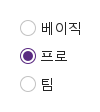
08 요금제 세로 선택

position · defaultValue 설정을 적용한 요금제 세로 선택 예제입니다.

Qt 실행 화면 · 이미지
요금제 세로 선택 · 실행 결과
기본 실행 화면
QML 코드
import QtQuick
import Syidax.Core

Item {
    implicitWidth: Math.max(360, childrenRect.width)
    implicitHeight: childrenRect.height

    property QtObject settings: QtObject {
        id: storyArgs
        property string defaultValue: "pro"
        property string position: "vertical"
        property string size: "medium"
        property bool disabled: false
        property bool readonly: false
        property bool required: false
    }


    SyRadioGroup {
        defaultValue: storyArgs.defaultValue
        position: storyArgs.position
        size: storyArgs.size
        disabled: storyArgs.disabled
        readonly: storyArgs.readonly
        required: storyArgs.required
        SyRadio { value: "basic"; text: "베이직" }
        SyRadio { value: "pro"; text: "프로" }
        SyRadio { value: "team"; text: "팀" }
    }

}

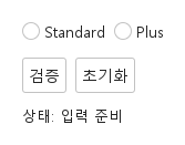
09 필수 입력과 초기화

검증 전·오류 표시·초기화 결과를 비교합니다.

Qt 실행 화면 · 이미지
필수 입력과 초기화 · 입력 전
QML 코드
import QtQuick
import Syidax.Core

Column {
    width: 440; spacing: 12
    SyRadioGroup {
        id: field; width: parent.width; name: "selection"; required: true
        SyRadio { text: "Standard"; value: "standard" }
SyRadio { text: "Plus"; value: "plus" }
        
        error: "계속하려면 이 항목을 입력하세요."
    }
    Row {
        spacing: 8
        SyButton { id: check; text: "검증"; onClicked: field.reportValidity() }
        SyButton { id: reset; text: "초기화"; onClicked: field.reset() }
    }
    Text { text: "상태: " + (field.invalid ? "오류" : "입력 준비"); color: Theme.semantic.textDefault }
}

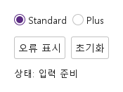
10 사용자 지정 오류

업무 규칙에 맞는 오류를 표시하고 초기화합니다.

Qt 실행 화면 · 이미지
사용자 지정 오류 · 입력 전
QML 코드
import QtQuick
import Syidax.Core

Column {
    width: 440; spacing: 12
    SyRadioGroup {
        id: field; width: parent.width; name: "selection"; required: true
        SyRadio { text: "Standard"; value: "standard" }
SyRadio { text: "Plus"; value: "plus" }
        defaultValue: "standard"
        error: "현재 사용할 수 없는 선택입니다. 다른 값을 선택하세요."
    }
    Row {
        spacing: 8
        SyButton { id: check; text: "오류 표시"; onClicked: field.setCustomError() }
        SyButton { id: reset; text: "초기화"; onClicked: field.reset() }
    }
    Text { text: "상태: " + (field.invalid ? "오류" : "입력 준비"); color: Theme.semantic.textDefault }
}

API 107

항목을 가리키거나 선택하면 QML 예제와 복사 버튼이 나타납니다.

속성 · SyRadioGroup

항목동작 / 조건
공통 필드 속성(name, label, required, disabled, message, error, touched, submitted, customError, validStatus, valid, invalid, showTitle, ready)은 Form 페이지에 설명되어 있습니다.

속성 · SyRadioGroup

속성타입기본값설명
stringdefaultValue선택된 선택지의 value.
string""초기 선택이자 reset()이 돌아가는 값.
string"horizontal"horizontal(행, 8 px 간격) · vertical(열, 4 px 간격). 세그먼트는 어느 쪽이든 간격 없이 맞붙음.
string"outlined"체크된 SyRadioButton 세그먼트의 모양: outlined(secondary) · solid(primary). 세그먼트의 appearance로 밀어 넣어지며 원은 무시.
string"medium"모든 선택지에 밀어 넣어짐: 원 14 · 16 · 18 px에 글자 12 · 14 · 16 px, 세그먼트 24 · 32 · 40 px.
boolfalse선택 없음 → valueMissing. label에 * 표시를 더함.
boolfalse모든 선택지가 반응 없고 회색. 항상 유효. 제출되지 않음.
boolfalse선택은 보이지만 바꿀 수 없음. 선택지에 포커스 가능. 항상 유효. 제출됨.
string""폼 키
string""그룹 위 제목
string""도움말 줄
string""사용자 정의 오류 문구.
list(읽기 전용)—안에 선언한 선택지들, 순서대로.
bool(읽기 전용)—첫 선택지가 SyRadioButton이면 true.
real(읽기 전용)—적용 중인 간격: 세그먼트 0, 세로 4, 가로 8.
Item…—기본 속성. 선택지들. 직접 자식만.

속성 · SyRadio

속성타입기본값설명
string""이 선택지가 선택될 때 그룹의 value가 되는 값.
string""원 옆 라벨. 클릭해도 선택됨.
Item…—기본 속성. 안에 선언한 아이템은 라벨 텍스트 뒤에 놓임.
boolfalse이것이 선택된 선택지인지. 그룹이 씀. 그룹 밖에서는 클릭이 설정.
boolfalse이 선택지만: 회색, 반응 없음, Tab과 화살표 키가 건너뜀.
boolfalse이 선택지만: 보이지만 클릭과 Space가 아무 일도 하지 않고, 형제에서의 화살표 키 이동도 건너뜀.
string"medium"그룹의 size가 덮어씀.
boolfalse그룹이 씀. 선택지 자신의 플래그와 합쳐져 effectiveDisabled / effectiveReadonly가 됨.
읽기 전용—합쳐진 상태, 포커스, 호버, 현재 색조.
real(읽기 전용)—크기별 14 · 16 · 18과 12 · 14 · 16.

속성 · SyRadioButton

항목동작 / 조건
SyButton입니다 — 모든 버튼 속성(text, icon.source, iconOnly, tooltip, loading, fullWidth, size)을 쓸 수 있습니다 — 거기에 더해:

속성 · SyRadioButton

속성타입기본값설명
string""이 세그먼트가 선택될 때 그룹의 value가 되는 값.
boolfalse이것이 선택된 세그먼트인지(버튼의 checked, 그룹이 씀).
string"outlined"체크됐을 때의 모양: outlined → secondary, solid → primary. 그룹이 variant에서 씀.
string바인딩상태에 바인딩(default · secondary · primary). 직접 지정하지 마십시오.
boolfalse이 세그먼트만. readonly는 그룹에 있음(세그먼트별 readonly는 없음).
boolfalse그룹이 씀.
boolfalse그룹이 씀.
——맞붙는 모서리를 위해 그룹이 씀(SyButton 참고).
bool(읽기 전용)—자기 disabled 또는 그룹의 것.

메서드 · SyRadioGroup

메서드설명
코드에서 선택: 그룹을 touched로 표시하고 value를 설정(changed 발생). disabled·readonly 동안 무시. 모르는 값은 모든 선택지를 해제.
value를 defaultValue로. touched·보고·custom 플래그를 지움.
체크된 선택지(없으면 첫 선택지)에 포커스.
모든 선택지에서 포커스 제거.
필수인데 선택이 없는 경우(또는 사용자 정의 오류)가 아니면 true. 조용히.
같은 결과, 그리고 이제부터 오류 줄이 보임.
"" · valueMissing · custom.
custom 상태 강제 / 해제. 오류가 즉시 보임.

메서드 · SyRadio · SyRadioButton

메서드설명
클릭: selected(value)를 발생시키고, 그룹 밖에서는 선택지를 체크. disabled·readonly 동안 무시.
선택지가 선언된 SyRadioGroup 또는 null.
그룹의 선택을 이전(−1) 또는 다음(+1) 활성 선택지로 옮김 — 화살표 키가 호출하는 것.

시그널

시그널인자발생 시점
detail: { value: string, isValid: bool, status: string }로딩 뒤 그룹의 value가 바뀜 — 클릭, Space, 화살표 키, select(), reset(), 대입. 초기 defaultValue와 체크된 선택지를 다시 클릭할 때는 발생하지 않음.
value: string — 선택지 자신의 값선택지가 클릭되거나 Space로 골라짐. 그룹이 갱신하기 전이며, 이미 체크된 경우에도 발생. 선택지나 그룹이 disabled·readonly인 동안에는 발생하지 않음.

시그널

항목동작 / 조건
SyRadioGroup은 필드로서 focused / blured를 선언하지만 결코 발생시키지 않습니다.
SyRadioButton은 버튼의 clicked()도 발생시킵니다.

동작

항목동작 / 조건
그룹은 자기 직접 자식인 SyRadio와 SyRadioButton 아이템을 모읍니다(Column이나 Row로 감싼 선택지는 찾지 못함). 그리고 직접 배치합니다. 선언 순서대로, 각자의 암시적 크기로, 8 px 간격의 행(horizontal) 또는 4 px 간격의 열(vertical)로. 세그먼트는 간격 없이 1픽셀 겹쳐 맞붙습니다. 숨긴 선택지는 건너뜁니다. 첫 선택지가 SyRadioButton이면 그룹은 버튼 그룹입니다 — 두 종류를 섞지 마십시오. 나중에 추가·제거된 선택지도 자동으로 반영됩니다.
이 선택지가 선택될 때 그룹의 value가 되는 값.
초기 선택이자 reset()이 돌아가는 값.
선택지가 클릭되거나 Space로 골라짐. 그룹이 갱신하기 전이며, 이미 체크된 경우에도 발생. 선택지나 그룹이 disabled·readonly인 동안에는 발생하지 않음.
선택된 선택지의 value. 선택이 없으면 "". 대입 가능하며 바뀔 때마다 changed 발생.
코드에서 선택: 그룹을 touched로 표시하고 value를 설정(changed 발생). disabled·readonly 동안 무시. 모르는 값은 모든 선택지를 해제.
로딩 뒤 그룹의 value가 바뀜 — 클릭, Space, 화살표 키, select(), reset(), 대입. 초기 defaultValue와 체크된 선택지를 다시 클릭할 때는 발생하지 않음.
이것이 선택된 선택지인지. 그룹이 씀. 그룹 밖에서는 클릭이 설정.
변화가 있을 때마다 그룹은 각 선택지에 checked, groupDisabled와 groupReadonly(자기 disabled / readonly에서), size, 그리고 — 세그먼트에만 — appearance(variant에서)를 써넣습니다.
이 선택지만: 회색, 반응 없음, Tab과 화살표 키가 건너뜀.
이 선택지만: 보이지만 클릭과 Space가 아무 일도 하지 않고, 형제에서의 화살표 키 이동도 건너뜀.
원과 글자 크기. 그룹의 size가 덮어씀.
체크됐을 때의 모양: outlined → secondary, solid → primary. 그룹이 variant에서 씀.
상태에 바인딩(default · secondary · primary). 직접 지정하지 마십시오.
변화가 있을 때마다 그룹은 각 선택지에 checked, groupDisabled와 groupReadonly(자기 disabled / readonly에서), size, 그리고 — 세그먼트에만 — appearance(variant에서)를 써넣습니다. 선택지 하나에 지정한 size는 덮어써집니다.
이 세그먼트만. readonly는 그룹에 있음(세그먼트별 readonly는 없음).
활성 선택지마다 Tab 정지점입니다. Space가 포커스된 선택지를 고릅니다(세그먼트에서는 Space가 버튼의 클릭). Left / Up은 이전 활성 선택지로, Right / Down은 다음으로 선택을 옮기고 끝에서 순환합니다. 화살표 키는 비활성 선택지와 읽기 전용 선택지를 건너뛰며, 이동은 새 선택지를 즉시 선택하고 포커스합니다. Enter는 아무 일도 하지 않습니다. 포커스 링은 포커스된 원이나 세그먼트 둘레에 disabled가 아닌 동안 그려집니다.
선택 없음 → valueMissing. label에 * 표시를 더함.
그룹 아래 오류 줄("This field is required" 또는 error)은 그룹이 touched(첫 클릭)되거나 보고된(reportValidity()) 뒤 나타나고, 그동안 message는 숨겨집니다.

같은 결과, 그리고 이제부터 오류 줄이 보임.
그룹 아래 오류 줄("This field is required" 또는 error)은 그룹이 touched(첫 클릭)되거나 보고된(reportValidity()) 뒤 나타나고, 그동안 message는 숨겨집니다.
label은 그룹 위에 필수 표시와 함께 제목을 그립니다.
색조는 disabled > readonly > focus > hover > enabled, Theme.radio에서.
그룹 밖의 SyRadio나 SyRadioButton은 클릭하면 스스로 체크되고 그대로 남습니다 — 클릭으로 해제할 방법이 없고 화살표 키도 동작하지 않습니다. 진짜 배타적 선택에는 그룹을 쓰십시오.
width를 정하지 않으면 그룹은 선택지의 행 또는 열만큼 넓고(오류·도움말 줄은 그 너비 안에서 줄 바꿈), SyRadio 행은 최소 24 px 높이, 세그먼트는 크기별 24 · 32 · 40 px입니다.