QML
← 전체 컴포넌트

Progress Bar

가로 막대로 다운로드나 처리 작업의 완료 비율을 표시합니다.

import Syidax.Core.ProgressBar

지원 QML 타입

타입정의 / 역할
선택적으로 수치를 표시하는 막대형 진행률 표시기입니다.

예제로 보기

미리보기는 Qt 실행 화면의 이미지입니다. 아래 버튼으로 결과를 전환하세요.

01 기본 구성

SyProgressBar는 왼쪽부터 percent(0 … 100)만큼 채워지는 가로 트랙이며 그 위에 퍼센트가 쓰입니다.

Qt 실행 화면 · 이미지
기본 구성 · 기본
기본 실행 화면
QML 코드
import QtQuick
import Syidax.Core

Item {
    implicitWidth: Math.max(360, childrenRect.width)
    implicitHeight: childrenRect.height
    id: story

    property QtObject settings: QtObject {
        id: storyArgs
        property real percent: 40
        property string status: "default"
        property string valuePosition: "center"
        property bool hidePercent: false
        property bool indeterminate: false
    }


    SyProgressBar {
        width: 320
        percent: storyArgs.percent
        status: storyArgs.status
        valuePosition: storyArgs.valuePosition
        hidePercent: storyArgs.hidePercent
        indeterminate: storyArgs.indeterminate
    }

}

02 status

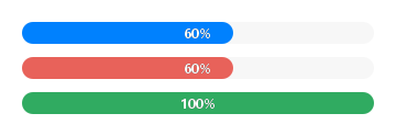
status는 테마의 진행 토큰에서 채움 색을 고릅니다: "default"(진행 중), "error", "complete".

Qt 실행 화면 · 이미지
status · 기본
기본 실행 화면
QML 코드
import QtQuick
import Syidax.Core

pragma ComponentBehavior: Bound

Item {
    implicitWidth: Math.max(360, childrenRect.width)
    implicitHeight: childrenRect.height
    id: story
    readonly property var statuses: ["default", "error", "complete"]

    Column {
        spacing: 12
        Repeater {
            model: story.statuses
            delegate: SyProgressBar {
                required property string modelData
                width: 320
                percent: modelData === "complete" ? 100 : 60
                status: modelData
            }
        }
    }
}

03 valuePosition

valuePosition은 퍼센트 라벨의 위치를 정합니다.

Qt 실행 화면 · 이미지
valuePosition · 기본
QML 코드
import QtQuick
import Syidax.Core

Item {
    implicitWidth: Math.max(360, childrenRect.width)
    implicitHeight: childrenRect.height
    property QtObject settings: QtObject {
        id: storyArgs
        property string valuePosition: "progress-right"
        property real percent: 55
    }


    SyProgressBar { width: 320; percent: storyArgs.percent; valuePosition: storyArgs.valuePosition }
}

04 indeterminate

indeterminate: true는 길이를 모르는 작업용입니다: 퍼센트 라벨이 사라지고 트랙 너비의 절반인 막대가 1.5초마다 왼쪽 끝 바깥에서 오른쪽 끝 바깥으로 현재 status 색으로 흘러갑니다.

Qt 실행 화면 · 이미지
indeterminate · 기본
QML 코드
import QtQuick
import Syidax.Core

Item {
    implicitWidth: Math.max(360, childrenRect.width)
    implicitHeight: childrenRect.height
    property QtObject settings: QtObject {
        id: storyArgs
        property bool indeterminate: true
    }


    SyProgressBar { width: 320; percent: 30; indeterminate: storyArgs.indeterminate }
}

05 segment

segment는 채움을 색 구간으로 나눕니다.

Qt 실행 화면 · 이미지
segment · 기본
기본 실행 화면
QML 코드
import QtQuick
import Syidax.Core

Item {
    implicitWidth: Math.max(360, childrenRect.width)
    implicitHeight: childrenRect.height
    property QtObject settings: QtObject {
        id: storyArgs
        property real percent: 80
    }


    SyProgressBar {
        width: 320; percent: storyArgs.percent
        segment: [{ percent: 30, status: "error" }, { percent: 60, status: "complete" }]
    }
}

06 changed · getValue

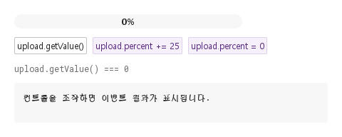
changed(percent)는 클램프된 값이 바뀔 때마다 — 변화마다 한 번, 클램프된 수로 — 발생합니다: percent를 150으로 두면 100을 보고하고, 다시 150으로 두면 value가 움직이지 않았으므로 아무것도 보고하지 않습니다.

Qt 실행 화면 · 이미지
changed · getValue · 기본
QML 코드
import QtQuick
import Syidax.Core

Item {
    component EventLog: Rectangle {
        id: logBox
        property var lines: []
        implicitWidth: 440
        implicitHeight: Math.max(56, logText.implicitHeight + 24)
        radius: 4; color: Theme.semantic.backgroundBold
        function log(value) { lines = lines.slice(-3).concat([String(value)]) }
        Text {
            id: logText; x: 12; y: 12; width: parent.width - 24
            text: logBox.lines.length ? logBox.lines.join("\n") : "컨트롤을 조작하면 이벤트 결과가 표시됩니다."
            wrapMode: Text.Wrap; color: Theme.semantic.textDefault
            font.family: Theme.monoFontFamily; font.pixelSize: 12
        }
    }

    implicitWidth: Math.max(360, childrenRect.width)
    implicitHeight: childrenRect.height
    // Focused Gallery routes: keep only the selected API and its prerequisites.
    id: featureStory

    Column {
        spacing: 12
        SyProgressBar {
            id: upload
            width: 320
            onChanged: (percent) => { if (true) { output.log(("changed: %1%").arg(percent)) } }
        }
        Row {
            spacing: 8
            SyButton { id: exampleControl1;  visible: true; text: "upload.getValue()"; size: "small"; onClicked: output.log("getValue() → " + upload.getValue()) }
            SyButton { id: exampleControl2;  text: "upload.percent += 25"; variant: "secondary"; size: "small"; onClicked: upload.percent += 25 }
            SyButton { id: exampleControl3;  text: "upload.percent = 0"; variant: "secondary"; size: "small"; onClicked: upload.percent = 0 }
        }
        Text {
            text: "upload.getValue() === " + upload.getValue()
            font.family: Theme.monoFontFamily
            font.pixelSize: 12
            color: Theme.semantic.textSubtle
        }
        EventLog { id: output }
    }
}

API 36

항목을 가리키거나 선택하면 QML 예제와 복사 버튼이 나타납니다.

속성

속성타입기본값설명
real0진행률. 0 … 100으로 클램프되어 value가 됩니다.
boolfalse채움 대신 흐르는 반 너비 막대. 라벨을 숨깁니다.
string"default""default" · "error" · "complete" — 채움 색.
string"center"트랙 위 "left" · "center" · "right" · 채움 안 "progress-left" · "progress-center" · "progress-right"(채움이 50 px 이하이면 progress-left).
boolfalse퍼센트 라벨을 그리지 않습니다.
var (list 또는 string)[]누적 지점 [{ percent, status }, …] 또는 같은 내용의 JSON 문자열. 100까지 남은 부분은 기본 구간.
string""접근성 이름(비어 있으면 "Progress"). 시각적 툴팁은 없습니다.
real (읽기 전용)—클램프된 퍼센트.
string (읽기 전용)—그려지는 글자: "40%", hidePercent이면 "".
real (읽기 전용)—채움의 너비(px; indeterminate이면 트랙의 절반).
string—50 px 폴백을 적용한 라벨 위치와, 그것이 트랙 위치 중 하나인지.
bool (읽기 전용)—50 px 폴백을 적용한 라벨 위치와, 그것이 트랙 위치 중 하나인지.
color (읽기 전용)—status의 채움 색.
var (읽기 전용)—파싱된 구간 { percent, status }와 value에서 잘린 구간 { fraction, status }.

메서드

메서드설명
클램프된 퍼센트(real, 0 … 100)를 반환합니다 — value와 같습니다. 인자 없음, 어느 상태에서나 동작합니다.
상태 이름("default" · "error" · "complete")의 채움 색을 반환합니다. 구간 그리기에 쓰입니다.
라벨 너비를 받아 현재 위치의 x를 반환합니다. 거의 쓸 일 없는 내부 도우미입니다.

시그널

시그널인자발생 시점
percent: real — 클램프된 값, 0 … 100value가 바뀔 때마다. percent가 움직여도 클램프된 값이 그대로면 발생하지 않고, status · indeterminate · segment에도 발생하지 않습니다.

동작

항목동작 / 조건
클램프된 퍼센트.
진행률. 0 … 100으로 클램프되어 value가 됩니다.
채움 너비는 width × value / 100이고 라벨은 Math.round(value) + "%"입니다.
value가 바뀔 때마다. percent가 움직여도 클램프된 값이 그대로면 발생하지 않고, status · indeterminate · segment에도 발생하지 않습니다.
퍼센트 라벨을 그리지 않습니다.
채움 대신 흐르는 반 너비 막대. 라벨을 숨깁니다.
트랙 위 "left" · "center" · "right" · 채움 안 "progress-left" · "progress-center" · "progress-right"(채움이 50 px 이하이면 progress-left).
채움이 50 px 이하인 동안 모든 progress-* 위치는 progress-left가 되며, effectivePosition(읽기 전용)이 실제로 쓰이는 위치를 알려 줍니다.
"default" · "error" · "complete" — 채움 색.
누적 지점 [{ percent, status }, …] 또는 같은 내용의 JSON 문자열. 100까지 남은 부분은 기본 구간.
암시적 240 × 20 px. 막대는 준 너비를 채우고 높이는 항상 20 px이며 양 끝이 완전히 둥급니다. 트랙이 채움을 잘라 냅니다.
접근성 이름(비어 있으면 "Progress"). 시각적 툴팁은 없습니다.

키보드

항목동작 / 조건
진행률. 0 … 100으로 클램프되어 value가 됩니다.
"default" · "error" · "complete" — 채움 색.
누적 지점 [{ percent, status }, …] 또는 같은 내용의 JSON 문자열. 100까지 남은 부분은 기본 구간.
value가 바뀔 때마다. percent가 움직여도 클램프된 값이 그대로면 발생하지 않고, status · indeterminate · segment에도 발생하지 않습니다.
클램프된 퍼센트(real, 0 … 100)를 반환합니다 — value와 같습니다. 인자 없음, 어느 상태에서나 동작합니다.