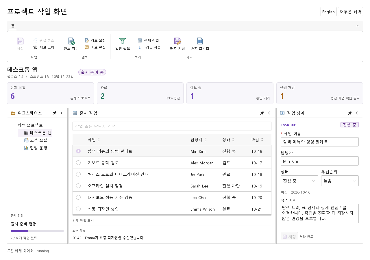
Global Header
앱 이름과 로고, 내비게이션, 검색과 공통 동작을 모아 놓는 상단 헤더입니다.
import Syidax.Core.GlobalHeader
미리보기는 Qt 실행 화면의 이미지입니다. 아래 버튼으로 결과를 전환하세요.
01 기본 구성
기본 구성의 설정과 실행 결과를 비교합니다.
Qt 실행 화면 · 이미지기본 실행 화면
QML 코드
import QtQuick
import Syidax.Core

Item {
    component EventLog: Rectangle {
        id: logBox
        property var lines: []
        implicitWidth: 440
        implicitHeight: Math.max(56, logText.implicitHeight + 24)
        radius: 4; color: Theme.semantic.backgroundBold
        function log(value) { lines = lines.slice(-3).concat([String(value)]) }
        Text {
            id: logText; x: 12; y: 12; width: parent.width - 24
            text: logBox.lines.length ? logBox.lines.join("\n") : "컨트롤을 조작하면 이벤트 결과가 표시됩니다."
            wrapMode: Text.Wrap; color: Theme.semantic.textDefault
            font.family: Theme.monoFontFamily; font.pixelSize: 12
        }
    }

    implicitWidth: Math.max(360, childrenRect.width)
    implicitHeight: childrenRect.height

    property QtObject settings: QtObject {
        id: storyArgs
        property string title: "콘솔"
        property bool search: true
        property bool information: true
        property bool notification: true
    }


    Column {
        spacing: 12
        SyGlobalHeader {
            width: 760
            title: storyArgs.title
            search: storyArgs.search
            information: storyArgs.information
            notification: storyArgs.notification
            onSelected: (detail) => output.log(detail.tabkey)
            tabs: [
                SyTab { tabkey: "home"; text: "홈" },
                SyTab { tabkey: "data"; text: "데이터" },
                SyTab { tabkey: "reports"; text: "보고서" }
            ]
        }
        EventLog { id: output }
    }

}
02 logo · tabs · actions
세 list 속성이 아이템을 받습니다.
Qt 실행 화면 · 이미지기본 실행 화면
QML 코드
import QtQuick
import Syidax.Core

Item {
    implicitWidth: Math.max(360, childrenRect.width)
    implicitHeight: childrenRect.height
    // Focused Gallery routes: keep only the selected API and its prerequisites.
    id: featureStory

    property QtObject settings: QtObject {
        id: storyArgs
        property int width: 560
    }


    SyGlobalHeader { id: featureTarget0;
        width: storyArgs.width
        title: "콘솔"
        logo: Rectangle { width: 28; height: 28; radius: 6; color: Theme.semantic.backgroundBrandBold; Text { anchors.centerIn: parent; text: "SY"; font.family: Theme.fontFamily; font.pixelSize: 12; font.weight: Font.Bold; color: "white" } }
        tabs: [
            SyTab { tabkey: "home"; text: "홈" },
            SyTab { tabkey: "data"; text: "데이터" },
            SyTab { tabkey: "reports"; text: "보고서" },
            SyTab { tabkey: "settings"; text: "설정" },
            SyTab { tabkey: "admin"; text: "관리" }
        ]
        actions: SyButton { text: "로그인"; size: "small" }
    }
}
03 selected · actionClick · changed
SyGlobalHeader에는 시그널이 셋 있습니다:
Qt 실행 화면 · 이미지기본 실행 화면
QML 코드
import QtQuick
import Syidax.Core

Item {
    component EventLog: Rectangle {
        id: logBox
        property var lines: []
        implicitWidth: 440
        implicitHeight: Math.max(56, logText.implicitHeight + 24)
        radius: 4; color: Theme.semantic.backgroundBold
        function log(value) { lines = lines.slice(-3).concat([String(value)]) }
        Text {
            id: logText; x: 12; y: 12; width: parent.width - 24
            text: logBox.lines.length ? logBox.lines.join("\n") : "컨트롤을 조작하면 이벤트 결과가 표시됩니다."
            wrapMode: Text.Wrap; color: Theme.semantic.textDefault
            font.family: Theme.monoFontFamily; font.pixelSize: 12
        }
    }

    implicitWidth: Math.max(360, childrenRect.width)
    implicitHeight: childrenRect.height
    // Focused Gallery routes: keep only the selected API and its prerequisites.
    id: featureStory


    Column {
        spacing: 12
        SyGlobalHeader {
            width: 760
            title: "콘솔"
            search: true; information: true; notification: true
            onSelected: (detail) => { if (true) { output.log(("selected: %1").arg(detail.tabkey)) } }
            onActionClick: (detail) => { if (true) { output.log(("actionClick: %1").arg(detail.type)) } }
            onChanged: (detail) => { if (true) { output.log(("changed: %1").arg(detail.value)) } }
            tabs: [
                SyTab { tabkey: "home"; text: "홈" },
                SyTab { tabkey: "data"; text: "데이터" }
            ]
        }
        EventLog { id: output }
    }
}
04 setActiveTab · updateOverflowTabs
setActiveTab(index)는 그 인덱스의 탭을 활성 탭으로 만들고 selected({ tabkey, index })를 발생시킵니다.
Qt 실행 화면 · 이미지QML 코드
import QtQuick
import Syidax.Core

Item {
    implicitWidth: Math.max(360, childrenRect.width)
    implicitHeight: childrenRect.height
    // Focused Gallery routes: keep only the selected API and its prerequisites.
    id: featureStory

    Column {
        spacing: 24
        SyGlobalHeader { id: bar; width: 760; title: "콘솔"; tabs: [ SyTab { tabkey: "home"; text: "홈" }, SyTab { tabkey: "data"; text: "데이터" }, SyTab { tabkey: "reports"; text: "보고서" } ] }
        Row {
            spacing: 8
            SyButton { id: exampleControl1;  visible: true; text: "bar.setActiveTab(1)"; variant: "secondary"; size: "small"; onClicked: bar.setActiveTab(1) }
            SyButton { id: exampleControl2;  visible: true; text: "bar.updateOverflowTabs()"; variant: "secondary"; size: "small"; onClicked: bar.updateOverflowTabs() }
        }
        Text {
            text: "bar.active === " + bar.active + "   bar.overflowTabs.length === " + bar.overflowTabs.length
            font.family: Theme.monoFontFamily
            font.pixelSize: 12
            color: Theme.semantic.textSubtle
        }
    }
}
05 검색 헤더
search 설정을 적용한 검색 헤더 예제입니다.
Qt 실행 화면 · 이미지기본 실행 화면
QML 코드
import QtQuick
import Syidax.Core

Item {
    component EventLog: Rectangle {
        id: logBox
        property var lines: []
        implicitWidth: 440
        implicitHeight: Math.max(56, logText.implicitHeight + 24)
        radius: 4; color: Theme.semantic.backgroundBold
        function log(value) { lines = lines.slice(-3).concat([String(value)]) }
        Text {
            id: logText; x: 12; y: 12; width: parent.width - 24
            text: logBox.lines.length ? logBox.lines.join("\n") : "컨트롤을 조작하면 이벤트 결과가 표시됩니다."
            wrapMode: Text.Wrap; color: Theme.semantic.textDefault
            font.family: Theme.monoFontFamily; font.pixelSize: 12
        }
    }

    implicitWidth: Math.max(360, childrenRect.width)
    implicitHeight: childrenRect.height

    property QtObject settings: QtObject {
        id: storyArgs
        property string title: "콘솔"
        property bool search: true
        property bool information: true
        property bool notification: true
    }


    Column {
        spacing: 12
        SyGlobalHeader {
            width: 760
            title: storyArgs.title
            search: storyArgs.search
            information: storyArgs.information
            notification: storyArgs.notification
            onSelected: (detail) => output.log(detail.tabkey)
            tabs: [
                SyTab { tabkey: "home"; text: "홈" },
                SyTab { tabkey: "data"; text: "데이터" },
                SyTab { tabkey: "reports"; text: "보고서" }
            ]
        }
        EventLog { id: output }
    }

}
06 정보·알림 헤더
information · notification 설정을 적용한 정보·알림 헤더 예제입니다.
Qt 실행 화면 · 이미지기본 실행 화면
QML 코드
import QtQuick
import Syidax.Core

Item {
    component EventLog: Rectangle {
        id: logBox
        property var lines: []
        implicitWidth: 440
        implicitHeight: Math.max(56, logText.implicitHeight + 24)
        radius: 4; color: Theme.semantic.backgroundBold
        function log(value) { lines = lines.slice(-3).concat([String(value)]) }
        Text {
            id: logText; x: 12; y: 12; width: parent.width - 24
            text: logBox.lines.length ? logBox.lines.join("\n") : "컨트롤을 조작하면 이벤트 결과가 표시됩니다."
            wrapMode: Text.Wrap; color: Theme.semantic.textDefault
            font.family: Theme.monoFontFamily; font.pixelSize: 12
        }
    }

    implicitWidth: Math.max(360, childrenRect.width)
    implicitHeight: childrenRect.height

    property QtObject settings: QtObject {
        id: storyArgs
        property string title: "콘솔"
        property bool search: true
        property bool information: true
        property bool notification: true
    }


    Column {
        spacing: 12
        SyGlobalHeader {
            width: 760
            title: storyArgs.title
            search: storyArgs.search
            information: storyArgs.information
            notification: storyArgs.notification
            onSelected: (detail) => output.log(detail.tabkey)
            tabs: [
                SyTab { tabkey: "home"; text: "홈" },
                SyTab { tabkey: "data"; text: "데이터" },
                SyTab { tabkey: "reports"; text: "보고서" }
            ]
        }
        EventLog { id: output }
    }

}
API 35
항목을 가리키거나 선택하면 QML 예제와 복사 버튼이 나타납니다.