QML
← 전체 컴포넌트

Tooltip

컨트롤에 마우스를 올리거나 포커스를 맞췄을 때 짧은 도움말을 표시합니다.

import Syidax.Core.Tooltip

지원 QML 타입

타입정의 / 역할
대상에 포인터를 올리거나 포커스할 때 표시하는 짧은 도움말입니다.

예제로 보기

미리보기는 Qt 실행 화면의 이미지입니다. 아래 버튼으로 결과를 전환하세요.

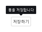
01 기본 구성

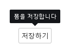
SyTooltip은 선언된 아이템 옆에 떠오르는 작은 어두운 라벨입니다 — 버튼, 아이콘, 필드 안에 선언하면 그 아이템이 앵커가 됩니다.

Qt 실행 화면 · 이미지
기본 구성 · 열린 화면
QML 코드
import QtQuick
import Syidax.Core

Item {
    implicitWidth: Math.max(360, childrenRect.width)
    implicitHeight: childrenRect.height

    property QtObject settings: QtObject {
        id: storyArgs
        property string content: "폼을 저장합니다"
        property string position: "top"
        property string trigger: "hover"
        property bool hideArrow: false
        property int opendelay: 0
        property int closedelay: 0
        property int maxWidth: 320
        property string animation: "none"
    }


    Item {
        width: 320
        height: 120
        SyButton {
            anchors.centerIn: parent
            text: "저장하기"
            SyTooltip { id: exampleControl1; 
                content: storyArgs.content
                position: storyArgs.position
                trigger: storyArgs.trigger
                hideArrow: storyArgs.hideArrow
                opendelay: storyArgs.opendelay
                closedelay: storyArgs.closedelay
                maxWidth: storyArgs.maxWidth
                animation: storyArgs.animation
            }
        }
    }

}

02 position

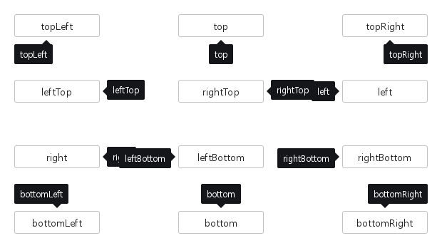
position은 쪽과 정렬을 이름으로 정합니다: "top"(기본), "bottom", "left", "right"는 툴팁을 앵커 가장자리의 가운데에 둡니다.

Qt 실행 화면 · 이미지
position · 기본
기본 실행 화면
QML 코드
import QtQuick
import Syidax.Core

pragma ComponentBehavior: Bound

Item {
    implicitWidth: Math.max(360, childrenRect.width)
    implicitHeight: childrenRect.height
    id: story
    readonly property var positions: ["topLeft", "top", "topRight", "leftTop", "rightTop", "left", "right", "leftBottom", "rightBottom", "bottomLeft", "bottom", "bottomRight"]

    Item {
        width: 600
        height: 340
        Grid {
            anchors.centerIn: parent
            columns: 3
            columnSpacing: 110
            rowSpacing: 60
            Repeater {
                model: story.positions
                delegate: SyButton {
                    id: cell
                    required property string modelData
                    text: cell.modelData
                    width: 120
                    SyTooltip { content: cell.modelData; position: cell.modelData; trigger: "none"; Component.onCompleted: Qt.callLater(setOpen) }
                }
            }
        }
    }
}

03 trigger

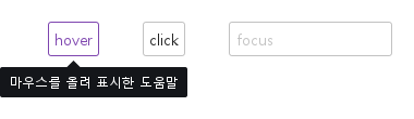
마우스 진입, 클릭, 입력란 포커스에 따른 결과 화면을 비교합니다.

Qt 실행 화면 · 이미지
trigger · 호버 결과
QML 코드
import QtQuick
import Syidax.Core

Item {
    width: 520; height: 180
    Row {
        x: 24; y: 28; spacing: 40
        SyButton {
            id: hoverTarget; text: "hover"
            SyTooltip { id: hoverPopup; position: "bottom"; content: "마우스를 올려 표시한 도움말" }
        }
        SyButton {
            id: clickTarget; text: "click"
            SyTooltip { id: clickPopup; trigger: "click"; position: "bottom"; content: "버튼을 클릭해 표시한 도움말" }
        }
        FocusScope {
            id: focusAnchor; width: 150; height: focusTarget.height
            SyInput {
                id: focusTarget; placeholder: "focus"; width: parent.width
                SyTooltip { id: focusPopup; anchor: focusAnchor; trigger: "focus"; position: "bottom"; content: "입력란에 포커스가 있는 동안 표시" }
            }
        }
    }
}

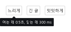
04 opendelay · closedelay · maxWidth · hideArrow · animation

타이밍과 모양.

Qt 실행 화면 · 이미지
opendelay · closedelay · maxWidth · hideArrow · animation · 열린 화면
QML 코드
import QtQuick
import Syidax.Core

Item {
    implicitWidth: Math.max(360, childrenRect.width)
    implicitHeight: childrenRect.height
    // Focused Gallery routes: keep only the selected API and its prerequisites.
    id: featureStory

    Row {
        spacing: 16
        SyButton { text: "느리게"; SyTooltip { id: featureTarget0; content: "여는 데 0.5초, 닫는 데 300 ms"; opendelay: 500; closedelay: 300 } }
        SyButton { text: "긴 글"; SyTooltip { id: featureTarget1; content: "이 영역의 내용을 가져오는 중입니다. 스피너가 가리기 전까지는 그대로 읽을 수 있습니다."; maxWidth: 220 } }
        SyButton { text: "밋밋하게"; SyTooltip { id: featureTarget2; content: "화살표 없이, 페이드로"; hideArrow: true; animation: "fade"; animationSpeed: "slow" } }
    }
}

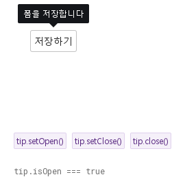
05 setOpen · setClose · close

setOpen()은 툴팁을 열고 setClose()는 닫습니다 — trigger와 상관없이 코드에서.

Qt 실행 화면 · 이미지
setOpen · setClose · close · 열린 화면
QML 코드
import QtQuick
import Syidax.Core

Item {
    implicitWidth: Math.max(360, childrenRect.width)
    implicitHeight: childrenRect.height
    // Focused Gallery routes: keep only the selected API and its prerequisites.
    id: featureStory

    Column {
        spacing: 24
        Item {
            width: 560; height: 150
            SyButton {
                x: 24; y: 24
 text: "저장하기"; SyTooltip { id: tip; content: "폼을 저장합니다"; trigger: "none" } }
        }
        Row {
            objectName: "exampleCommands"

            spacing: 8
            SyButton { id: exampleControl1;  visible: true; text: "tip.setOpen()"; variant: "secondary"; size: "small"; onClicked: tip.setOpen() }
            SyButton { id: exampleControl2;  visible: true; text: "tip.setClose()"; variant: "secondary"; size: "small"; onClicked: tip.setClose() }
            SyButton { id: exampleControl3;  visible: true; text: "tip.close()"; variant: "secondary"; size: "small"; onClicked: tip.close() }
        }
        Text {
            text: "tip.isOpen === " + tip.isOpen
            font.family: Theme.monoFontFamily
            font.pixelSize: 12
            color: Theme.semantic.textSubtle
        }
    }
}

06 클릭으로 설명 열기

trigger 설정을 적용한 클릭으로 설명 열기 예제입니다.

Qt 실행 화면 · 이미지
클릭으로 설명 열기 · 열린 화면
QML 코드
import QtQuick
import Syidax.Core

Item {
    implicitWidth: Math.max(360, childrenRect.width)
    implicitHeight: childrenRect.height

    property QtObject settings: QtObject {
        id: storyArgs
        property string content: "폼을 저장합니다"
        property string position: "top"
        property string trigger: "click"
        property bool hideArrow: false
        property int opendelay: 0
        property int closedelay: 0
        property int maxWidth: 320
        property string animation: "none"
    }


    Item {
        width: 320
        height: 120
        SyButton {
            anchors.centerIn: parent
            text: "저장하기"
            SyTooltip { id: exampleControl1; 
                content: storyArgs.content
                position: storyArgs.position
                trigger: storyArgs.trigger
                hideArrow: storyArgs.hideArrow
                opendelay: storyArgs.opendelay
                closedelay: storyArgs.closedelay
                maxWidth: storyArgs.maxWidth
                animation: storyArgs.animation
            }
        }
    }

}

API 62

항목을 가리키거나 선택하면 QML 예제와 복사 버튼이 나타납니다.

속성

속성타입기본값설명
string""글자. n은 줄을 바꿉니다.
string"top""top" · "topLeft" · "topRight" · "bottom" · "bottomLeft" · "bottomRight" · "left" · "leftTop" · "leftBottom" · "right" · "rightTop" · "rightBottom".
string"hover""hover" · "click" · "focus" · "none".
int0트리거 이벤트 뒤 열기 / 닫기까지의 밀리초.
int320텍스트의 최대 너비(px)이며 창 너비로도 제한됩니다. 긴 설명은 자동 줄바꿈하고, 0을 명시하면 줄바꿈하지 않습니다.
boolfalse화살표를 뺍니다(그러면 툴팁이 앵커에서 10 px 대신 4 px 떨어짐).
boolfalse스스로 닫히지 않음. setClose() / close()만.
string"none""none" · "fade"; 속도 "x-fast" · "fast" · "medium" · "slow" · "x-slow".
string"fast""none" · "fade"; 속도 "x-fast" · "fast" · "medium" · "slow" · "x-slow".
Item선언된 아이템따라다닐 아이템. 세 단계 안에서 hovered를 가진 가장 가까운 조상으로 결정됩니다.
bool (읽기 전용)—툴팁이 보임.
string (읽기 전용)—뒤집기 뒤의 쪽: top · bottom · left · right, 선택적으로 -start / -end.
bool!hideArrow베이스 팝업의 화살표 스위치. hideArrow에 바인딩됩니다.
color툴팁 토큰면의 모양. 사용자 스타일에서만 덮어쓰십시오.
color투명면의 모양. 사용자 스타일에서만 덮어쓰십시오.
real2면의 모양. 사용자 스타일에서만 덮어쓰십시오.
boolfalse면의 모양. 사용자 스타일에서만 덮어쓰십시오.
real10 / 4베이스 팝업 기하: 앵커와의 거리, 쪽 뒤집기, 앵커 너비 맞춤.
booltrue베이스 팝업 기하: 앵커와의 거리, 쪽 뒤집기, 앵커 너비 맞춤.
boolfalse베이스 팝업 기하: 앵커와의 거리, 쪽 뒤집기, 앵커 너비 맞춤.
읽기 전용—계산된 속도, 현재 쪽, 앵커가 열기를 받는지, 오버레이 좌표의 앵커 사각형.

메서드

메서드설명
대기 중인 지연을 취소하고 트리거와 상관없이 엽니다 — 앵커가 disabled / readonly / 비활성이면 제외.
대기 중인 지연을 취소하고 sticky여도 닫습니다.
베이스 팝업의 닫기: 즉시 숨기고 대기 중인 opendelay를 취소합니다(Escape와 바깥 누름도 같음).
베이스 팝업의 열기: 비활성 앵커에서도 열고 지연이 없습니다.
열려 있으면 setClose(), 아니면 트리거식 열기 요청(지연과 앵커 검사 적용).
배치를 다시 계산합니다. 앵커·크기·창 변화에 자동으로 호출됩니다.

시그널

항목동작 / 조건
팝업이 표시되기 직전에 발생합니다.
팝업의 열기 전환이 끝나면 발생합니다.
팝업이 숨겨지기 직전에 발생합니다.
팝업의 닫기 전환이 끝나면 발생합니다.
visible 값이 바뀌면 발생하는 속성 변경 알림입니다.
isOpen 값이 바뀌면 발생하는 속성 변경 알림입니다.

동작

항목동작 / 조건
따라다닐 아이템. 세 단계 안에서 hovered를 가진 가장 가까운 조상으로 결정됩니다.
상호작용 가능한 앵커 — 앵커가 enabled이고 disabled도 readonly도 true가 아닐 때만 열립니다.
대기 중인 지연을 취소하고 트리거와 상관없이 엽니다 — 앵커가 disabled / readonly / 비활성이면 제외.
"hover" · "click" · "focus" · "none".
포인터가 툴팁 자체 위에 있는 동안 대기 중인 닫힘은 보류됩니다(closedelay와 함께 유용). 지연 — opendelay / closedelay(ms).
대기 중인 지연을 취소하고 sticky여도 닫습니다.
베이스 팝업의 열기: 비활성 앵커에서도 열고 지연이 없습니다.
열려 있으면 setClose(), 아니면 트리거식 열기 요청(지연과 앵커 검사 적용).
지연 — opendelay / closedelay(ms).
베이스 팝업의 닫기: 즉시 숨기고 대기 중인 opendelay를 취소합니다(Escape와 바깥 누름도 같음).
스스로 닫히지 않음. setClose() / close()만.
"top" · "topLeft" · "topRight" · "bottom" · "bottomLeft" · "bottomRight" · "left" · "leftTop" · "leftBottom" · "right" · "rightTop" · "rightBottom".
뒤집기 뒤의 쪽: top · bottom · left · right, 선택적으로 -start / -end.
글자. n은 줄을 바꿉니다.
텍스트의 최대 너비(px)이며 창 너비로도 제한됩니다. 긴 설명은 자동 줄바꿈하고, 0을 명시하면 줄바꿈하지 않습니다.
화살표를 뺍니다(그러면 툴팁이 앵커에서 10 px 대신 4 px 떨어짐).
애니메이션 — animation: "fade"("none"이 아닌 모든 이름이 페이드)는 열고 닫을 때 animationMs에 걸쳐 불투명도 전환을 실행합니다.
툴팁이 보임.
상태 — isOpen은 팝업의 visible입니다.
팝업이 표시되기 직전에 발생합니다.
팝업의 열기 전환이 끝나면 발생합니다.
팝업이 숨겨지기 직전에 발생합니다.
팝업의 닫기 전환이 끝나면 발생합니다.

키보드

항목동작 / 조건
아이템이 있는 내용에는 SyPopover, 버튼이 있는 질문에는 SyPopconfirm, 필드 피드백에는 SyInlineMessage; 흔한 앵커로 SyButton과 SyIcon.